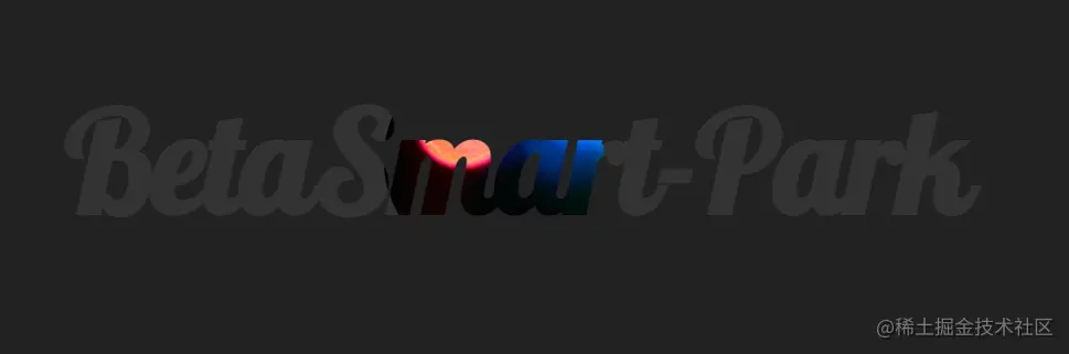
纯 CSS 制作赛博朋克 2077 “故障风”按钮
代码
<!DOCTYPE html>
<html lang="en">
<head>
<meta charset="UTF-8">
<meta name="viewport" content="width=device-width, initial-scale=1.0">
<title>Document</title>
<link href="https://fonts.font.im/css?family=Lobster" rel="stylesheet">
</head>
<style>
body{
display: flex;
justify-content: center;
align-items: center;
min-height: 100vh;
background-color: #f8f005;
}
button, button::after{
width: 380px;
height: 86px;
font-size: 36px;
font-family: 'Lobster', cursive;
background: linear-gradient(45deg, transparent 5%, #ff013c 5%);
border: 0;
color: #fff;
letter-spacing: 3px;
line-height: 88px;
box-shadow: 6px 0px 0px #00e6f6;
outline: transparent;
position: relative;
}
button::after {
--slice-0: inset(50% 50% 50% 50%);
--slice-1: inset(80% -6px 0 0);
--slice-2: inset(50% -6px 30% 0);
--slice-3: inset(10% -6px 85% 0);
--slice-4: inset(40% -6px 50% 0);
--slice-5: inset(80% -6px 5% 0);
content: 'BetaSmart-Park';
display: block;
position: absolute;
top: 0;
left: 0;
right: 0;
bottom: 0;
background: linear-gradient(45deg, transparent 3%, #00e6f6 3% #00e6f6 5%, #ff013c 5%);
text-shadow: -3px -3px 0px #f8f005, 3px 3px 0px #00e6f6;
clip-path: var(--slice-0);
}
@keyframes glitch {
0% {
clip-path: var(--slice-1);
transform: translate(-20px, -10px);
}
10% {
clip-path: var(--slice-3);
transform: translate(10px, 10px);
}
20% {
clip-path: var(--slice-1);
transform: translate(-10px, 10px);
}
30% {
clip-path: var(--slice-3);
transform: translate(0px, 5px);
}
40% {
clip-path: var(--slice-2);
transform: translate(-5px, 0px);
}
50% {
clip-path: var(--slice-3);
transform: translate(5px, 0px);
}
60% {
clip-path: var(--slice-4);
transform: translate(5px, 10px);
}
70% {
clip-path: var(--slice-2);
transform: translate(-10px, 10px);
}
80% {
clip-path: var(--slice-5);
transform: translate(20px, -10px);
}
90% {
clip-path: var(--slice-1);
transform: translate(-10px, 0px);
}
100% {
clip-path: var(--slice-1);
transform: translate(0);
}
}
button:hover::after {
animation: 1s glitch;
animation-timing-function: steps(2,end);
}
</style>
<body>
<button>BetaSmart-Park</button>
</body>
</html>
纯CSS实现聚光灯效果
原文链接地址
代码
<!DOCTYPE html>
<html lang="en">

<head>
  <meta charset="UTF-8">
  <meta name="viewport" content="width=device-width, initial-scale=1.0">
  <title>Document</title>
  <link href="https://fonts.font.im/css?family=Lobster" rel="stylesheet">
</head>
<style>
  body {
    background-color: #222;
    display: flex;
    justify-content: center;
    align-items: center;
    min-height: 100vh;
  }

  h1 {
    color: #333;
    font-size: 8rem;
    font-family: 'Lobster', cursive;
    margin: 0;
    padding: 0;
    letter-spacing: -0.1rem;
    position: relative;
  }

  h1::after {
    content: attr(data-spotlight);
    color: transparent;
    position: absolute;
    top: 0;
    left: 0;
    -webkit-clip-path: ellipse(100px 100px at 0% 50%);
    clip-path: ellipse(100px 100px at 0% 50%);
    animation: spotlight 5s infinite;
    background-image: url(https://images.unsplash.com/photo-1581796084499-136c7350f1e9?ixid=MXwxMjA3fDB8MHxwaG90by1wYWdlfHx8fGVufDB8fHw%3D&ixlib=rb-1.2.1&auto=format&fit=crop&w=1050&q=80);
    background-size: 150%;
    background-position: center center;
    -webkit-background-clip: text;
    background-clip: text;
  }

  @keyframes spotlight {
    0% {
      -webkit-clip-path: ellipse(100px 100px at 0% 50%);
      clip-path: ellipse(100px 100px at 0% 50%);
    }

    50% {
      -webkit-clip-path: ellipse(100px 100px at 100% 50%);
      clip-path: ellipse(100px 100px at 100% 50%);
    }

    100% {
      -webkit-clip-path: ellipse(100px 100px at 0% 50%);
      clip-path: ellipse(100px 100px at 0% 50%);
    }
  }
</style>

<body>
  <h1 data-spotlight="BetaSmart-Park">BetaSmart-Park</h1>
</body>

</html>
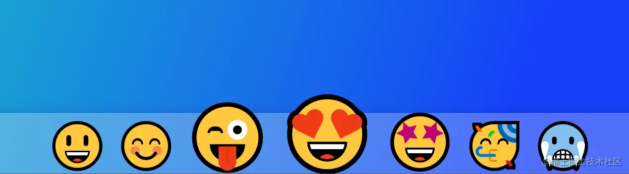
丝滑的效果
<!DOCTYPE html>
<html lang="en">

<head>
  <meta charset="UTF-8">
  <meta name="viewport" content="width=device-width, initial-scale=1.0">
  <title>Document</title>
</head>
<style>
  html {
    font-size: 15px;
  }

  body {
    margin: 0;
    padding: 0;
    display: flex;
    width: 100%;
    min-height: 100vh;
    overflow: hidden;
    align-items: flex-end;
    background-image: linear-gradient(109.6deg, rgba(25, 170, 209, 1) 11.3%, rgba(21, 65, 249, 1) 69.9%);
  }

  .glass {
    width: 100%;
    height: 8rem;
    background: rgba(255, 255, 255, 0.25);
    box-shadow: 0 8px 32px 0 rgba(31, 38, 135, 0.37);
    backdrop-filter: blur(4px);
    -webkit-backdrop-filter: blur(4px);
    border: 1px solid rgba(255, 255, 255, 0.18);
    display: flex;
    justify-content: center;
  }

  .dock {
    --scale: 1;

    list-style: none;
    margin: 0;
    padding: 0;
    display: flex;
    justify-content: center;
    align-items: center;
  }

  .dock li {
    font-size: calc(6rem * var(--scale));
    padding: 0 .5rem;
    cursor: default;

    position: relative;
    top: calc((6rem * var(--scale) - 6rem) / 2 * -1);

    transition: 15ms all ease-out;
  }

  .dock li.loading {
    animation: 1s loading ease-in infinite;
  }

  @keyframes loading {

    0%,
    100% {
      transform: translateY(0px);
    }

    60% {
      transform: translateY(-40px);
    }
  }
</style>

<body>
  <div class="glass">
    <ul class="dock">
      <li>😃</li>
      <li>😊</li>
      <li>😜</li>
      <li>😍</li>
      <li>🤩</li>
      <li>🥳</li>
      <li>🥶</li>
    </ul>
</body>

</html>
<script>
  document.querySelectorAll('.dock li').forEach(li => {
    li.addEventListener('click', e => {
      e.currentTarget.classList.add('loading')
    })

    li.addEventListener('mousemove', e => {
      let item = e.target
      let itemRect = item.getBoundingClientRect()
      let offset = Math.abs(e.clientX - itemRect.left) / itemRect.width

      let prev = item.previousElementSibling || null
      let next = item.nextElementSibling || null

      let scale = 0.6

      resetScale()

      if (prev) {
        prev.style.setProperty('--scale', 1 + scale * Math.abs(offset - 1))
      }

      item.style.setProperty('--scale', 1 + scale)

      if (next) {
        next.style.setProperty('--scale', 1 + scale * offset)
      }
    })
  })

  document.querySelector('.dock').addEventListener('mouseleave', e => {
    resetScale()
  })

  function resetScale() {
    document.querySelectorAll('.dock li').forEach(li => {
      li.style.setProperty('--scale', 1)
    })
  }
</script>


