项目来源:
该项目是去年(2019.07.07)开源的。最初的设计方向是基于控件阴影的。随着1年半的成长,ShadowLayout3.0不止于阴影。什么叫不止于阴影,其实就是加上了系统的shape功能。我们做项目的时候,尤其是大项目,而且还是那张间隔1-2个月后,需要迭代和优化的,此时有些复用的shape和selector不大记得具体的名字,需要花时间去找。那有没有一款控件,直接通过几个简单的属性,实现系统shape功能。(解放你的双手,清空项目drawable文件夹);所以它来了,ShadowLayout。目前star(1.3k)
一、特点功能
嵌套后即可享受阴影,比CardView更好用、更方便也更强大
支持定制化阴影:
1. 随意修改阴影颜色值
2. 阴影圆角:可统一设置圆角,也可对某几个角单独设置
3. x,y轴阴影偏移
4. 随意修改阴影扩散程度
5. 隐藏阴影:隐藏某边或多边阴影,或完全隐藏
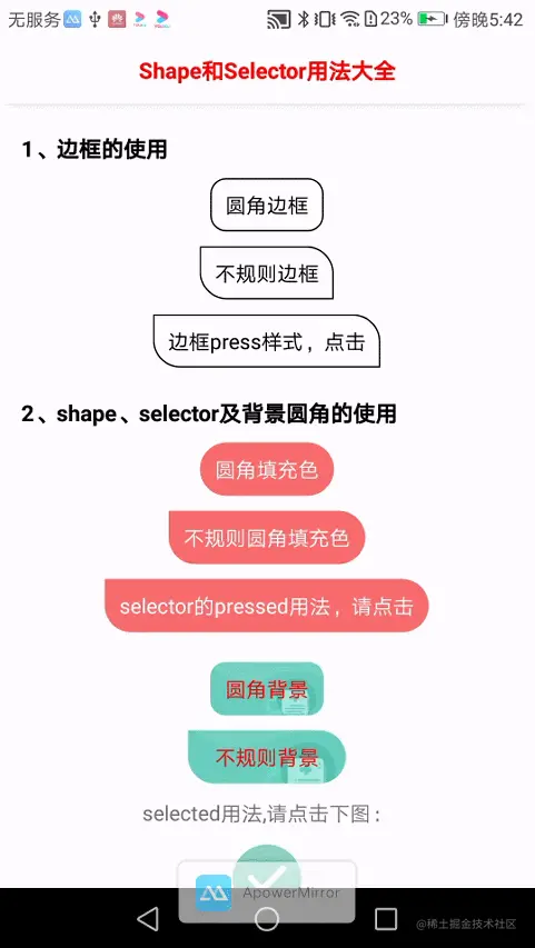
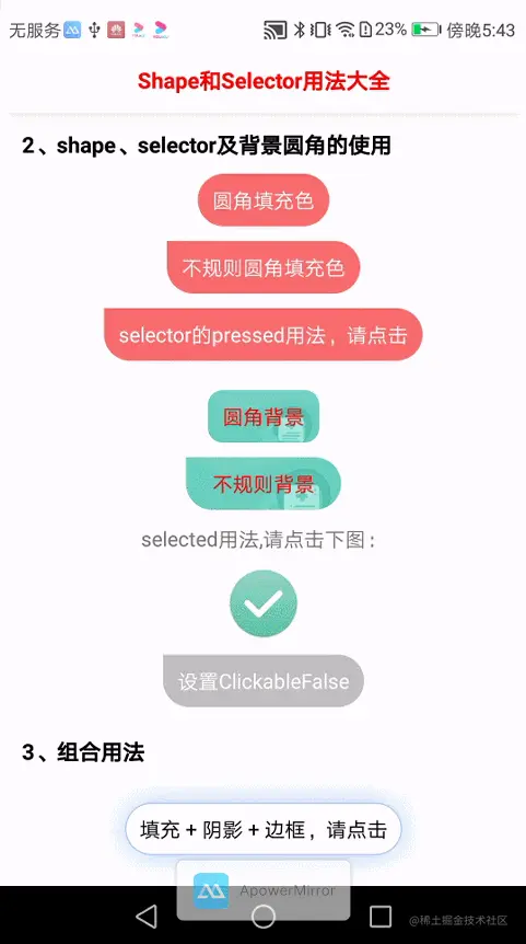
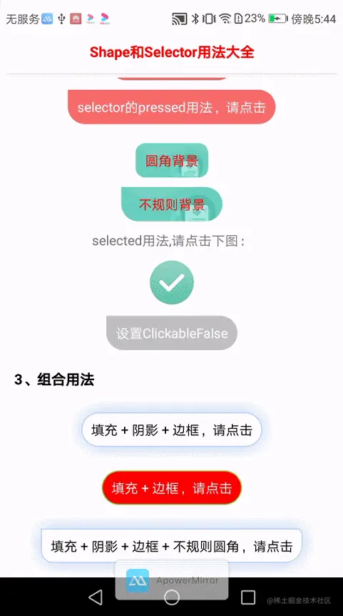
不止于阴影;系统shape功能:项目中shape、selector、ripple统统拥有。解放你的双手,清空项目drawable文件夹
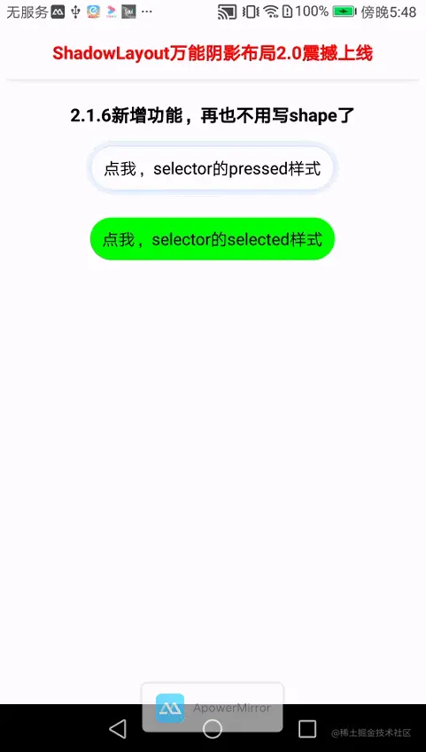
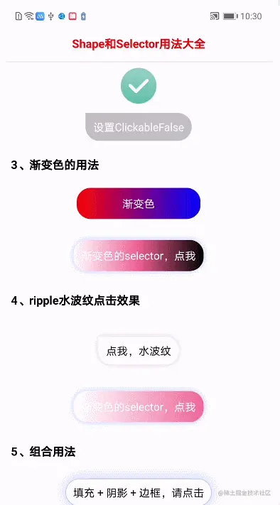
1. shape样式:pressed(按钮点击)、selected(按钮选择)、ripple(点击水波纹)
2. 背景色设置
3. stroke边框设置
4. 渐变色背景色值
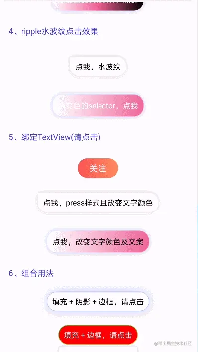
6. 可绑定textView后,可伴随文案变化,可伴随文案颜色变化
5. 按钮是否可被点击
二、ShadowLayout动态
三、效果展示
为录制流畅,截图分辨率模糊。可在下方扫描二维码下载,查看真机效果
3.1、功能展示(1.0)
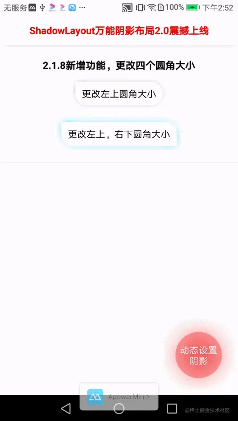
3.2、功能更新(2.0)
| 2.1.6新增shape,selector功能 | 2.1.7isSym属性对比 | 2.1.8单独更改某圆角大小 |
|---|
 |  |  |
3.3、版本来袭(3.0.1)
| stroke边框及点击 | shape及图片selector | 组合使用 |
|---|
 |  |  |
3.4、新增ripple水波纹(3.1.0)及渐变色,以及3.1.1绑定textView
| 3.1.0渐变色及ripple | 3.1.1绑定textView |
|---|
 |  |
四、Demo
扫描二维码下载demo,下载密码是:123456

五、添加依赖
六、基本使用
6.1、阴影的简单使用
            <com.lihang.ShadowLayout
                android:id="@+id/mShadowLayout"
                android:layout_width="wrap_content"
                android:layout_height="wrap_content"
                android:layout_gravity="center_horizontal"
                app:hl_cornerRadius="10dp"
                app:hl_shadowColor="#2a000000"
                app:hl_shadowLimit="5dp"
                >

                <TextView
                    android:id="@+id/txt_test"
                    android:layout_width="wrap_content"
                    android:layout_height="36dp"
                    android:gravity="center"
                    android:paddingLeft="10dp"
                    android:paddingRight="10dp"
                    android:text="圆角"
                    android:textColor="#000" />
            </com.lihang.ShadowLayout>
6.2、stroke边框的简单使用
            <com.lihang.ShadowLayout
                android:layout_width="wrap_content"
                android:layout_height="wrap_content"
                android:layout_gravity="center_horizontal"
                app:hl_cornerRadius="10dp"
                app:hl_strokeColor="#000">

                <TextView
                    android:layout_width="wrap_content"
                    android:layout_height="36dp"
                    android:gravity="center"
                    android:paddingLeft="10dp"
                    android:paddingRight="10dp"
                    android:text="圆角边框"
                    android:textColor="#000" />
            </com.lihang.ShadowLayout>
6.3、shape selector的简单使用
            <com.lihang.ShadowLayout
                android:layout_width="wrap_content"
                android:layout_height="wrap_content"
                android:layout_gravity="center_horizontal"
                android:layout_marginTop="10dp"
                app:hl_cornerRadius="30dp"
                app:hl_cornerRadius_leftTop="0dp"
                app:hl_layoutBackground="#F76C6C"
                app:hl_layoutBackground_true="#89F76C6C"
                app:hl_shapeMode="pressed">

                <TextView
                    android:layout_width="wrap_content"
                    android:layout_height="36dp"
                    android:gravity="center"
                    android:paddingLeft="10dp"
                    android:paddingRight="10dp"
                    android:text="selector的pressed用法,请点击"
                    android:textColor="#fff" />
            </com.lihang.ShadowLayout>
6.4、图片 selector的简单使用
    <com.lihang.ShadowLayout
        android:id="@+id/ShadowLayout_shape"
        android:layout_width="wrap_content"
        android:layout_height="wrap_content"
        android:layout_gravity="center_horizontal"
        android:layout_marginTop="10dp"
        app:hl_cornerRadius="18dp"
        app:hl_cornerRadius_rightTop="0dp"
        app:hl_layoutBackground="@mipmap/test_background_false"
        app:hl_layoutBackground_true="@mipmap/test_background_true">


        <TextView
            android:layout_width="wrap_content"
            android:layout_height="36dp"
            android:gravity="center"
            android:paddingLeft="10dp"
            android:paddingRight="10dp"
            android:text="图片selector"
            android:textColor="#fff" />

    </com.lihang.ShadowLayout>
如果你觉得麻烦,你还可以这样
            <com.lihang.ShadowLayout
                android:id="@+id/ShadowLayout_image"
                android:layout_width="50dp"
                android:layout_height="50dp"
                android:layout_gravity="center_horizontal"
                android:layout_marginTop="10dp"
                app:hl_layoutBackground="@mipmap/game_6_right"
                app:hl_layoutBackground_true="@mipmap/game_6_wrong"
                app:hl_shapeMode="pressed" />
6.5、渐变色的简单使用
            <com.lihang.ShadowLayout
                android:layout_width="wrap_content"
                android:layout_height="wrap_content"
                app:hl_cornerRadius="18dp"
                app:hl_startColor="#ff0000"
                app:hl_endColor="#0000ff"
                >

                <TextView
                    android:layout_width="160dp"
                    android:layout_height="40dp"
                    android:gravity="center"
                    android:text="渐变色"
                    android:textColor="#fff" />

            </com.lihang.ShadowLayout>
6.6、水波纹ripple的使用
            <com.lihang.ShadowLayout
                android:layout_width="wrap_content"
                android:layout_height="wrap_content"
                app:hl_cornerRadius="18dp"
                app:hl_shadowColor="#2a000000"
                app:hl_shadowLimit="7dp"
                app:hl_layoutBackground="#fff"
                app:hl_layoutBackground_true="#ff0000"
                app:hl_shapeMode="ripple"
                >

                <TextView
                    android:layout_width="160dp"
                    android:layout_height="40dp"
                    android:gravity="center"
                    android:text="水波纹"
                    />

            </com.lihang.ShadowLayout>
6.7、绑定textView,伴随文案及颜色变化
		<com.lihang.ShadowLayout
                    android:layout_width="wrap_content"
                    android:layout_height="wrap_content"
                    android:layout_gravity="center_horizontal"
                    android:layout_marginTop="20dp"
                    app:hl_bindTextView="@+id/txt_press"
                    app:hl_cornerRadius="18dp"
                    app:hl_layoutBackground="#FF9800"
                    app:hl_layoutBackground_true="#ff0000"
                    app:hl_shapeMode="pressed"
                    app:hl_textColor_true="#fff"
                    app:hl_text="点我,press样式"
                    app:hl_text_true="我改变了文案了"
                    >

                    <TextView
                        android:id="@+id/txt_press"
                        android:layout_width="wrap_content"
                        android:layout_height="36dp"
                        android:gravity="center"
                        android:paddingLeft="10dp"
                        android:paddingRight="10dp"
                        android:text="点我,press样式"
                        android:textColor="#000" />

                </com.lihang.ShadowLayout>
七、属性表格(Attributes)
7.1、关于阴影
| name | format | description |
|---|
| hl_shadowHidden | boolean | 是否隐藏阴影(默认false) |
| hl_shadowColor | color | 阴影颜色值,如不带透明,默认透明16% |
| hl_shadowLimit | dimension | 阴影扩散程度(dp) |
| hl_shadowOffsetX | dimension | x轴的偏移量(dp) |
| hl_shadowOffsetY | dimension | y轴的偏移量(dp) |
| hl_shadowHiddenLeft | boolean | 左边的阴影不可见,其他3边同理 |
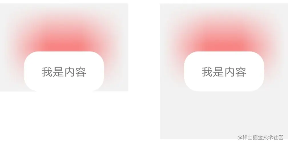
| hl_shadowSymmetry | boolean | 控件区域是否对称(默认true)根据此图理解
|
7.2、关于圆角
| name | format | description |
|---|
| hl_cornerRadius | dimension | 包括阴影圆角、shape圆角(dp) |
| hl_cornerRadius_leftTop | dimension | 左上圆角,其他角还是hl_cornerRadius值;同理其他3角(dp) |
7.3、关于shape
7.3.1、关于shape样式及背景色
| name | format | description |
|---|
| hl_shapeMode | enum | 有3种模式:pressed和selected。和系统shape一样,以及ripple点击水波纹 |
| hl_layoutBackground | reference/color | 背景色,为false时展示:可以是颜色值,图片以及系统shape样式 |
| hl_layoutBackground_true | reference/color | 背景色,为true时展示:可以是颜色值,图片以及系统shape样式 |
7.3.2、关于stroke边框
| name | format | description |
|---|
| hl_strokeWith | dimension | stroke边框线宽度 |
| hl_strokeColor | color | 边框颜色值,为false展示 |
| hl_strokeColor_true | color | 边框颜色值,为true展示 |
7.3.3、关于渐变色
| name | format | description |
|---|
| hl_startColor | color | 渐变起始颜色(设置渐变色后,hl_layoutBackground属性将无效) |
| hl_centerColor | color | 渐变中间颜色(可不填) |
| hl_endColor | color | 渐变的终止颜色 |
| hl_angle | integer | 渐变角度(默认0) |
7.3.4、关于绑定textView
| name | format | description |
|---|
| hl_bindTextView | reference | 当前要绑定的textView的id |
| hl_textColor | color | shape为false是展示的文案颜色 |
| hl_textColor_true | color | shape为true是展示的文案颜色 |
| hl_text | string | shape为false时展示的文案 |
| hl_text_true | string | shape为true时展示的文案 |
7.4、关于clickable
| name | format | description |
|---|
| clickable | boolean | 设置ShadowLayout是否可以被点击;代码设置:mShadowLayout.setClickable(false);(默认true) |
| hl_layoutBackground_clickFalse | reference/color | Clickable为false时,要展示的图片或颜色。(此属性应当在app:hl_shapeMode="pressed"时生效) |
八、方法表格(Method)
| name | format | description |
|---|
| setShadowHidden() | boolean | 是否隐藏阴影 |
| setShadowColor() | color | 设置阴影颜色值 |
| setShadowLimit() | dimension | 设置阴影扩散区域 |
| setOffsetX() | dimension | 设置阴影的X轴偏移量 |
| setOffsetY() | dimension | 设置阴影的Y轴偏移量 |
| setShadowHiddenTop() | boolean | 隐藏上边阴影(同理其他三遍) |
| setCornerRadius() | dimension | 设置圆角 |
| setLayoutBackground() | color | 设置false时的背景颜色值 |
| setLayoutBackgroundTrue() | color | 设置true时的背景颜色值 |
| setStrokeColor() | color | 设置false时的边框颜色 |
| setStrokeColorTrue() | color | 设置true时的边框颜色 |
| setClickable() | boolean | 设置ShadowLayout是否可以点击 |
九、其他作品
RichEditTextCopyToutiao
mPro
SmartLoadingView
十、本项目地址
ShadowLayout
我的公众号
最近打算出2个专栏。一个专门记录面试资料,一个专门记录面试刷题。其实公众号也可以当成笔记来记录的。