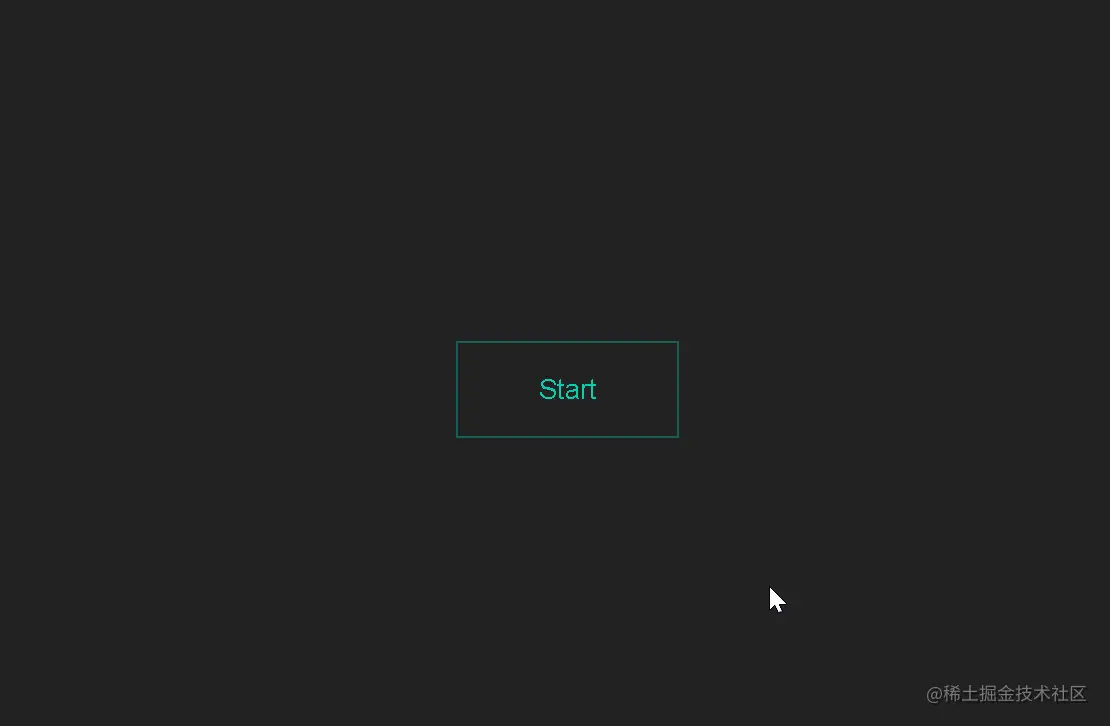
1.边框回旋效果
HTML
<button
  data-text="Start"
  class="btn btn-primary btn-ghost btn-border-stroke  btn-text-float-up"
>
  <div class="btn-borders">
    <div class="border-top"></div>
    <div class="border-right"></div>
    <div class="border-bottom"></div>
    <div class="border-left"></div>
  </div>
  <span class="btn-text">Start</span>
</button>
CSS
body {
  display: flex;
  height: 100vh;
  justify-content: center;
  align-items: center;
  text-align: center;
  background: #1A1E23;
}

.btn {
  --hue: 190;
  --ease-in-duration: 0.25s;
  --ease-in-exponential: cubic-bezier(0.95, 0.05, 0.795, 0.035);
  --ease-out-duration: 0.65s;
  --ease-out-delay: var(--ease-in-duration);
  --ease-out-exponential: cubic-bezier(0.19, 1, 0.22, 1);
  position: relative;
  padding: 1rem 3rem;
  font-size: 1rem;
  line-height: 1.5;
  color: white;
  text-decoration: none;
  background-color: hsl(var(--hue), 100%, 41%);
  border: 1px solid hsl(var(--hue), 100%, 41%);
  outline: transparent;
  overflow: hidden;
  cursor: pointer;
  user-select: none;
  white-space: nowrap;
  transition: 0.25s;

  &:hover {
    background: hsl(var(--hue), 100%, 31%);
  }

  &-primary {
    --hue: 171;
  }

  &-ghost {
    color: hsl(var(--hue), 100%, 41%);
    background-color: transparent;
    border-color: hsl(var(--hue), 100%, 41%);

    &:hover {
      color: white;
    }
  }

  &-border-stroke {
    border-color: hsla(var(--hue), 100%, 41%, 0.35);

    .btn-borders {
      position: absolute;
      top: 0;
      left: 0;
      width: 100%;
      height: 100%;

      .border-top {
        position: absolute;
        top: 0;
        width: 100%;
        height: 1px;
        background: hsl(var(--hue), 100%, 41%);
        transform: scaleX(0);
        transform-origin: left;
      }

      .border-right {
        position: absolute;
        right: 0;
        width: 1px;
        height: 100%;
        background: hsl(var(--hue), 100%, 41%);
        transform: scaleY(0);
        transform-origin: bottom;
      }

      .border-bottom {
        position: absolute;
        bottom: 0;
        width: 100%;
        height: 1px;
        background: hsl(var(--hue), 100%, 41%);
        transform: scaleX(0);
        transform-origin: left;
      }

      .border-left {
        position: absolute;
        left: 0;
        width: 1px;
        height: 100%;
        background: hsl(var(--hue), 100%, 41%);
        transform: scaleY(0);
        transform-origin: bottom;
      }

      // when unhover, ease-out left, bottom; ease-in right, top

      .border-left {
        transition: var(--ease-out-duration) var(--ease-out-delay)
          var(--ease-out-exponential);
      }
      .border-bottom {
        transition: var(--ease-out-duration) var(--ease-out-delay)
          var(--ease-out-exponential);
      }

      .border-right {
        transition: var(--ease-in-duration) var(--ease-in-exponential);
      }
      .border-top {
        transition: var(--ease-in-duration) var(--ease-in-exponential);
      }
    }

    &:hover {
      color: hsl(var(--hue), 100%, 41%);
      background: transparent;

      .border-top,
      .border-bottom {
        transform: scaleX(1);
      }
      .border-left,
      .border-right {
        transform: scaleY(1);
      }

      // when hover, ease-in left, bottom; ease-out right, top

      .border-left {
        transition: var(--ease-in-duration) var(--ease-in-exponential);
      }
      .border-bottom {
        transition: var(--ease-in-duration) var(--ease-in-exponential);
      }

      .border-right {
        transition: var(--ease-out-duration) var(--ease-out-delay)
          var(--ease-out-exponential);
      }
      .border-top {
        transition: var(--ease-out-duration) var(--ease-out-delay)
          var(--ease-out-exponential);
      }
    }
  }

  &-text-float-up {
    &::after {
      position: absolute;
      content: attr(data-text);
      top: 0;
      left: 0;
      width: 100%;
      height: 100%;
      display: flex;
      justify-content: center;
      align-items: center;
      opacity: 0;
      transform: translateY(35%);
      transition: 0.25s ease-out;
    }

    // when hover, ease-in top-text; ease-out bottom-text

    .btn-text {
      display: block;
      transition: 0.75s 0.1s var(--ease-out-exponential);
    }

    &:hover {
      // when hover, ease-in bottom-text; ease-out top-text

      .btn-text {
        opacity: 0;
        transform: translateY(-25%);
        transition: 0.25s ease-out;
      }

      &::after {
        opacity: 1;
        transform: translateY(0);
        transition: 0.75s 0.1s var(--ease-out-exponential);
      }
    }
  }
}
效果图
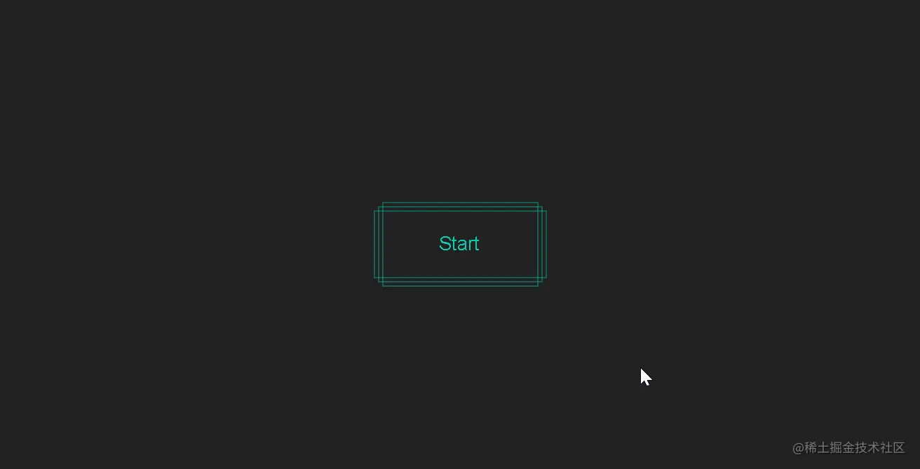
2.实现多重边框
HTML
<button class="btn btn-primary btn-ghost btn-multiple-border-stroke">
  <div class="btn-borders-group">
    <div class="border-top"></div>
    <div class="border-right"></div>
    <div class="border-bottom"></div>
    <div class="border-left"></div>
  </div>
  <div class="btn-borders-group">
    <div class="border-top"></div>
    <div class="border-right"></div>
    <div class="border-bottom"></div>
    <div class="border-left"></div>
  </div>
  <div class="btn-borders-group">
    <div class="border-top"></div>
    <div class="border-right"></div>
    <div class="border-bottom"></div>
    <div class="border-left"></div>
  </div>
  <span class="btn-text">Start</span>
</button>
CSS
body {
  display: flex;
  height: 100vh;
  justify-content: center;
  align-items: center;
  text-align: center;
  background: #1A1E23;
}

.btn {
  --hue: 190;
  --ease-in-duration: 0.25s;
  --ease-out-duration: 0.65s;
  --ease-out-delay: var(--ease-in-duration);
  position: relative;
  padding: 1rem 3rem;
  font-size: 1rem;
  line-height: 1.5;
  color: white;
  text-decoration: none;
  background-color: hsl(var(--hue), 100%, 41%);
  border: 1px solid hsl(var(--hue), 100%, 41%);
  outline: transparent;
  cursor: pointer;
  user-select: none;
  white-space: nowrap;
  transition: 0.25s;

  &:hover {
    background: hsl(var(--hue), 100%, 31%);
  }

  &-primary {
    --hue: 171;
  }

  &-ghost {
    color: hsl(var(--hue), 100%, 41%);
    background-color: transparent;
    border-color: hsl(var(--hue), 100%, 41%);

    &:hover {
      color: white;
    }
  }

  &-multiple-border-stroke {
    border-color: transparent;

    .btn-borders-group {
      position: absolute;
      top: 0;
      left: 0;
      display: flex;
      justify-content: center;
      align-items: center;
      width: 100%;
      height: 100%;
      border: 1px solid hsla(var(--hue), 100%, 41%, 0.35);

      &:nth-child(1) {
        left: -8px;
        padding: 0 8px;
      }

      &:nth-child(2) {
        top: -8px;
        padding: 8px 0;
      }

      &:nth-child(3) {
        top: -4px;
        left: -4px;
        padding: 4px;
      }

      .border-top {
        position: absolute;
        top: 0;
        width: 100%;
        height: 1px;
        background: hsl(var(--hue), 100%, 41%);
        transform: scaleX(0);
        transform-origin: left;
      }

      .border-right {
        position: absolute;
        right: 0;
        width: 1px;
        height: 100%;
        background: hsl(var(--hue), 100%, 41%);
        transform: scaleY(0);
        transform-origin: bottom;
      }

      .border-bottom {
        position: absolute;
        bottom: 0;
        width: 100%;
        height: 1px;
        background: hsl(var(--hue), 100%, 41%);
        transform: scaleX(0);
        transform-origin: left;
      }

      .border-left {
        position: absolute;
        left: 0;
        width: 1px;
        height: 100%;
        background: hsl(var(--hue), 100%, 41%);
        transform: scaleY(0);
        transform-origin: bottom;
      }

      // when unhover, ease-in top, right; ease-out bottom, left

      .border-left {
        transition: var(--ease-out-duration) var(--ease-out-delay) cubic-bezier(0.2, 1, 0.2, 1);
      }

      .border-bottom {
        transition: var(--ease-out-duration) var(--ease-out-delay) cubic-bezier(0.2, 1, 0.2, 1);
      }

      .border-right {
        transition: var(--ease-in-duration) cubic-bezier(1, 0, 0.8, 0);
      }

      .border-top {
        transition: var(--ease-in-duration) cubic-bezier(1, 0, 0.8, 0);
      }
    }

    &:hover {
      color: hsl(var(--hue), 100%, 41%);
      background: transparent;

      .border-top,
      .border-bottom {
        transform: scaleX(1);
      }

      .border-left,
      .border-right {
        transform: scaleY(1);
      }

      // when hover, ease-in bottom, left; ease-out top, right

      .border-left {
        transition: var(--ease-in-duration) cubic-bezier(1, 0, 0.8, 0);
      }

      .border-bottom {
        transition: var(--ease-in-duration) cubic-bezier(1, 0, 0.8, 0);
      }

      .border-right {
        transition: var(--ease-out-duration) var(--ease-out-delay) cubic-bezier(0.2, 1, 0.2, 1);
      }

      .border-top {
        transition: var(--ease-out-duration) var(--ease-out-delay) cubic-bezier(0.2, 1, 0.2, 1);
      }
    }
  }
}
效果图
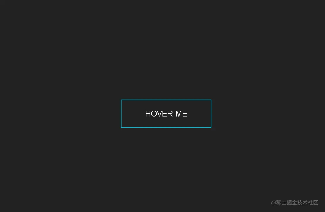
3.闪光按钮
HTML
<button class="btn btn-primary btn-ghost btn-shine">
  hover me
</button>
CSS
body {
  display: flex;
  height: 100vh;
  justify-content: center;
  align-items: center;
  background: #1A1E23;
}

.btn {
  --hue: 190;
  position: relative;
  padding: 1rem 3rem;
  font-size: 1rem;
  line-height: 1.5;
  color: white;
  text-decoration: none;
  text-transform: uppercase;
  background-color: hsl(var(--hue), 100%, 41%);
  border: 1px solid hsl(var(--hue), 100%, 41%);
  outline: transparent;
  overflow: hidden;
  cursor: pointer;
  user-select: none;
  white-space: nowrap;
  transition: 0.25s;

  &:hover {
    background: hsl(var(--hue), 100%, 31%);
  }

  &-primary {
    --hue: 187;
  }

  &-ghost {
    color: hsl(var(--hue), 100%, 41%);
    background-color: transparent;
    border-color: hsl(var(--hue), 100%, 41%);

    &:hover {
      color: white;
    }
  }

  &-shine {
    color: white;

    &::before {
      position: absolute;
      content: "";
      top: 0;
      left: 0;
      width: 100%;
      height: 100%;
      background: linear-gradient(
        120deg,
        transparent,
        hsla(var(--hue), 100%, 41%, 0.5),
        transparent
      );
      transform: translateX(-100%);
      transition: 0.6s;
    }

    &:hover {
      background: transparent;
      box-shadow: 0 0 20px 10px hsla(var(--hue), 100%, 41%, 0.5);
    }

    &:hover::before {
      transform: translateX(100%);
    }
  }
}
效果图
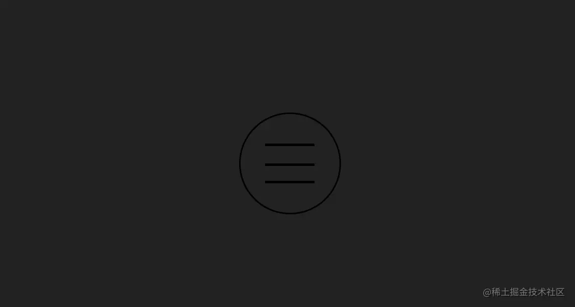
4.侧边栏按钮
HTML
<input type="checkbox" id="burger-toggle">
<label for="burger-toggle" class="burger-menu">
  <div class="line"></div>
  <div class="line"></div>
  <div class="line"></div>
</label>
<div class="overlay"></div>
CSS
body {
  display: flex;
  justify-content: center;
  align-items: center;
  min-height: 100vh;
  margin: 0;
  overflow: hidden;
  background: #ECEFFC;
}

#burger-toggle {
  appearance: none;
  opacity: 0;

  &:checked {

    // Here don't use box-shadow to make overlay because it will damage performance.
    &~.overlay {
      opacity: 1;
      transform: scale(160);
    }

    &~.burger-menu {
      .line {
        &:nth-child(1) {
          transform: translateY(calc(var(--burger-menu-radius) / 5)) rotate(45deg);
        }

        &:nth-child(2) {
          transform: scaleX(0);
        }

        &:nth-child(3) {
          transform: translateY(calc(var(--burger-menu-radius) / -5)) rotate(-45deg);
        }
      }
    }
  }
}

.burger-menu {
  --burger-menu-radius: 4em;
  position: relative;
  z-index: 100;
  display: block;
  width: var(--burger-menu-radius);
  height: var(--burger-menu-radius);
  background: white;
  border: solid 2px hsla(184, 9%, 62%, 0.4);
  border-radius: 50%;
  outline: none;
  cursor: pointer;
  transition: 0.5s ease-in-out;

  .line {
    position: absolute;
    left: 25%;
    width: 50%;
    height: 3px;
    background: hsla(210, 29%, 24%, 0.3);
    border-radius: 10px;
    overflow: hidden;
    transition: all 0.5s ease;

    &:nth-child(1) {
      top: 30%;
    }

    &:nth-child(2) {
      top: 50%;
    }

    &:nth-child(3) {
      top: 70%;
    }

    &::after {
      position: absolute;
      content: "";
      top: 0;
      left: 0;
      width: 100%;
      height: 100%;
      background: #2980b9;
      transform: translateX(-100%);
      transition: all 0.25s ease;
    }

    @for $i from 2 through 3 {
      &:nth-child(#{$i})::after {
        transition-delay: 0.1s * ($i - 1);
      }
    }
  }

  &:hover {
    box-shadow:
      0.4px 0.4px 0.8px rgba(0, 0, 0, 0.042),
      1px 1px 2px rgba(0, 0, 0, 0.061),
      1.9px 1.9px 3.8px rgba(0, 0, 0, 0.075),
      3.4px 3.4px 6.7px rgba(0, 0, 0, 0.089),
      6.3px 6.3px 12.5px rgba(0, 0, 0, 0.108),
      15px 15px 30px rgba(0, 0, 0, 0.15);

    .line::after {
      transform: translateX(0);
    }
  }
}

.overlay {
  position: absolute;
  width: 2em;
  height: 2em;
  background: hsla(204, 64%, 44%, 0.9);
  border-radius: 50%;
  opacity: 0;
  transition: 0.5s ease-in-out;
  will-change: transform;
}
效果图
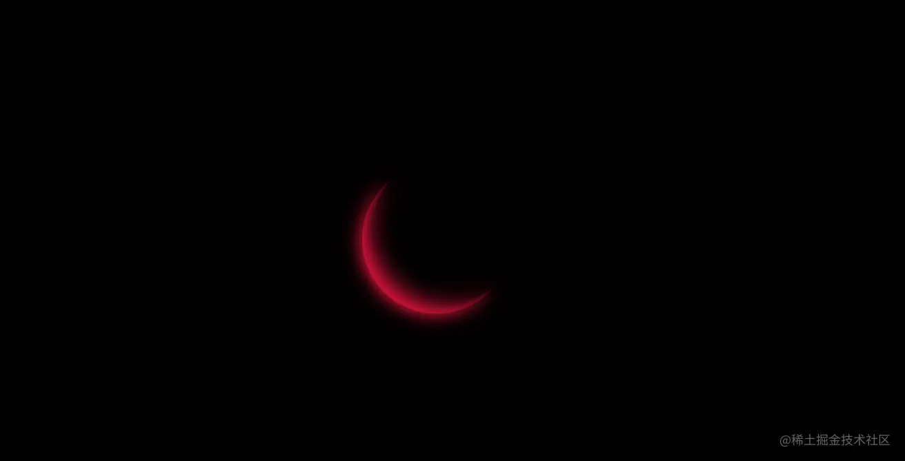
5.猩红之月
HTML
<div class="loading"></div>
CSS
body {
  display: flex;
  justify-content: center;
  align-items: center;
  height: 100vh;
  background: black;
}

.loading {
  position: relative;
  width: 8em;
  height: 8em;
  background: black;
  border-radius: 50%;
  box-shadow: inset 0.5em -0.5em crimson;
  animation: spin 2s linear infinite;

  &::before,
  &::after {
    position: absolute;
    content: "";
    width: 100%;
    height: 100%;
    background: inherit;
    border-radius: inherit;
    box-shadow: inherit;
  }

  &::before {
    filter: blur(5px);
  }

  &::after {
    filter: blur(10px);
  }
}

@keyframes spin {
  to {
    transform: rotate(1turn);
  }
}
效果图
6.霓虹灯文本
HTML
<div class="neon">fushigi no monogatari</div>
CSS
body {
  display: flex;
  height: 100vh;
  justify-content: center;
  align-items: center;
  text-align: center;
  background: black;
}

.neon {
  color: #cce7f8;
  font-size: 2.5rem;
  font-family: 'Pacifico', cursive;
  text-transform: uppercase;
  animation: shining 0.1s alternate infinite;
}

@keyframes shining {
  from {
    text-shadow: 0 0 6px rgba(182, 211, 207, 0.9),
      0 0 30px rgba(182, 211, 207, 0.3), 0 0 12px rgba(15, 115, 223, 0.5),
      0 0 21px rgba(15, 115, 223, 0.9), 0 0 34px rgba(15, 115, 223, 0.8),
      0 0 54px rgba(15, 115, 223, 0.9);
  }
  to {
    text-shadow: 0 0 6px rgba(182, 211, 207, 1),
      0 0 30px rgba(182, 211, 207, 0.4), 0 0 12px rgba(15, 115, 223, 0.6),
      0 0 22px rgba(15, 115, 223, 0.8), 0 0 38px rgba(15, 115, 223, 0.9),
      0 0 60px rgba(15, 115, 223, 1);
  }
}
效果图

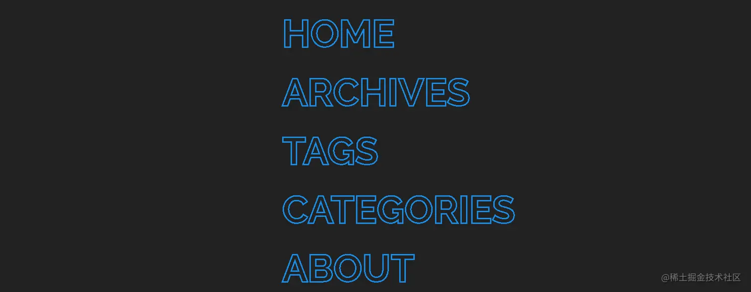
7.文字效果
HTML
<ul>
  <li><a href="#">home</a></li>
  <li><a href="#">archives</a></li>
  <li><a href="#">tags</a></li>
  <li><a href="#">categories</a></li>
  <li><a href="#">about</a></li>
</ul>
CSS
body {
  display: flex;
  height: 100vh;
  justify-content: center;
  align-items: center;
  text-align: center;
  background: #1A1E23;
}

ul {
  display: flex;
  flex-direction: column;
  align-items: start;
  list-style-type: none;

  li {
    padding: 6px 0;

    a {
      --fill-color: #198CE6;
      position: relative;
      display: block;
      padding: 4px 0;
      font: 700 3rem Raleway, sans-serif;
      text-decoration: none;
      text-transform: uppercase;
      -webkit-text-stroke: 2px var(--fill-color);
      background: linear-gradient(var(--fill-color) 0 100%) left / 0 no-repeat;
      color: transparent;
      background-clip: text;
      transition: 0.5s linear;

      &:hover {
        background-size: 100%;
      }
    }
  }
}
效果图
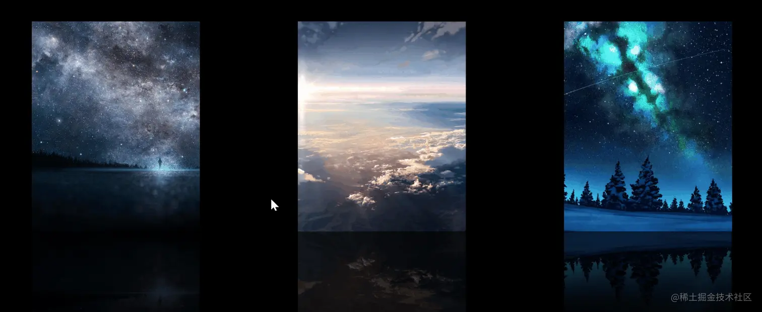
8.图片翻转
HTML
<div class="scene">
  <div class="card">
    <div class="card__face card__face--front">
      <img src="https://i.loli.net/2019/11/23/cnKl1Ykd5rZCVwm.jpg" />
    </div>
    <div class="card__face card__face--back">
      <img src="https://i.loli.net/2019/11/16/cqyJiYlRwnTeHmj.jpg" />
    </div>
  </div>
  <div class="card">
    <div class="card__face card__face--front">
      <img src="https://i.loli.net/2019/11/16/FLnzi5Kq4tkRZSm.jpg" />
    </div>
    <div class="card__face card__face--back">
      <img src="https://i.loli.net/2019/10/18/buDT4YS6zUMfHst.jpg" />
    </div>
  </div>
  <div class="card">
    <div class="card__face card__face--front">
      <img src="https://i.loli.net/2019/10/18/uXF1Kx7lzELB6wf.jpg" />
    </div>
    <div class="card__face card__face--back">
      <img src="https://i.loli.net/2019/11/03/RtVq2wxQYySDb8L.jpg" />
    </div>
  </div>
</div>
CSS
body {
  display: flex;
  justify-content: center;
  align-items: center;
  height: 100vh;
  background: black;
}

.scene {
  width: 1000px;
  display: flex;
  justify-content: space-between;
  perspective: 800px;

  .card {
    position: relative;
    width: 240px;
    height: 300px;
    color: white;
    cursor: pointer;
    transition: 1s ease-in-out;
    transform-style: preserve-3d;

    &:hover {
      transform: rotateY(0.5turn);
    }

    .card__face {
      position: absolute;
      top: 0;
      left: 0;
      width: 100%;
      height: 100%;
      backface-visibility: hidden;
      transition: 1s ease-in-out;
      -webkit-box-reflect: below 0
        linear-gradient(transparent, transparent, rgba(0, 0, 0, 0.4));

      img {
        width: 240px;
        height: 300px;
        object-fit: cover;
      }

      &--back {
        transform: rotateY(0.5turn);
      }
    }
  }
}
效果图
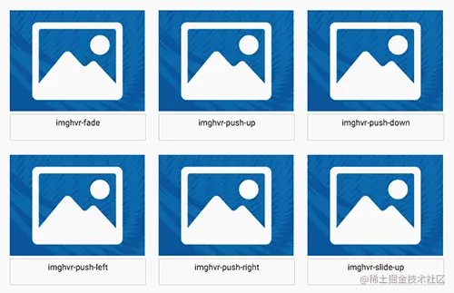
9.Imagehover
HTML
其中imghvr-fade就是对应的 CSS hover 效果,Class 名称 https://www.shejidaren.com/examples/imagehover-css/index.html

<head>
  <link rel=”stylesheet” href=”css/imagehover.min.css”>
</head>

<figure class=”imghvr-fade”>
  <img src=”#”>
  <figcaption>
    // Hover 内容
  </figcaption>
</figure>
CSS
修改背景色
[class^=’imghvr-‘],
[class*=’ imghvr-‘] {
  background-color: #D14233;
}
效果图


