

当 UI 给了多个 svg 图标,前端需要根据不同条件渲染不同图标,并且图标的颜色要与周围文本的颜色一致,例如 hover 状态下图标与字体的颜色都由 black 改变为 red,这样的需求应该怎么实现?
关于封装 svg 图标基础组件
通常情况下,我们可以直接复制 svg 文件内容到 template 中,然后修改其 fill 的颜色。
但这里我们需要对 svg 做一个封装,写成一个 IconBase.vue 文件如下(根据 svg 格式抽象的组件,保留 <svg>标签,path 部分抽象出来,封装成组件,动态引入)。
封装 IconBase 组件
封装后的 IconBase 组件支持传入:
- 名称
iconName - 宽度
width - 高度
height - 颜色
iconColor
<template>
  <svg
    xmlns="http://www.w3.org/2000/svg"
    :width="width"
    :height="height"
    viewBox="0 0 1024 1024"
    :aria-labelledby="iconName"
    role="presentation"
  >
    <title :id="iconName" lang="en">{{iconName}} icon</title>
    <g :fill="iconColor">
      <!-- path 部分抽象出来,封装成组件,动态引入 -->
      <component v-bind:is="currentIcon" />
    </g>
  </svg>
</template>

<script>
import Vue from 'vue'
export default {
  props: {
    iconName: {
      type: String,
      default: 'box'
    },
    width: {
      type: [Number, String],
      default: 18
    },
    height: {
      type: [Number, String],
      default: 18
    },
    iconColor: {
      type: String,
      default: 'currentColor'
    }
  },
  data () {
    return {
      currentIcon: ''
    }
  },

  created () {
    this.getSvgIcon()
  },

  methods: {
    getSvgIcon () {
      try {
        this.registerComponent(this.iconName).then(component => {
          this.currentIcon = component
        })
      } catch (error) {
        // console.log(error)
      }
    },
    /**
      *@desc 统一加载注册组件资源
    */
    registerComponent (name) {
      const files = require.context('@/components/icons/', false, /\.vue$/)
      if (files.keys().includes(`./${name}.vue`)) {
        return import('@/components/icons/' + name).then(component => { //eslint-disable-line
          return Vue.extend(component.default)
        })
      } else {
        console.log('未找到icon组件')
      }
    }
  }
}
</script>

<style scoped>
svg {
  display: inline-block;
  vertical-align: baseline;
  margin-bottom: -2px; /* yes, I'm that particular about formatting */
}
</style>
这里动态加载组件资源的方法第二部分有解释。先接着说明抽象成动态组件后,组件到底是什么。
动态引入和抽象出的组件到底是什么?
由于 IconBase.vue 文件中是以动态组件的方式引入的,所以需要对 svg 文件做处理,以 vue 组件的方式引用,需要将用到的每一个 svg 文件封装成如下结构:
<template>
  <path
    d="M484.266667 272.021333l6.634666 6.72c5.973333 5.973333 13.013333 12.842667 21.098667 20.629334l9.194667-8.917334c7.253333-7.04 13.44-13.184 18.56-18.432a193.28 193.28 0 0 1 277.44 0c75.904 77.525333 76.629333 202.794667 2.133333 281.194667L512 853.333333 204.672 553.237333c-74.474667-78.421333-73.770667-203.690667 2.133333-281.216a193.28 193.28 0 0 1 277.44 0z"
  / >
</template>
同时需要注意的是最好将所有要用到的svg封装成的 vue 文件放在一个目录下,方便 require.context() 使用。
如何使用 IconBase 组件?
组件封装完成后,使用方法如下,这里的 IconLike 就是一个图标文件的文件名。
<template>
  <div id="app">
    <icon-base icon-name="IconLike"></icon-base>111
  </div>
</template>
当添加 hover 样式后,图标颜色随着文本颜色变化:
<style lang="stylus" scoped>
#app
  &:hover
    color red
</style>
关于动态加载组件资源的说明
以上的例子中使用了动态加载组件的方式,这里详细说明一下动态加载组件的方法:
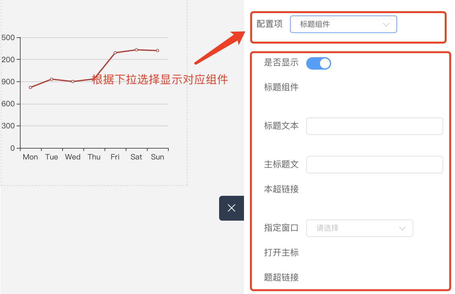
这里使用了另外一个 demo 来说明,是之前做可视化大屏配置项目中使用到的。当选择 echarts 的一项配置标题组件 title ,下方就动态显示封装了 title 包含的所有配置项的表单组件。
先说说使用动态加载组件的原因
如图所示的功能改如何去做?第一想到的可能是v-if, v-else-if, v-else,但在条件多的时候会导致太冗余,页面看起来很复杂的问题。所以一方面为了简化代码,一方面为了减少手动 import 组件的步骤,我们使用动态加载组件。
使用动态加载组件
那么如何做到根据选择的配置项显示对应的组件信息呢? vue 中提供了 vue.extend() 方法以及 is 的使用。
is预期接收String| Object(组件的选项对象)。当currentView改变时,组件也跟着改变。点击 is 官网介绍 查看。
<template>
    <component v-bind:is="currentView"></component>
</template>
- 同时我们需要
Vue.extend(component.default)去实现加载注册组件资源。为了优化功能,这里还做了未找到文件的报错处理机制,防止未能import成功时的处理:
/**
  *@desc 响应下拉选择
  */
handleChangeApi (value) {
  try {
    this.registerComponent(value).then(component => {
      this.currentView = component
    })
  } catch (error) {
      // 未找到相应文件报错处理
  }
}
使用 require.context() 减少手动 import
这里使用到了 require.context(),可以去了解一下如何使用,这对于需要引入大量文件时比较有用。
/**
  *@desc 用require.context()获取文件夹下所有文件,统一加载注册组件资源
  */
registerComponent (name) {
  const files = require.context('./form', false, /\.vue$/)
  if (files.keys().includes(`./${name}.vue`)) {
    return import('./form/' + name).then(component => {
      return Vue.extend(component.default)
    })
  } else {
    this.$message.error('配置项暂不支持')
  }
}
以上就是 vue 中动态组件的使用方法了。
上述步骤就是 Vue 中动态使用 SVG 图标的说明。最后插入一个小经验,关于 vue 父组件向子组件如何传递图片变量。
其他代替方案
其它帮助你管理 SVG 图标的工具有:
vue-svg-icon
svg-sprite-loader
svgo-loader
vue父组件如何向子组件传递图片变量?
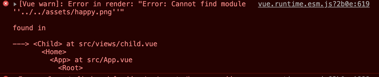
通常我们会使用以下代码在 vue 中动态引入图片:
<img :src="require('../../assets/happy.png')" />
那如果我们想要在 require 中传变量可以吗?答案是不行。
因为 require 的参数值必须是字符串直接量。当我们传一个变量进去,例如:<img :src="require(icon)" alt />,明明路径是正确的,但会报路径找不到的错误:
require 方法
父组件直接 require 进图片传递, 注意:路径不能使用 @/assets,否则也会报错。
// 父组件
<template>
    <child :icon="require('../../assets/happy.png')" />
</template>

<script>
import child from './child'

export default {
  components: {
    child
  }
}
</script>
import 方法
父组件需要将图片先 import 进来,再将图片作为参数传递给子组件,这个方法的好处是可以写成 @/assets/happy.png 格式:
// 父组件
<template>
    <child :icon="happy" />
</template>

<script>
import child from './child'
import happy from '@/assets/happy.png'

export default {
  components: {
    child
  },
  data () {
    return {
      happy
    }
  }
}
</script>
两种方案的子组件写法相同, img 的 src 属性直接写变量就好:
// 子组件
<template>
    <img :src="icon" alt />
</template>

<script>
export default {
  props: {
    icon: {
      type: String,
      default: ''
    }
  },
}
</script>
element-ui 使用者戳这里:结合 icon 和 img 的兼容性写法:
如果你是 elementUI 的使用者,可能会烦恼如果一个图标显示的既有可能是 el-icon-edit,也可能是 img,那我们是要用两个参数分别传递吗?
当然不啦,为了使子组件更具兼容性,推荐父组件只传递一个参数。
// 显示 img
<child :icon="happy" /> <!-- import happy from '@/assets/happy.png' -->
// 显示 icon
<child :icon="el-icon-eleme" />  <!-- const el-icon-eleme = 'el-icon-eleme' -->
因为通过一个参数传递,所以在子组件中需要用正则 /(.*)\.(png|jpg|jpeg|gif|bmp)$/ 和 /^data:image\/[a-z]+;base64/ 判断一下类型:
// 子组件
<template>
  <div>
    <i v-if="isIcon" :class="icon"></i>
    <img v-else :src="icon" />
  </div>
</template>

<script>
const IMG_REG = /(.*)\.(png|jpg|jpeg|gif|bmp)$/
const SIMPLE_IMG_BASE_64_REG = /^data:image\/[a-z]+;base64/
export default {
  props: {
    icon: {
      type: String,
      default: ''
    }
  },
  computed: {
    isIcon () {
      return !IMG_REG.test(this.icon) && !SIMPLE_IMG_BASE_64_REG.test(this.icon)
    }
  }
}
</script>
