

正常来讲,flex会根据容器宽度进行元素的放大和缩小,但是在以下情景下,却会失效。
<div style="display: flex;max-width: 200px; overflow: auto;background: yellow;padding: 10px;height: 200px;">
    <div style="width: 300px;min-width: 500px;height: 100%;background: red;"></div>
    <div style="width:100px;background: green;"></div>
</div>
以上布局,无论设置flex-shrink 为多少,也不会进行缩放,原因就是min-width,限制了可缩放的最小宽度。
这个很好理解,但是某些css,会默认设置min-width:auto;
<div style="display: flex;max-width: 200px; overflow: auto;background: yellow;padding: 10px;height: 200px;">
    <div style="width: 300px;height: 100%;background: red;white-space: nowrap;;">
    一段超出宽度设置的字符一段超出宽度设置的字符一段超出宽度设置的字符一段超出宽度设置的字符一段超出宽度设置的字符一段超出宽度设置的字符
    </div>
    <div style="width:100px;background: green;"></div>
</div>
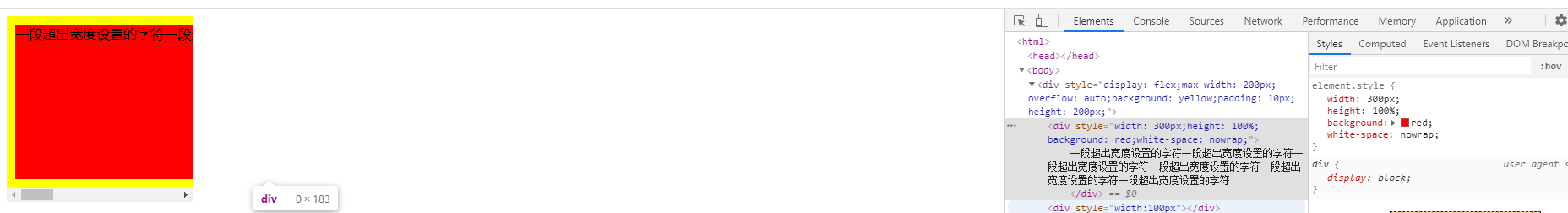
以上这段代码,移除了,min-width的设置,并增加white-space: nowrap; 设置项禁止换行,明明我没有设置min-width,居然也会出现flex缩放失效的问题,这是为何?

而在flex中,mix-width,又会默认设置为auto,会根据容器内容进行动态设置。

当我们设置white-space: nowrap 会导致容器宽度的横向增加,也使得min-width 自动跟随内容增加,那么flex就自然而然的无法进行内容缩放了。
<div style="display: flex;max-width: 200px; overflow: auto;background: yellow;padding: 10px;height: 200px;">
    <div style="width: 300px;min-width:0;height: 100%;background: red;white-space: nowrap;;">
    一段超出宽度设置的字符一段超出宽度设置的字符一段超出宽度设置的字符一段超出宽度设置的字符一段超出宽度设置的字符一段超出宽度设置的字符
    </div>
    <div style="width:100px;background: green;"></div>
</div>
解决方式,就是在flex布局容器元素上重设min-width:0
