

微信群头像布局有些特点,可以根据群内人数的个数实现不同的布局展示,周末好奇如何实现,进行了一番研究,形成本文记录。
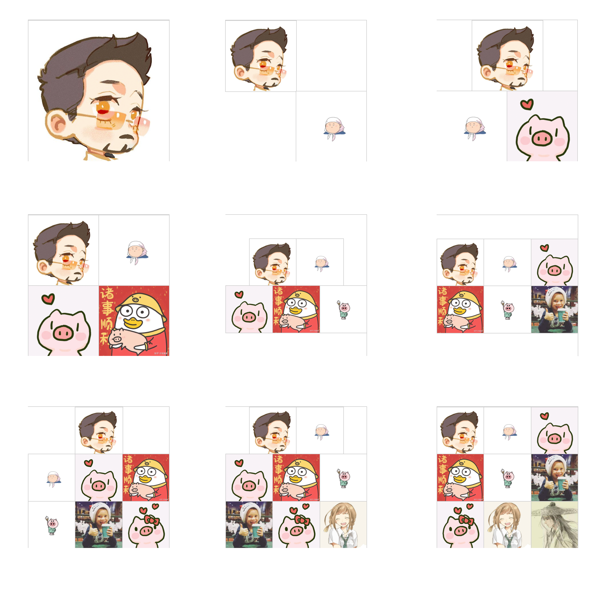
本文仅限于实现最多9个头像布局展示(
微信最多也是9个),更多的头像不再讨论。
布局头像如下:
一、准备工作
- 1、css伪类选择器
:only-child{ /* 仅1个子元素 */}
:nth-child(1):nth-last-child(2) { /* 仅2个子元素 */ }
:nth-child(1):nth-last-child(3) { /* 仅3个子元素 */ }
...  /* 更多匹配规则 */

当然,:nth-child(1) 也可以使用 :first-child 代替
:nth-child(1):nth-last-child(2) 指的是
:nth-child(1) → num:1 从左往右第一个
                  ↓
               [  1 ,  2  ]
                  ↑
     从右向左第二个 2:num ← :nth-last-child(2)

通过以上匹配规则从而限制匹配到的元素
- 2、css实现一个元素的宽高相等
/* 通过:before实现 */
例如:
div{width:100px;}
div:before{
    content: "";
    display: block;
    padding-top: 100%;
}
- 3、flex布局
flex布局不再这里重复,可以查阅 阮一峰大神的flex布局教程
- 4、头像数据及页面结构
<div class="box">
<!--<div class="subbox">
<img class="img" src="https://img.uhomes.com/static/wxapp/activity/201906/avatar/001.jpg" alt="">
</div>
......
-->
</div>
<script></script>
二、css实现
.box {
    width: 300px;   /* 假定白框展示为宽高 300*300 */
    height: 300px;
    box-sizing: border-box;
    display: flex;   /* 设定flex布局,主轴次轴居中对齐,允许换行 */
    justify-content: center;
    align-items: center;
    align-content:center;/* 设定包含的元素换行时,多个轴线居中对齐 */
    flex-flow: row wrap;
}
.subbox {
    position: relative;
    box-sizing: border-box;
    width: 50%; /* 设定元素元素默认为父元素宽的50% */
}
.subbox:before {  /* 设定元素为宽高相等 */
    content: "";
    display: block;
    padding-top: 100%;
}
.img { /* 设定头像占满父元素,即头像宽高也相等 */
    position: absolute;
    top: 0;
    left: 0;
    width: 100%;
    height: 100%;
    border: 1px solid #ccc;
}

/* ↓↓↓ 以下为具体不同头像个数的匹配样式 ↓↓↓ */

/* 只有一个 占100%父元素宽*/
.subbox:only-child {
    width: 100%;
}

/* 只有两个 占50%父元素宽,且呈对角线分布*/
.subbox:nth-child(1):nth-last-child(2) {
    margin-right: 50%;
}
.subbox:nth-child(2):nth-last-child(1) {
    margin-left: 50%;
}

/* 只有三个 占33.3%父元素宽,且呈上一下二分布*/
.subbox:nth-child(1):nth-last-child(3) {
    margin: 0 25%;
}

/* 五六七八九个宽都是父元素宽的 1/3 */
.subbox:nth-child(1):nth-last-child(5),
.subbox:nth-child(1):nth-last-child(5) ~ .subbox,
.subbox:nth-child(1):nth-last-child(6),
.subbox:nth-child(1):nth-last-child(6) ~ .subbox,
.subbox:nth-child(1):nth-last-child(7),
.subbox:nth-child(1):nth-last-child(7) ~ .subbox,
.subbox:nth-child(1):nth-last-child(8),
.subbox:nth-child(1):nth-last-child(8) ~ .subbox,
.subbox:nth-child(1):nth-last-child(9),
.subbox:nth-child(1):nth-last-child(9) ~ .subbox{
    width: 33.3%;
}

/* 五个、八个 */
.subbox:nth-child(1):nth-last-child(5),
.subbox:nth-child(1):nth-last-child(8) {
    margin-left: 15%;
}
.subbox:nth-child(2):nth-last-child(4),
.subbox:nth-child(2):nth-last-child(7) {
    margin-right:15%;
}

/* 七个 */
.subbox:nth-child(1):nth-last-child(7) {
    margin: 0 33.3%;
}
