

1、效果如图(爱心动画)

<!DOCTYPE html>
<html>
	<head>
		<meta charset="utf-8">
		<script defer src="https://use.fontawesome.com/releases/v5.0.6/js/all.js"></script>
		<title></title>
		<style type="text/css">
			* {
				margin: 0;
				padding: 0;
			}

			body {
				background: black;
				height: 100vh;
				display: flex;
				justify-content: center;
				align-items: center;
			}

			ul {
				width: 380px;
				display: flex;
				height: 200px;
			}

			li {
				width: 20px;
				height: 20px;
				border-radius: 10px;

				margin-right: 20px;
			}

			li:nth-child(1) {
				background: red;
				animation: lover1 4s 0s infinite;
			}

			li:nth-child(2) {
				background: darkturquoise;
				animation: lover2 4s 0.2s infinite;
			}

			li:nth-child(3) {
				background: darksalmon;
				animation: lover3 4s 0.4s infinite;
			}

			li:nth-child(4) {
				background: deeppink;
				animation: lover4 4s 0.6s infinite;
			}

			li:nth-child(5) {
				background: yellow;
				animation: lover5 4s 0.8s infinite;
			}

			li:nth-child(6) {
				background: deeppink;
				animation: lover4 4s 1.0s infinite;
			}

			li:nth-child(7) {
				background: darksalmon;
				animation: lover3 4s 1.2s infinite;
			}

			li:nth-child(8) {
				background: darkturquoise;
				animation: lover2 4s 1.4s infinite;
			}

			li:nth-child(9) {
				background: red;
				animation: lover1 4s 1.6s infinite;
			}

			@keyframes lover1 {

				30%,
				50% {
					height: 60px;
					transform: translateY(-30px);
				}

				70%,
				100% {
					height: 0px;
					transform: translateY(0px);
				}
			}

			@keyframes lover2 {

				30%,
				50% {
					height: 125px;
					transform: translateY(-60px);
				}

				70%,
				100% {
					height: 0px;
					transform: translateY(0px);
				}
			}

			@keyframes lover3 {

				30%,
				50% {
					height: 160px;
					transform: translateY(-75px);
				}

				70%,
				100% {
					height: 0px;
					transform: translateY(0px);
				}
			}

			@keyframes lover4 {

				30%,
				50% {
					height: 180px;
					transform: translateY(-30px);
				}

				70%,
				100% {
					height: 0px;
					transform: translateY(0px);
				}
			}

			@keyframes lover5 {

				30%,
				50% {
					height: 200px;
					transform: translateY(-45px);
				}

				70%,
				100% {
					height: 0px;
					transform: translateY(0px);
				}
			}
		</style>
	</head>
	<body>

		<ul>
			<li></li>
			<li></li>
			<li></li>
			<li></li>
			<li></li>
			<li></li>
			<li></li>
			<li></li>
			<li></li>
		</ul>
	</body>
</html>
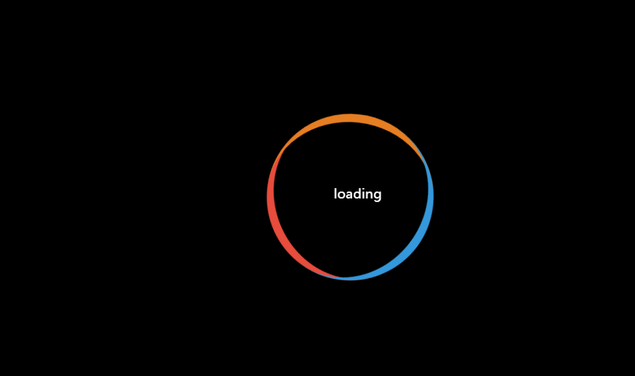
2、效果如图
<!DOCTYPE html>
<html>
	<head>
		<meta charset="utf-8">
		<script defer src="https://use.fontawesome.com/releases/v5.0.6/js/all.js"></script>
		<title></title>
		<style type="text/css">
			* {
				margin: 0;
				padding: 0;
			}
            body{
				background: black;
				height: 100vh;
				display: flex;
				align-items: center;
				justify-content: center;

			}
			.loading{
				color:white;
				width: 200px;
				height: 200px;
				/* background: red; */
				box-sizing: border-box;
				border-radius: 50%;
				border-top: 10px solid #e74c3c;
				/* text-align: center;
				line-height: 200px; */
				position:relative;
				animation: a1 2s linear infinite;
			}
			.loading span{
				width: 200px;
				height: 200px;
				display: block;
				text-align: center;
				line-height: 200px;
				animation: a2 2s linear infinite;
			}
		   .loading:before,.loading:after{
			   content: '';
			   width: 200px;
			   height: 200px;
			   /* background: red; */
			   position: absolute;
			   left: 0;
			   top: -10px;
			   box-sizing: border-box;
			   border-radius: 50%;
		   }
		    .loading:before{
				border-top: 10px solid #e67e22;
				transform: rotate(120deg);
			}
			.loading:after{
				border-top: 10px solid #3498db;
				transform: rotate(-120deg);
			}

			@keyframes a1{
				to{
					transform: rotate(360deg);
				}
			}
			@keyframes a2{
				to{
					transform: rotate(-360deg);
				}
			}
		</style>
	</head>
	<body>
    <div class="loading">
	  <span>loading</span>
	</div>
	</body>
</html>
