

公众号 数据分析那些事儿

Echarts是一个使用 JavaScript 实现的开源可视化库,可以流畅的运行在 PC 和移动设备上,兼容当前绝大部分浏览器(IE8/9/10/11,Chrome,Firefox,Safari等),底层依赖矢量图形库 ZRender,提供直观,交互丰富,可高度个性化定制的数据可视化图表。
ECharts 提供了常规的折线图、柱状图、散点图、饼图、K线图,用于统计的盒形图,用于地理数据可视化的地图、热力图、线图,用于关系数据可视化的关系图、treemap、旭日图,多维数据可视化的平行坐标,还有用于 BI 的漏斗图,仪表盘,并且支持图与图之间的混搭。
而 Python 是一门富有表达力的语言,很适合用于数据处理。当数据分析遇上数据可视化时, Pyecharts诞生了。
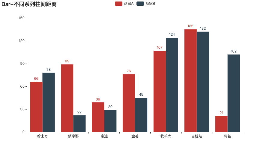
1 柱状图
from pyecharts import options as opts
from pyecharts.charts import Bar
from pyecharts.faker import Faker
c = (
    Bar()
    .add_xaxis(Faker.choose())
    .add_yaxis("商家A", Faker.values(), gap="0%")
    .add_yaxis("商家B", Faker.values(), gap="0%")
    .set_global_opts(title_opts=opts.TitleOpts(title="Bar-不同系列柱间距离"))
    .render("bar_different_series_gap.html")
)
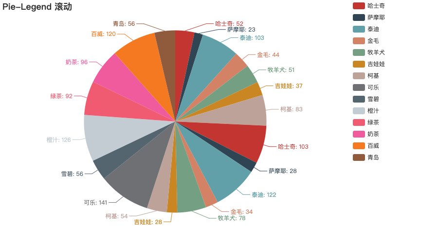
2 饼图
from pyecharts import options as opts
from pyecharts.charts import Pie
from pyecharts.faker import Faker
c = (
    Pie()
    .add(
        "",
        [
            list(z)
            for z in zip(
                Faker.choose() + Faker.choose() + Faker.choose(),
                Faker.values() + Faker.values() + Faker.values(),
            )
        ],
        center=["40%", "50%"],
    )
    .set_global_opts(
        title_opts=opts.TitleOpts(title="Pie-Legend 滚动"),
        legend_opts=opts.LegendOpts(type_="scroll", pos_left="80%", orient="vertical"),
    )
    .set_series_opts(label_opts=opts.LabelOpts(formatter="{b}: {c}"))
    .render("pie_scroll_legend.html")
)
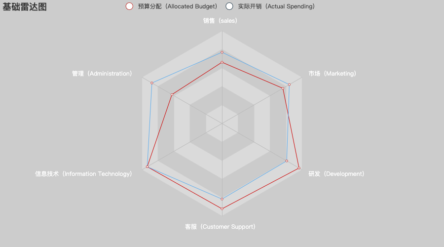
3 雷达图
import pyecharts.options as opts
from pyecharts.charts import Radar
v1 = [[4300, 10000, 28000, 35000, 50000, 19000]]
v2 = [[5000, 14000, 28000, 31000, 42000, 21000]]
(
    Radar(init_opts=opts.InitOpts(bg_color="#CCCCCC"))
    .add_schema(
        schema=[
            opts.RadarIndicatorItem(name="销售(sales)", max_=6500),
            opts.RadarIndicatorItem(name="管理(Administration)", max_=16000),
            opts.RadarIndicatorItem(name="信息技术(Information Technology)", max_=30000),
            opts.RadarIndicatorItem(name="客服(Customer Support)", max_=38000),
            opts.RadarIndicatorItem(name="研发(Development)", max_=52000),
            opts.RadarIndicatorItem(name="市场(Marketing)", max_=25000),
        ],
        splitarea_opt=opts.SplitAreaOpts(
            is_show=True, areastyle_opts=opts.AreaStyleOpts(opacity=1)
        ),
        textstyle_opts=opts.TextStyleOpts(color="#fff"),
    )
    .add(
        series_name="预算分配(Allocated Budget)",
        data=v1,
        linestyle_opts=opts.LineStyleOpts(color="#CD0000"),
    )
    .add(
        series_name="实际开销(Actual Spending)",
        data=v2,
        linestyle_opts=opts.LineStyleOpts(color="#5CACEE"),
    )
    .set_series_opts(label_opts=opts.LabelOpts(is_show=False))
    .set_global_opts(
        title_opts=opts.TitleOpts(title="基础雷达图"), legend_opts=opts.LegendOpts()
    )
    .render("basic_radar_chart.html")
)
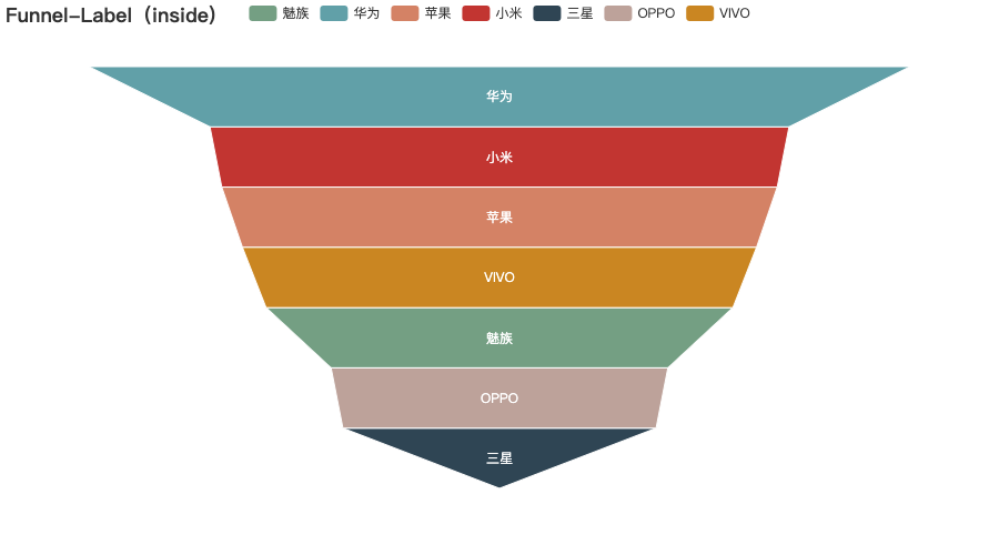
4 漏斗图
from pyecharts import options as opts
from pyecharts.charts import Funnel
from pyecharts.faker import Faker

c = (
    Funnel()
    .add(
        "商品",
        [list(z) for z in zip(Faker.choose(), Faker.values())],
        label_opts=opts.LabelOpts(position="inside"),
    )
    .set_global_opts(title_opts=opts.TitleOpts(title="Funnel-Label(inside)"))
    .render("funnel_label_inside.html")
)
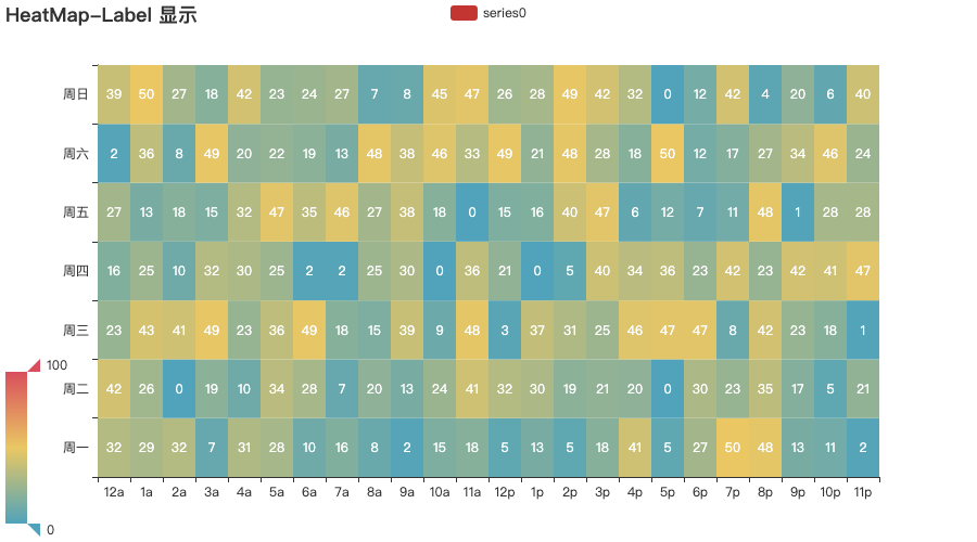
5 热力图
import random
from pyecharts import options as opts
from pyecharts.charts import HeatMap
from pyecharts.faker import Faker
value = [[i, j, random.randint(0, 50)] for i in range(24) for j in range(7)]
c = (
    HeatMap()
    .add_xaxis(Faker.clock)
    .add_yaxis(
        "series0",
        Faker.week,
        value,
        label_opts=opts.LabelOpts(is_show=True, position="inside"),
    )
    .set_global_opts(
        title_opts=opts.TitleOpts(title="HeatMap-Label 显示"),
        visualmap_opts=opts.VisualMapOpts(),
    )
    .render("heatmap_with_label_show.html")
)
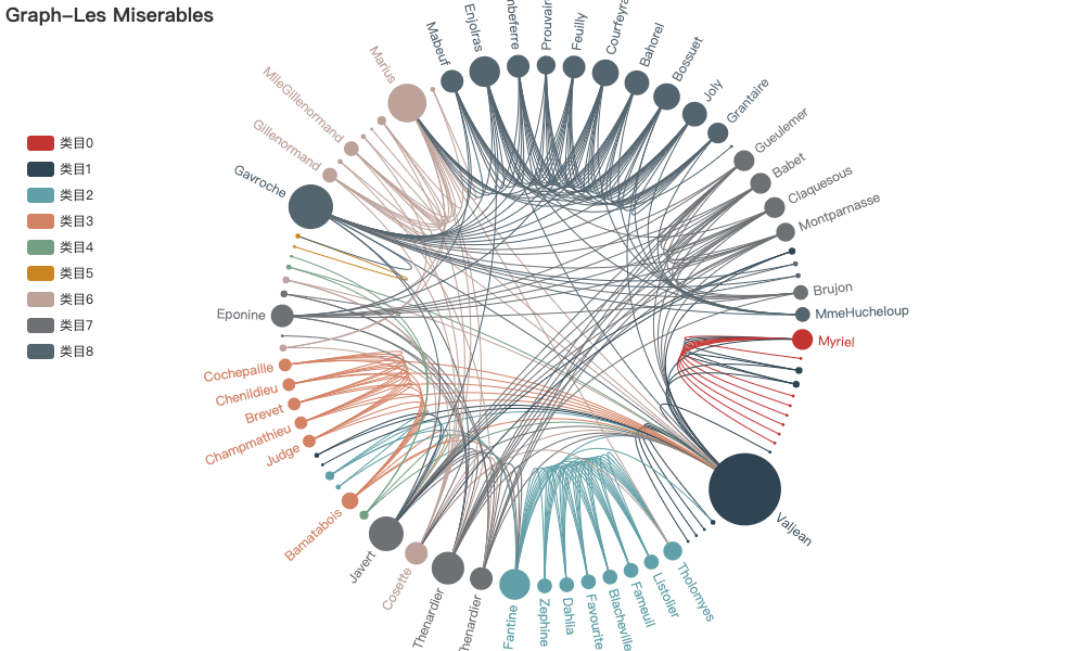
6 关系图
import json
from pyecharts import options as opts
from pyecharts.charts import Graph
with open("les-miserables.json", "r", encoding="utf-8") as f:
    j = json.load(f)
    nodes = j["nodes"]
    links = j["links"]
    categories = j["categories"]
c = (
    Graph(init_opts=opts.InitOpts(width="1000px", height="600px"))
    .add(
        "",
        nodes=nodes,
        links=links,
        categories=categories,
        layout="circular",
        is_rotate_label=True,
        linestyle_opts=opts.LineStyleOpts(color="source", curve=0.3),
        label_opts=opts.LabelOpts(position="right"),
    )
    .set_global_opts(
        title_opts=opts.TitleOpts(title="Graph-Les Miserables"),
        legend_opts=opts.LegendOpts(orient="vertical", pos_left="2%", pos_top="20%"),
    )
    .render("graph_les_miserables.html")
)
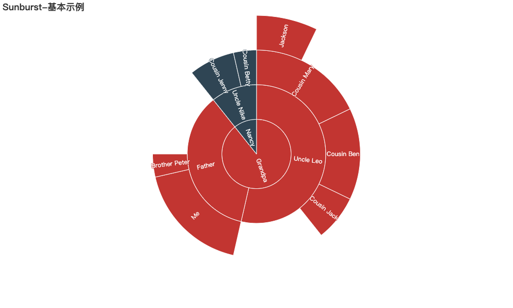
7 旭日图
from pyecharts.charts import Sunburst
from pyecharts import options as opts
data = [
    opts.SunburstItem(
        name="Grandpa",
        children=[
            opts.SunburstItem(
                name="Uncle Leo",
                value=15,
                children=[
                    opts.SunburstItem(name="Cousin Jack", value=2),
                    opts.SunburstItem(
                        name="Cousin Mary",
                        value=5,
                        children=[opts.SunburstItem(name="Jackson", value=2)],
                    ),
                    opts.SunburstItem(name="Cousin Ben", value=4),
                ],
            ),
            opts.SunburstItem(
                name="Father",
                value=10,
                children=[
                    opts.SunburstItem(name="Me", value=5),
                    opts.SunburstItem(name="Brother Peter", value=1),
                ],
            ),
        ],
    ),
    opts.SunburstItem(
        name="Nancy",
        children=[
            opts.SunburstItem(
                name="Uncle Nike",
                children=[
                    opts.SunburstItem(name="Cousin Betty", value=1),
                    opts.SunburstItem(name="Cousin Jenny", value=2),
                ],
            )
        ],
    ),
]
sunburst = (
    Sunburst(init_opts=opts.InitOpts(width="1000px", height="600px"))
    .add(series_name="", data_pair=data, radius=[0, "90%"])
    .set_global_opts(title_opts=opts.TitleOpts(title="Sunburst-基本示例"))
    .set_series_opts(label_opts=opts.LabelOpts(formatter="{b}"))
    .render("basic_sunburst.html")
)
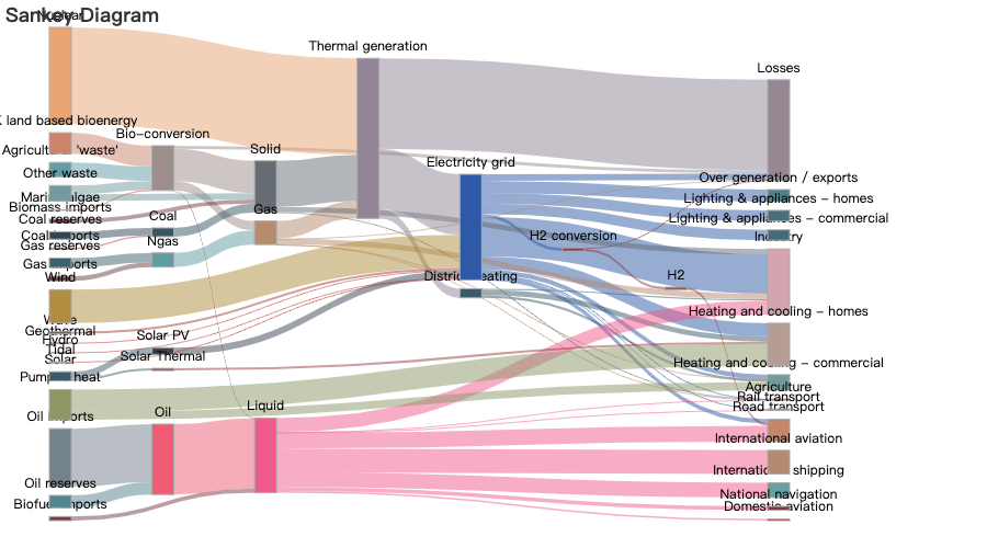
8 桑基图
import asyncio
from aiohttp import TCPConnector, ClientSession
import pyecharts.options as opts
from pyecharts.charts import Sankey
async def get_json_data(url: str) -> dict:
    async with ClientSession(connector=TCPConnector(ssl=False)) as session:
        async with session.get(url=url) as response:
            return await response.json()
# 获取官方的数据
data = asyncio.run(
    get_json_data(url="https://echarts.baidu.com/examples/data/asset/data/energy.json")
)
(
    Sankey()
    .add(
        series_name="",
        nodes=data["nodes"],
        links=data["links"],
        itemstyle_opts=opts.ItemStyleOpts(border_width=1, border_color="#aaa"),
        linestyle_opt=opts.LineStyleOpts(color="source", curve=0.5, opacity=0.5),
        tooltip_opts=opts.TooltipOpts(trigger_on="mousemove"),
    )
    .set_global_opts(title_opts=opts.TitleOpts(title="Sankey Diagram"))
    .render("sankey_diagram.html")
)
9 词云图
import pyecharts.options as opts
from pyecharts.charts import WordCloud
data = [
    ("生活资源", "999"),
    ("供热管理", "888"),
    ("供气质量", "777"),
    ("生活用水管理", "688"),
    ("一次供水问题", "588"),
    ("交通运输", "516"),
    ("供电管理", "223"),
    ("燃气管理", "152"),
    ("教育管理", "152"),
    ("医疗纠纷", "152"),
    ("执法监督", "152"),
    ......
    ("房屋与图纸不符", "11"),
    ("有线电视安装及调试维护", "11"),
    ("低保管理", "11"),
    ("劳动争议", "11"),
    ("社会福利及事务", "11"),
    ("一次供水问题", "11"),
]
(
    WordCloud()
    .add(series_name="热点分析", data_pair=data, word_size_range=[6, 66])
    .set_global_opts(
        title_opts=opts.TitleOpts(
            title="热点分析", title_textstyle_opts=opts.TextStyleOpts(font_size=23)
        ),
        tooltip_opts=opts.TooltipOpts(is_show=True),
    )
    .render("basic_wordcloud.html")
)

10 地图
from pyecharts import options as opts
from pyecharts.charts import Map
from pyecharts.faker import Faker
c = (
    Map()
    .add("商家A", [list(z) for z in zip(Faker.provinces, Faker.values())], "china")
    .set_global_opts(
        title_opts=opts.TitleOpts(title="Map-VisualMap(分段型)"),
        visualmap_opts=opts.VisualMapOpts(max_=200, is_piecewise=True),
    )
    .render("map_visualmap_piecewise.html")
)

参考http://pyecharts.org/#/
