

直接上代码
<!DOCTYPE html>
<html lang="zh-CN">
<head>
    <meta charset="utf-8">
    <meta http-equiv="X-UA-Compatible" content="IE=edge">
</head>
<body>
    <div class="base-coupons"></div>
</body>
</html>
<style>
    .base-coupons {
        width: 250px;
        height: 100px;
        position: relative;
        background: radial-gradient(circle at right top, transparent 6px, #ffb3a7 0) top left / 24% 50% no-repeat, radial-gradient(circle at right bottom, transparent 6px, #ffb3a7 0) bottom left /60px 51% no-repeat, radial-gradient(circle at left top, transparent 6px, #ffb3a7 0) top right /190px 51% no-repeat, radial-gradient(circle at left bottom, transparent 6px, #ffb3a7 0) bottom right /190px 51% no-repeat;
        filter: drop-shadow(0px 0px 3px rgba(0, 0, 0, .2));
        border-radius: 4px;
    }

    .base-coupons::before {
        content: '';
        height: 80px;
        border: 1px dashed #fff;
        position: absolute;
        left: 60px;
        top: 0;
        bottom: 0;
        margin: auto;
    }
</style>
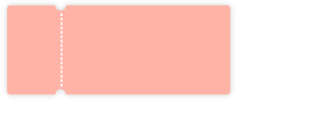
- 效果图如下:
