

我给大家分享的是用前端框架vuejs来实现tabbar组件的封装 —— 第一次写文章,写得不好请见谅。
1.首先,为什么要实现tabbar组件的封装呢?
是因为很多大部分的移动程序都是采用了tabber这种模式的组件,导致了tabber的使用频率特别高,为了方便起见,封装tabber组件,大大解决了时间,每次写项目需要用到tabbar时,直接导入就可以,不需要再花费时间去重复相同的代码,节约成本。
2.前奏准备 —— 插槽
1.因为封装TabBar组件,我主要采用的是插槽slot,所有在开始之前,我先简单的介绍插槽
2.在学习插槽前,先理解一个概念: 编译作用域
-
官方的准则是:父组件模版的所有东西都会在父级作用域内编译;子组件的所有东西都会在子级作用域内编译。
-
换句话就是说: 父组件替代插槽的标签,但是内容却是由子组件来提供。
3.组件的插槽
-
组件的插槽是为了让我们封装的组件更加具有扩展性。
-
让使用者可以决定组件内部的一些内容到底展示什么。
-
一旦有了这个组件,我们就可以在多个页面中复用了。
4.slot基本使用
- 在子组件中使用特殊的元素就可以为子组件开启一个插槽,该插槽插入什么内容取决于父组件如何使用,通过下面一个例子,来给子组件定义一个插槽:插槽中的内容表示,如果没有在该组件插入任何内容,就默认显示该内容。
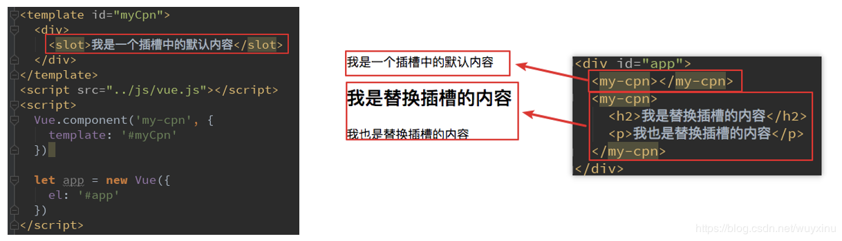
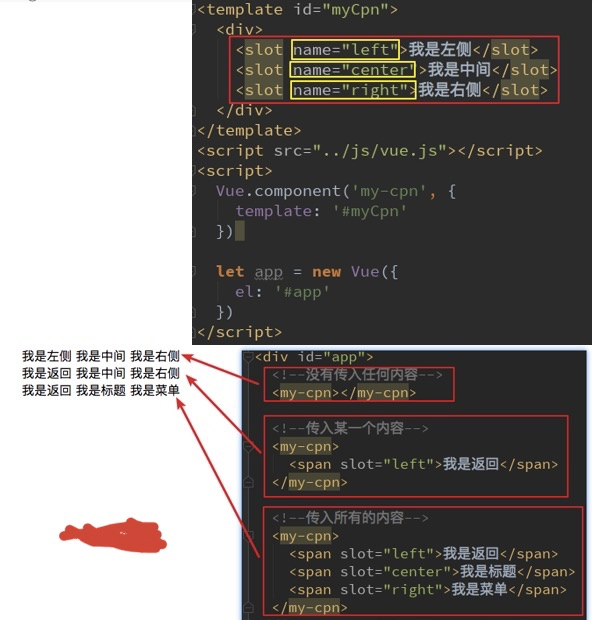
5.具名插槽slot
-
当子组件的功能复杂时,子组件的插槽可能并非是一个。比如我们封装导航栏的子组件,就需要三个插槽,分别代表左边、中间、右边。这个时候我们就需要给插槽起一个名字:
<slot name='myslot'></slot>
3.但是对于不同网页的导航,它们有不同的区别,那么如何封装这类tabber组件呢?
-
如果,我们每一个单独去封装一个组件,显示是不合适的,但是如果我们封装成一个,好像也不合理
比如每个页面都返回,这部分内容我们就需要重复去封装。比如有些左侧是菜单,有些是返回,有些中间是搜索,有些是文字等等。 -
那么如何封装合适呢?抽取共性,保留不同
最好的封装方式就是将共性抽取到组件中,将不同暴露为插槽。 一旦我们预留了插槽,就可以让使用者根据自己的需求,决定插槽中插入什么内容。 是搜索框,还是文字,还是菜单。可以由调用者来决定 -
应该如何封装
- 自义定TabBar组件,在App中使用
- 让TabBar出于底部,并且设置相关的样式
-
TabBar中显示的内容是由外界决定
- 采用插槽
- flex布局平分TabBar
-
自定义TabBarItem,可以传入 图片和文字
- 定义TabBarItem,并且定义三个插槽:图片(点击前和点击后),文字
- 给三个插槽外层包装div,为了防止用户使用时相关类被覆盖,和用于设置样式
- 填充插槽,实现底部TabBar的效果
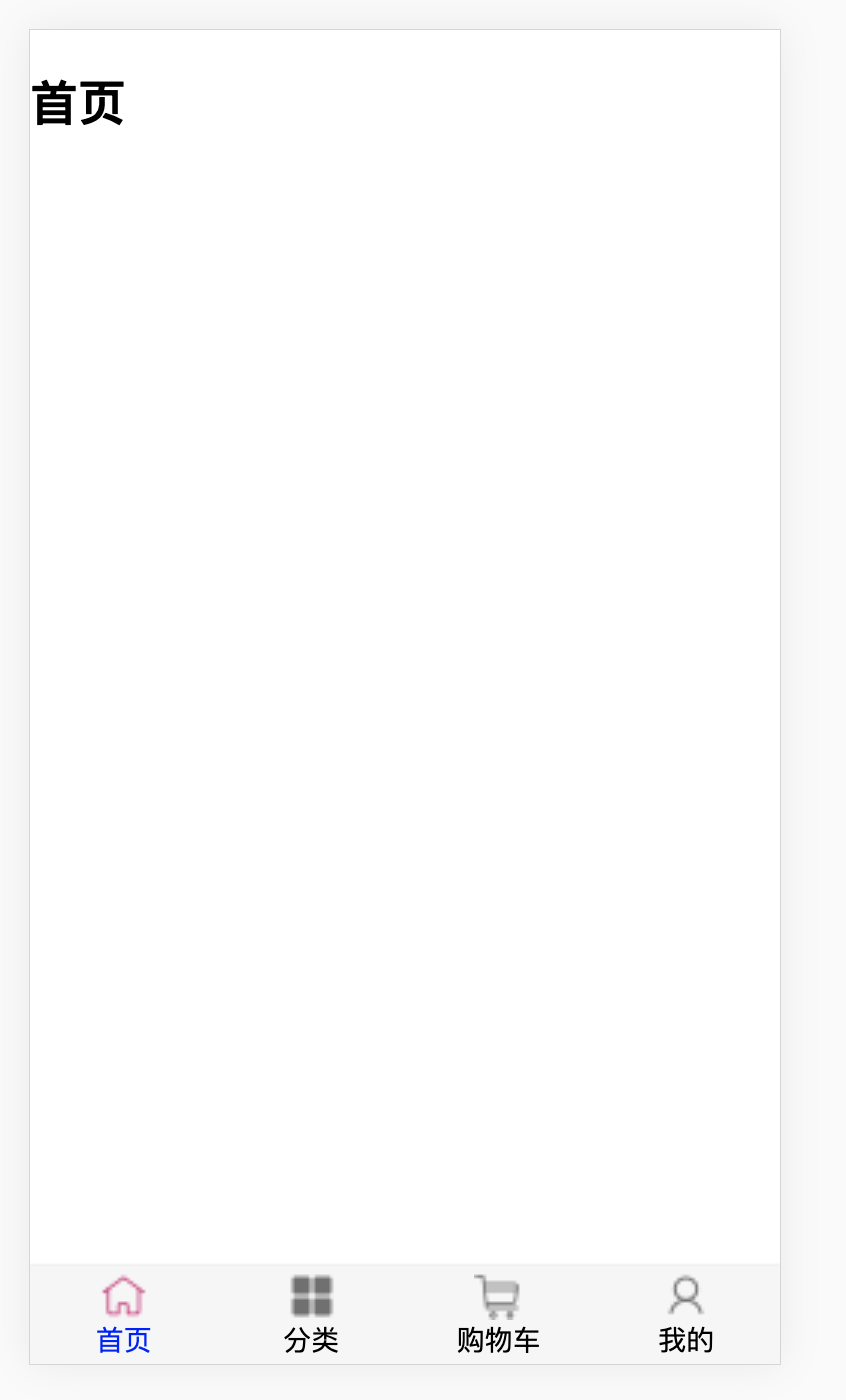
4.TabBar-基本结构的搭建
- 下图就是我们需要搭建出来的tabbar的基本结构
-
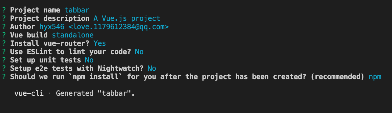
在开始前需要安装好vue的脚手架,可以参照vue官方,cn.vuejs.org/ 这里我使用的是vuecli2,
-
新建一个项目
vue init webpack tabbar -
填写项目描述,作者,安装vue-router
-
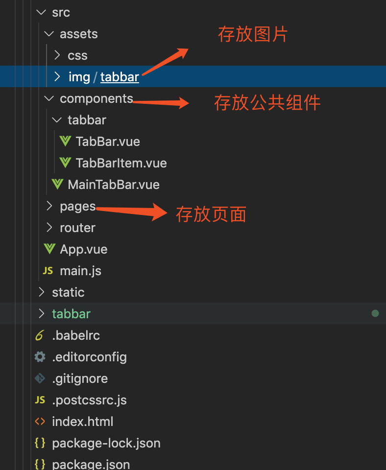
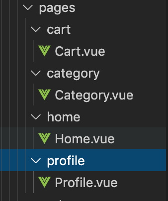
将所有用的资源,拷贝到项目中,这里我把图片素材,拷入到了src/assets/img/tabbar目录里。在src下,新建了一个pages目录,存放每一个页面的组件,可以看一下我的目录
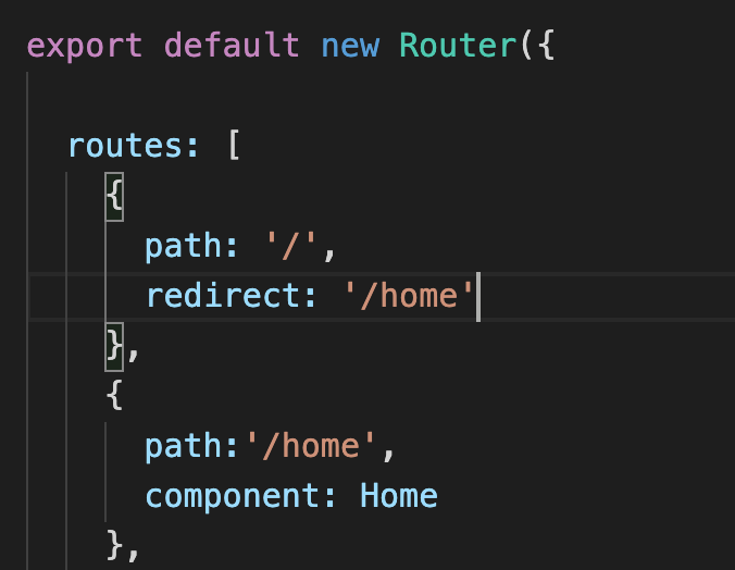
- 由于首页更改了位置,所以在router里面的index.js需要更改为
5. 第一个组件TabBar
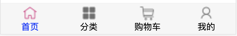
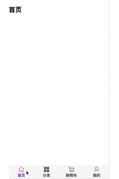
如何创建组件tabbar,也就是移动端底部的工具栏,这是将要实现的效果图。
- 首先,这个组件分为两部分:第一个是组件的外层容器,第二个是组件的子容器item,组件里面又分为图片和文字结合。子组件有2个状态,一个是默认灰色的状态,一个是选中状态。然后在components文件夹下面,新建两个组件,通过这两个组件来结合实现我们底部的tab组件:一个是TabBarItem.vue ,实现子组件的item项,
- TabBarItem.vue
<template>
  <div class="tab-bar-item">
    <!-- 插槽会被直接替换,所有最好在插槽外面包装一个div -->
    <div> <slot name="item-icon"></slot></div>
    <div> <slot  name="item-icon-active"></slot> </div>
    <div> <slot name="item-text" ></slot> </div>
  </div>
</template>

<style >
.tab-bar-item{
  flex: 1;
  text-align: center;
  height: 49px;
  font-size: 14px;
}
.tab-bar-item img{
  width: 24px;
  height: 24px;
  margin-top: 3px;
  /* 去除图片自身带的空隙 */
  vertical-align: middle;
}
.active {
  color: rgb(255, 0, 149);
}
</style>
- 一个是TabBar.vue,实现tab的外层容器
<template>
   <div id="tab-bar">
      <slot></slot>
    </div>
</template>

<script>
export default {

}
</script>

<style scoped>
#tab-bar{
  display: flex;
  background-color: #f6f6f6;
  position: fixed;
  left: 0;
  right: 0;
  bottom: 0;
  box-shadow:0px -1px 1px rgba(100,100,100,.1);
}

</style>
- 在components文件夹下新建一个MainTabBar.vue,组合这两个组件,实现tab组件效果
<template>
   <tab-bar>
      <tab-bar-item  >
        <img slot="item-icon" src="@/assets/img/tabbar/shouye.png" alt="">
        <div slot="item-text">首页</div>
      </tab-bar-item>
      <tab-bar-item >
        <img slot="item-icon" src="@/assets/img/tabbar/icon_category.png" alt="">
        <div slot="item-text">分类</div>
      </tab-bar-item>
      <tab-bar-item>
        <img slot="item-icon" src="@/assets/img/tabbar/gouwuche.png" alt="">
        <div slot="item-text">购物车</div>
      </tab-bar-item>
      <tab-bar-item >
        <img slot="item-icon" src="@/assets/img/tabbar/wode.png" alt="">
        <div slot="item-text">我的</div>
      </tab-bar-item>
    </tab-bar>
</template>

<script>
import TabBar from '@/components/tabbar/TabBar';
import TabBarItem from '@/components/tabbar/TabBarItem';
export default {
  components: {
    TabBar,
    TabBarItem
  }
}
</script>

<style>

</style>
- 完成的效果图
6. 点击切换实现路由页面的跳转
要实现子组件的点击切换改变状态,也就在两张图片中进行切换,用户直接同时把两张图片传入,底层封装会进行自动的切换。
- 首先使用者添加选中后的active图片
<template>
   <tab-bar>
      <tab-bar-item >
        <img slot="item-icon" src="@/assets/img/tabbar/shouye.png" alt="">
        <img slot="item-icon-active" src="@/assets/img/tabbar/shouye-2.png" alt="">
        <div slot="item-text">首页</div>
      </tab-bar-item>
      <tab-bar-item >
        <img slot="item-icon" src="@/assets/img/tabbar/icon_category.png" alt="">
        <img slot="item-icon-active" src="@/assets/img/tabbar/icon_category-2.png" alt="">
        <div slot="item-text">分类</div>
      </tab-bar-item>
      <tab-bar-item >
        <img slot="item-icon" src="@/assets/img/tabbar/gouwuche.png" alt="">
        <img slot="item-icon-active" src="@/assets/img/tabbar/gouwuche-2.png" alt="">
        <div slot="item-text">购物车</div>
      </tab-bar-item>
      <tab-bar-item>
        <img slot="item-icon" src="@/assets/img/tabbar/wode.png" alt="">
        <img slot="item-icon-active" src="@/assets/img/tabbar/wode-2.png" alt="">
        <div slot="item-text">我的</div>
      </tab-bar-item>
    </tab-bar>
</template>

<script>
import TabBar from '@/components/tabbar/TabBar';
import TabBarItem from '@/components/tabbar/TabBarItem';
export default {
  components: {
    TabBar,
    TabBarItem
  }
}
</script>
- TabBarItem.vue里面v-if和v-else来判断用户需要哪张图片
<template>
  <div class="tab-bar-item">
    <!-- 插槽会被直接替换,所有最好在插槽外面包装一个div -->
    <div v-if="!isActive"> <slot name="item-icon"></slot></div>
    <div v-else> <slot  name="item-icon-active"></slot> </div>
    <div :class="{active: isActive }"> <slot name="item-text" ></slot> </div>
  </div>

</template>

<script>
export default {
  name: "TabBarItem",
  data() {
    return {
        isActive: false,
    }
  }
}
</script>

<style >
.tab-bar-item{
  flex: 1;
  text-align: center;
  height: 49px;
  font-size: 14px;
}
.tab-bar-item img{
  width: 24px;
  height: 24px;
  margin-top: 3px;
  /* 去除图片自身带的空隙 */
  vertical-align: middle;
}
.active {
  color: rgb(255, 0, 149);
}
</style>
- 通过vue-router 路由来进行页面的切换
- 在pages页面下分别创建4个页面的文件夹组件
- 在router下设置路由跳转(采用懒加载)
- 在pages页面下分别创建4个页面的文件夹组件
import Vue from 'vue'
import Router from 'vue-router';

const Home = () => import('../pages/home/Home')
const Cart = () => import('../pages/cart/Cart')
const Profile = () => import('../pages/profile/Profile')
const Category = () => import('../pages/category/Category')

Vue.use(Router)

export default new Router({
  routes: [
    {
      path: '/',
      redirect: '/home'
    },
    {
      path:'/home',
      component: Home
    },
    {
      path:'/cart',
      component: Cart
    },
    {
      path:'/profile',
      component: Profile
    },
    {
      path:'/category',
      component: Category
    },
  ],
  mode: 'history'
})
-
- 给MainTabBar.vue 的各子组件添加path
<tab-bar>
      <tab-bar-item path="/home" >
        <img slot="item-icon" src="@/assets/img/tabbar/shouye.png" alt="">
        <img slot="item-icon-active" src="@/assets/img/tabbar/shouye-2.png" alt="">
        <div slot="item-text">首页</div>
      </tab-bar-item>
      <tab-bar-item path="/category" ">
        <img slot="item-icon" src="@/assets/img/tabbar/icon_category.png" alt="">
        <img slot="item-icon-active" src="@/assets/img/tabbar/icon_category-2.png" alt="">
        <div slot="item-text">分类</div>
      </tab-bar-item>
      <tab-bar-item path="/cart">
        <img slot="item-icon" src="@/assets/img/tabbar/gouwuche.png" alt="">
        <img slot="item-icon-active" src="@/assets/img/tabbar/gouwuche-2.png" alt="">
        <div slot="item-text">购物车</div>
      </tab-bar-item>
      <tab-bar-item path="/profile"">
        <img slot="item-icon" src="@/assets/img/tabbar/wode.png" alt="">
        <img slot="item-icon-active" src="@/assets/img/tabbar/wode-2.png" alt="">
        <div slot="item-text">我的</div>
      </tab-bar-item>
    </tab-bar>
-
- 给TabBarItem.vue添加点击事件,通过改变路由来跳转页面
- 通过props把接受父组件值,且必须为String类型
- 需要返回上一步,就使用push,不让返回上一步,就是用replace, 这里我们使用了this.$router.replace()来跳转路由
<template>
  <div class="tab-bar-item" @click="itemClick">
    <!-- 插槽会被直接替换,所有最好在插槽外面包装一个div -->
    <div v-if="!isActive"> <slot name="item-icon"></slot></div>
    <div v-else> <slot  name="item-icon-active"></slot> </div>
    <div :class="{active:isActive}"> <slot name="item-text" ></slot> </div>
  </div>

</template>

<script>
export default {
  name: "TabBarItem",
  props: {
    path: String,
  },
  computed: {
    isActive() {
      // /home -> item1(/home) =true
      // 否则为false
      // indexOf !== -1 就找到了
      return this.$route.path.indexOf(this.path) !== -1
    },
  },
  methods: {
    itemClick() {
      // 需要用户返回,用push,不需要就用replace
      this.$router.replace(this.path);
    }
  }
}
</script>

<style >
.tab-bar-item{
  flex: 1;
  text-align: center;
  height: 49px;
  font-size: 14px;
}
.tab-bar-item img{
  width: 24px;
  height: 24px;
  margin-top: 3px;
  /* 去除图片自身带的空隙 */
  vertical-align: middle;
}
.active {
  color: rgb(255, 0, 149);
}
</style>
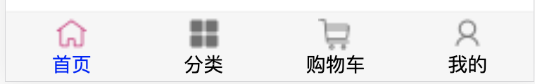
7.TabBar的颜色动态控制
- 当点击跳转页面的时候,想使得每个item里的文字颜色不一样
- 在MainTabBar.vue通过插槽插入颜色
 <tab-bar>
      <tab-bar-item path="/home" activeColor="blue">
        <img slot="item-icon" src="@/assets/img/tabbar/shouye.png" alt="">
        <img slot="item-icon-active" src="@/assets/img/tabbar/shouye-2.png" alt="">
        <div slot="item-text">首页</div>
      </tab-bar-item>
      <tab-bar-item path="/category" activeColor="red">
        <img slot="item-icon" src="@/assets/img/tabbar/icon_category.png" alt="">
        <img slot="item-icon-active" src="@/assets/img/tabbar/icon_category-2.png" alt="">
        <div slot="item-text">分类</div>
      </tab-bar-item>
      <tab-bar-item path="/cart">
        <img slot="item-icon" src="@/assets/img/tabbar/gouwuche.png" alt="">
        <img slot="item-icon-active" src="@/assets/img/tabbar/gouwuche-2.png" alt="">
        <div slot="item-text">购物车</div>
      </tab-bar-item>
      <tab-bar-item path="/profile" activeColor="green">
        <img slot="item-icon" src="@/assets/img/tabbar/wode.png" alt="">
        <img slot="item-icon-active" src="@/assets/img/tabbar/wode-2.png" alt="">
        <div slot="item-text">我的</div>
      </tab-bar-item>
    </tab-bar>
- 在TabBarItem.vue中通过计算属性动态的给文字添加颜色
<template>
  <div class="tab-bar-item" @click="itemClick">
    <!-- 插槽会被直接替换,所有最好在插槽外面包装一个div -->
    <div v-if="!isActive"> <slot name="item-icon"></slot></div>
    <div v-else> <slot  name="item-icon-active"></slot> </div>
    <div :style="activeStyle"> <slot name="item-text" ></slot> </div>
  </div>

</template>

<script>
export default {
  name: "TabBarItem",
  props: {
    path: String,
    activeColor: {
      type: String,
      default: 'red'
    }
  },
  data() {
    return {
      // isActive: false,
    }
  },
  computed: {
    isActive() {
      // /home -> item1(/home) =true
      // 否则为false
      // indexOf !== -1 就找到了
      return this.$route.path.indexOf(this.path) !== -1
    },
    activeStyle() {
      return this.isActive ? {color: this.activeColor} : {}
    }
  },
  methods: {
    itemClick() {
      // 需要用户返回,用push,不需要就用replace
      this.$router.replace(this.path);
    }
  }
}
</script>

<style >
.tab-bar-item{
  flex: 1;
  text-align: center;
  height: 49px;
  font-size: 14px;
}
.tab-bar-item img{
  width: 24px;
  height: 24px;
  margin-top: 3px;
  /* 去除图片自身带的空隙 */
  vertical-align: middle;
}
</style>
8. 动态演示
