

前言
最近项目中使用了G2来实现图表,其中遇到了几种非经典图表(颜色区块趋势图与刻度图),这里总结一下,希望对大家有帮助。
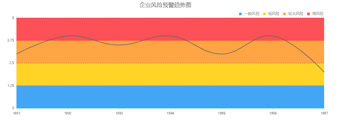
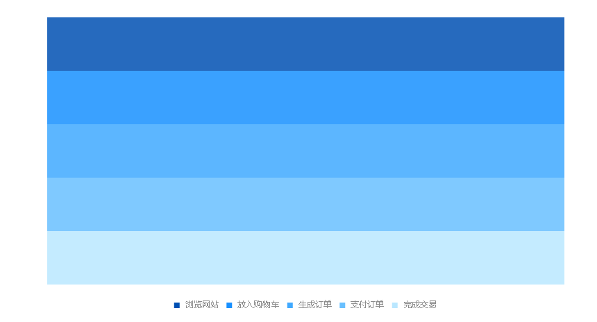
颜色区块趋势图
刻度图
1、G2简单介绍
G2
G2 是一套基于可视化编码的图形语法,以数据驱动,具有高度的易用性和扩展性,用户无需关注各种繁琐的实现细节,一条语句即可构建出各种各样的可交互的统计图表。
安装
这里主要介绍npm安装
通过下面的命令即可完成安装
npm install @antv/g2 --save
成功安装完成之后,即可使用 import 或 require 进行引用。
import G2 from '@antv/g2';

const chart = new G2.Chart({
  container: 'c1',
  width: 600,
  height: 300,
});
具体使用方法就不在这里一一介绍,请参考官网:antv-g2.gitee.io/zh/docs/man…
颜色区块趋势图实现
颜色区块趋势图主要是由面积图和漏斗图结合实现,下面就具体说明:
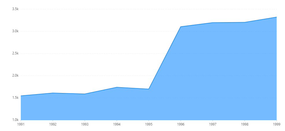
面积图实现
面积图实现官网都有实例,这里就展示一下代码:
const data = [
  { year: '1991', value: 15468 },
  { year: '1992', value: 16100 },
  { year: '1993', value: 15900 },
  { year: '1994', value: 17409 },
  { year: '1995', value: 17000 },
  { year: '1996', value: 31056 },
  { year: '1997', value: 31982 },
  { year: '1998', value: 32040 },
  { year: '1999', value: 33233 }
];
const chart = new G2.Chart({
  container: 'container',
  forceFit: true,
  height: 500
});
chart.source(data);
chart.scale({
  value: {
    min: 10000
  },
  year: {
    range: [ 0, 1 ]
  }
});
chart.axis('value', {
  label: {
    formatter: val => {
      return (val / 10000).toFixed(1) + 'k';
    }
  }
});
chart.tooltip({
  crosshairs: {
    type: 'line'
  }
});
chart.area().position('year*value');
chart.line().position('year*value').size(2);
chart.render();
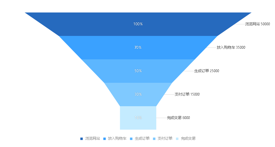
漏斗图实现
具体也可以看官网实例,这里只展示源码实例:
const { DataView } = DataSet;
let data = [
  { action: '浏览网站', pv: 50000 },
  { action: '放入购物车', pv: 35000 },
  { action: '生成订单', pv: 25000 },
  { action: '支付订单', pv: 15000 },
  { action: '完成交易', pv: 8000 }
];
const dv = new DataView().source(data);
dv.transform({
  type: 'map',
  callback(row) {
    row.percent = row.pv / 50000;
    return row;
  }
});
data = dv.rows;
const chart = new G2.Chart({
  container: 'container',
  forceFit: true,
  height: 500,
  padding: [ 20, 120, 95 ]
});
chart.source(data, {
  percent: {
    nice: false
  }
});
chart.axis(false);
chart.tooltip({
  showTitle: false,
  itemTpl: '<li data-index={index} style="margin-bottom:4px;">'
    + '<span style="background-color:{color};" class="g2-tooltip-marker"></span>'
    + '{name}<br/>'
    + '<span style="padding-left: 16px">浏览人数:{pv}</span><br/>'
    + '<span style="padding-left: 16px">占比:{percent}</span><br/>'
    + '</li>'
});
chart.coord('rect').transpose().scale(1, -1);
chart.intervalSymmetric().position('action*percent')
  .shape('funnel')
  .color('action', [ '#0050B3', '#1890FF', '#40A9FF', '#69C0FF', '#BAE7FF' ])
  .label('action*pv', (action, pv) => {
    return action + ' ' + pv;
  }, {
    offset: 35,
    labelLine: {
      lineWidth: 1,
      stroke: 'rgba(0, 0, 0, 0.15)'
    }
  })
  .tooltip('action*pv*percent', (action, pv, percent) => {
    return {
      name: action,
      percent: parseInt(percent * 100) + '%',
      pv
    };
  });
data.forEach(obj => {
  // 中间标签文本
  chart.guide().text({
    top: true,
    position: {
      action: obj.action,
      percent: 'median'
    },
    content: parseInt(obj.percent * 100) + '%', // 显示的文本内容
    style: {
      fill: '#fff',
      fontSize: '12',
      textAlign: 'center',
      shadowBlur: 2,
      shadowColor: 'rgba(0, 0, 0, .45)'
    }
  });
});
chart.render();
改造雷达图,实现y轴间隔颜色区分
我们看出雷达图其实并没有实现我们想要的整个y轴进行颜色区分,下面我们进行一下改装,还是直接先上源码:
const { DataView } = DataSet;
let data = [
  { action: '浏览网站', pv: 1 },
  { action: '放入购物车', pv: 1 },
  { action: '生成订单', pv: 1 },
  { action: '支付订单', pv: 1 },
  { action: '完成交易', pv: 1 }
];  // 将pv得值设为一样,这样轴的长度就一样了
const dv = new DataView().source(data); // 引入数据
dv.transform({
  type: 'map',
  callback(row) {
    row.percent = row.pv ;
    return row;
  }
});
data = dv.rows;
const chart = new G2.Chart({
  container: 'container',
  forceFit: true,
  height: 500,
  padding: [ 20, 120, 95 ]
});
chart.source(data, {
  percent: {
    nice: false
  }
});
chart.axis(false);  // 不显示坐标轴
chart.tooltip(false);  // 不显示提示
chart.coord('rect').transpose().scale(1, -1); // 布局规模
chart.intervalSymmetric().position('action*percent')
  .shape('funnel')
  .color('action', [ '#0050B3', '#1890FF', '#40A9FF', '#69C0FF', '#BAE7FF' ]) // 设置颜色

chart.render();
View 视图
视图,由 Chart 生成和管理,拥有自己独立的数据源、坐标系和图层,用于异构数据的可视化以及图表组合,一个 Chart 由一个或者多个视图 View 组成。因此 view 上的 api 同 chart 基本相同。
如何创建视图对象:
chart.view();
下面是创建视图的语法,首先你需要创建一个 chart 对象,然后调用 chart.view(cfg) 方法生成:
const view = chart.view({
  start: {
    x: 0,
    y: 0
  }, // 视图绘图区域的起始点,x、y 数值在 0 - 1 范围内
  end: {
    x: 1,
    y: 1
  } // 视图绘图区域的结束点,x、y 数值在 0 - 1 范围内
});
chart.view(cfg) 方法中的参数 cfg 可以为空或者传入以下属性:

{
  start: null, // 绘制区域的起始坐标,默认值为 {x: 0, y: 0}
  end: null, // 绘制区域的终点坐标,默认值为 {x: 1, y: 1}
  data: null, // 源数据,标准的 JSON 数组
  animate: {boolean} // 同 chart 配置保持一致
}
属性 start 绘制区域的起始坐标,结构如下:
{
  x: 0, // x 取值范围为 0 -1
  y: 0 // y 取值范围为 0 -1
}
对于 view,我们的起始点是从左上角开始的。
end 绘制区域的终点坐标,结构如下:
{
  x: 0, // x 取值范围为 0 -1
  y: 0 // y 取值范围为 0 -1
}
data
视图的数据源,同时也可以使用 view.source(data) 方法设置数据源。 具体用法也可参考官网:antv-g2.gitee.io/zh/docs/api…
chart与view结合实现预警折线图
接下来我们就来chart和view结合来实现颜色区块趋势图:
import G2 from '@antv/g2'
const DataSet = require('@antv/data-set')

 const data = this.bardata
      // const num = Math.floor(this.bardata.length / 6)
      const ds = new DataSet({
        state: {
          dates: null
        }
      })
      const totalDv = ds.createView().source(data)
      const dvChart = ds.createView()
      dvChart.source(data).transform({
        type: 'filter',
        callback: obj => {
          return obj
        }
      })
      const chart = new G2.Chart({
        container: 'barId',
        forceFit: true,
        height: 400,
        animate: false
      })

      const view = chart.view({
        start: {
          x: 0,
          y: 0
        }, // 指定该视图绘制的起始位置,x y 为 [0 - 1] 范围的数据
        end: {
          x: 1,
          y: 1
        } // 指定该视图绘制的结束位置,x y 为 [0 - 1] 范围的数据
      })
      const dv = new DataSet.View().source(this.dataView)
      dv.transform({
        type: 'map',
        callback(row) {
          row.percent = row.pv
          return row
        }
      })
      const dataView = dv.rows

      view.source(dataView, {
        percent: {
          nice: false
        }
      })  // 引入view数据
      view.axis(false)  // 影藏坐标轴
      view
        .coord('rect')
        .transpose()
        .scale(1, 1)
      view
        .tooltip(false)
        .intervalSymmetric()
        .position('action*percent')
        .shape('funnel')
        .color('action', ['#2196F3', '#FFCC00', '#FF9523', '#FA3239'])  // 颜色区分
      chart.source(dvChart, {
        date: {
          tickCount: 7,   // 横坐标展示7个
          mask: 'YYYY/MM/D'
        },
        price: {
          min: 0,
          max: totalDv.max('price')
        }
      })
      chart.tooltip({
        itemTpl: '<li>{price}</li>'
      })  // 鼠标移上去显示信息处理
      chart.axis('date', {
        label: {
          offsetX: -20,
          formatter: val => {
            const item = val.split(' ')[0]
            const array = item.split('/')
            return array[1] + '/' + array[2]
          }
        }
      })  // 横坐标显示数据显示
      chart.scale('price', {
        min: 0,
        max: 5,
        maxLimit: 5, // 对数据的最大值的限制,无论数据中是否存在比这个值大的数据,生成的坐标点不会大于这个值
        tickCount: 5, // 定义坐标轴刻度线的条数,默认为 5
        tickInterval: 1.25 // 纵坐标轴之间间隔
      })
      chart.legend({
        position: 'top-right', // 设置图例的显示位置
        offsetY: 8
      })
      chart
        .line()
        .position('date*price')
        .size(2)
        .color('#5C5B5B')  // 面积图边缘线设置
      chart
        .area()
        .position('date*price')
        .tooltip(
          'date*price',
          (date, price) => {
            return {
              date,
              price
            }
          } // 返回的参数名对应 itemTpl 中的变量名
        )
        .shape('smooth')
        .opacity(0.01)  // 面积部分透明度设为0.01,使只能看到边缘线部分,面积部分影藏
      const startDataX = data[0].date
      const endDataX = data[data.length - 1].date
      for (var i = 0; i < this.dataView.length; i++) {
        chart.guide().line({
          top: true,
          start: [startDataX, i + 1 + (i + 1) * 0.25],
          end: [endDataX, i + 1 + (i + 1) * 0.25],
          lineStyle: {
            stroke: 'red',
            lineWidth: 1,
            lineDash: [3, 3]
          }
        })
      }
      chart.render()
最终实现效果

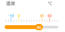
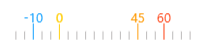
刻度图
刻度图实现主要由两部分组成,刻度和进度条,下面我们分开来说明。
刻度实现
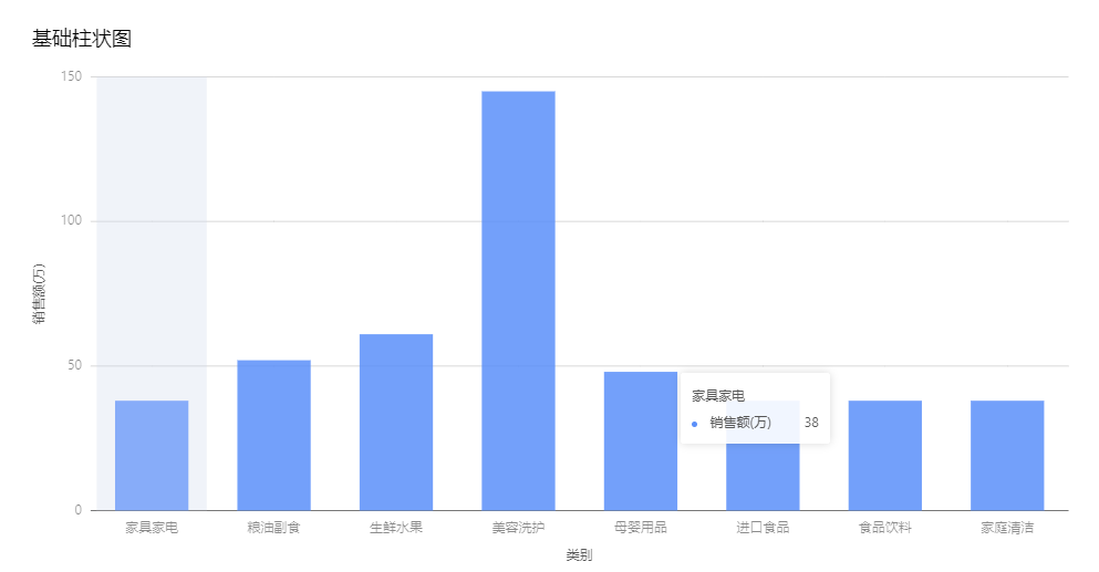
刻度的实现主要通过修改柱形图来实现的。
柱形图
import { Column } from '@antv/g2plot';

const data = [
  {
    type: '家具家电',
    sales: 38,
  },
  {
    type: '粮油副食',
    sales: 52,
  },
  {
    type: '生鲜水果',
    sales: 61,
  },
  {
    type: '美容洗护',
    sales: 145,
  },
  {
    type: '母婴用品',
    sales: 48,
  },
  {
    type: '进口食品',
    sales: 38,
  },
  {
    type: '食品饮料',
    sales: 38,
  },
  {
    type: '家庭清洁',
    sales: 38,
  },
];

const columnPlot = new Column(document.getElementById('container'), {
  title: {
    visible: true,
    text: '基础柱状图',
  },
  forceFit: true,
  data,
  padding: 'auto',
  data,
  xField: 'type',
  yField: 'sales',
  meta: {
    type: {
      alias: '类别',
    },
    sales: {
      alias: '销售额(万)',
    },
  },
});

columnPlot.render();
通过不同属性设置,来实现刻度图:
 const container = document.getElementById(typeId)
      const data = numData
      this.cailbarWidth = 460
      const that = this
      const config = {
        title: {
          text: '簇状柱形图'
        },
        description: {
          text: '一个基本的簇状柱形图'
        },
        legend: {
          visible: false,
          flipPage: false
        },
        tooltip: {
          visible: false
        },
        xAxis: {
          visible: false
        },
        yAxis: {
          grid: {
            visible: false
          },
          label: {
            visible: false
          },
          title: {
            visible: false
          }
        },
        color: serie => {
            if (serie === this.hasValue[0]) {
              return '#0099ff'
            } else if (serie === this.hasValue[1]) {
              return '#ffcc00'
            } else if (serie === this.hasValue[2]) {
              return '#ff9900'
            } else if (serie === this.hasValue[3]) {
              return '#ff3300'
            } else {
              return '#b7b5b5'
            }
        }, // 根据不同阈值设置颜色
        label: {
          visible: true,
          formatter: function(...value) {
            if (value[1]._origin.num !== 1) {
              return value[1]._origin.num
            }
          },
          style: function(value) {
            const styleData = [
              {
                fill: '#0099ff',
                adjustPosition: true
              },
              {
                fill: '#ffcc00'
              },
              {
                fill: '#ff9900'
              },
              {
                fill: '#ff3300'
              }
            ] // 根据不同阈值设置字体颜色
            if (value === 2) {
              that.itemNum = that.itemNum + 1
              if (that.itemNum < 5) {
                return styleData[that.itemNum - 1]
              } else {
                return styleData[that.itemNum - 5]
              }
            } // 设置阈值数字显示
          }
        },
        forceFit: false,
        width: this.cailbarWidth,
        height: 72,
        xField: 'x',
        yField: 'y',
        groupField: 'serie',
        columnSize: 1
      }
      const plot = new G2Plot.GroupColumn(container, {
        data,
        ...config
      })
      plot.render()
其中numData的值的处理方法
const num = {
        min: 0,
        max: 100
      }
      for (let i = num.min; i < num.max; i++) {
        let item = ''
        item = {
          valueX: i * 5,
          y: 1
        }
        if (item.valueX > num.max) {
          break
        }
        numData.push(item)
      }  // 5格显示一个刻度

        for (var i = 0; i < numData.length; i++) {
          switch (i) {
            case 2:
              numData[i].y = 2
              numData[i].num = limitData.bbottom
              break
            case 5:
              numData[i].y = 2
              numData[i].num = limitData.bottom
              break
            case 14:
              numData[i].y = 2
              numData[i].num = limitData.top
              break
            case 17:
              numData[i].y = 2
              numData[i].num = limitData.ttop
              break
            default:
              numData[i].num = 1
              break
          }
        }   // 2.5.14.17为固定位置,刻度长度增加为2

      for (let j = 0; j < numData.length; j++) {
        numData[j].serie = 'Row' + j
        numData[j].x = 'common'
        if (numData[j].num !== 1) {
          this.hasValue.push(numData[j].serie)
        }
      }  // this.hasValue方便颜色控制
进度条
<div class="progressContainerDetail">
    <div class="progress" :style="{ width: processShow + '%', backgroundColor: colorNum }"></div>
    <div
      :style="{ left: processShow - widthNum + '%', backgroundColor: colorNum }"
      class="div-content-pro"
    >
      {{ progress }}
    </div>
  </div>
  <style scoped lang="scss">
.div-content-pro {
  color: #fff;
  position: absolute;
  left: 68%;
  top: -6px;
  text-align: center;
  background-color: #d5d043;
  width: 14%;
  border-radius: 10px;
}
.progressContainerDetail {
  position: absolute;
  left: -12px;
  top: 60px;
  height: 8px;
  width: 164px;
  border-radius: 10px;
  background-color: #ddd;
  margin-left: 80px;
}
.progress {
  position: absolute;
  top: -2px;
  border-radius: 10px;
  height: 12px;
  line-height: 20px;
}
</style>
其中,为了刻度和进度条实现联动,并且可以变化颜色,我们对上侧动态数据做了以下处理:
 /**
     * @author liujie22
     * @desc 颜色处理公共数据方法
     */
    HandlenumValue(num, dataOne, dataTwo) {
      const itNum = Math.abs(dataOne - dataTwo)
      const adNum = Math.abs(num - dataTwo)
      return adNum / itNum
    },
    /**
     * @author liujie22
     * @desc 颜色处理方法
     */
    colorAction(num, limitData) {
      // 对应阈值位置刻度间隔
      const bbottomNum = FIRST_POINT * SECOND_POINT // 下下限阈值对应间隔
      const bottomNum = SECOND_POINT * SECOND_POINT // 下限阈值对应间隔
      const topNum = THIRD_POINT * SECOND_POINT // 上线阈值对应间隔
      const ttopNum = FOUR_POINT * SECOND_POINT // 上上限阈值对应间隔
      const allWidth = ALL_POINTNUM // 总间隔
      const widthBottomNum = bottomNum - bbottomNum // 下下限阈值与下限阈值之间的间隔数
      const widthTopNum = topNum - bottomNum // 上限阈值与下限阈值对应的间隔数
      const widthTtopNum = ttopNum - topNum // 上上限阈值与上限阈值对应的间隔数
      const ttopNumWidth = allWidth - ttopNum // 上上限以上对应的间隔数
      if (this.typeId === 'liquid' || this.typeId === 'pressure') {
        // 当为液压和压力时
        if (num <= limitData.bottomThreshold) {
          // 数值小于下下限阈值。求出数值占下下限所占刻度百分比,然后乘于下下限所占刻度,得到进度显示位置百分比
          this.colorNum = '#0099ff'
          const numValue = num / limitData.bottomThreshold
          this.processShow = parseInt(numValue * bbottomNum)
        } else if (num > limitData.bottomThreshold && num <= limitData.lowThreshold) {
          // 数值在下下限阈值与下限阈值之间。求出数值占下下限与下限所占刻度百分比,然后乘于下下限与上限之间所占刻度加上下下限所占刻度,求出进度百分比
          this.colorNum = '#ffcc00'

          const numValue = this.HandlenumValue(
            num,
            limitData.lowThreshold,
            limitData.bottomThreshold
          )
          this.processShow = parseInt(numValue * widthBottomNum) + bbottomNum
        } else if (num <= limitData.highThreshold && num > limitData.lowThreshold) {
          // 数值在上限阈值与下限阈值之间。求出数值占下限与上限限所占刻度百分比,然后乘于下限与上限之间所占刻度加上下限所占刻度,求出进度百分比
          this.colorNum = '#666'
          const numValue = this.HandlenumValue(num, limitData.highThreshold, limitData.lowThreshold)
          this.processShow = parseInt(numValue * widthTopNum) + bottomNum
        }
      } else if (this.typeId === 'temperate') {
        // 当为温度刻度时
        if (num <= limitData.bottomThreshold) {
          // 数值小于下下限阈值。
          if (limitData.bottomThreshold < 0) {
            // 下下限阈值小于0。求出数值占下下限所占刻度百分比,然后乘于下下限所占刻度,得到进度显示位置百分比(小于0需求绝对值)
            this.colorNum = '#0099ff'
            const itNum = Math.abs(num) - Math.abs(limitData.bottomThreshold)
            const absNum = Math.abs(limitData.bottomThreshold) - itNum
            const numValue = absNum / Math.abs(limitData.bottomThreshold)
            this.processShow = parseInt(numValue * bbottomNum)
          } else {
            // 下下限阈值大于0。求出数值占下下限所占刻度百分比,然后乘于下下限所占刻度,得到进度显示位置百分比
            this.colorNum = '#0099ff'
            const numValue = num / limitData.bottomThreshold
            this.processShow = parseInt(numValue * bbottomNum)
          }
        } else if (num > limitData.bottomThreshold && num <= limitData.lowThreshold) {
          // 数值在下下限阈值与下限阈值之间。求出数值占下下限与下限所占刻度百分比,然后乘于下下限与上限之间所占刻度加上下下限所占刻度,求出进度百分比
          this.colorNum = '#ffcc00'
          const itNum = Math.abs(limitData.bottomThreshold) - Math.abs(num)
          const numValue = itNum / Math.abs(limitData.bottomThreshold)
          this.processShow = parseInt(numValue * widthBottomNum) + bbottomNum
        } else if (num <= limitData.highThreshold && num > limitData.lowThreshold) {
          // 数值在上限阈值与下限阈值之间。求出数值占下限与上限限所占刻度百分比,然后乘于下限与上限之间所占刻度加上下限所占刻度,求出进度百分比
          this.colorNum = '#666'
          const numValue = this.HandlenumValue(num, limitData.highThreshold, limitData.lowThreshold)
          this.processShow = parseInt(numValue * widthTopNum) + bottomNum
        }
      } else {
        // 当为其他刻度时。求出数值占下限与上限限所占刻度百分比,然后乘于下限与上限之间所占刻度加上下限所占刻度,求出进度百分比
        if (num <= limitData.highThreshold) {
          this.colorNum = '#666'
          const numValue = num / limitData.highThreshold
          this.processShow = parseInt(numValue * widthTopNum) + bottomNum
        }
      }
      if (num > limitData.highThreshold && num <= limitData.topThreshold) {
        // 数值在上限阈值与上上限阈值之间。求出数值占上限与上上限限所占刻度百分比,然后乘于上上限与上限之间所占刻度加上上限所占刻度,求出进度百分比
        this.colorNum = '#ff9900'
        const numValue = this.HandlenumValue(num, limitData.topThreshold, limitData.highThreshold)
        this.processShow = parseInt(numValue * widthTtopNum) + topNum
      } else if (num > limitData.topThreshold) {
        // 数值大于上上限阈值。
        const limitNum = FOUR_POINT * SECOND_POINT
        const fourNum = parseInt((limitData.topThreshold * allWidth) / limitNum) // 当进度为100时,对应的最大数值
        if (num > fourNum) {
          // 超过最大数值,都按100%显示
          this.colorNum = '#ff3300'
          this.processShow = 100
        } else {
          // 在最大数值以内。求出数值占上上限到最大所占刻度百分比,然后乘于上上限之后之间所占刻度加上限所占刻度,求出进度百分比
          this.colorNum = '#ff3300'
          const numValue = this.HandlenumValue(num, allWidth, limitData.topThreshold)
          this.processShow = parseInt(numValue * ttopNumWidth) + ttopNum
        }
      }
    },
    备注:// 刻度图位置参数
export const FIRST_POINT = 3 // 下下限对应显示位置
export const SECOND_POINT = 5 // 下限对应显示位置
export const THIRD_POINT = 14 // 上限对应显示位置
export const FOUR_POINT = 17 // 上上限对应显示位置
export const ALL_POINTNUM = 100

// 刻度宽度
export const DETAIL_WIDTH = 300
最终实现进度跟随刻度进行区间显示,切跟随刻度设置阈值变化颜色。

结语
这里主要介绍了颜色区块趋势图与刻度图实现,其实主要是chart和view的结合使用方法的思路,正确使用chart和view结合,还有G2与G2Plot属性设置,与div相结合实现可以满足条件的刻度图。都是自己凑出来的,希望对大家有点帮助。
