

css3新增了transition与animation两种方式可实现动画,那么在出现transition与animation之前,有两种方式实现动画:一种是使用css的hover伪类属性方式,另外一种是使用js改变css属性方式;接下来我会介绍transition与animation的使用方法以及解决了什么问题,最后会分析我们为什么使用transition与animation实现动画要比js方式性能要高效!
transition的使用
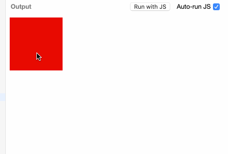
我们之前使用hover伪类实现动画,是以下效果:
.div {
    width:100px;
    height:100px;
    background:red;
}
.div:hover {
    width:200px;
    height:200px;
    background:green;
}
.div {
    width:100px;
    height:100px;
    background:red;
    transition:3s;
}
.div:hover {
    width:200px;
    height:200px;
    background:green;
}
transition 是 transition-property(状态发生变化的属性),transition-duration(过渡所用的时间),transition-timing-function(过渡变化的速度) 和 transition-delay(延迟多长时间开始过渡) 的一个简写属性。
上例中,3s就是过渡所用时间,我们没有设置transition-property,就会默认所有发生变化的状态都会过渡,如果我们只需要某个特定属性发生过渡变化,只需要写明就可以了;
.div {
    width:100px;
    height:100px;
    background:red;
    transition:width 3s;
}
.div:hover {
    width:200px;
    height:200px;
    background:green;
}
.div {
    width:100px;
    height:100px;
    background:red;
    transition:width 3s, background 3s;
}
.div:hover {
    width:200px;
    height:200px;
    background:green;
}
假如我们想要width先过渡,2s后height再过渡,2s后颜色再过渡,可以使用下面写法;
.div {
    width:100px;
    height:100px;
    background:red;
    transition:width 3s, height 2s 3s ease-in-out, background 3s 5s ease-in-out;
}
.div:hover {
    width:200px;
    height:200px;
    background:green;
}

- transition需要事件触发,比如hover事件,click事件,因此不能在网页加载时自动发生;
- transition是一次性的,不能重复发生,触发多次触发;
- transition只能定义开始状态和结束状态,不能定义中间状态,也就是说只有两个状态。 animation的出现就解决了transition上面的问题;
animation的使用
animation可以实现transiton的效果,看下面代码;
.div {
    width:100px;
    height:100px;
    background:red;
}
.div:hover {

    animation: move 3s forwards;
}
@keyframes move {
    100% {
         background: green;
          width:200px;
          height:200px;
    }
}
.div {
    width:100px;
    height:100px;
    background:red;
  animation: move 3s infinite alternate;
}
@keyframes move {
    100% {
         background: green;
          width:200px;
          height:200px;animation-name
    }
}
- animation-name 动画的名字,就是上面的move,需要使用keyframes关键字定义move的效果;
- animation-duration 动画的持续时间,就是上面的3s
- animation-timing-function 动画的变化速度,和transition的animation-timing-function值是一样
- animation-delay 动画延迟执行的时间
- animation-direction 动画执行的方向;动画循环播放时,每次都是从结束状态跳回到起始状态,再开始播放;animation-direction可以改变这种循环方向,值有:normal、reverse、alternate、alternate-reverse
- animation-iteration-count 动画执行的次数,可以是数字,也可以是infinite(无限循环);
- animation-fill-mode 默认情况下动画结束以后,会立即从结束状态跳回到起始状态。如果想让动画保持在结束状态,需要使用animation-fill-mode属性,值为forward。
- animation-play-state 动画是否运行或者暂停;running:当前动画正在运行;paused:当前动画以被停止;
目前,IE 10和Firefox(>= 16)支持没有前缀的animation,而chrome不支持,所以必须使用webkit前缀。
.div {
    width:200px;
    height:200px;
    background:red;
    margin: 100px auto;
    -webkit-animation: move 3s infinite alternate;
    animation: move 3s infinite alternate;
}
@keyframes move {
  0% {
    background: red;
    transform: scale(0.4);
    }
  50% {
    background: yellow;
    border-radius: 100%;
  }
  100% {
    background: green;
    transform: scale(1.5);
    }
}
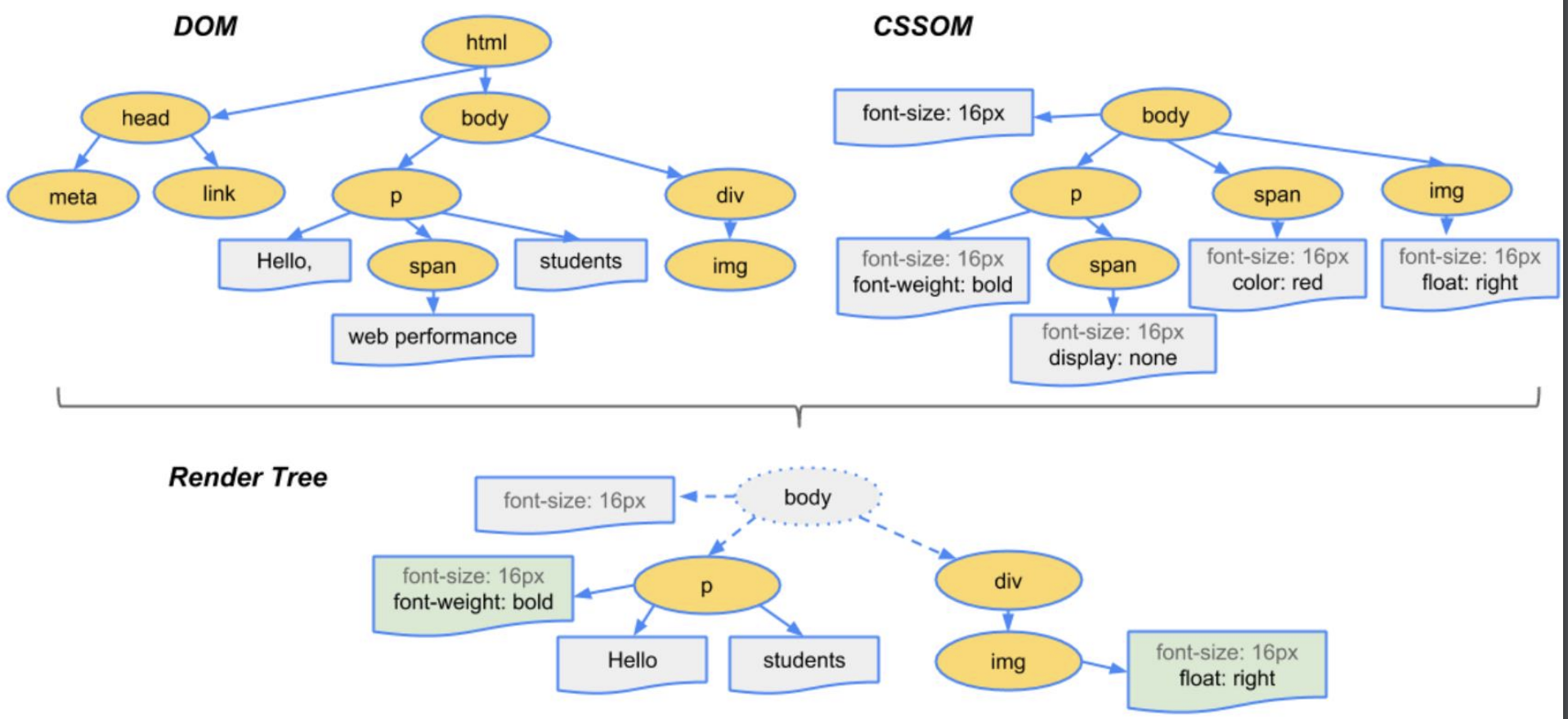
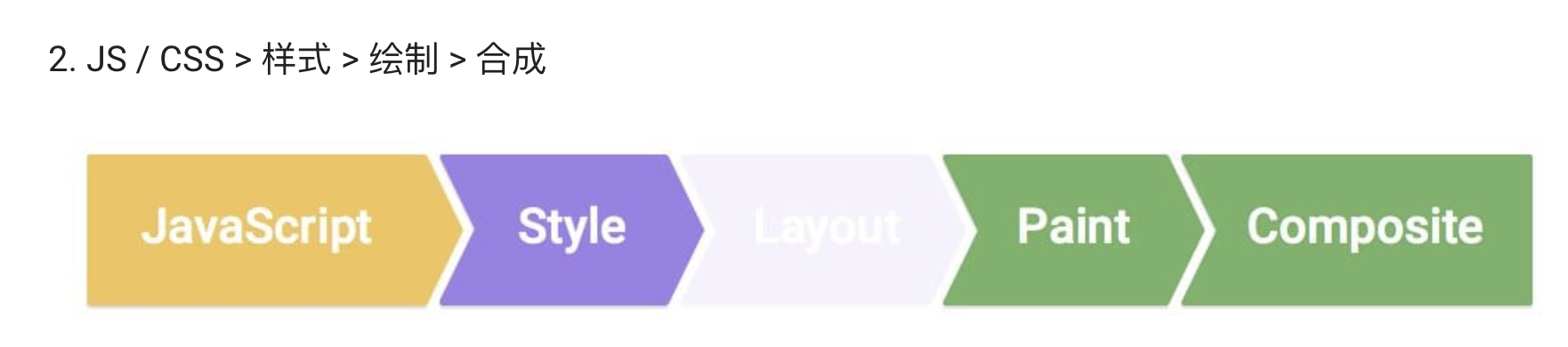
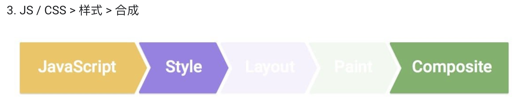
要分析动画优化,那不得不提下浏览器对页面的渲染原理;
动画性能分析
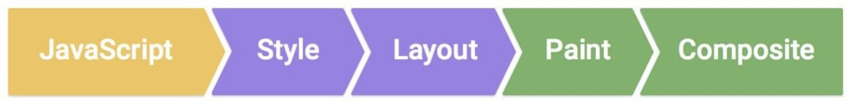
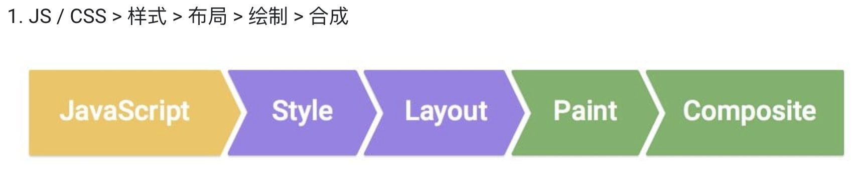
浏览器对页面的渲染原理,可分为以下步骤:
1.根据HTML构建DOM树;
2.根据CSS构建CSSOM树;
3.将DOM树与CSSOM树合成一个渲染树(render tree);
4.Layout布局,包括文档流、盒模型、计算大小和位置;
5.Paint绘制,包括边框颜色、文字颜色、阴影等画出来;
6.Compose合成,根据层叠关系展示画面;
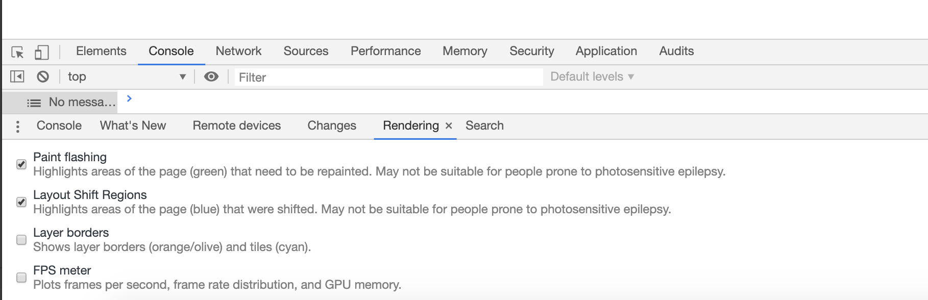
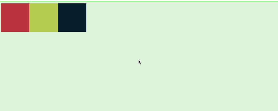
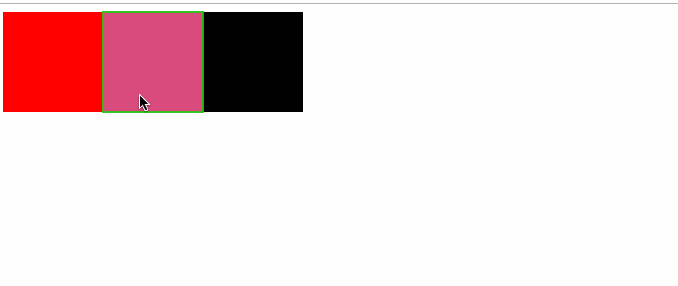
你可以打开控制台中选择rendering,选中paint flashing(绘制,绿色高亮区域)、layout shift regions(布局,蓝色高亮区域)
<!doctype html>
<html lang="en">
<head>
  <meta charset="UTF-8">
  <meta name="viewport"
        content="width=device-width, user-scalable=no, initial-scale=1.0, maximum-scale=1.0, minimum-scale=1.0">
  <meta http-equiv="X-UA-Compatible" content="ie=edge">
  <title>Document</title>
  <style>
    div {
      width: 100px;
      height: 100px;
      background: red;
      float: left;
    }
    div:nth-child(2) {
      background: yellow;
    }
    div:nth-child(3) {
      background:black;
    }
  </style>
</head>
<body>
<div id="div"></div>
<div></div>
<div></div>
<script>
  let div = document.getElementById("div");
  setInterval(()=>{
    div.style.display='none'
  },1000)
</script>
</body>
</html>
执行代码如下:
<!doctype html>
<html lang="en">
<head>
  <meta charset="UTF-8">
  <meta name="viewport"
        content="width=device-width, user-scalable=no, initial-scale=1.0, maximum-scale=1.0, minimum-scale=1.0">
  <meta http-equiv="X-UA-Compatible" content="ie=edge">
  <title>Document</title>
  <style>
    div {
      width: 100px;
      height: 100px;
      background: red;
      float: left;
    }
    div:nth-child(2) {
      background: yellow;
    }
    div:nth-child(3) {
      background:black;
    }
    div:hover {
      background:deeppink;
    }
  </style>
</head>
<body>
<div id="div"></div>
<div></div>
<div></div>
</body>
</html>
<!doctype html>
<html lang="en">
<head>
<meta charset="UTF-8">
<meta name="viewport"
content="width=device-width, user-scalable=no, initial-scale=1.0, maximum-scale=1.0, minimum-scale=1.0">
<meta http-equiv="X-UA-Compatible" content="ie=edge">
<title>Document</title>
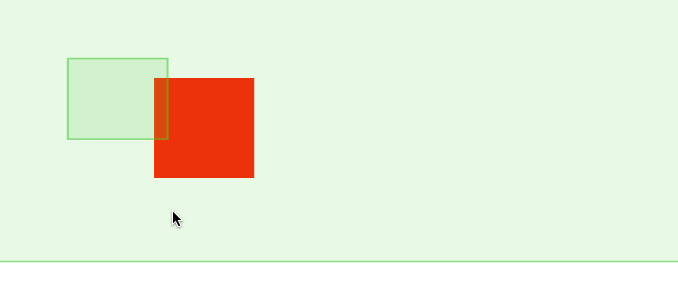
<style>
#div {
width: 100px;
height: 100px;
background: red;
margin: 100px auto;
-webkit-animation: change 3s infinite alternate;
animation: change 3s infinite alternate;
}
@keyframes change {
0% {
transform: translateX(100PX);
}
50% {
transform: translateX(300PX);
}
100% {
transform: translateX(500PX);
}
}
</style>
</head>
<body>
<div id="div"></div>
</body>
</html>
参考文档:css动画简介 animation tricks
结束语:感谢饥人谷,以上文章记录了自己在饥人谷的学习内容;
