flex布局为弹性布局,用起来简单而强大,解决了float流式布局清除浮动等得麻烦,今天对flex稍作整理,方便以后温故而知新
一、使用方法
 <div class="box">
    <div class="item">1</div>
    <div class="item">2</div>
    <div class="item">3</div>
    <div class="item">4</div>
    <div class="item">5</div>
 </div>
 .box {
    display:-webkit-flex;
    display:flex;
 }
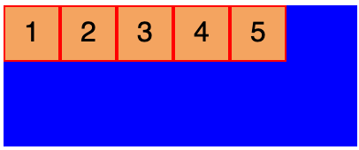
此时五个盒子变成一行显示
    .box{
        flex-direction:row; /*项目排列方向[row-reverse][column][column-reverse]*/
        flex-wrap:nowrap; /*如何换行[wrap][wrap-reverse]*/
        flex-flow:row nowrap; /*上边两个属性得简写*/
        justify-content:flex-start; /* 主轴对其方式[flex-end][center][space-between][space-around]*/
        align-items:flex-start; /*交叉轴对其方式[flex-end][center][baseline][stretch]*/
        align-content:flex-start; /*多根轴线对其方式,只有一根轴线不起作用[flex-end][center][spance-between][space-around][stretch]*/
    }
以下6个属性作用于容器的项目
    order:0; /*数值越小,排列越靠前,默认为0.*/
    flex-grow:0; /*项目的放大比例,默认0*/
    flex-shrink:1; /*项目缩小比例,默认1*/
    flex-basis:auto; /*不是很明确*/
    flex:0 1 auto; /*flex-grow,flex-shrink和flex-basis的简写,默认值为0 1 auto*/
    align-self:auto; /*单独的对齐方式,可以覆盖align-items属性*/
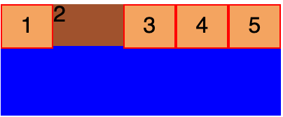
flex-grow:1;其他默认情况下,元素将撑满剩余空间
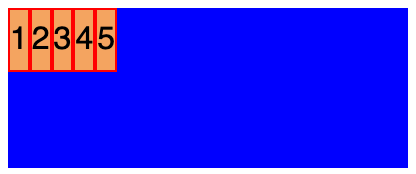
flex-shrink:0其他默认情况下,元素将不会被缩放