

前言
前几天偶然看到缺角矩形这个功能,脑袋中第一想法是,搞个绝对定位的伪元素,哪里需要挡哪里,或者找UI小哥聊聊天,忽然灵光一闪,想起之前翻过的《CSS揭秘》一书,记得有这个篇章,遂有了此文。
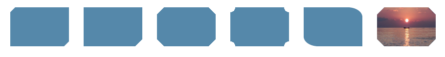
话不多说,放个效果图先
缺角
1. 伪元素实现
<div class="bg cover"></div>
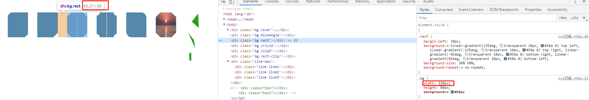
.bg{
  width: 120px;
  height: 80px;
  background: #58a;
} /* 下文元素都使用了此样式 */
.cover{
position: relative;
}
.cover::before {
content: '';
width: 0;
height: 0;
position: absolute;
right: 0;
bottom: 0;
border: 5px solid #fff;
border-top-color: transparent;
border-left-color: transparent;
}
.cover::after{
content: '';
width: 0;
height: 0;
position: absolute;
left: 0;
top: 0;
border: 5px solid #fff;
border-bottom-color: transparent;
border-right-color: transparent;
}
用伪元素画一个和背景色相同的三角形,然后绝对定位到需要遮挡的地方,如下图,但是这个最多只能弄两个缺角

2. 渐变实现
CSS语法
background-image: linear-gradient(direction, color-stop1, color-stop2, ...);
| 值 | 描述 |
|---|---|
| direction | 用角度值指定渐变的方向(或角度)。 |
| color-stop1, color-stop2,... | 用于指定渐变的起止颜色。 |
并且渐变可以接受一个角度(比如45deg)作为方向,而且色标的位置信息也可以是绝对的长度值。
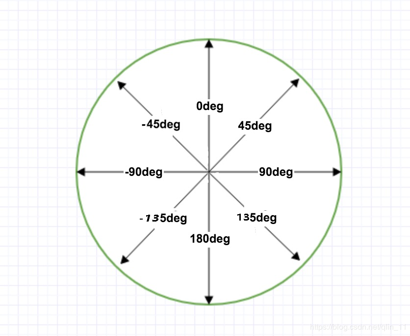
图来自官网,p的完整了一些
45deg: 表示从左下到右上的方向
-45deg: 表示从右下到左上的方向
......
<div class="bg missAngle"></div>
.missAngle{
    background: linear-gradient(-45deg, transparent 10px, #58a 0);
}

实现多个角
<div class="bg rect"></div>
.rect{
  background: linear-gradient(135deg, transparent 10px, #58a 0) top left,
          linear-gradient(-135deg, transparent 10px, #58a 0) top right,
          linear-gradient(-45deg, transparent 10px, #58a 0) bottom right,
          linear-gradient(45deg, transparent 10px, #58a 0) bottom left;
  background-size: 50% 50%;
  background-repeat: no-repeat;
  /* Internet Explorer 9 及更早版本 IE 浏览器不支持渐变。 */
}

这个实际上使用四个图形拼接出来的,如下图
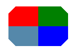 background-size: 50% 50%; 表示每个小图形宽50%,高50%
「弧形切角」
<div class="bg cricle"></div>
.cricle{
  background: radial-gradient(circle at top left, transparent 10px, #58a 0) top left,
          radial-gradient(circle at top right, transparent 10px, #58a 0) top right,
          radial-gradient(circle at bottom right, transparent 10px, #58a 0) bottom right,
          radial-gradient(circle at bottom left, transparent 10px, #58a 0) bottom left;
  background-size: 50% 50%;
  background-repeat: no-repeat;
}

「最后,Internet Explorer 9 及更早版本 IE 浏览器不支持渐变。」
这里有一个问题,拉动浏览器,当宽度被挤压,小于定义宽度时,可能会出现白色的缝隙,这里需要注意一下下,如下图
当背景图是一张图片的时候,这时实现缺角的话渐变就不好使了,接下来请出clip-path
clip-path实现
clip-path CSS 属性可以创建一个只有元素的部分区域可以显示的剪切区域。区域内的部分显示,区域外的隐藏。
clip-path: polygon(x y, x1 y1, x2 y2, x3 y3, ...)
x y, x1 y1, x2 y2, x3 y3, ... 这些表示坐标轴中的点,根据所有的点绘制一个封闭的图形
<div class="bg rect-clip"></div>
.rect-clip{
  background-image: url(./im.jpg);
  background-size: 100% 100%;
  background-repeat: no-repeat;
  clip-path: polygon(15px 0, calc(100% - 15px) 0, 100% 15px,
    100% calc(100% - 15px), calc(100% - 15px) 100%,
    15px 100%, 0 calc(100% - 15px), 0 15px)
}
效果图:
总宽度为120px
calc(100% - 15px)  =>  105px
100%               =>  120px
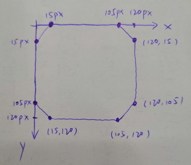
将对应的点连接起来就构成了一个缺角矩形
clip-path的功能还是蛮强大的,绘制各种各样的形状,菱形,五角星啊等等,比如下图
<div class="bg clip5"></div>
.clip5{
  	margin-left: 30px;
    /*clip-path: inset(25% 0 25% 0 round 0 25% 0 25%);*/
    clip-path: inset(0 round 0 25%); /* 可以简写 */
    /* inset(<top> <right> <bottom> <left> round <top-radius> <right-radius> <bottom-radius> <left-radius>) */
    /* inset使用四个值(对应“上 右 下 左”的顺序)来设置圆角半径。 */
}
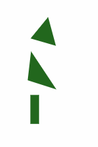
 「用来做动画」
<div class="line-box">
	<div class="line line1"></div>
	<div class="line line2"></div>
	<div class="line line3"></div>
</div>
.line-box{
	width: 100px;
	height: 60px;
}
.line{
	width: 100%;
	height: 100%;
	background: #26b91a;
}
.line1{
	-webkit-clip-path: polygon(80% 0, 40% 40%, 80% 80%);
	clip-path: polygon(80% 0, 40% 40%, 80% 80%);
	animation: a 2s 1s infinite;
}
.line2{
	clip-path: polygon(10% 10%, 60% 40%, 50% 90%);
	animation: b 2s 1s infinite;
}
.line3{
	clip-path: polygon(20% 20%, 30% 20%, 30% 50%, 20% 50%);
	animation: c 2s 1s infinite;
}
@keyframes a{
	90% {
		background: #1f351f;
	}
	100% {
		clip-path: polygon(50% 40%, 25% 100%, 75% 100%);
	}
}
@keyframes b{
	90% {
		background: #1f351f;
	}
	100% {
		clip-path: polygon(50% 0, 0% 100%, 100% 100%);
	}
}
@keyframes c{
	90% {
		background: #1f351f;
	}
	100% {
		clip-path: polygon(40% 0, 60% 0, 60% 100%, 40% 100%);
	}
}
这里只列举了clip-path的部分功能,更多形状点这里,一个用来生成各种形状(包括随意拖拉自定义)并且可以直接生成代码的网站。
虽然这个能绘制各式形状,但是兼容性却不怎么好,谷歌版本79,火狐71测试正常,IE不可,具体兼容性请看这里
如果项目需要考虑兼容性问题,也可以放一张图片当作背景图,图片压缩一下,或者只有最多两个缺角使用伪元素,根据项目实际情况选择合适自己的方案
缺角边框
<div class="out-rect">
	<div class="in-rect"></div>
</div>
.out-rect {
    margin-top: 30px;
    display: flex;
    align-items: center;
    justify-content: center;
    width: 200px;
    height: 80px;
    padding: 5px;
    background: linear-gradient(-45deg, transparent 10px, #58a 0) top right;
    background-size: 100% 100%;
    background-repeat: no-repeat;
}
.in-rect{
    width: 100%;
    height: 100%;
    background: linear-gradient(-45deg, transparent 8px, #fff 0) top right;
    background-size: 100% 100%;
    background-repeat: no-repeat;
}
效果如下:
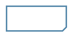 两个缺角矩形叠加的效果,内部矩形宽高跟随父div大小,只要保持垂直居中就好,padding的值为最终呈现的边框的宽度
折角
还是使用渐变linear-gradient实现,在缺角矩形的基础上多了一个折角
效果图如下:
 首先实现第一种
<div class="bg foldingAngle"></div>
.bg{
  width: 120px;
  height: 80px;
  background: #58a;
}
.foldingAngle{
	background:
		linear-gradient(to left bottom, transparent 50%, rgba(0, 0, 0, 0.4) 0) no-repeat 100% 0 / 1.4em 1.4em,
	    linear-gradient(-135deg, transparent 1em, #58a 0);
}
效果图

linear-gradient(to left bottom, transparent 50%, rgba(0, 0, 0, 0.4) 0) no-repeat 100% 0 / 1.4em 1.4em
朝左下方向,透明黑色各一半渐变绘制,位置: 100% 0   size: 1.4em 1.4em
如下:
 size 为1.4em 1.4em 这个三角形是一个45°的直角三角形,直角边长1.4em, 斜边长为 1.4/√2 ≈ 1
所以绘制一个缺角为1em的矩形
linear-gradient(-135deg, transparent 1em, #58a 0)
-135deg 朝左下方向绘制一个缺角矩形
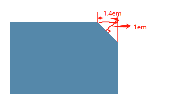
两次渐变重叠,所以效果图为:
一定要先画小三角,再画缺角矩形,否则矩形会盖住小三角
「右下角折角」
<div class="bg foldingAngle2"></div>
.foldingAngle2{
	background:
		linear-gradient(to left top, transparent 50%, rgba(0, 0, 0, 0.4) 0) no-repeat 100% 100% / 1.4em 1.4em,
	    linear-gradient(-45deg, transparent 1em, #58a 0);
}

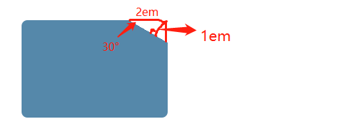
这样子看起来有点儿不真实,并且现实中折角不一定都是45°
下面画一个30°的折角,先画一个缺角矩形
<div class="bg foldingAngle2"></div>
.foldingAngle2{
	margin-top: 30px;
    position: relative;
    border-radius: .3em;
	background: linear-gradient(-150deg, transparent 1em, #58a 0);
}
 接下来画折角
根据上图红色数字,折角宽2/√3 ≈ 1.15em 长:2em 画出折角
.foldingAngle2::before{
	content: '';
	position: absolute;
	right: 0;
	top: 0;
	width: 1.15em;
	height: 2em;
	background: linear-gradient(to left bottom, transparent 50%, rgba(0, 0, 0, 0.2) 0, rgba(0, 0, 0, 0.3)) 100% 0 no-repeat;
	border-bottom-left-radius: inherit;
}
 旋转一下
旋转一下
.foldingAngle2::before{
	content: '';
	position: absolute;
	right: 0;
	top: 0;
	width: 1.15em;
	height: 2em;
	background: linear-gradient(to left bottom, transparent 50%, rgba(0, 0, 0, 0.2) 0, rgba(0, 0, 0, 0.3)) 100% 0 no-repeat;
	transform: rotate(-30deg);
	transform-origin: bottom right; /* 让三角形的右下角成为旋转的中心 */
}
 上移一下,偏移量为2-1.15=0.85em,再加点阴影
.foldingAngle2::before{
	content: '';
	position: absolute;
	right: 0;
	top: 0;
	width: 1.15em;
	height: 2em;
	background: linear-gradient(to left bottom, transparent 50%, rgba(0, 0, 0, 0.2) 0, rgba(0, 0, 0, 0.3)) 100% 0 no-repeat;
	transform: translateY(-0.85em) rotate(-30deg);
	transform-origin: bottom right;
	box-shadow: -.2em .2em .3em -.1em rgba(0, 0, 0, .15);
	border-bottom-left-radius: inherit; /* 左下角继承border-radius */
}
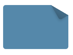 这样子就是最终的效果
改变角度和长宽计算有些麻烦,可以使用预处理器@mixin,这里只说一下过程,不多叙述
ok,结束👏
本文使用 mdnice 排版
