

1. transform
1.1 定义
transform主要用于给元素做变换,主要由以下几种变换,rotate(旋转),scale(缩放),skew(扭曲),translate(移动)和matrix(矩阵变换).
语法:
transform: none | transform-functions
none表示不做变换, transform-functions表示变化函数,可以使一个变换函数或者多个变换函数的组合.
.transform-multi:hover {
  transform: scale(1.2) rotate(30deg);
}
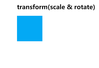
transform-origin转换基点
transform-origin: x-axis y-axis z-axis;, transform-origin用来定义转换的基点,默认的转换基点是元素的中心点,下图是以右下角为基点做变换的效果图.
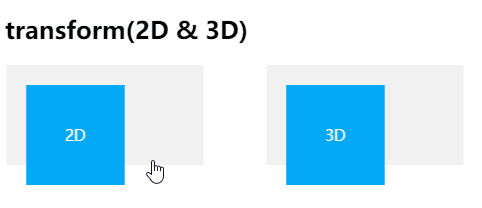
transform-style定义嵌套元素在三维空间呈现
transform-style: flat|preserve-3d;
flat: 表示所有子元素在2D平面呈现preverse-3d: 表示所有子元素在3D空间中呈现
效果图:
1.2 使用场景
简单的罗列api的使用会让人感觉枯燥和无意义,下面我就结合具体的使用场景来实践transform的一些转换函数.
- 使用
transition和position: absolute;结合实现水平垂直居中:
html:
<h2 style="padding-top: 20px;">使用transition实现水平垂直居中</h2>
<div class="transform-box">
  <div class="middle-center">
    <p>水平垂直居中</p>
    <p>宽度和高度由子元素撑开</p>
  </div>
</div>
css:
.transform-box {
  width: 200px;
  height: 200px;
  position: relative;
   background-color: #00f;
}
.middle-center {
   background-color: #f00;
  position: absolute;
  left: 50%;
  top: 50%;
  transform: translateX(-50%) translateY(-50%);
  color: #fff;
}
效果图:

- 定义放大,旋转,倾斜,矩阵变换等交互效果:
html:
<h2>scale, rotate, skew, martix</h2>
<div class="transform-box">
  <div class="white-container">
    <div class="gray-bg scale">
      <div class="blue-content">
      </div>
    </div>
    <p class="info-text">scale(2)</p>
  </div>
  <div class="white-container">
    <div class="gray-bg rotate">
      <div class="blue-content">

      </div>
    </div>
    <p class="info-text">rotate(45deg)</p>
  </div>
  <div class="white-container">
    <div class="gray-bg skew">
      <div class="blue-content">

      </div>
    </div>
    <p class="info-text">skew(45deg)</p>
  </div>

  <div class="white-container">
    <div class="gray-bg matrix">
      <div class="blue-content">

      </div>
    </div>
    <p class="info-text">matrix(2, 2, 0, 2, 45, 0)</p>
  </div>
</div>
css:
.transform-box {
  display: flex;
  text-align: center;

}
.white-container {
  width: 200px;
  flex: 0 0 200px;
  margin-right: 20px;
  background: #f1f1f1;
}
.gray-bg {
  width: 100px;
  height: 100px;
  margin: 15px auto;
  background: #ddd;
  cursor: pointer;
  box-shadow: 0 0 5px #ccc inset;
}
.blue-content {
  width: 100px;
  height: 100px;
  position: relative;
  background: #03A9F4;
  opacity: .5;
  box-shadow: 0 0 5px #ccc;
}
.info-text {
  color: #555;
}
.scale:hover .blue-content {
  -webkit-transform: scale(1.5, 1.5);
  transform: scale(1.5, 1.5);
}
.rotate:hover .blue-content {
  -webkit-transform: rotate(45deg);
  transform: scale(45deg);
}
.skew:hover .blue-content {
  -webkit-transform: skew(45deg);
  transform: skew(45deg);
}
.matrix:hover .blue-content {
  -webkit-transform: matrix(2, 2, 0, 2, 45, 0);
  transform: matrix(2, 2, 0, 2, 45, 0);
}
效果图:
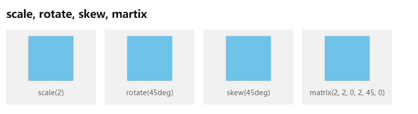
值得一提的是如果有需要,我们可以使用matrix作出非常复杂的矩阵变换,有兴趣的同学可以研究一下:CSS3 Transform Matrix
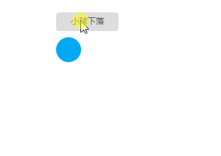
- 用js来动态改变
transform的属性值实现动画的过渡效果:
我们以小球下落的动效来做示例:
html:
<h2>Js操作元素的transform属性值实现小球下落动效</h2>
<button class="boll-btn" id="boll-btn">小球下落</button>
<div class="boll" id="boll"></div>
css:
.boll-btn {
  width: 100px;
  height: 30px;
  line-height: 28px;
  border: none;
  border-radius: 5px;
  color: #555;
  margin-bottom: 10px;
}
.boll {
  width: 40px;
  height: 40px;
  border-radius: 50%;
  background: #03A9F4;
  transform: translateY(0px);
  margin-bottom: 300px;
}
js:
const domBoll = document.getElementById('boll')
document.getElementById('boll-btn').onclick=function() {
  let distance = 0
  let timer = setInterval(() => {

  if(distance >= 300) {
     clearInterval(timer)
     }  domBoll.style.transform = 'translateY('+ distance++ +'px)'
  }, 30)
}
效果图:
如果需要的话,可以使用translate3d,rotate3d等API将元素提升为合成层,开启硬件加速渲染,但开启硬件加速渲染之后,有些时候可能会导致浏览器频繁闪烁或抖动,可以尝试以下办法解决:
-webkit-backface-visibility:hidden;
-webkit-perspective:1000;
2. transition
2.1 定义
语法:
transition: property duration timing-function delay;
用来定义某个css属性或者多个css属性的变化的过渡效果.
属性定义及使用说明:
| 值 | 描述 |
|---|---|
| transition-property | 指定CSS属性的name,transition效果: 大小,位置,扭曲等 |
| transition-duration | 规定完成过渡效果需要花费的时间(以秒或毫秒计)。 默认值是 0,意味着不会有效果。 |
| transition-timing-function | 指定transition效果的转速曲线 |
| transition-delay | 定义transition效果开始的时候 |
transition-property:
属性值:
- none: 没有属性获得过渡效果
- all: 所有属性的变化都获得过渡效果
- property: 特定属性变化获得过渡效果,如: width, height,opacity等.
transition-timing-function:
transition-timing-function: linear|ease|ease-in|ease-out|ease-in-out|cubic-bezier(n,n,n,n);
属性值:
- linear: 规定以相同速度开始至结束的过渡效果(等于 cubic-bezier(0,0,1,1));
- ease: 规定慢速开始,然后变快,然后慢速结束的过渡效果(cubic-bezier(0.25,0.1,0.25,1));
- ease-in: 规定以慢速开始的过渡效果(等于 cubic-bezier(0.42,0,1,1));
- ease-out: 规定以慢速结束的过渡效果(等于 cubic-bezier(0,0,0.58,1));
- ease-in-out: 规定以慢速开始和结束的过渡效果(等于 cubic-bezier(0.42,0,0.58,1))
- cubic-bezier(n,n,n,n): 在 cubic-bezier 函数中定义自己的值。可能的值是 0 至 1 之间的数值
2.2 使用场景
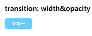
- 实现激活状态的过渡效果(宽度和透明度变化):
html:
<h2>transition: width&opacity</h2>
<p class="transition-p">菜单一</p>
css:
.transition-p {
  width: 100px;
  height: 40px;
  opacity: 0.6;
  border-radius: 10px;
  background: #03A9F4;
  text-align: center;
  line-height: 40px;
  color: #fff;
  transition: all 0.5s ease-in;
}
.transition-p:hover {
  opacity: 1.0;
  width: 120px;
}
效果图:
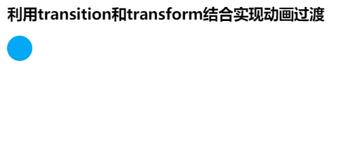
- transition和transform结合实现动画过渡
html:
<h2>利用transition和transform结合实现动画过渡</h2>
<div class="boll1" id="boll1"></div>
css:
.boll1 {
  width: 40px;
  height: 40px;
  border-radius: 50%;
  background: #03A9F4;
  transform: translateY(0px);
  margin-bottom: 300px;
  transition: all cubic-bezier(0.42,0,0.58,1) 2.0s 1.0s;
  cursor: pointer
}
.boll1:hover {
  transform: translateY(200px);
}
效果图:
日常的菜单交互,鼠标移进放大,小球下落等交互都可以使用transition实现,transition一般只有两个状态,始态和终态.一般只有两个状态的单次动画交互使用transition.
3. animation
3.1 定义
animation动画的定义,先通过@(-webkit-)keyframes定义动画名称及动画的行为,然后再通过animation的相关属性定义动画的执行效果.
语法:
animation: name duration timing-function delay iteration-count direction fill-mode play-state;
用来定义多个中间态的一系列的动画过渡效果.
属性定义及使用说明:
| 值 | 描述 |
|---|---|
| animation-name | 指定要绑定到选择器的关键帧的名称 |
| animation-duration | 规动画指定需要多少秒或毫秒完成 |
| animation-timing-function | 设置动画将如何完成一个周期 |
| animation-delay | 设置动画在启动前的延迟间隔 |
| animation-iteration-count | 定义动画的播放次数 |
| animation-direction | 指定是否应该轮流反向播放动画 |
| animation-fill-mode | 规定当动画不播放时(当动画完成时,或当动画有一个延迟未开始播放时),要应用到元素的样式 |
| animation-play-state | 指定动画是否正在运行或已暂停 |
| initial | 设置属性为其默认值, 阅读关于 initial的介绍 |
| inherit | 从父元素继承属性, 阅读关于 initinherital的介绍 |
其中animation-name指向的是@keyframes定义的动画.
@keyframes:
@keyframes animationname {keyframes-selector {css-styles;}}
| 值 | 描述 |
|---|---|
| animationname | 必需, 定义动画的名称 |
| keyframes-selector | 必需, 定义动画的多个中间态 合法值: 0-100% from(和0%相同) to(和100%相同) |
| css-styles | 必需的, 一个或多个合法的CSS样式属性 |
3.2 使用场景
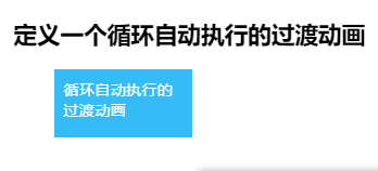
- 定义一个循环自动执行的过渡动画(还记得春晚的小彩旗吗?)
html:
<h2>定义一个循环自动执行的过渡动画</h2>
<div class="animation-container" >
  <div class="animation-infinite">
    循环自动执行的过渡动画
  </div>
</div>
css:
.animation-container {
  position: relative;
  padding-bottom: 50px;
}
.animation-infinite {
  position: absolute;
  left: 0;
  top: 0;
  width: 100px;
  height: 50px;
  padding: 10px;
  background: #03A9F4;
  color: #fff;
  animation: move-to-right 2.0s infinite;
}
/* 定义右移动画 */
@keyframes move-to-right {
  0% {
    opacity: 1.0;
    width: 100px;
    left: 0;
  }
  25% {
    opacity: 0.4;
    width: 120px;
    left: 40px;
  }
  50% {
    opacity: 0.6;
    width: 150px;
    left: 80px;
  }
  75% {
    opacity: 0.8;
    width: 120px;
    left: 40px;
  }
  100% {
    opacity: 1;
    width: 100px;
    left: 0;
  }
}
效果图:
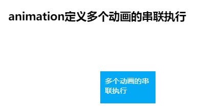
- 定义多个动画的串联执行
html:
<h2>animation定义多个动画的串联执行</h2>
<div class="animation-container" >
  <div class="animation-infinite1">
    多个动画的串联执行
  </div>
</div>
css:
.animation-container {
  position: relative;
  padding-bottom: 150px;
}
.animation-infinite1 {
  position: absolute;
  left: 0;
  top: 0;
  width: 100px;
  height: 50px;
  padding: 10px;
  background: #03A9F4;
  color: #fff;
  animation: to-right 2.0s ease-in,to-bottom 1.0s ease-in 2.0s,to-left 2.0s ease-in 3.0s,to-top 2.0s ease-in 5.0s;

}
@keyframes to-right {
  0% {
    top: 0;
    left: 0;
  }
  100% {
    top: 0;
    left: 200px;
  }
}
@keyframes to-bottom {
  0% {
    top: 0;
    left: 200px;
  }
  100% {
    top: 100px;
    left: 200px;
  }
}
@keyframes to-left {
  0% {
    top: 100px;
    left: 200px;
  }
  100% {
    top: 100px;
    left: 0;
  }
}
@keyframes to-top {
  0% {
    top: 100px;
    left: 0;
  }
  100% {
    top: 0;
    left: 0;
  }
}
效果图:
和transform一样,我们可以将animation动画定义在一个class上,然后通过js操作给某个元素加上对应的类,从而触发动画的执行,我们可以灵活的进行多个动画的切换,控制动画的执行次数等.
总结
transform, transition 和animation的区别:
- transform本身是没有过渡效果的,它只是对元素做大小,旋转,倾斜等各种变换,通过和transition或者animation相结合,可以让这一变换过程具有动画的效果,它通常只有一个到达态,中间态的过渡可以通过和transition或者animation相结合实现,也可以通过js设置定时器来实现.
- transition一般是定义单个或多个css属性发生变化时的过渡动画,比如width,opacity等.当定义的css属性发生变化的时候才会执行过渡动画,animation动画一旦定义,就会在页面加载完成后自动执行.
- transition定义的动画触发一次执行一次,想要再次执行想要再次触发.animation定义的动画可以指定播放次数或者无限循环播放. transition: 需要用户操作,执行次数固定.
- transition定义的动画只有两个状态,开始态和结束态,animation可以定义多个动画中间态,且可以控制多个复杂动画的有序执行.
ps: 对这篇文章中的使用场景部分,我仅写出来在我平时工作中会用到的一些场景,欢迎在评论区留言分享你们的一些动画使用场景,供大家学习~ 示例源代码地址
一起进步,愿我们都能成为更好的自己~
