//html
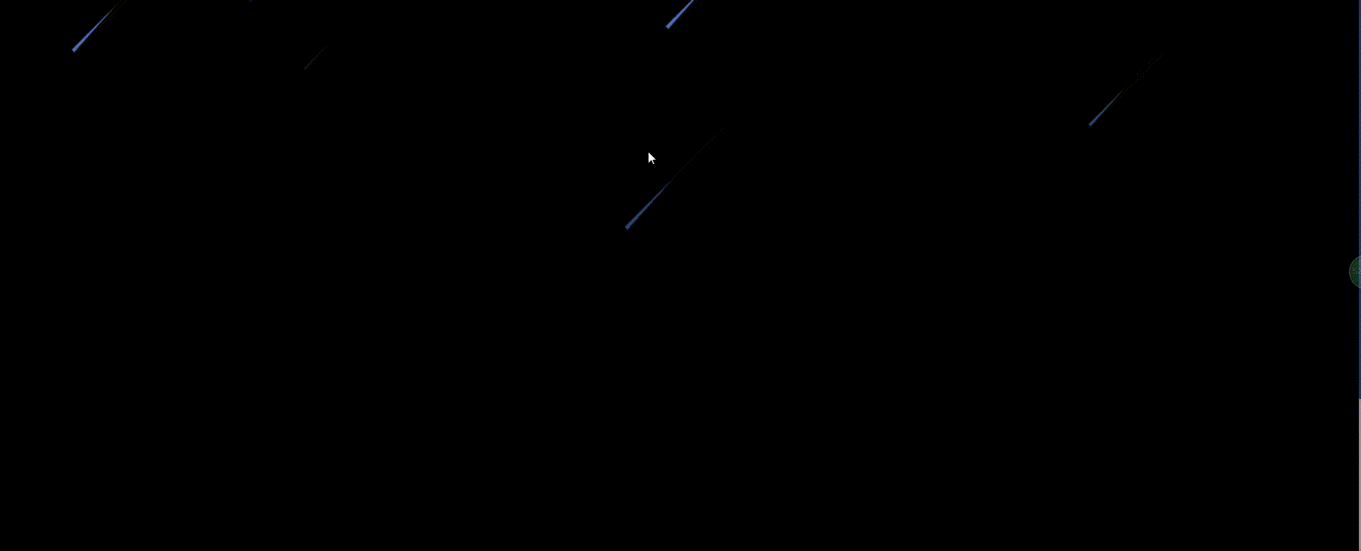
<div class="stars-space">
<div class="star star-a"></div>
<div class="star star-b"></div>
<div class="star star-c"></div>
<div class="star star-d"></div>
<div class="star star-e"></div>
<div class="star star-f"></div>
<div class="star star-g"></div>
<div class="star star-h"></div>
</div>
//css
.stars-space {
position: absolute;
left: 0;
bottom: 0;
width: 100%;
height: 100%;
z-index: 0;
}
.star {
display: block;
width: 1px;
background: transparent;
position: relative;
opacity: 0;
/*过渡动画*/
animation: star-ani 2s linear infinite;
-webkit-animation: star-ani 2s linear infinite;
-moz-animation: star-ani 2s linear infinite;
}
.star:after {
content: '';
display: block;
border-style: solid;
border-width: 0 90px 5px 90px;
border-color: transparent transparent transparent rgba(101, 143, 250, .8);
box-shadow: 0 0 1px 0 rgba(255, 255, 255, .1);
/*变形*/
transform: rotate(-45deg) translate3d(1px, 3px, 0);
-webkit-transform: rotate(-45deg) translate3d(1px, 3px, 0);
-moz-transform: rotate(-45deg) translate3d(1px, 3px, 0);
transform-origin: 0 100%;
-webkit-transform-origin: 0 100%;
-moz-transform-origin: 0 100%;
}
.star-a {
top: -30px;
left: 20%;
}
.star-b {
top: 60px;
left: 24%;
animation-delay: 4s;
-webkit-animation-delay: 4s;
-moz-animation-delay: 4s;
}
.star-c {
top: 40px;
left: 60%;
animation-duration: 3s;
-webkit-animation-duration: 3s;
-moz-animation-duration: 3s;
animation-delay: 15s;
-webkit-animation-delay: 1s;
-moz-animation-delay: 5s;
}
.star-d {
top: -30px;
left: 108%;
animation-delay: 2s;
-webkit-animation-delay: 2s;
-moz-animation-delay: 2s;
}
.star-e {
top: 40px;
left: 86%;
animation-duration: 4s;
-webkit-animation-duration: 4s;
-moz-animation-duration: 4s;
animation-delay: 1s;
-webkit-animation-delay: 1s;
-moz-animation-delay: 1s;
}
.star-f {
top: -200px;
left: 60%;
animation-duration: 4s;
-webkit-animation-duration: 4s;
-moz-animation-duration: 4s;
}
.star-g {
top: -150px;
left: 110%;
animation-duration: 3s;
-webkit-animation-duration: 3s;
-moz-animation-duration: 3s;
}
.star-h {
top: -150px;
left: 15%;
animation-duration: 2.5s;
-webkit-animation-duration: 2.5s;
-moz-animation-duration: 2.5s;
}
@keyframes star-ani {
0% {
opacity: 0;
transform: scale(0.5) translate3d(0, 0, 0);
-webkit-transform: scale(0.5) translate3d(0, 0, 0);
-moz-transform: scale(0.5) translate3d(0, 0, 0);
}
50% {
opacity: 1;
transform: translate3d(-200px, 200px, 0);
-webkit-transform: translate3d(-200px, 200px, 0);
-moz-transform: translate3d(-200px, 200px, 0);
}
100% {
opacity: 0;
transform: scale(1.2) translate3d(-300px, 300px, 0);
-webkit-transform: scale(1.2) translate3d(-300px, 300px, 0);
-moz-transform: scale(1.2) translate3d(-300px, 300px, 0);
}
}
@-webkit-keyframes star-ani {
0% {
opacity: 0;
transform: scale(0.5) translate3d(0, 0, 0);
-webkit-transform: scale(0.5) translate3d(0, 0, 0);
-moz-transform: scale(0.5) translate3d(0, 0, 0);
}
50% {
opacity: 1;
transform: translate3d(-200px, 200px, 0);
-webkit-transform: translate3d(-200px, 200px, 0);
-moz-transform: translate3d(-200px, 200px, 0);
}
100% {
opacity: 0;
transform: scale(1.2) translate3d(-300px, 300px, 0);
-webkit-transform: scale(1.2) translate3d(-300px, 300px, 0);
-moz-transform: scale(1.2) translate3d(-300px, 300px, 0);
}
}
@-moz-keyframes star-ani {
0% {
opacity: 0;
transform: scale(0.5) translate3d(0, 0, 0);
-webkit-transform: scale(0.5) translate3d(0, 0, 0);
-moz-transform: scale(0.5) translate3d(0, 0, 0);
}
50% {
opacity: 1;
transform: translate3d(-200px, 200px, 0);
-webkit-transform: translate3d(-200px, 200px, 0);
-moz-transform: translate3d(-200px, 200px, 0);
}
100% {
opacity: 0;
transform: scale(1.2) translate3d(-300px, 300px, 0);
-webkit-transform: scale(1.2) translate3d(-300px, 300px, 0);
-moz-transform: scale(1.2) translate3d(-300px, 300px, 0);
}
}


