一、行布局
1.基础的行布局
<!DOCTYPE html>
<html>
<head>
	<title></title>
	<style type="text/css">
		body{
			margin: 0;
			padding: 0;
			color: #fff;
			text-align: center;
		}
		.container{
			width: 800px;
			height: 1000px;
			background: #4c77f2;
			margin: 0 auto;
		}
	</style>
</head>
<body>
	<div class="container">这是页面内容</div>
</body>
</html>
2、行布局自适应
修改width为百分比:
.container{
	width: 100%;
	height: 1000px;
	background: #4c77f2;
	margin: 0 auto;
}
3、行布局自适应限制最大宽
.container{
	width: 100%;
	max-width:1000px;
	height: 1000px;
	background: #4c77f2;
	margin: 0 auto;
}
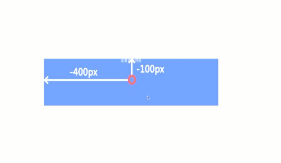
4、行布局垂直水平居中
样例:百度的搜索
<!DOCTYPE html>
<html>
<head>
	<title></title>
	<style type="text/css">
		body{
			margin: 0;
			padding: 0;
			color: #fff;
			text-align: center;
		}
		.container{
			width: 800px;
			height: 200px;
			background: #4c77f2;
			position: absolute;
			top: 50%;
			left: 50%;
			margin-top:-100px;
			margin-left: -400px;
		}
	</style>
</head>
<body>
	<div class="container">这是页面内容</div>
</body>
</html>
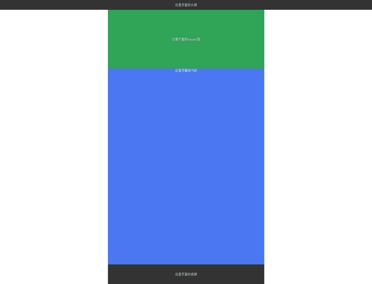
5、经典的行布局
<!DOCTYPE html>
<html>
<head>
	<title></title>
	<style type="text/css">
		body{
			margin: 0;
			padding: 0;
			color: #fff;
			text-align: center;
			font-size: 16px;
		}
		.header{
			width: 800px;
			height: 50px;
			background:#333;
			margin: 0 auto;
			line-height: 50px;
		}
		.banner{
			/*width: 800px;*/
			width: 100%; /*多行布局某部分自适应*/
			height: 300px;
			background:#30a457;
			margin: 0 auto;
			line-height: 300px;
		}
		.container{
			width: 800px;
			height: 1000px;
			background: #4c77f2;
			margin: 0 auto;
		}
		.footer{
			width: 800px;
			height: 100px;
			background: #333;
			margin: 0 auto;
			line-height: 100px;
		}
	</style>
</head>
<body>
	<div class="header">这是页面的头部</div>
	<div class="banner">这是页面的banner图</div>
	<div class="container">这是页面的内容</div>
	<div class="footer">这是页面的底部</div>
</body>
</html>
需求:要求导航栏随着页面滚动固定在顶部:
.header{
	width: 100%;
	height: 50px;
	background:#333;
	margin: 0 auto;
	line-height: 50px;
	position: fixed;/*使其固定在顶端*/
}
.banner{
	width: 800px;
	/*width: 100%; */
	height: 300px;
	background:#30a457;
	margin: 0 auto;
	line-height: 300px;
	padding-top: 50px;/* 防止header覆盖banner*/
}
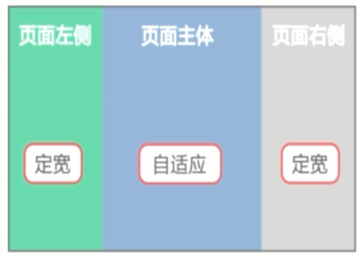
二、多列布局
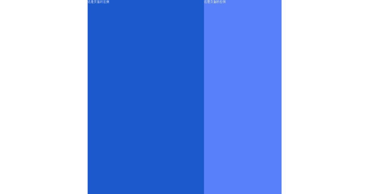
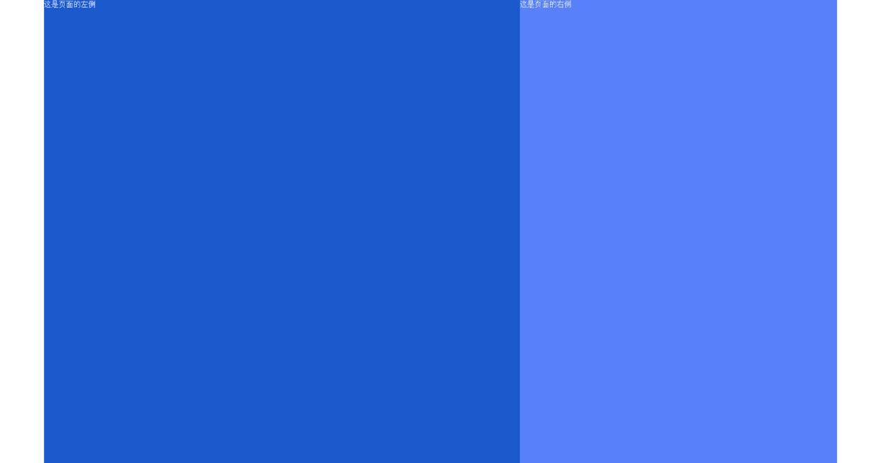
1.两列布局固定
<!DOCTYPE html>
<html>
<head>
	<title>会员列表</title>
	<style type="text/css">
		body{
			margin: 0;
			padding: 0;
			color: #fff;
		}
		.container{
			width: 1000px;
			height: 1000px;
			margin: 0 auto;
		}
		.left{
			width: 600px;
			height: 1000px;
			background: #1a5acd;
			float: left;
		}
		.right{
			width: 400px;
			height: 1000px;
			background: #5880f9;
			float: right;
		}
	</style>
</head>
<body>
	<div class="container">
		<div class="left">这是页面的左侧</div>
		<div class="right">这是页面的右侧</div>
	</div>
</body>
</html>
2.两列布局自适应
.container{
	/*width: 1000px;*/
	width: 90%;
	height: 1000px;
	margin: 0 auto;
}
.left{
	/*width: 600px;*/
	width: 60%;
	height: 1000px;
	background: #1a5acd;
	float: left;
}
.right{
	/*width: 400px;*/
	width: 40%;
	height: 1000px;
	background: #5880f9;
	float: right;
}
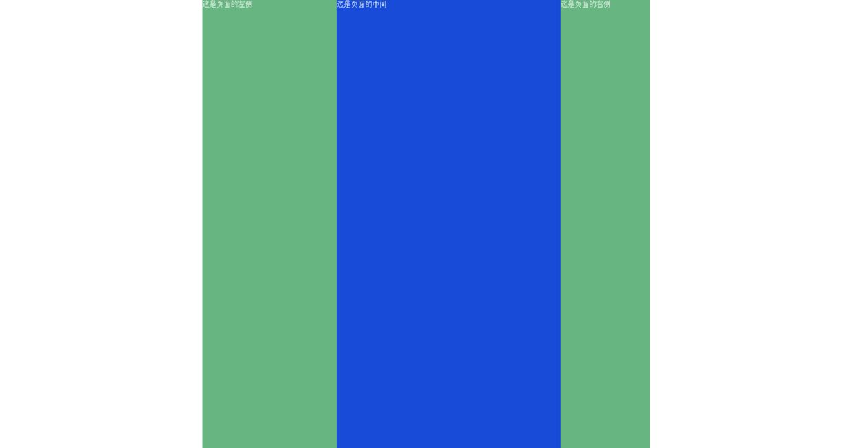
3.三列布局固定
<!DOCTYPE html>
<html>
<head>
	<title>会员列表</title>
	<style type="text/css">
		body{
			margin: 0;
			padding: 0;
			color: #fff;
		}
		.container{
			width: 1000px;
			margin: 0 auto;
		}
		.left{
			width: 300px;
			height: 1000px;
			background: #67b581;
			float: left;
		}
		.right{
			width: 200px;
			height: 1000px;
			background: #67b581;
			float: right;
		}
		.middle{
			width: 500px;
			height: 1000px;
			background: #174bd8;
			float: left;
		}
	</style>
</head>
<body>
	<div class="container">
		<div class="left">这是页面的左侧</div>
		<div class="middle">这是页面的中间</div>
		<div class="right">这是页面的右侧</div>
	</div>
</body>
</html>
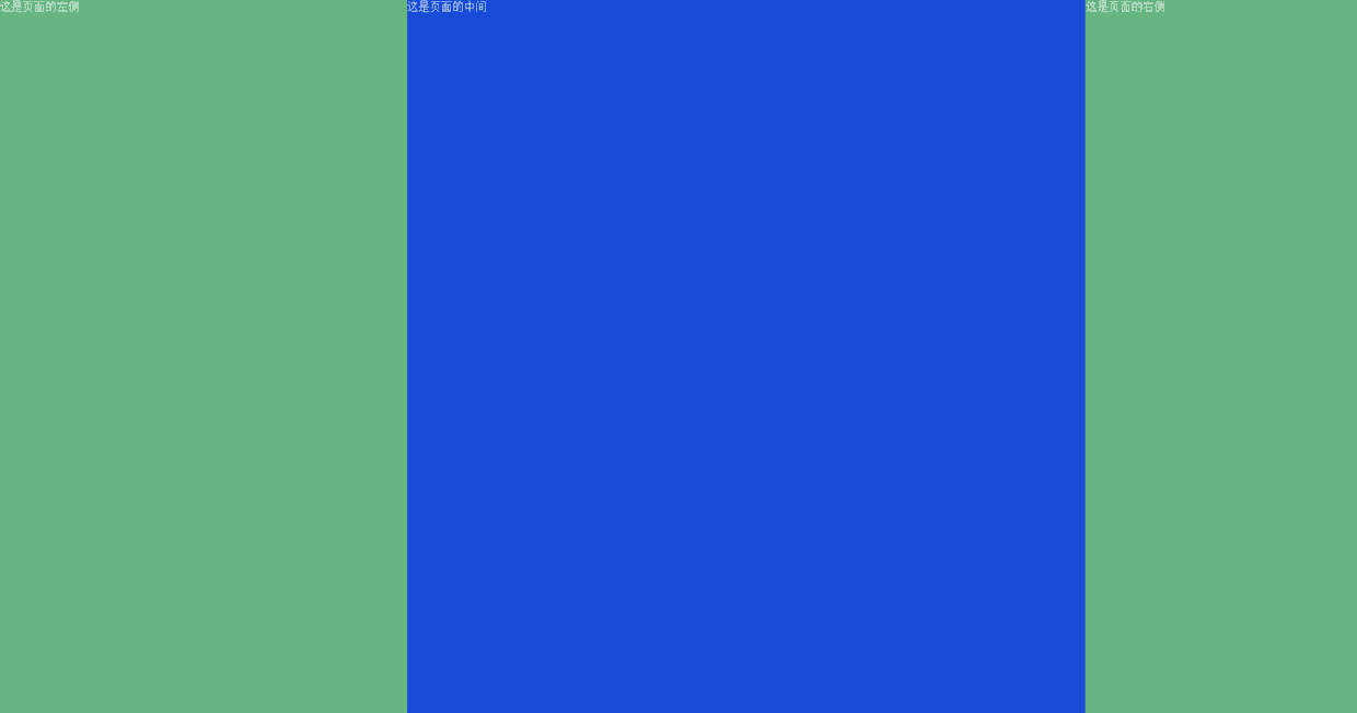
4.三列布局自适应
.container{
	/*width: 1000px;*/
	width: 100%;
	margin: 0 auto;
}
.left{
	/*width: 300px;*/
	width: 30%;
	height: 1000px;
	background: #67b581;
	float: left;
}
.right{
	/*width: 200px;*/
	width: 20%;
	height: 1000px;
	background: #67b581;
	float: right;
}
.middle{
	/*width: 500px;*/
	width: 50%;
	height: 1000px;
	background: #174bd8;
	float: left;
}
三、混合布局
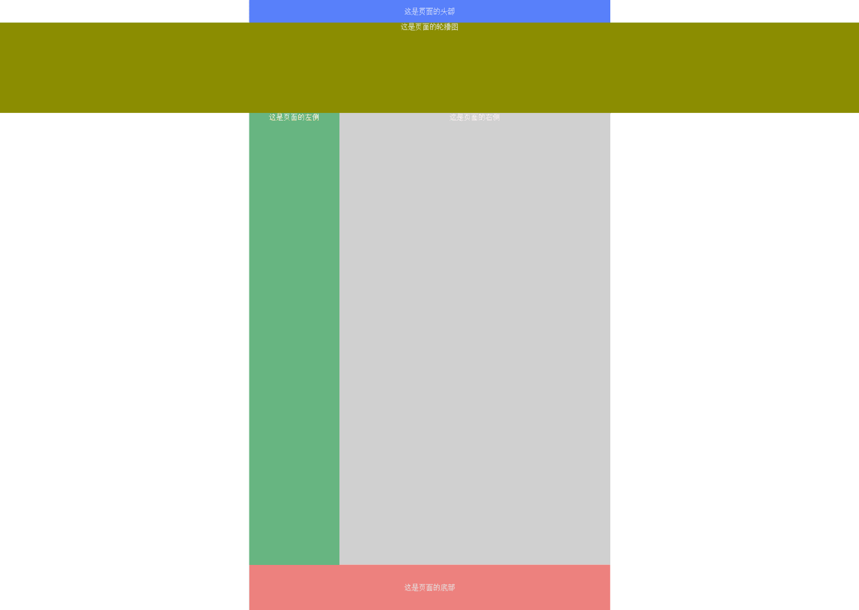
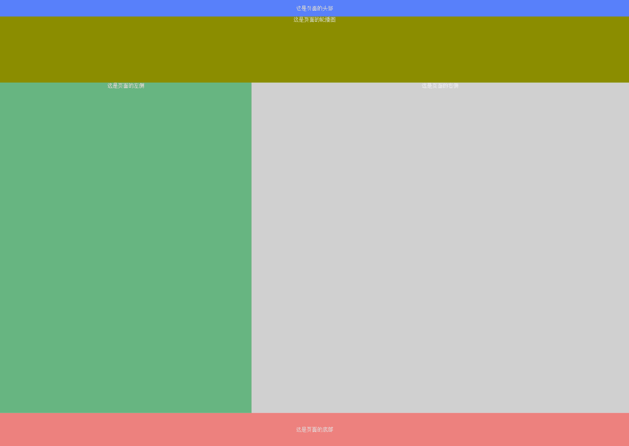
1.混合布局固定
<!DOCTYPE html>
<html>
<head>
	<title>会员列表</title>
	<style type="text/css">
		body{
			margin: 0;
			padding: 0;
			font-size: 16px;
			color: #fff;
			text-align: center;
		}
		.header{
			width: 800px;
			height: 50px;
			background: #5880f9;
			margin: 0 auto;
			line-height: 50px;
		}
		.container{
			width: 800px;
			margin: 0 auto;
			height: 1000px;
		}
		.container .left{
			width: 200px;
			height: 1000px;
			background: #67b581;
			float: left;
		}
		.container .right{
			width: 600px;
			height: 1000px;
			background: #d0d0d0;
			float: right;
		}
		.footer{
			width: 800px;
			height: 100px;
			background: #ed817e;
			margin: 0 auto;
			line-height: 100px;
		}
		.banner{
			width: 100%;
			height: 200px;
			background: #8b8d01;
			margin: 0 auto;
		}
	</style>
</head>
<body>
	<div class="header">这是页面的头部</div>
	<div class="banner">这是页面的轮播图</div>
	<div class="container">
		<div class="left">这是页面的左侧</div>
		<div class="right">这是页面的右侧</div>
	</div>
	<div class="footer">这是页面的底部</div>
</body>
</html>
1.混合布局自适应
<style type="text/css">
	body{
		margin: 0;
		padding: 0;
		font-size: 16px;
		color: #fff;
		text-align: center;
	}
	.header{
		/*width: 800px;*/
		width: 100%;
		height: 50px;
		background: #5880f9;
		margin: 0 auto;
		line-height: 50px;
	}
	.container{
		/*width: 800px;*/
		width: 100%;
		margin: 0 auto;
		height: 1000px;
	}
	.container .left{
		/*width: 200px;*/
		width: 40%;
		height: 1000px;
		background: #67b581;
		float: left;
	}
	.container .right{
		/*width: 600px;*/
		width: 60%;
		height: 1000px;
		background: #d0d0d0;
		float: right;
	}
	.footer{
		/*width: 800px;*/
		width: 100%;
		height: 100px;
		background: #ed817e;
		margin: 0 auto;
		line-height: 100px;
	}
	.banner{
		width: 100%;
		height: 200px;
		background: #8b8d01;
		margin: 0 auto;
	}
</style>
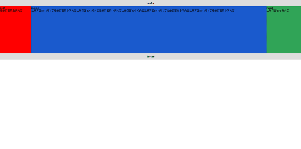
四、圣杯布局
#####布局要求:
- 三列布局,中间宽度自适应,两边定宽(比较适合网站的管理后台)
- 中间栏要在浏览器中优先展示渲染
- 允许任意列的高度最高
- 用最简单的CSS、最少的HACK语句
<!DOCTYPE html>
<html>
<head>
	<title></title>
	<style type="text/css">
		*{
			margin: 0;
			padding: 0;
		}
		body{
			min-width: 700px;
		}
		.header,.footer{
			float: left;
			width: 100%;
			background: #ddd;
			height: 40px;
			line-height: 40px;
			text-align: center;
		}
		.container{
			padding: 0 220px 0 200px;
		}
		.left, .middle, .right{
			position: relative;
			float: left;
			min-height: 300px;
		}
		.middle{
			width: 100%;
			background: #1a5acd;
		}
		.left{
			width: 200px;
			background: #f00;
			margin-left: -100%;
			left: -200px;
		}
		.right{
			width: 220px;
			background: #30a457;
			margin-left: -220px;
			right: -220px;
		}
	</style>
</head>
<body>
	<div class="header">
		<h4>header</h4>
	</div>
	<div class="container">
		<div class="middle">
			<h4>middle</h4>
			<p>这是页面的中间内容这是页面的中间内容这是页面的中间内容这是页面的中间内容这是页面的中间内容这是页面的中间内容这是页面的中间内容这是页面的中间内容这是页面的中间内容</p>
		</div>
		<div class="left">
			<h4>left</h4>
			<p>这是页面的左侧内容</p>
		</div>
		<div class="right">
			<h4>right</h4>
			<p>这是页面的右侧内容</p>
		</div>
	</div>
	<div class="footer">
		<h4>footer</h4>
	</div>
</body>
</html>
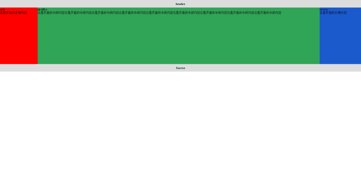
五、双飞翼布局
去掉相对布局,只需要浮动和负边距
<!DOCTYPE html>
<html>
<head>
	<title></title>
	<style type="text/css">
		*{
			margin: 0;
			padding: 0;
		}
		body{
			min-width: 700px;
		}
		.header, .footer{
			width: 100%;
			float: left;
			height: 40px;
			background: #ddd;
			line-height: 40px;
			text-align: center;
		}
		.sub, .main, .extra{
			float: left;
			min-height: 300px;
		}
		.main{
			width: 100%;
			min-height: 300px;
		}
		.main-inner{
			margin-left: 200px;
			margin-right: 220px;
			background: #30a457;
			min-height: 300px;
		}
		.sub{
			width: 200px;
			background: #f00;
			margin-left: -100%;
		}
		.extra{
			width: 220px;
			background: #1a5acd;
			margin-left: -220px;
		}
	</style>
</head>
<body>
	<div class="header">
		<h4>header</h4>
	</div>
	<div class="main">
		<div class="main-inner">
			<h4>middle</h4>
			<p>这是页面的中间内容这是页面的中间内容这是页面的中间内容这是页面的中间内容这是页面的中间内容这是页面的中间内容这是页面的中间内容这是页面的中间内容这是页面的中间内容</p>
		</div>
	</div>
	<div class="sub">
		<h4>sub</h4>
		<p>这是页面的左侧内容</p>
	</div>
	<div class="extra">
		<h4>extra</h4>
		<p>这是页面的右侧内容</p>
	</div>
	<div class="footer">
		<h4>footer</h4>
	</div>
</body>
</html>