

项目中常用 CSS 代码复用。将其封装成 mixin. (收藏)
1、文本溢出显示 ... 的样式.
- 固定行数(支持多行)
@mixin ellipsis($rowCount: 1) {
  @if $rowCount <=1 {
    overflow: hidden;
    text-overflow: ellipsis;
    white-space: nowrap;
  } @else {
    min-width: 0;
    overflow: hidden;
    text-overflow: ellipsis;
    display: -webkit-box;
    -webkit-line-clamp: $rowCount;
    -webkit-box-orient: vertical;
  }
}
- 行数不固定 (对最后一行进行缩略)
/**
* 行数不确定的情况
* 1.{max-height} : 文本所在区域的最大高度
* 2.{line-height} : 文本的行高。
*/
@mixin mls-ellipsis($maxHeight: 200px, $lineHeight: 22px) {
  overflow: hidden;
  position: relative;
  max-height: $maxHeight;
  line-height: $lineHeight;
  &::after {
    position: absolute;
    right: 0;
    bottom: 1px;
    padding-left: 25px;
    background: linear-gradient(to right, transparent, #fff 50%);
    content: "...";
  }
}
2、移动端 1px
移动端由于像素密度比的问题, 实际的1px边框看起来比较粗, 如果想要更"细"可以使用下面的代码. 不同像素密度比的设备都可以兼容(pc/手机), 还支持任意数量圆角.
/**
* 真.1px边框
* {List}: 多个方向边框, 默认值为bottom, 你可以根据需要传入(top, left, bottom, right) 4个方向;
* {Color} 边框的颜色, 默认#ccc;
* {List} 4个圆角半径, 默认0;
* {String} 一个高级设置, 一般都不需要改动, 由于细边框的实现使用了css的伪类, 所以为了规避可能出现的样式冲突, 我们可以自己指定使用:after还是:before, 默认after;
*/
@mixin thinBorder(
  $directionMaps: bottom,
  $color: #ccc,
  $radius: (
    0,
    0,
    0,
    0
  ),
  $position: after
) {
  // 是否只有一个方向
  $isOnlyOneDir: string==type-of($directionMaps);

  @if ($isOnlyOneDir) {
    $directionMaps: ($directionMaps);
  }

  @each $directionMap in $directionMaps {
    border-#{$directionMap}: 1px solid $color;
  }

  // 判断圆角是list还是number
  @if (list==type-of($radius)) {
    border-radius: nth($radius, 1)
      nth($radius, 2)
      nth($radius, 3)
      nth($radius, 4);
  } @else {
    border-radius: $radius;
  }

  @media only screen and (-webkit-min-device-pixel-ratio: 2) {
    & {
      position: relative;

      // 删除1像素密度比下的边框
      @each $directionMap in $directionMaps {
        border-#{$directionMap}: none;
      }
    }

    &:#{$position} {
      content: "";
      position: absolute;
      top: 0;
      left: 0;
      display: block;
      width: 200%;
      height: 200%;
      transform: scale(0.5);
      box-sizing: border-box;
      padding: 1px;
      transform-origin: 0 0;
      pointer-events: none;
      border: 0 solid $color;

      @each $directionMap in $directionMaps {
        border-#{$directionMap}-width: 1px;
      }

      // 判断圆角是list还是number
      @if (list==type-of($radius)) {
        border-radius: nth($radius, 1) *
          2
          nth($radius, 2) *
          2
          nth($radius, 3) *
          2
          nth($radius, 4) *
          2;
      } @else {
        border-radius: $radius * 2;
      }
    }
  }

  @media only screen and (-webkit-min-device-pixel-ratio: 3) {
    &:#{$position} {
      // 判断圆角是list还是number
      @if (list==type-of($radius)) {
        border-radius: nth($radius, 1) *
          3
          nth($radius, 2) *
          3
          nth($radius, 3) *
          3
          nth($radius, 4) *
          3;
      } @else {
        border-radius: $radius * 3;
      }

      width: 300%;
      height: 300%;
      transform: scale(0.3333);
    }
  }
}
3、三角图标
常用来做下拉菜单的方向指示
/**
* 等边三角形
* @param {String} 尺寸
* @param {Color} 颜色
* @param {String} 方向
*/
@mixin triangle($size: 5px, $color: rgba(0, 0, 0, 0.6), $dir: bottom) {
  width: 0;
  height: 0;
  border-style: solid;

  @if (bottom==$dir) {
    border-width: $size $size 0 $size;
    border-color: $color transparent transparent transparent;
  } @else if (top==$dir) {
    border-width: 0 $size $size $size;
    border-color: transparent transparent $color transparent;
  } @else if (right==$dir) {
    border-width: $size 0 $size $size;
    border-color: transparent transparent transparent $color;
  } @else if (left==$dir) {
    border-width: $size $size $size 0;
    border-color: transparent $color transparent transparent;
  }
}
4、loading

可调节大小
@mixin loading-half-circle($width: 1em) {
  display: inline-block;
  height: $width;
  width: $width;
  border-radius: $width;
  border-style: solid;
  border-width: $width/10;
  border-color: transparent currentColor transparent transparent;
  animation: rotate 0.6s linear infinite;
  vertical-align: middle;
}
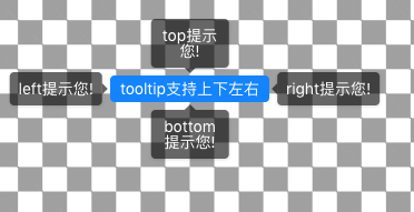
5、棋盘 (不常用,先收藏)
/**
* 棋盘背景
* @param {Color} 背景色
*/
@mixin bgChessboard($color: #aaa) {
  background-image: linear-gradient(
      45deg,
      $color 25%,
      transparent 25%,
      transparent 75%,
      $color 75%,
      $color
    ),
    linear-gradient(
      45deg,
      $color 26%,
      transparent 26%,
      transparent 74%,
      $color 74%,
      $color
    );
  background-size: 10vw 10vw;
  background-position: 0 0, 5vw 5vw;
}
