

定义
::before 创建一个伪元素,其将成为匹配选中的元素的第一个子元素。常通过 content 属性来为一个元素添加修饰性的内容。::after用来创建一个伪元素,作为已选中元素的最后一个子元素。通常会配合content属性来为该元素添加装饰内容。默认地,这两个个伪元素是行内元素,不过可以使用属性 display 改变这一点。其实这个前后也只是个概念而已,灵活运用这两个“帮手”,可以简化很多实现,以及很多有趣的实现。
特性
- 不占用DOM节点,简化DOM节点数,自然js也无法操作。
- 用在块级元素以及大部分的行级元素。但是比如img等替换元素元素,就得看怎么用了,比如图片资源加载失败也是能使用的。
- 伪元素被点击的时候触发的是主元素的 click 事件。
- 不利于调试,也不利于SEO。
使用
CSS3使用双冒号::和伪类的单冒号区:分开来。浏览器也接受由CSS 2 引入的 :before 写法。 ::before和::after需要使用content属性指定要插入的内容。content必须有值(空值也行)。 content插入的内容默认是 inline 元素,可以通过display:block改变
content的值有以下几种情况:
- 空值
- 字符串:作为伪元素的内容添加到主元素中
- attr(attr_name) : 取得主元素的属性值
- url()或者uri(): 引用外部资源
- counter(): 实现序号功能
常见使用场景
- 清除浮动
<div class="clear-fix">
   <div> </div>
</div>
<style>
    clear-fix::after {
        clear: both;
        content: "";
        display: block;
        height: 0;
        overflow: hidden
    }
</style>
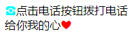
- 利用伪类实现简单图标
<span class="phone">点击电话按钮拨打电话</span>
<span class="heart">给你我的心</span>
<style>
   .phone::before {
       content: "\260E";
       color: aqua
   }
   .heart::after {
	  content: "\260E";
      color: red
   }
</style>
- 扩大可点区域
button {
 position: relative;
 /* *** */
}
button::before {
 content: '';
 position: absolute;
 top: -10px; right: -10px;
 bottom: -10px; left: -10px;
}
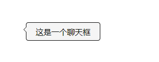
- 轻松实现聊天框
<style>
    .chart-div{
        position: relative;
        width:150px;
        height: 36px;
        border:1px solid black;
        border-radius:5px;
        background: rgba(245,245,245,1)
    }
    .chart-div:before,.chart-div:after{
        content: "";
        display: block;
        position: absolute;
        top:8px;
        width: 0;
        height: 0;
        border:6px solid transparent;
    }
    .chart-div:before{
        left:-11px;
        border-right-color: #f5f5f5;
        z-index:1
    }
    .chart-div:after{
        left:-12px;
        border-right-color: #000;
        z-index: 0
    }
  </style>
  <div class="chart-div">这是一个聊天框</div>
如图
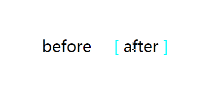
6.元素 hover 特效
<span>before</span>
<span>after</span>
<style>
	span {
            margin: 30px;
            position: relative;
            display: inline-block;
            color: #000;
            font-size: 32px;
        }
        span:hover::before,
        span:hover::after {
            position: absolute;
        }
        span:hover::before {
            content: "\5B";
            left: -20px;
            color: aqua;
        }
        span:hover::after {
            content: "\5D";
            right: -20px;
            color: aqua;
        }
</style>
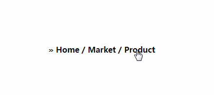
 <div>
    <a href="#">Home</a>
    <a href="#">Market</a>
    <a href="#">Product</a>
 </div>
 <style>
 	a {
        text-decoration: none;
        font-weight: bold;
        color: #000;
    }
    a:after {
        content: " /";
    }
    a:first-of-type::before {
        content: " » ";
    }
    a:last-of-type:after {
        content: "";
    }
 </style>
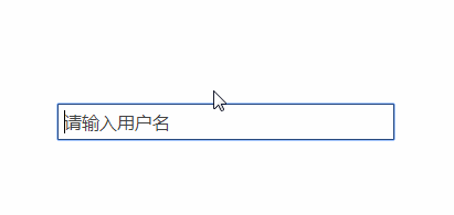
<div class="test" placeholder="请输入用户名" contenteditable="true"></div>
<style>
.test {
    border: 1px solid #000;
    padding: 5px;
}
.test:empty::before {
    content: attr(placeholder);
    color: #444;
}
</style>
