所用Css3知识点:
- linear-gradient( red , black ) 渐变色
- animation动画
- transform变换
- flex布局
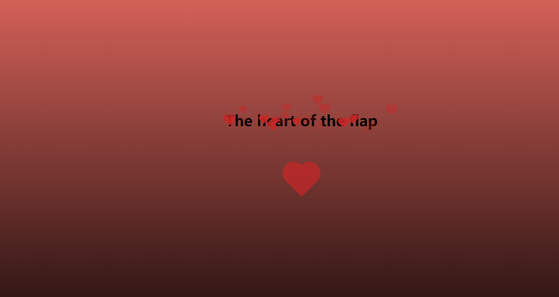
静态效果展示
图一:
图二:

代码展示
html:
<div class="box">
    <div class="title">
        <h2>The heart of the flap</h2>
    </div>
    <div class="heart"></div>
</div>
css:
* {
    margin: 0;
    padding: 0;

}

html,
body {
    height: 100%;
    width: 100%;
    background: linear-gradient(rgb(250, 114, 104), black);
    display: flex;
    justify-content: center;
    align-items: center;
}

.box {
    display: flex;
    justify-content: center;
    align-items: center;
    flex-direction: column;
}

.title {
    position: relative;
    height: 50px;

}

.heart {
    width: 50px;
    height: 50px;
    background: rgb(201, 38, 38);
    position: relative;
    transform: rotate(45deg);
    margin-top: 40px;
    margin-bottom: 20px;
    animation: heartMove 1.5s infinite alternate linear;
}

.item::before,
.item::after,
.heart::before,
.heart::after {
    content: "";
    display: block;
    width: 100%;
    height: 100%;
    background: rgb(201, 38, 38);
    border-radius: 50%;
    position: absolute;
}

.item::before,
    .heart::before {
    transform: translateX(-50%);
}

.item::after,
.heart::after {
    transform: translateY(-50%);
}
js:
    var title = document.querySelector('.title')
    function init() {
        var width = title.offsetWidth
        var count = (width / 50) * 5
        for (var i = 0; i < count; i++) {
            var ele = document.createElement('div')
            ele.classList.add('item')
            var size = parseInt(random(6, 12))
            ele.style.width = size + 'px'
            ele.style.height = size + 'px'
            ele.style.left = random(0, 95) + '%'
            ele.style.top = random(20, 60) + '%'
            // 设置每个小心的随机等待时间
            ele.style.animationDelay = random(0, 4) + 's'
            title.appendChild(ele)
        }

    }

    function random(min, max) {
        return Math.floor(Math.random() * (max - min) + min)
    }
    init()


