

1.瞎叨叨
也不知道写点什么,本来想写写Flutter的集成测试。因为前一阵子给flutter_deer写了一套,不过感觉也没啥内容,写不了几句话就放弃了。(其实本篇内容也不多。。。)
那就写写最近在做的事情。没错,就是文章标题提到的适配深色模式(DarkMode),也可以说是实现夜间模式的功能。相信许多iOS的同学最近都比较关注,毕竟iOS 13上个月推送更新了。
说适配的原因是因为在iOS 13 和 Android 10系统上它都属于新特性。适配的目的是为了达到应用的主题随着系统主题模式的切换而变化,给用户更好的一致性体验。与它类似的就是系统语言的设置,当系统设置某种语言时,应用内的文字也相应变化。
好在Flutter也提供了适配的入口,使得我们可以一次适配两个平台。我手上的小米mix2s虽然是Android 9 的,没想到也能适配。
2.准备工作
下面我就说说我在适配flutter_deer中的经验,Flutter版本1.9.1。
首先是规范问题,标题、副标题、分割线、各种背景等颜色,以及深色模式下相对应的颜色一定要先规范起来。否则你自己不仅被这些颜色搞得眼冒金星,同时应用也没有一个统一的风格。
3.适配开始
1.全局调整
Flutter 在 MaterialApp中提供了theme 与 darkTheme两个入口让我们设置两种模式下的颜色及文字样式。接收的ThemeData中近乎涵盖了所有Material Widget中所使用的颜色及主题。(Cupertino系列组件官方还在适配中,所以Flutter版本1.9.1暂不支持。)
通过配置theme 与 darkTheme可以让我们省去很多的判断代码,比如我的分割线在不同模式下是两种不同颜色,我不可能每使用一次,就在使用的地方去判断一次。通过配置全局dividerTheme,我们就可以直接使用Divider()或者BorderSide。
	ThemeData(
      dividerTheme: DividerThemeData(
        color: isDarkMode ? Colours.dark_line : Colours.line,
        space: 0.6,
        thickness: 0.6
      )
    );
同样我们的页面背景色、文字样式都可以这样配置。以下就是deer中最终整理的配置。
	ThemeData(
      errorColor: isDarkMode ? Colours.dark_red : Colours.red,
      brightness: isDarkMode ? Brightness.dark : Brightness.light,
      primaryColor: isDarkMode ? Colours.dark_app_main : Colours.app_main,
      accentColor: isDarkMode ? Colours.dark_app_main : Colours.app_main,
      // Tab指示器颜色
      indicatorColor: isDarkMode ? Colours.dark_app_main : Colours.app_main,
      // 页面背景色
      scaffoldBackgroundColor: isDarkMode ? Colours.dark_bg_color : Colors.white,
      // 主要用于Material背景色
      canvasColor: isDarkMode ? Colours.dark_material_bg : Colors.white,
      // 文字选择色(输入框复制粘贴菜单)
      textSelectionColor: Colours.app_main.withAlpha(70),
      textSelectionHandleColor: Colours.app_main,
      textTheme: TextTheme(
        // TextField输入文字颜色
        subhead: isDarkMode ? TextStyles.textDark : TextStyles.text,
        // Text默认文字样式
        body1: isDarkMode ? TextStyles.textDark : TextStyles.text,
        // 这里用于小文字样式
        subtitle: isDarkMode ? TextStyles.textDarkGray12 : TextStyles.textGray12,
      ),
      inputDecorationTheme: InputDecorationTheme(
        hintStyle: isDarkMode ? TextStyles.textHint14 : TextStyles.textDarkGray14,
      ),
      appBarTheme: AppBarTheme(
        elevation: 0.0,
        color: isDarkMode ? Colours.dark_bg_color : Colors.white,
        brightness: isDarkMode ? Brightness.dark : Brightness.light,
      ),
      dividerTheme: DividerThemeData(
        color: isDarkMode ? Colours.dark_line : Colours.line,
        space: 0.6,
        thickness: 0.6
      )
    );
使用:
	MaterialApp (
      title: 'Flutter Deer',
      theme: getTheme(),
      darkTheme: getTheme(isDarkMode: true),
      home: TestPage()
    );
当然有些Widget没有使用到,所以也就没有去适配。以上这些color、theme具体的使用地方需要自己去翻看源码及注释才能知道,所以这是一个比较费力的过程。
其实这里你也可以利用某些“坑位”,比如应用内的另外一种功能文字在字号、颜色上都与主文字不一样,使用的地方还很多,每次使用再判断也很麻烦,这样就可以设置到未使用的属性上,比如上面代码中的subtitle。这样使用时就可以通过调用Theme.of(context).textTheme.subtitle来实现。
Text(
  "文字",
  style: Theme.of(context).textTheme.subtitle
)
需要注意的是:毕竟是全局配置,尽量保持通用,不要影响其他widget也是要考虑的地方。
这部分配置完成后,你需要的是"去同存异"。
-
比如你指定的文字样式与全局配置相同时,就需要删除它。
-
如果文字颜色相同,但是字号不同。那就删除颜色配置信息,保留字号设置:
Text(
  "仅保留不同信息",
  style: const TextStyle(
    fontSize: 12.0,
  )
)
因为Text的源码中就是通过merge方法来合并全局配置与局部配置。merge中其实就是调用copyWith来实现的。所以也可以这样写:
Text(
  "仅保留不同信息",
  style: Theme.of(context).textTheme.body1.copyWith(fontSize: 12.0)
)
- 颜色不同。因为深色模式主要就是颜色变化,所以可以考虑上面的“subtitle”方案。如果仅有几处,可以封装一些方法统一判断处理。
2.局部调整
在经过全局的配置后,大多数适配问题得到了解决。但可能还有一些细节要调整,比如图标、个别的文字颜色、背景色。这时需要的就是如何判断深色模式:
  bool isDarkMode(BuildContext context){
    return Theme.of(context).brightness == Brightness.dark;
  }
这里的brightness就是上面在全局配置ThemeData中指定的brightness。
Tips:
-
有些纯色的小图标可以直接使用
Image.asset的color来修改。 -
Button的textColor属性最好还是局部处理,因为源码中“非黑即白”,我很痛苦啊!
  /// The foreground color of the [button]'s text and icon.
  ///
  /// If [button] is not [MaterialButton.enabled], the value of
  /// [getDisabledTextColor] is returned. If the button is enabled and
  /// [buttonTextColor] is non-null, then [buttonTextColor] is returned.
  ///
  /// Otherwise the text color depends on the value of [getTextTheme]
  /// and [getBrightness].
  ///
  ///  * [ButtonTextTheme.normal]: [Colors.white] is used if [getBrightness]
  ///    resolves to [Brightness.dark]. [Colors.black87] is used if
  ///    [getBrightness] resolves to [Brightness.light].
  ///  * [ButtonTextTheme.accent]: [colorScheme.secondary].
  ///  * [ButtonTextTheme.primary]: If [getFillColor] is dark then [Colors.white],
  ///    otherwise if [button] is a [FlatButton] or an [OutlineButton] then
  ///    [colorScheme.primary], otherwise [Colors.black].
  Color getTextColor(MaterialButton button) {
    if (!button.enabled)
      return getDisabledTextColor(button);

    if (button.textColor != null)
      return button.textColor;

    switch (getTextTheme(button)) {
      case ButtonTextTheme.normal:
        return getBrightness(button) == Brightness.dark ? Colors.white : Colors.black87;

      case ButtonTextTheme.accent:
        return colorScheme.secondary;

      case ButtonTextTheme.primary: {
        final Color fillColor = getFillColor(button);
        final bool fillIsDark = fillColor != null
          ? ThemeData.estimateBrightnessForColor(fillColor) == Brightness.dark
          : getBrightness(button) == Brightness.dark;
        if (fillIsDark)
          return Colors.white;
        if (button is FlatButton || button is OutlineButton)
          return colorScheme.primary;
        return Colors.black;
      }
    }

    assert(false);
    return null;
  }
2020.01.01 补充:
如果启动页需要适配的话,要考虑应用启动时短暂的白屏现象。(比如启动时白屏,启动页为黑色背景,这样会不和谐)最优的方式是使用Android、iOS原生的方式处理应用启动与启动页的过渡。
这里我介绍一下简易版的方式:
Android端:
android -> app -> src -> main -> res 目录下新建 drawable-night 文件夹,添加launch_background.xml文件。
<?xml version="1.0" encoding="utf-8"?>
<!-- Modify this file to customize your launch splash screen -->
<layer-list xmlns:android="http://schemas.android.com/apk/res/android">
    <item >
        <color android:color="#FF18191A"/> <-- 具体的颜色色值
    </item>
</layer-list>
这样在深色模式下,会使用对应的颜色背景。(当然要保证你的默认样式使用到了此文件)
iOS端:
修改Background 为 System Background Color:
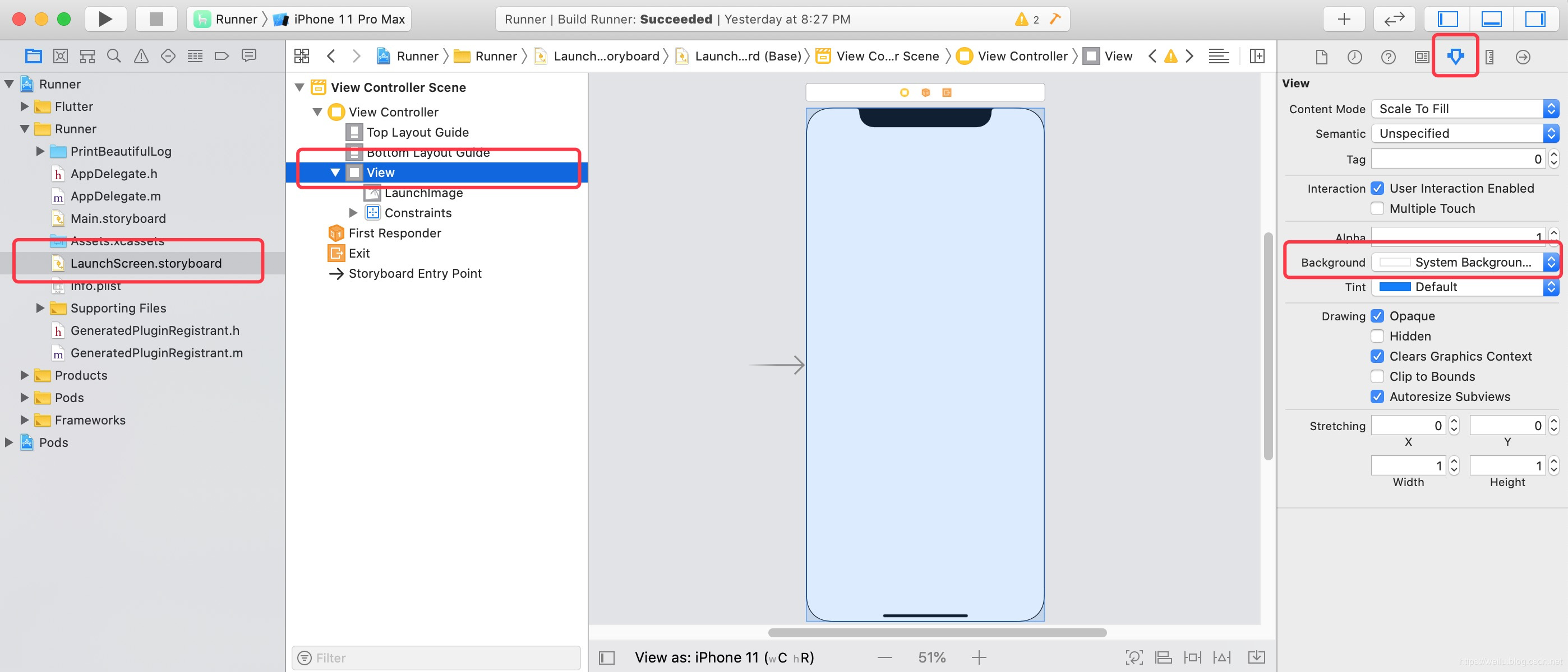
具体的代码示例点击查看
3.功能拓展
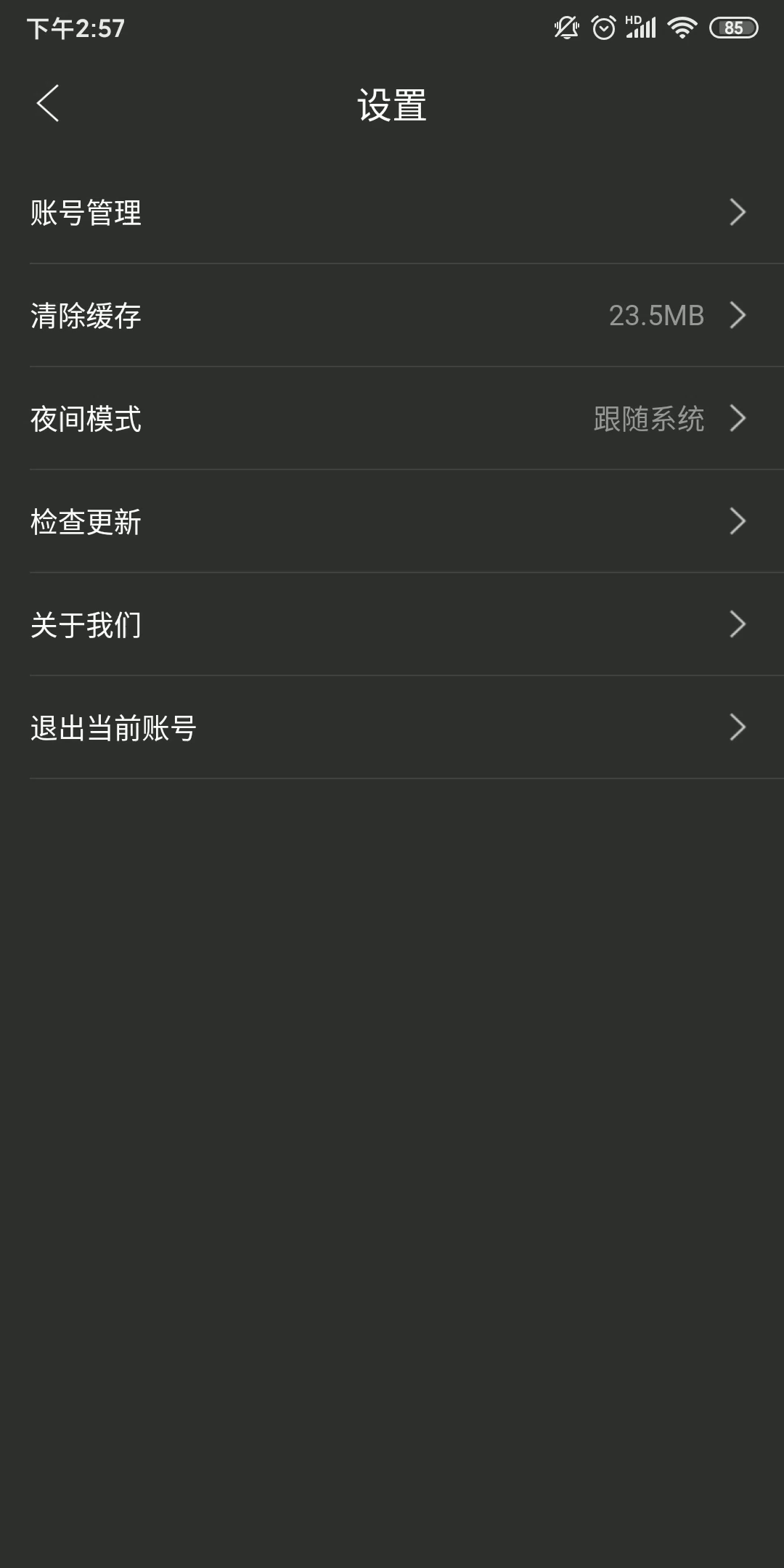
如果你适配好了深色模式,其实可以稍微拓展一下这个功能。我想到了微信中的多语言功能,在多语言这类功能中,默认选项是“跟随系统”,当然你也可以指定某种语言。
按照这个思路我在设置中添加了“夜间模式”的功能,默认也是跟随系统,当然你也可以手动的开启和关闭。
这里暂时有个问题,在iOS手机上开启深色模式,当我应用内关闭深色模式后,状态栏文字无法变为黑色。
问题主要还是Flutter 1.9.1的版本并没有适配iOS 13 Status Bar增的UIStatusBarStyleDarkContent 。
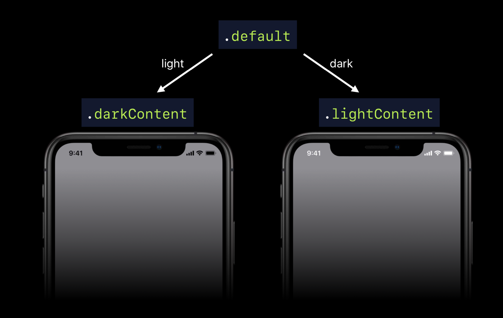
这个问题Flutter的issues中也有人反馈了,期待官方的适配修复吧。
上述这些,基本就是适配深色模式主要内容了。本身没有什么复杂的,主是是个细心活。
说了这么多,最后放几张适配的效果图给大家看看:
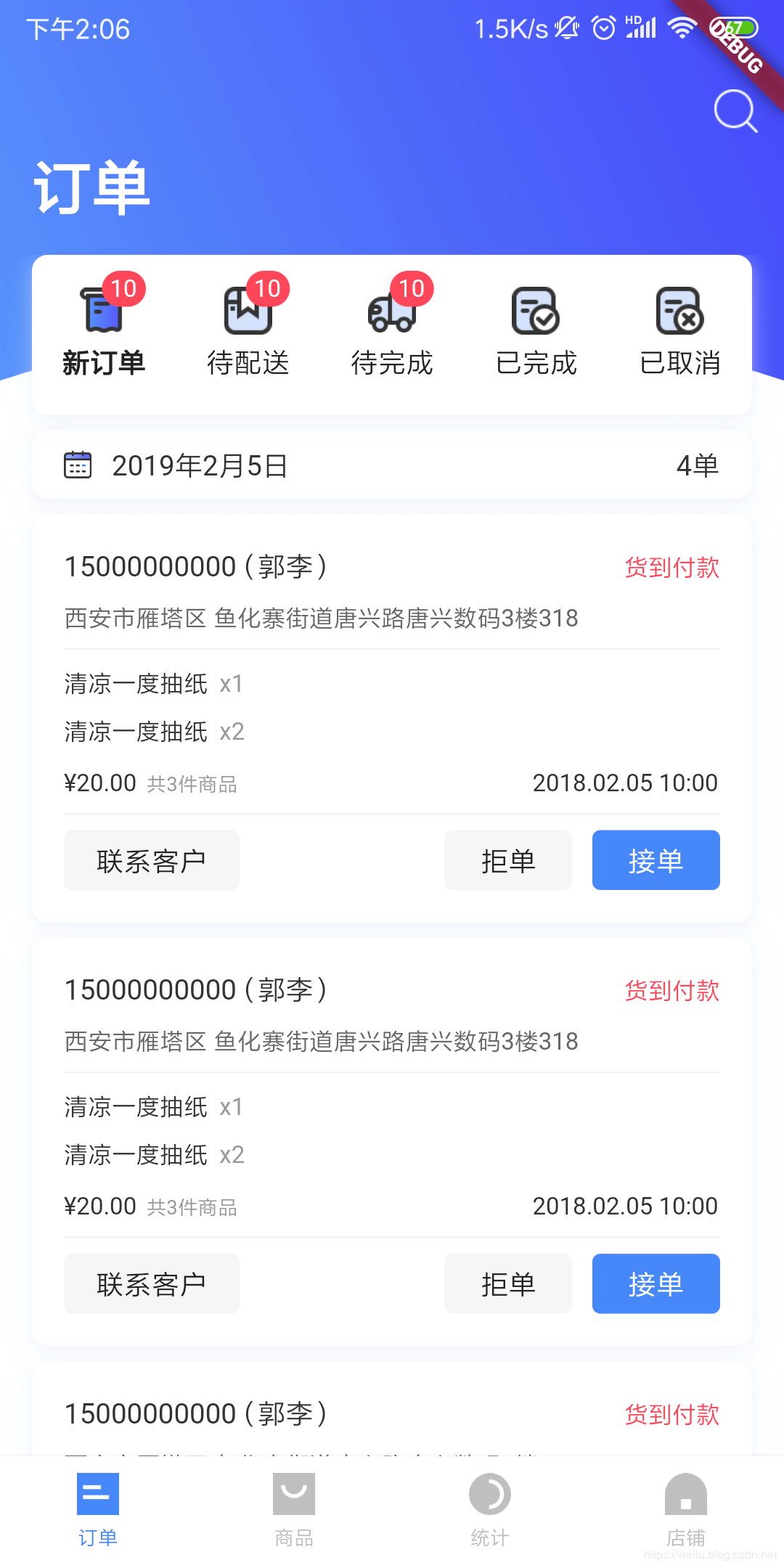 |
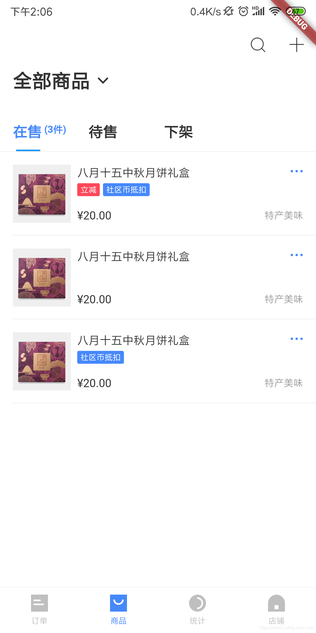 |
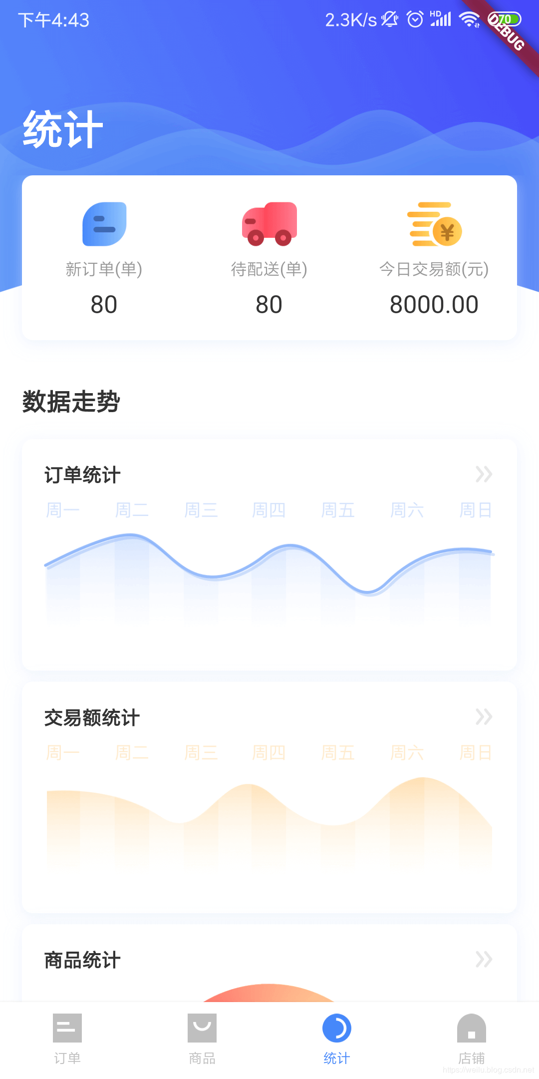 |
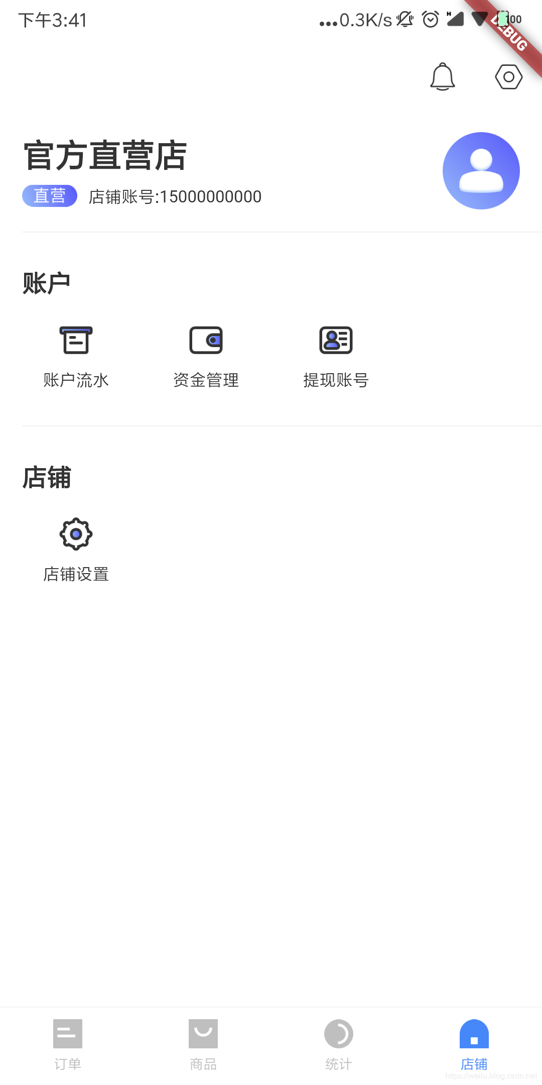 |
|---|---|---|---|
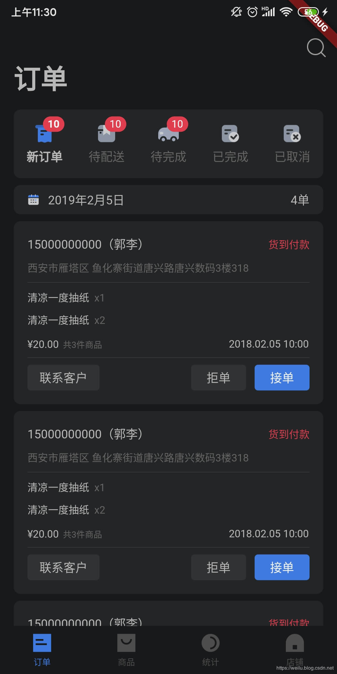 |
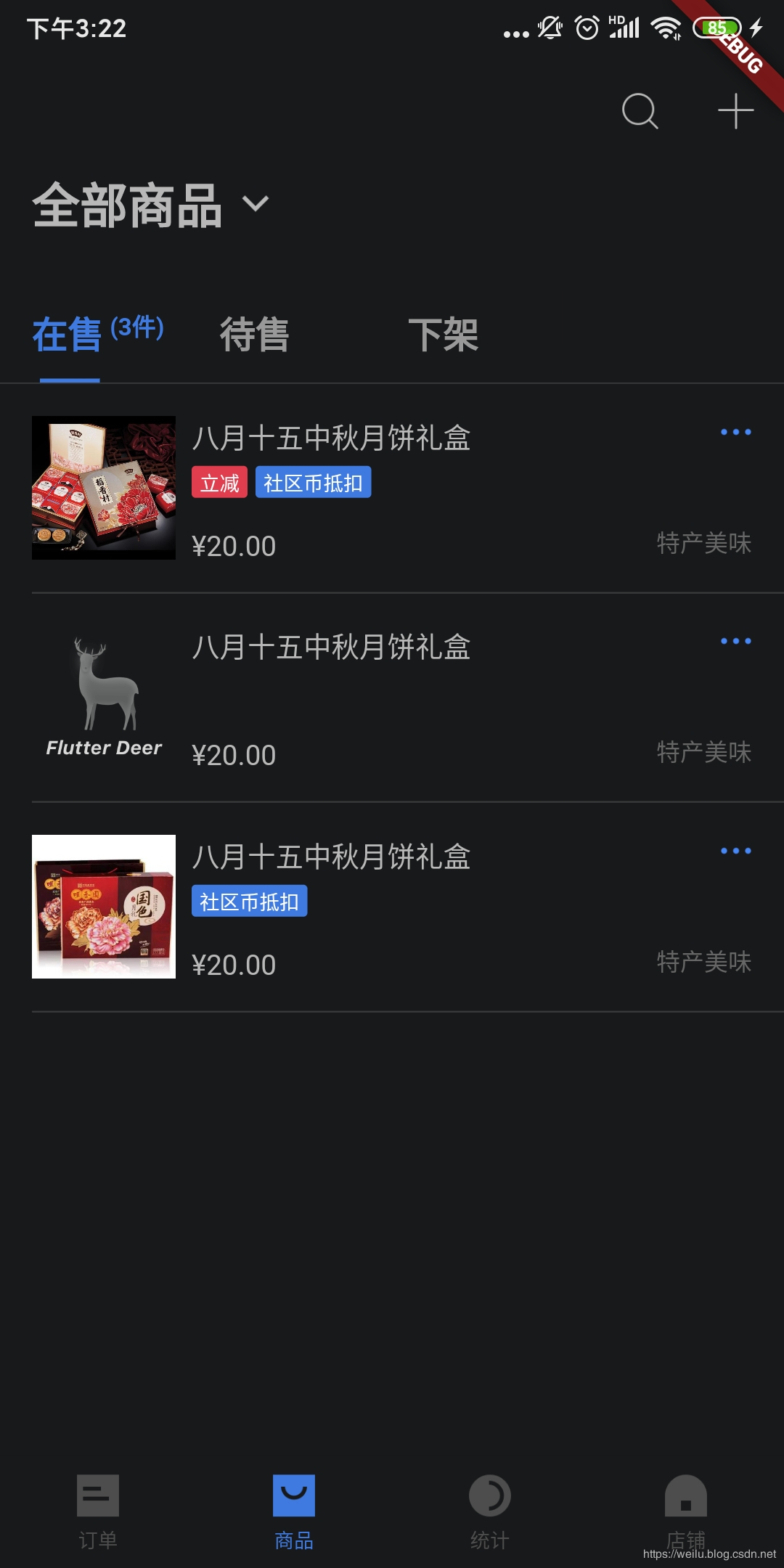 |
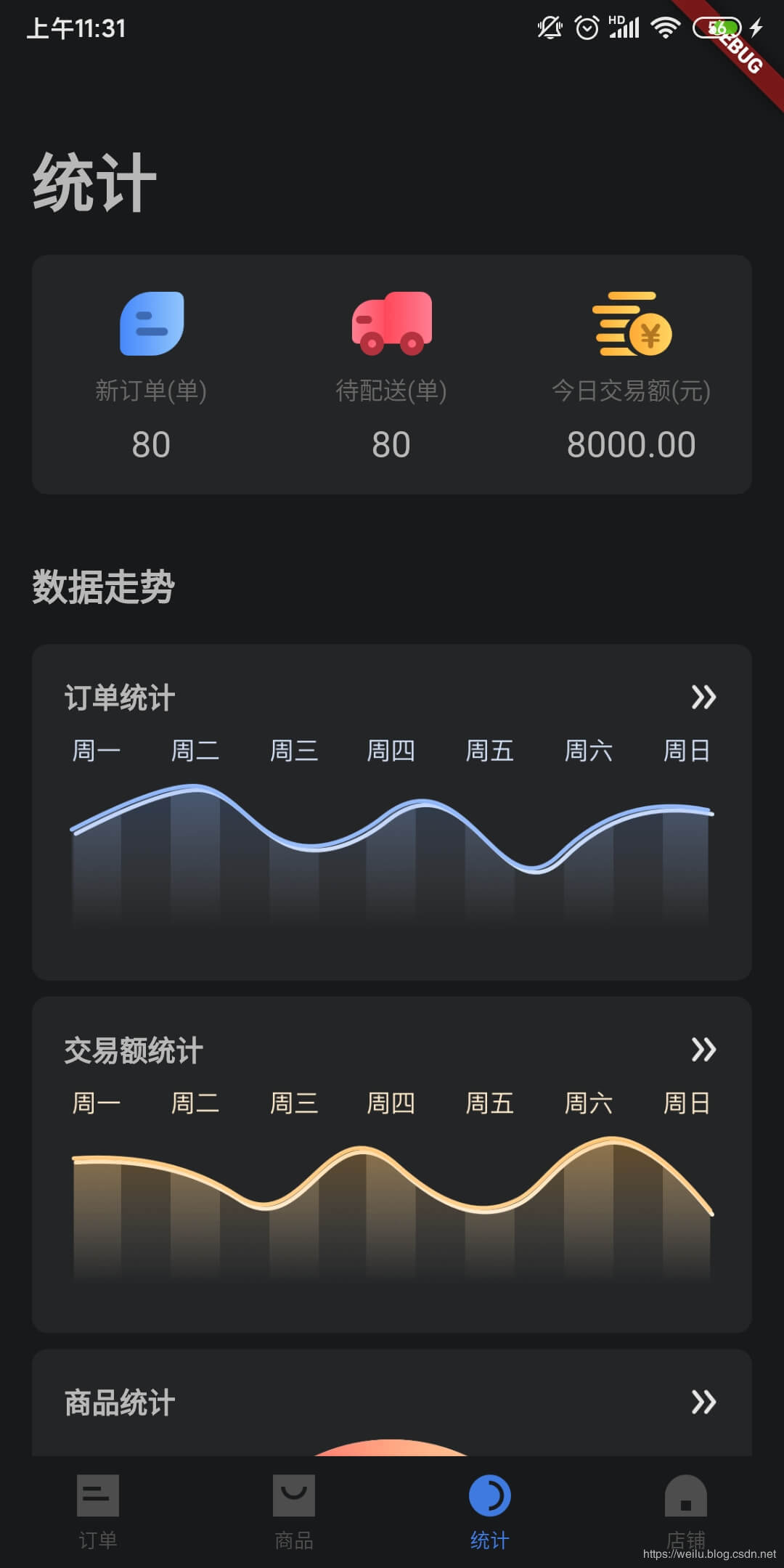 |
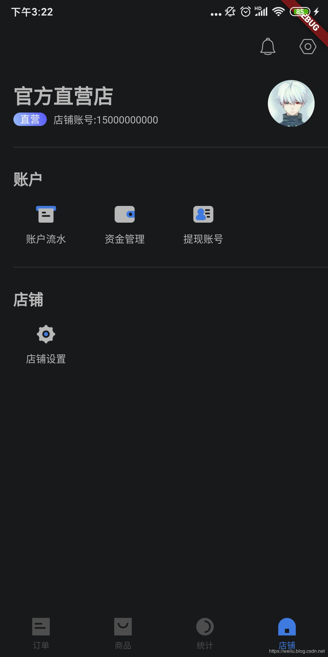 |
详细的代码以及实现细节,可以参看flutter_deer的代码。深色模式相关的设计图也已经同步更新了。最后希望可以点赞支持一波!!!
