

现在在 App 中,常见的一个效果就是折叠工具栏,在 Android 上,这种效果可以通过 CollapsingToolbarLayout + NestedScrollView + AppBarLayout 来实现,在 Flutter 里面,也有 NestedScrollView 和 SliverAppBar 来实现这样的效果。
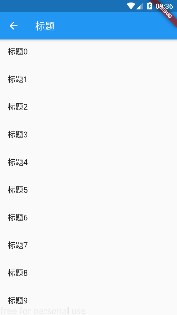
一、只使用 AppBar
先看最简单的情况,只使用 AppBar
一般情况下,我们的 App 都是这样的:
 return  Scaffold(
       appBar: AppBar(
         title: Text("标题"),
       ),
       body: ListView.builder(
         itemBuilder: (BuildContext context, int index) {
           return ListTile(title:Text( "标题$index"),);
         },
         itemCount: 50,
       ),

);
效果是这样的:
二、使用 SliverAppBar
SliverAppBar 其实是属于 Slivers 里面的一个控件,而 Slivers 包含的可滚动的控件一般都是在复杂的滑动嵌套的场景下使用,一般都是作为 CustomScrollView 的子 Widget 来使用。比如 ListView 对应的 Slivers 组件是 SliverFixedExtentList,GirdView 对应的是 SliverGrid。CustomScrollView 的作用就是使这些 Sliver 组件的滑动效果同一的。
如果是使用 NestedScrollView + SliverAppbar 是这样的:
    return  Scaffold(
      body: NestedScrollView(
        headerSliverBuilder: (BuildContext context, bool innerBoxIsScrolled) {
          return <Widget>[
              SliverAppBar(
            title: Text("标题"),
            floating: false,
            snap: false,
            pinned: true,
          )

          ];
        },
        body: ListView.builder(
          itemBuilder: (BuildContext context, int index) {
            return ListTile(title:Text( "标题$index"),);
          },
          itemCount: 50,
        ),
      ),

    );
效果:
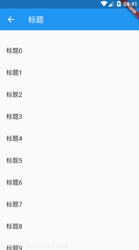
效果其实和上面的一样。
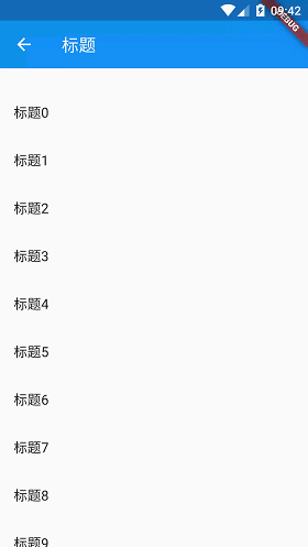
接着把 pined 属性值改为 false 。效果如下:
其他属性如下:
const SliverAppBar({
    Key key,
    this.leading,         //在标题左侧显示的一个控件,通常为一个图标
    this.automaticallyImplyLeading = true,//? 控制是否应该尝试暗示前导小部件为null
    this.title,           //标题
    this.actions,          //右侧的操作菜单,最多三个
    this.flexibleSpace,    //可以展开的区域,通常是一个FlexibleSpaceBar
    this.bottom,         //底部内容区域,通常是 TabBar
    this.elevation,            //阴影
    this.forceElevated = false,
    this.backgroundColor,       //APP bar 的颜色,默认值为 ThemeData.primaryColor
    this.brightness,   //Appbar的主题,有白色和黑色两种主题
    this.iconTheme,  //Appbar 上图标的颜色、透明度、和尺寸信息
    this.textTheme,    //Appbar 上的文字主题
    this.primary = true,  //此应用栏是否显示在屏幕顶部
    this.centerTitle,     //标题是否居中显示,默认值根据不同的操作系统
    this.titleSpacing = NavigationToolbar.kMiddleSpacing,//横轴上标题内容 周围的间距
    this.expandedHeight,     //展开高度
    this.floating = false,       //是否随着滑动隐藏标题
    this.pinned = false,  //是否固定在顶部
    this.snap = false,   //与floating结合使用
  })
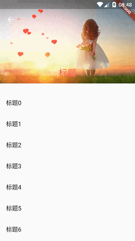
三、折叠工具栏
指定 flexibleSpace 就可以定义展开区域。
   return  Scaffold(
     body: NestedScrollView(
       headerSliverBuilder: (BuildContext context, bool innerBoxIsScrolled) {
         return <Widget>[


          /*   SliverAppBar(
           title: Text("标题"),
           floating: false,
           snap: false,
           pinned: true,
         )
*/


           SliverAppBar(
             expandedHeight: 200.0,
             floating: true,
             snap: false,
             pinned: true,
             flexibleSpace: FlexibleSpaceBar(
                 centerTitle: true,
                 title: Text("标题",
                     style: TextStyle(
                       color: Colors.redAccent,
                       fontSize: 16.0,
                     )),
                 background: Image.asset(
                   "images/bg.jpg",
                   fit: BoxFit.fill,
                 )
             ),
           )


         ];
       },
       body: ListView.builder(
         itemBuilder: (BuildContext context, int index) {
           return ListTile(title:Text( "标题$index"),);
         },
         itemCount: 50,
       ),
     ),

   );
效果:
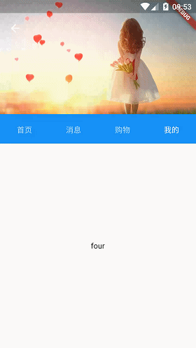
四、工具栏底部加 Tab
SliverBar 中指定 bottom 属性为 TabBar,同时 NestedScrollView body 属性指定为 TabVarView
return Scaffold(
      body: NestedScrollView(
          controller: _scrollviewController,
          headerSliverBuilder: (context, boxIsScrolled) {

            return [
              SliverAppBar(
                pinned: true,
                floating: true,
                elevation: 0.5,
                forceElevated: true,
                //backgroundColor: Colors.grey,
                expandedHeight: 240,
                flexibleSpace: FlexibleSpaceBar(
                  collapseMode: CollapseMode.pin, //视差效果
                  background: Container(
                    //color: Colors.grey,
                    child: Column(
                      children: <Widget>[
                        Container(
                          height: 210.0,
                          width: 420,
                          color: Colors.blue,
                          child: Image.asset(
                            "images/bg.jpg",
                            fit: BoxFit.fitWidth,
                          ),
                        )
                      ],
                    ),
                  ),
                ),
                bottom: TabBar(controller: _tabController, tabs: [
                  Tab(
                    text: "首页",
                  ),
                  Tab(
                    text: "消息",
                  ),
                  Tab(
                    text: "购物",
                  ),
                  Tab(
                    text: "我的",
                  )
                ]),
              ),


            ];

          },

          body: TabBarView(
              controller: _tabController,
              children: [
                Center(
                  child:  Text("one"),
                ),

                Center(
                  child:  Text("two"),
                ),

                Center(
                  child:  Text("three"),
                ),

                Center(
                  child:  Text("four"),
                ),

              ]

          )
      ),
    );
效果:
最后
欢迎关注「Flutter 编程开发」微信公众号 。

