

作为一个前端小猴子,不管是面试的时候还是工作中,我们都会或多或少的遇到“使用css居中”的效果,今天就写一篇关于css垂直水平居中的几种方法。

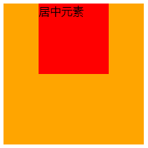
栗子1:从最简单的水平居中开始
margin: 0 auto;
块级元素使用margin: 0 auto;可以在父元素的中间位置居中,不过要记得设置块级元素的宽高。 HTML部分
<div class="wrap">
  <div class="example1">
    <p>CSS</p>
  </div>
</div>
CSS部分
.example1 {
  width: 200px;
  height: 200px;
  background-color: orange;
}
.example1 p {
  width: 100px;
  height: 100px;
  background-color: red;
  margin: 0 auto;
  line-height: 100px;
  text-align: center;
}
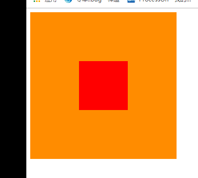
栗子2:元素水平垂直居中
position元素已知宽度 绝对定位+margin反向偏移
<div class="wrap">
    <div class="example2">
    </div>
</div>
.wrap {
    position: relative;
    background-color: orange;
    width: 300px;
    height: 300px;
}
.example2 {
    background-color: red;
    width: 100px;
    height: 100px;
    position: absolute;
    left: 50%;
    top: 50%;
    margin: -50px 0 0 -50px;
}
position transform元素未知宽度 如果元素未知宽度,只需将上面example2中的margin: -50px 0 0 -50px;替换为:transform: translate(-50%,-50%);
栗子3: flex布局
HTML同上面,附css代码
.warp {
  background-color: #FF8C00;
  width: 200px;
  height: 200px;
  display: flex;
  justify-content: center; /*使子项目水平居中*/
  align-items: center; /*使子项目垂直居中*/
}
.example3 {
  background-color: #F00;
  width: 100px;
  height: 100px;
}
另外一种就是 table-cell布局了,这个我就不介绍了,因为不想介绍。
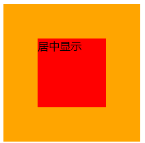
栗子4: 绝对布局
div使用绝对布局,设置margin:auto;并设置top、left、right、bottom的值相等即可,不一定要都是0。 HTML部分
<div class="warp">
  <div class="example3">
    居中显示
  </div>
</div>
CSS部分
.warp {
  position: relative;
  background-color: orange;
  width: 200px;
  height: 200px;
}
.example3 {
  position: absolute;
  top: 0;
  left: 0;
  right: 0;
  bottom: 0;
  background-color: red;
  width: 100px;
  height: 100px;
  margin: auto;
}
栗子5:给子元素相对定位,在通过translaY()得到垂直居中
.warp {
  position: relative;
  background-color: orange;
  width: 200px;
  height: 200px;
}
.example3 {
  position: relative;
  top:50%;
  transform:translateY(-50%);
  background-color: red;
  width: 100px;
  height: 100px;
  margin: 0 auto;
}
栗子6:利用inline-block的vertical-align: middle去对齐after伪元素
利用inline-block的vertical-align:middle去对齐after伪元素实现效果更加好,居中块的尺寸可以做包裹性、自适应内容,兼容性也相当好。缺点是水平居中需要考虑inline-block间隔中的留白(代码换行符遗留问题。)
.warp {
    text-align: center;
    overflow: auto;
    width: 200px;
    height: 200px;
    background-color: orange;
}
.example3 {
    display: inline-block;
    background-color: red;
    vertical-align: middle;
    width: 100px;
    height: 100px;
}

.warp:after {
    content: '';
    display: inline-block;
    vertical-align: middle;
    height: 100%;
    margin-left: -0.25em;
    /* To offset spacing. May vary by font */
}
栗子7:display: flex-box
flexbox布局。此乃布局终极大法,专治各种布局定位难题!优点:能解决各种排列布局问题.
.warp {
  display: -webkit-flex;
  display: -moz-box;
  display: -ms-flexbox;
  display: -webkit-box;
  display: flex;
  -webkit-box-align: center;
  -moz-box-align: center;
  -ms-flex-align: center;
  -webkit-align-items: center;
  align-items: center;
  -webkit-box-pack: center;
  -moz-box-pack: center;
  -ms-flex-pack: center;
  -webkit-justify-content: center;
  justify-content: center;
  width: 200px;
  height: 200px;
  background-color: orange;
}

.example3 {
  width: 100px;
  height: 100px;
  background-color: red;
}
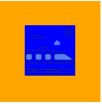
图片居中的栗子1:
<div class="warp">
  <div class="example3">
    <img src="xxxx" alt="">
  </div>
</div>
.warp {
  width: 200px;
  height: 200px;
  background-color: orange;
  display: flex;
  align-items: center;
  justify-content: center;
}
.example3 img {
  width: 100px;
  height: 100px;
  background-color: blue;
}
图片居中的栗子2:
.warp {
  width: 200px;
  height: 200px;
  background-color: orange;
  line-height: 200px;
    text-align: center;
}
.example3 img {
  width: 100px;
  height: 100px;
  background-color: blue;
  vertical-align: middle;
}
就写到这里了,后续在遇到的话会继续添加的。。
如果小伙伴有别的写法,可以在评论区留言,我会一一回复的。
动动你的小手,关注一下我的订阅号,不定时推送前端干货,和你在学习前进的道路上,一同披荆斩棘,我与你同在。

