

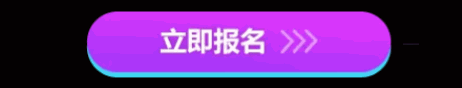
心脏跳动效果
适用场景:吸引眼球,激发用户点击心理
<div class="demo"></div>

// css部分
.demo {
    animation: pulse 1s infinite;
    -webkit-animation: pulse 1s infinite;
    -o-animation: pulse 1s infinite;
    -moz-animation: pulse 1s infinite;
    cursor: pointer;
}
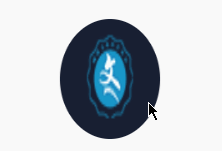
鼠标移入图片翻转,移出恢复原样(类似于硬币翻转)
使用场景:强调此处信息
<section>
    <div>
        <img src="/resources/images/web_v1/homepage/logo_blue.png" alt="为您推荐icon">
    </div>
</section>

// css部分
section:hover div {
    transform : rotateY(180deg);
}
section div {
	position        : relative;
	overflow        : hidden;
	transition      : all 1s;
	transform-style : preserve-3d;
	width           : 120px;    // 根据需求,自定义
	height          : 120px;    // 根据需求,自定义
	border-radius   : 50%;      // 根据需求,自定义
	margin          : auto;
}
section div img {
    width  : 100%;
	height : 100%;
}
鼠标移入块凸起,移出恢复原样
使用场景:强调此处信息、聊天室房间等......
<ul>
    // 给li标签增加鼠标移入,凸起并带有阴影
    <li>
        <div class="chatroom-img">
            <img class="play-user"
                 src="图片.png"
                 alt="图片">
            // 鼠标未移入li标签时,此标签隐藏,移入时展示
            <div class="voice_hover">
                <img src="voicewave.gif"
                     alt="聊天室音频波段图">
            </div>
        </div>
        <div class="chatroom-info">
            ...自定义
        </div>
        <div class="chatroom-introduction">
            ...自定义
        </div>
    </li>
</ul>

// css代码
li {
    transition    : all .3s ease;
    border-radius : 8px;
    height        : 250px;
}
li:hover {
    -webkit-box-shadow : 0 3px 30px rgba(0, 0, 0, .2);
    box-shadow         : 0 3px 30px rgba(0, 0, 0, .2);
    -webkit-transform  : translateY(-3px);
    -ms-transform      : translateY(-3px);
}
li:hover .voice_hover {
    display : block !important;
}
.voice_hover {
    display          : none;
    background-color : rgba(51, 51, 51, 0.2);
    position         : absolute;
    top              : 0;
    width            : 100%;
    height           : 100%;
}
.voice_hover img {
    position  : absolute;
    left      : 50%;
    transform : translateX(-50%)
}
鼠标移入框内图片放大效果,移出恢复原样(类似于放大镜)
使用场景:凸出此处图片信息

<div>
    <img ser="自定义" alt="自定义"
</div>

// css代码
div {
    width: 110px;
    height: 110px;
}
div:hover img {
    transition : all 0.6s cubic-bezier(0.215, 0.61, 0.355, 1) 0s;
    transform  : scale(1.2, 1.2);
}
img {
    width         : 100%;
    height        : 100%;
}
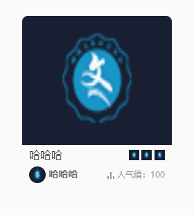
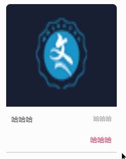
鼠标移入 框底部能量条充满,移出恢复原样
使用场景:高亮此处信息
<ul>
    // 鼠标移入li时,触发能量条充满动画
    <li>
        <div>
            <img src="自定义"
                 alt="自定义">
        </div>
        <div class="recommend-info">
            <h4>
                哈哈哈
            </h4>
            <span>
                哈哈哈
            </span>
        </div>
        <div class="recommend-introduction">
            <strong>
                哈哈哈
            </strong>
        </div>
        // 此处为能量条的占位符,初始宽度为0,鼠标移入li时 宽度为100%,加上动画就成了
        <span></span>
    </li>
</ul>

// css代码
li {
    // 空能量条的效果
    border-bottom : 2px solid #D9D9D9;
}
li:hover {
    cursor : pointer;
}
li:hover > span {
    width      : 100%;
    transition : .36s ease;
}
span {
    position   : absolute;
    bottom     : -2px;
    left       : 0;
    display    : block;
    width      : 0;
    height     : 2px;
    transition : .36s ease;
    background : #FF1E48;
}
鼠标移入展示相关信息,移出恢复原样
注意图中 展示框右侧的小三角,用css代码实现,非常实用(如聊天框等)
使用场景:展示二维码等...
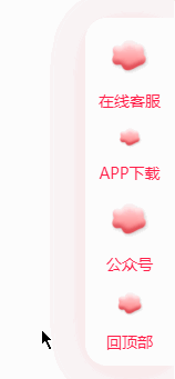
<div class="sidebar-wechat"
     title="公众号">
    <img src="/resources/images/huowan_web/ranking_bg.png"
         alt="联系客服icon">
    <h3>
        公众号
    </h3>
    // 默认display: none ,鼠标移入时展示block,
    <div class="code">
        <img src="/resources/images/huowan_web/ranking_bg.png"
             alt="联系客服icon">
    </div>
</div>

// css代码
.sidebar-wechat {
    cursor     : pointer;
}
.sidebar-wechat:hover .code {
    display : block;
}
.sidebar-wechat .code{
    display          : none;
    position         : absolute;
    z-index          : 9;
    top              : 55%;
    right            : 90px;
    border-radius    : 8px;
    box-shadow       : 0 6px 12px 0 rgba(106, 115, 133, 0.22);
    background-color : #fff;
}
.sidebar-wechat .code:after {
    position     : absolute;
    top          : 33%;
    left         : 100%;
    content      : '';
    transform    : translateY(-50%);
    border-width : 5px;
    border-style : solid;
    border-color : transparent transparent transparent #fff;// 小三角的主要实现
}
