

前言
如今越来越多的app开始添加支付功能,不论哪种支付,不可避免的步骤就是密码的输入,就算没有密码输入,验证码也是少不了的。比较low的实现方式是用一组EditText来拼,每个输入框只允许输入1个字符,通过TextWatcher来监听,输入完成后下一个输入框自动获取焦点。今天介绍一种自定义View的方式实现,优雅而不失逼格!
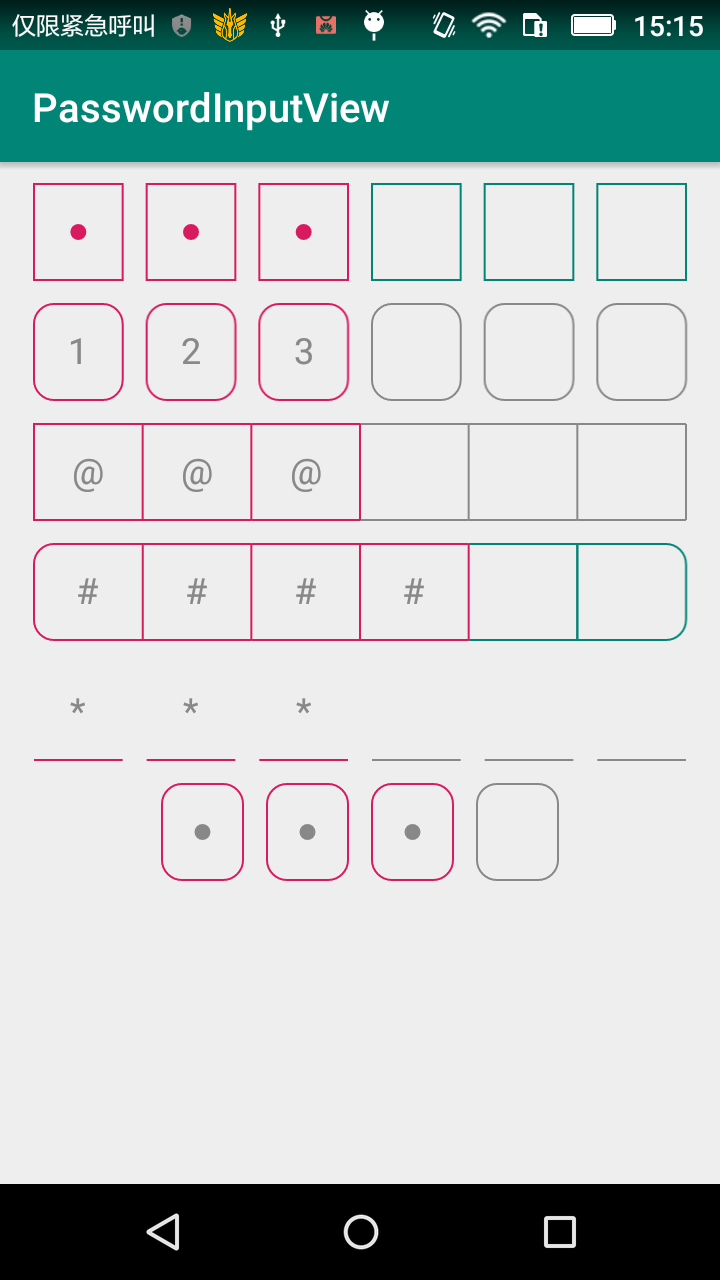
废话不多说,先上图
Github地址,如果对您有帮助,麻烦给个star,手动狗头
特性
- 仿支付宝微信风格
- 下划线风格
- 可显示明文或者密文,密文支持显示圆点,星号,或者任意字符
- 支持设置密码框之间的间隔和圆角(间隔为0时圆角只显示最左和最右的圆角)
- 支持设置边框和密码的颜色
- 支持单独设置已输入部分的边框颜色
原理
- 通过View宽度和间隔宽度计算每个密码框的宽度
    @Override
    protected void onSizeChanged(int w, int h, int oldw, int oldh) {
        super.onSizeChanged(w, h, oldw, oldh);
        int availableWidth = w - getPaddingLeft() - getPaddingRight();
        int availableHeight = h - getPaddingTop() - getPaddingBottom();

        checkSpacing(availableWidth);
        checkRadius(availableWidth, availableHeight);
    }

    // 计算boxWidth并检查圆角大小是否过大
    private void checkRadius(int availableWidth, int availableHeight) {
        // 每个盒子的宽度 = (可用宽度 - 间隔宽度)/ 盒子个数
        boxWidth = (availableWidth - (maxLength - 1f) * spacing) / maxLength;

        float availableRadius = Math.min(availableHeight / 2f, boxWidth / 2);
        if (radius > availableRadius) {
            Log.d(TAG, "radius is too large, reset it");
            radius = (int) availableRadius;
        } else if (radius < 0) {
            radius = 0;
        }
    }

    // 检查间距是否过大
    private void checkSpacing(int availableWidth) {
        if (spacing < 0 || (maxLength - 1) * spacing >= availableWidth) {
            Log.d(TAG, "spacing is too large, reset it to zero");
            spacing = 0;
        }
    }
- 绘制边框和密码
    @Override
    protected void onDraw(Canvas canvas) {
////        super.onDraw(canvas); // 去掉EditText默认的绘制

        int top = getPaddingTop();
        int bottom = getHeight() - getPaddingBottom();
        int start = getPaddingLeft();
        float left;

        for (int i = 0; i < maxLength; i++) {
            left = start + (boxWidth + spacing) * i;
            rectF.set(left, top, left + boxWidth, bottom);

            drawBorder(canvas, i);

            if (i >= textLength) continue;

            drawPassword(canvas, i);
        }
    }
- 绘制边框(区分不同的风格和间距、圆角等)
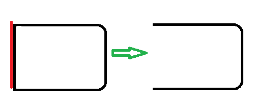
在间距为0的时候,如果直接每一位密码都绘制方框,相邻的边就会重复绘制,所以我在绘制时,只有第一个绘制方框,后边的每一个只绘制上、右、下三条边(真的是屁大点优化 -_-|||),如下:
注意,如果有圆角,在最后一个方框不能直接绘制三条边,我是采用绘制一个圆角矩形,然后再用xfermode合成去掉左边的一条边来完成。如果,先绘制圆角矩形,再绘制左边边框,然后再合成
    private void drawBorder(Canvas canvas, int index) {
        paint.setColor(index < textLength ? inputBorderColor : borderColor);
        paint.setStyle(Paint.Style.STROKE);
        switch (borderStyle) {
            case BorderStyle.BOX:// 边框模式
                if (radius == 0) {
                    // 圆角为0,判断间距
                    // 间距为0时第一个绘制方框,后边的每一个只绘制上、右、下三条边,避免重复绘制一条边
                    // 如果间距不为0,直接绘制方框
                    if (spacing == 0) {
                        if (index == 0) {
                            canvas.drawRect(rectF, paint);
                        } else {
                            fillLinesArray();
                            canvas.drawLines(linesArray, paint);
                        }
                    } else {
                        canvas.drawRect(rectF, paint);
                    }
                } else {
                    // 圆角!=0
                    // 策略同上,只是增加了圆角,没有间距并且有圆角的情况只绘制第一个和最后一个圆角
                    if (spacing == 0) {
                        if (index == 0) {
                            fillRadiusArray(true);
                            path.reset();
                            path.addRoundRect(rectF, radiusArray, Path.Direction.CCW);
                            canvas.drawPath(path, paint);
                        } else if (index == maxLength - 1) {
                            // 这里绘制最后一个密码框的三条边,带圆角
                            // 先绘制一个带两个圆角的方框,然后用xfermode合成去掉左边的一条边
                            int layer = canvas.saveLayer(null, null, Canvas.ALL_SAVE_FLAG);

                            fillRadiusArray(false);
                            path.reset();
                            path.addRoundRect(rectF, radiusArray, Path.Direction.CCW);
                            canvas.drawPath(path, paint);

                            paint.setXfermode(xfermode);
                            canvas.drawLine(rectF.left, rectF.top, rectF.left, rectF.bottom, paint);
                            paint.setXfermode(null);

                            canvas.restoreToCount(layer);
                        } else {
                            fillLinesArray();
                            canvas.drawLines(linesArray, paint);
                        }
                    } else {
                        path.reset();
                        path.addRoundRect(rectF, radius, radius, Path.Direction.CCW);
                        canvas.drawPath(path, paint);
                    }
                }
                break;
            case BorderStyle.LINE:// 底部边线
                canvas.drawLine(rectF.left, rectF.bottom, rectF.right, rectF.bottom, paint);
                break;
        }
    }
- 绘制密码圆点(不同风格有圆点、星号和明文)
绘制密码就比较简单,需要注意的是绘制明文或者字符时需要进行文字的测量,保证居中显示
    private void drawPassword(Canvas canvas, int index) {
        paint.setColor(pwdColor);
        paint.setStyle(Paint.Style.FILL);
        switch (pwdStyle) {
            case PwdStyle.CIRCLE:// 绘制圆点
                canvas.drawCircle((rectF.left + rectF.right) / 2, (rectF.top + rectF.bottom) / 2, 8, paint);
                break;
            case PwdStyle.ASTERISK:// 绘制*号
                canvas.drawText(asterisk, (rectF.left + rectF.right) / 2,
                        (rectF.top + rectF.bottom - metrics.ascent - metrics.descent) / 2, paint);
                break;
            case PwdStyle.PLAINTEXT:// 绘制明文
                canvas.drawText(String.valueOf(getText().charAt(index)), (rectF.left + rectF.right) / 2,
                        (rectF.top + rectF.bottom - metrics.ascent - metrics.descent) / 2, paint);
                break;
        }
    }
注意事项:
- 绘制圆角canvas.drawRoundRect有api版本限制,所以采用path的方式来绘制
- 设置圆角、间距后需要重新计算密码框的宽度
- 需要始终保持光标在最后,防止出现错乱
- 注意EditText的默认背景会有边距,会影响绘制,所以需要去掉背景 android:background="@null"
最后介绍下使用方式
- 布局中:
    <!--
         注意EditText的默认背景会有边距,会影响绘制,所以需要去掉
         android:background="@null"
     -->
    <com.matthew.passwordinput.lib.PasswordInputView
        android:layout_width="match_parent"
        android:layout_height="50dp"
        android:layout_marginTop="10dp"
        android:background="@null"
        android:padding="1dp"
        android:text="123"
        app:layout_constraintLeft_toLeftOf="parent"
        app:layout_constraintRight_toRightOf="parent"
        app:layout_constraintTop_toTopOf="parent"
        app:pwv_haveInputBorderColor="@color/colorAccent"
        app:pwv_pwdStyle="plaintext"
        app:pwv_radius="10dp"
        app:pwv_spacing="12dp" />
- 设置监听器
    passwordView.setInputListener(new PasswordInputView.InputListener() {
        @Override
        public void onInputCompleted(String text) {
            // 输入完成后回调
        }
    });
- 属性参考
    <declare-styleable name="PasswordInputView">
        <attr name="pwv_maxLength" format="integer" /> // 最大长度

        <attr name="pwv_borderColor" format="color" /> // 边框颜色
        <attr name="pwv_pwdColor" format="color" /> // 密码颜色
        <attr name="pwv_haveInputBorderColor" format="color" /> // 已输入部分边框的颜色

        <attr name="pwv_strokeWidth" format="dimension" /> // 边框宽度
        <attr name="pwv_radius" format="dimension" /> // 圆角半径
        <attr name="pwv_spacing" format="dimension" /> // 每个密码框之间的间距
        <attr name="pwv_asterisk" format="string" />
        // 当密码风格为星号风格时,可以用任意字符替换星号,替换的字符为pwv_asterisk的第一个字符

        <attr name="pwv_borderStyle" format="enum"> // 边框风格 方框 和 下划线
            <enum name="box" value="0" />
            <enum name="line" value="1" />
        </attr>
        <attr name="pwv_pwdStyle" format="enum"> // 密码风格 圆点、星号、明文
            <enum name="circle" value="0" />
            <enum name="asterisk" value="1" />
            <enum name="plaintext" value="2" />
        </attr>
    </declare-styleable>
