

- 原文地址:Flutter Layout Cheat Sheet
- 原文作者:Tomek Polański
- 译文出自:掘金翻译计划
- 本文永久链接:github.com/xitu/gold-m…
- 译者:EmilyQiRabbit
- 校对者:smilemuffie,suhanyujie
你需要了解 Flutter 的简单布局模版吗? 现在我将展示给你我总结的一系列 Flutter 布局代码片段。我会尽量保证代码简短易懂,并且会给出效果图。 但是我们仍旧需要循序渐进 —— 模版目录将会随之逐步深入。我将会将更多的篇幅集中于 Flutter 部件的应用,而不是单纯陈列组件(Flutter Gallery 在这一点做的很好!) 如果你对于 Flutter 布局还有其他疑问,或者想要分享你的代码,请留言给我!
目录
- Row 和 Column
- IntrinsicWidth 和 IntrinsicHeight
- Stack
- Expanded
- ConstrainedBox
- Container
- 装饰(decoration):BoxDecoration
- 图片(image):DecorationImage
- 边框(border):Border
- 边框半径(borderRadius):BorderRadius
- 形状(shape):BoxShape
- 阴影(boxShadow):
List<BoxShadow> - 渐变(gradient):RadialGradient
- 背景混合模式(backgroundBlendMode):BlendMode
- SizedBox
- SafeArea
Row 和 Column
MainAxisAlignment
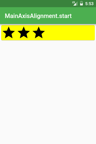
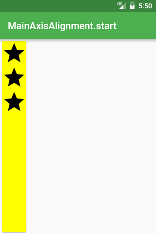
Row /*或 Column*/(
  mainAxisAlignment: MainAxisAlignment.start,
  children: <Widget>[
    Icon(Icons.star, size: 50),
    Icon(Icons.star, size: 50),
    Icon(Icons.star, size: 50),
  ],
),
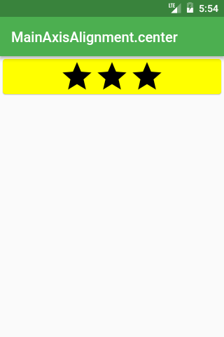
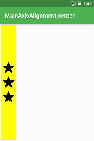
Row /*或 Column*/(
  mainAxisAlignment: MainAxisAlignment.center,
  children: <Widget>[
    Icon(Icons.star, size: 50),
    Icon(Icons.star, size: 50),
    Icon(Icons.star, size: 50),
  ],
),
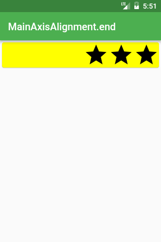
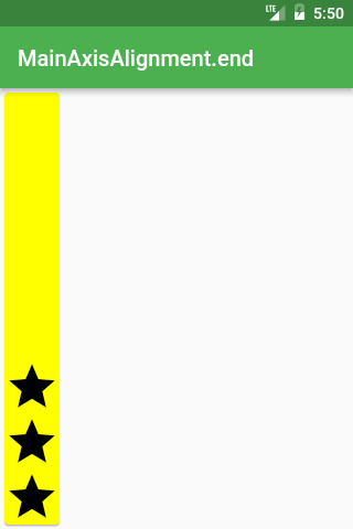
Row /*或 Column*/(
  mainAxisAlignment: MainAxisAlignment.end,
  children: <Widget>[
    Icon(Icons.star, size: 50),
    Icon(Icons.star, size: 50),
    Icon(Icons.star, size: 50),
  ],
),
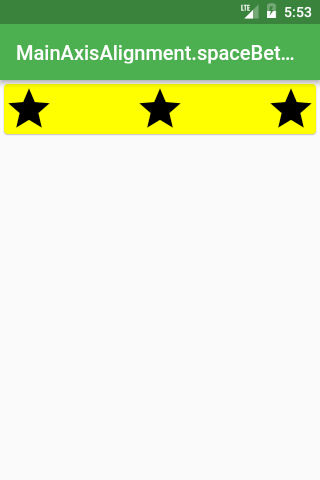
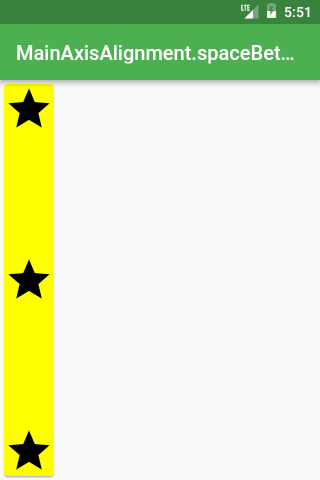
Row /*或 Column*/(
  mainAxisAlignment: MainAxisAlignment.spaceBetween,
  children: <Widget>[
    Icon(Icons.star, size: 50),
    Icon(Icons.star, size: 50),
    Icon(Icons.star, size: 50),
  ],
),
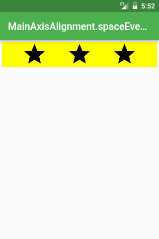
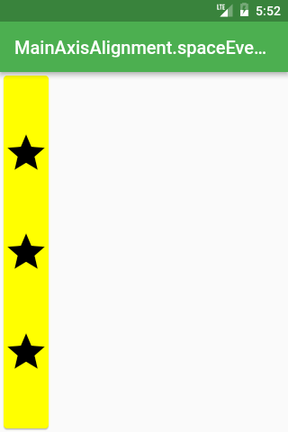
Row /*或 Column*/(
  mainAxisAlignment: MainAxisAlignment.spaceEvenly,
  children: <Widget>[
    Icon(Icons.star, size: 50),
    Icon(Icons.star, size: 50),
    Icon(Icons.star, size: 50),
  ],
),
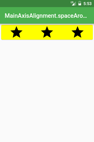
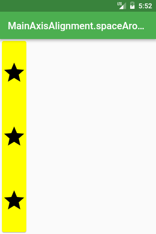
Row /*或 Column*/(
  mainAxisAlignment: MainAxisAlignment.spaceAround,
  children: <Widget>[
    Icon(Icons.star, size: 50),
    Icon(Icons.star, size: 50),
    Icon(Icons.star, size: 50),
  ],
),
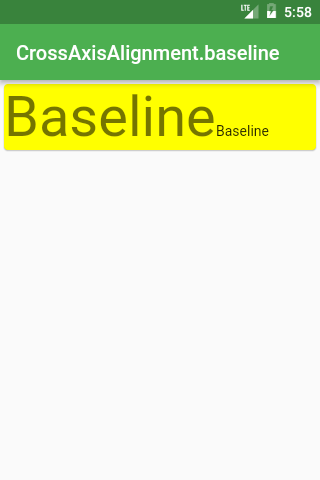
如果你想要不同字符的基线对齐,你应该使用 CrossAxisAlignment.baseline。
Row(
  crossAxisAlignment: CrossAxisAlignment.baseline,
  textBaseline: TextBaseline.alphabetic,
  children: <Widget>[
    Text(
      'Baseline',
      style: Theme.of(context).textTheme.display3,
    ),
    Text(
      'Baseline',
      style: Theme.of(context).textTheme.body1,
    ),
  ],
),
CrossAxisAlignment
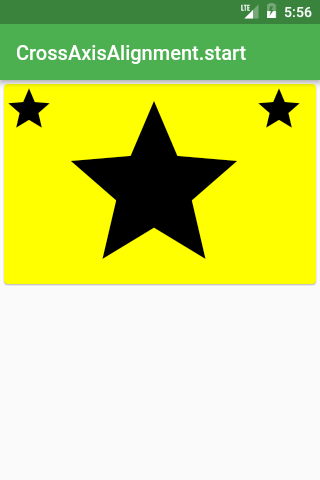
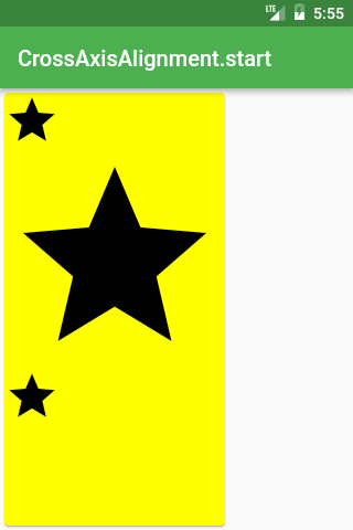
Row /*或 Column*/(
  crossAxisAlignment: CrossAxisAlignment.start,
  children: <Widget>[
    Icon(Icons.star, size: 50),
    Icon(Icons.star, size: 200),
    Icon(Icons.star, size: 50),
  ],
),
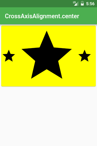
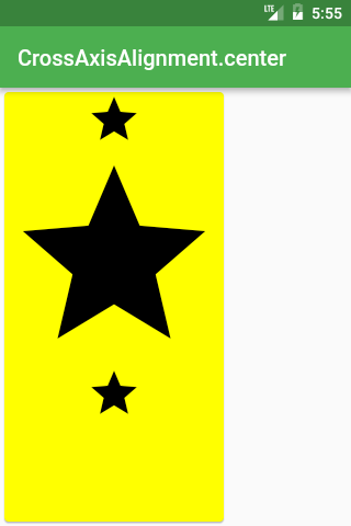
Row /*或 Column*/(
  crossAxisAlignment: CrossAxisAlignment.center,
  children: <Widget>[
    Icon(Icons.star, size: 50),
    Icon(Icons.star, size: 200),
    Icon(Icons.star, size: 50),
  ],
),
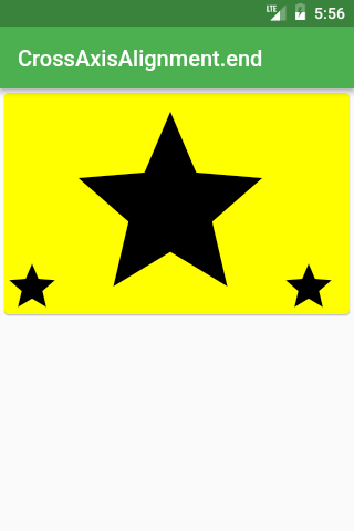
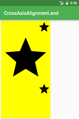
Row /*或 Column*/(
  crossAxisAlignment: CrossAxisAlignment.end,
  children: <Widget>[
    Icon(Icons.star, size: 50),
    Icon(Icons.star, size: 200),
    Icon(Icons.star, size: 50),
  ],
),
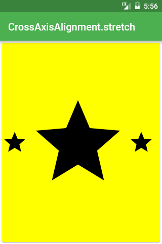
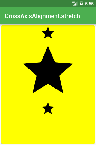
Row /*或 Column*/(
  crossAxisAlignment: CrossAxisAlignment.stretch,
  children: <Widget>[
    Icon(Icons.star, size: 50),
    Icon(Icons.star, size: 200),
    Icon(Icons.star, size: 50),
  ],
),
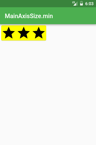
MainAxisSize
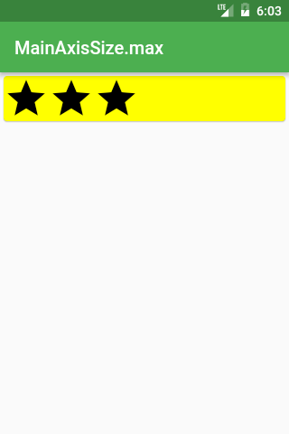
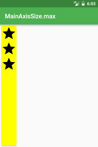
Row /*或 Column*/(
  mainAxisSize: MainAxisSize.max,
  children: <Widget>[
    Icon(Icons.star, size: 50),
    Icon(Icons.star, size: 50),
    Icon(Icons.star, size: 50),
  ],
),
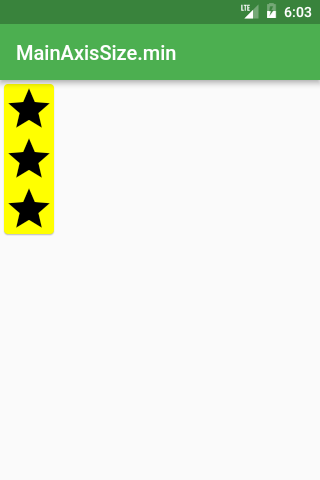
Row /*或 Column*/(
  mainAxisSize: MainAxisSize.min,
  children: <Widget>[
    Icon(Icons.star, size: 50),
    Icon(Icons.star, size: 50),
    Icon(Icons.star, size: 50),
  ],
),
IntrinsicWidth 和 IntrinsicHeight
想要某行或列中所有部件和最高/最宽的部件一样高/宽?不要乱找了,答案在这里!
当你有这种样式的布局:
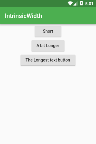
Widget build(BuildContext context) {
  return Scaffold(
    appBar: AppBar(title: Text('IntrinsicWidth')),
    body: Center(
      child: Column(
        children: <Widget>[
          RaisedButton(
            onPressed: () {},
            child: Text('Short'),
          ),
          RaisedButton(
            onPressed: () {},
            child: Text('A bit Longer'),
          ),
          RaisedButton(
            onPressed: () {},
            child: Text('The Longest text button'),
          ),
        ],
      ),
    ),
  );
}
但是你希望所有的按钮都和最宽的按钮等宽,只需要使用 IntrinsicWidth:
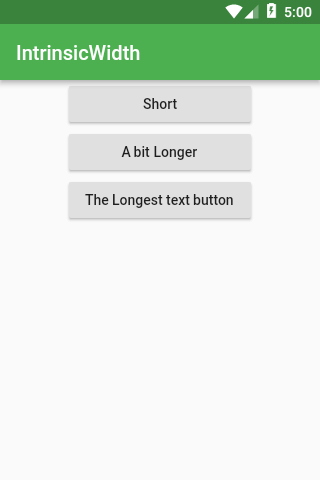
Widget build(BuildContext context) {
  return Scaffold(
    appBar: AppBar(title: Text('IntrinsicWidth')),
    body: Center(
      child: IntrinsicWidth(
        child: Column(
          crossAxisAlignment: CrossAxisAlignment.stretch,
          children: <Widget>[
            RaisedButton(
              onPressed: () {},
              child: Text('Short'),
            ),
            RaisedButton(
              onPressed: () {},
              child: Text('A bit Longer'),
            ),
            RaisedButton(
              onPressed: () {},
              child: Text('The Longest text button'),
            ),
          ],
        ),
      ),
    ),
  );
}
如果你需要的是让所有部件和最高的部件等高,可以结合使用 IntrinsicHeight 和 Row 部件。
Stack
非常适用于将部件叠加在一起
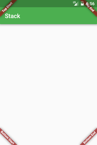
@override
Widget build(BuildContext context) {
  Widget main = Scaffold(
    appBar: AppBar(title: Text('Stack')),
  );

  return Stack(
    fit: StackFit.expand,
    children: <Widget>[
      main,
      Banner(
        message: "Top Start",
        location: BannerLocation.topStart,
      ),
      Banner(
        message: "Top End",
        location: BannerLocation.topEnd,
      ),
      Banner(
        message: "Bottom Start",
        location: BannerLocation.bottomStart,
      ),
      Banner(
        message: "Bottom End",
        location: BannerLocation.bottomEnd,
      ),
    ],
  );
}
如果想使用自己的部件,需要将它们放置在 Positioned 里面
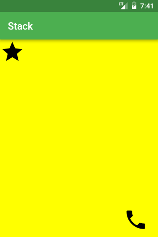
Widget build(BuildContext context) {
  return Scaffold(
    appBar: AppBar(title: Text('Stack')),
    body: Stack(
      fit: StackFit.expand,
      children: <Widget>[
        Material(color: Colors.yellowAccent),
        Positioned(
          top: 0,
          left: 0,
          child: Icon(Icons.star, size: 50),
        ),
        Positioned(
          top: 340,
          left: 250,
          child: Icon(Icons.call, size: 50),
        ),
      ],
    ),
  );
}
如果你不想去猜测 top 或 bottom 的值,你可以使用 LayoutBuilder 来检索它们
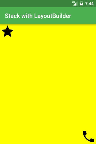
Widget build(BuildContext context) {
  const iconSize = 50;
  return Scaffold(
    appBar: AppBar(title: Text('Stack with LayoutBuilder')),
    body: LayoutBuilder(
      builder: (context, constraints) =>
        Stack(
          fit: StackFit.expand,
          children: <Widget>[
            Material(color: Colors.yellowAccent),
            Positioned(
              top: 0,
              child: Icon(Icons.star, size: iconSize),
            ),
            Positioned(
              top: constraints.maxHeight - iconSize,
              left: constraints.maxWidth - iconSize,
              child: Icon(Icons.call, size: iconSize),
            ),
          ],
        ),
    ),
  );
}
Expanded
Expanded 可以和 Flex\Flexbox 布局一起应用,并且非常适用于分配多元素的空间。
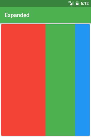
Row(
  children: <Widget>[
    Expanded(
      child: Container(
        decoration: const BoxDecoration(color: Colors.red),
      ),
      flex: 3,
    ),
    Expanded(
      child: Container(
        decoration: const BoxDecoration(color: Colors.green),
      ),
      flex: 2,
    ),
    Expanded(
      child: Container(
        decoration: const BoxDecoration(color: Colors.blue),
      ),
      flex: 1,
    ),
  ],
),
ConstrainedBox
默认情况下,大多数组件都会使用尽可能小的空间:
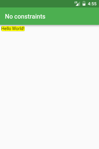
Card(child: const Text('Hello World!'), color: Colors.yellow)
ConstrainedBox 让部件可以使用期望的剩余空间。
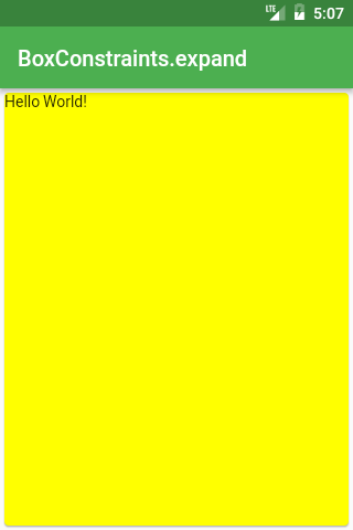
ConstrainedBox(
  constraints: BoxConstraints.expand(),
  child: const Card(
    child: const Text('Hello World!'),
    color: Colors.yellow,
  ),
),
你可以使用 BoxConstraints 指定部件可以使用多大的空间 —— 通过指定 height/width 的 min/max 属性。
BoxConstraints.expand 将会让组件使用无限制(所有可用)的空间,除非另有指定:
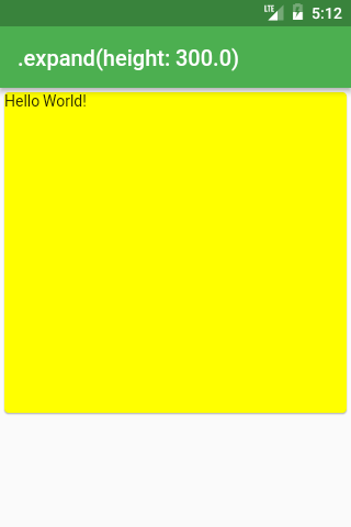
ConstrainedBox(
  constraints: BoxConstraints.expand(height: 300),
  child: const Card(
    child: const Text('Hello World!'),
    color: Colors.yellow,
  ),
),
上面代码和如下代码等效:
ConstrainedBox(
  constraints: BoxConstraints(
    minWidth: double.infinity,
    maxWidth: double.infinity,
    minHeight: 300,
    maxHeight: 300,
  ),
  child: const Card(
    child: const Text('Hello World!'),
    color: Colors.yellow,
  ),
),
Container
最常用的部件之一 —— 并且它之所以这么常用是有原因的:
用于布局工具的 Container
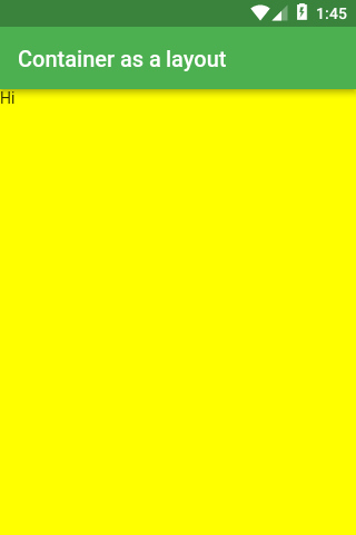
如果你没有指定 Container 的 height 和 width,它将和 child 的大小相同
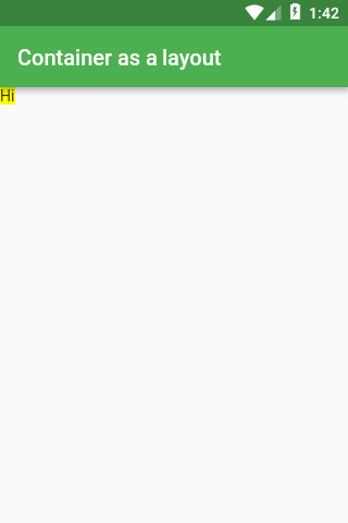
Widget build(BuildContext context) {
  return Scaffold(
    appBar: AppBar(title: Text('Container as a layout')),
    body: Container(
      color: Colors.yellowAccent,
      child: Text("Hi"),
    ),
  );
}
如果你想要 Container 扩大到和它的父级元素相等,对 height 和 width 属性使用 double.infinity
Widget build(BuildContext context) {
  return Scaffold(
    appBar: AppBar(title: Text('Container as a layout')),
    body: Container(
      height: double.infinity,
      width: double.infinity,
      color: Colors.yellowAccent,
      child: Text("Hi"),
    ),
  );
}
Container 的装饰
你可以使用 color 属性来改变 Container 的背景色,但是 decoration 和 foregroundDecoration 则可以做更多。(使用这两个属性,你可以彻底改变 Container 的外观,这部分我将在后续讨论,因为这部分内容很多)
decoration 总会放置在 child 后面,而 foregroundDecoration 则在 child 的上面。
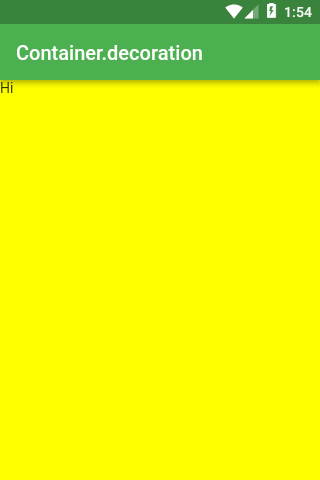
Widget build(BuildContext context) {
  return Scaffold(
    appBar: AppBar(title: Text('Container.decoration')),
    body: Container(
      height: double.infinity,
      width: double.infinity,
      decoration: BoxDecoration(color: Colors.yellowAccent),
      child: Text("Hi"),
    ),
  );
}
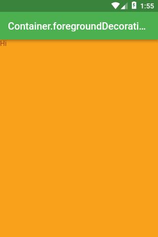
Widget build(BuildContext context) {
  return Scaffold(
    appBar: AppBar(title: Text('Container.foregroundDecoration')),
    body: Container(
      height: double.infinity,
      width: double.infinity,
      decoration: BoxDecoration(color: Colors.yellowAccent),
      foregroundDecoration: BoxDecoration(color: Colors.red.withOpacity(0.5)),
      child: Text("Hi"),
    ),
  );
}
Container 的变换
如果你不想使用 Transform 部件来改变你的布局,你可以使用 Container 的 transform 属性
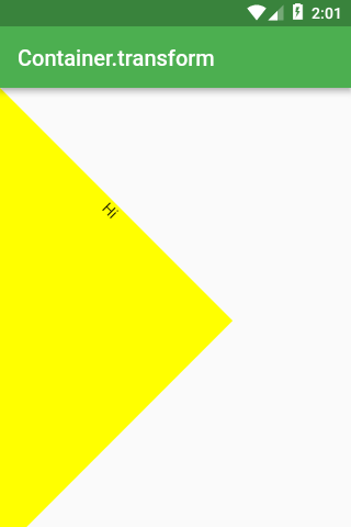
Widget build(BuildContext context) {
  return Scaffold(
    appBar: AppBar(title: Text('Container.transform')),
    body: Container(
      height: 300,
      width: 300,
      transform: Matrix4.rotationZ(pi / 4),
      decoration: BoxDecoration(color: Colors.yellowAccent),
      child: Text(
        "Hi",
        textAlign: TextAlign.center,
      ),
    ),
  );
}
BoxDecoration
装饰效果通常用于容器组件,来改变组件的外观。
图片(image):DecorationImage
将图片作为背景:
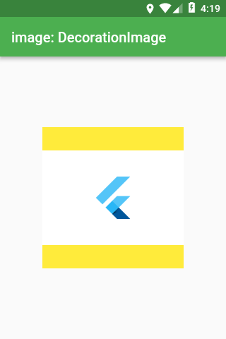
Scaffold(
  appBar: AppBar(title: Text('image: DecorationImage')),
  body: Center(
    child: Container(
      height: 200,
      width: 200,
      decoration: BoxDecoration(
        color: Colors.yellow,
        image: DecorationImage(
          fit: BoxFit.fitWidth,
          image: NetworkImage(
            'https://flutter.io/images/catalog-widget-placeholder.png',
          ),
        ),
      ),
    ),
  ),
);
边框(border):Border
指定容器的边框样式。
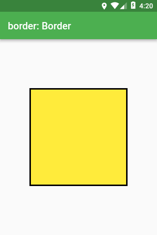
Scaffold(
  appBar: AppBar(title: Text('border: Border')),
  body: Center(
    child: Container(
      height: 200,
      width: 200,
      decoration: BoxDecoration(
        color: Colors.yellow,
        border: Border.all(color: Colors.black, width: 3),
      ),
    ),
  ),
);
边框半径(borderRadius):BorderRadius
让边框可以是圆角。
如果装饰的 shape 是 BoxShape.circle,那么 borderRadius 将无效
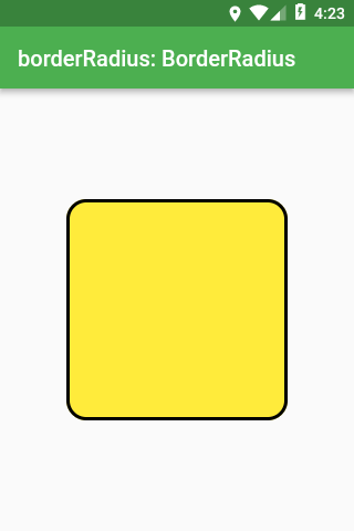
Scaffold(
  appBar: AppBar(title: Text('borderRadius: BorderRadius')),
  body: Center(
    child: Container(
      height: 200,
      width: 200,
      decoration: BoxDecoration(
          color: Colors.yellow,
          border: Border.all(color: Colors.black, width: 3),
          borderRadius: BorderRadius.all(Radius.circular(18))),
    ),
  ),
);
形状(shape):BoxShape
盒子的形状可以是长方形、正方形、椭圆或者圆形。
对于其他任意形状,你应该使用 ShapeDecoration 而不是 BoxDecoration
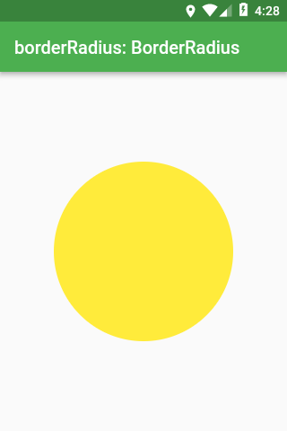
Scaffold(
  appBar: AppBar(title: Text('shape: BoxShape')),
  body: Center(
    child: Container(
      height: 200,
      width: 200,
      decoration: BoxDecoration(
        color: Colors.yellow,
        shape: BoxShape.circle,
      ),
    ),
  ),
);
阴影(boxShadow):List<BoxShadow>
可以给容器添加阴影。
这个参数是一个列表,这样你就可以定义多种不同的阴影,然后将它们组合在一起。
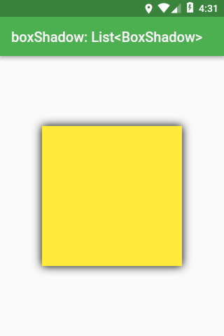
Scaffold(
  appBar: AppBar(title: Text('boxShadow: List<BoxShadow>')),
  body: Center(
    child: Container(
      height: 200,
      width: 200,
      decoration: BoxDecoration(
        color: Colors.yellow,
        boxShadow: const [
          BoxShadow(blurRadius: 10),
        ],
      ),
    ),
  ),
);
渐变(gradient)
有三种类型的渐变:LinearGradient、RadialGradient 和 SweepGradient。
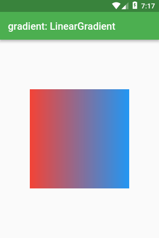
Scaffold(
  appBar: AppBar(title: Text('gradient: LinearGradient')),
  body: Center(
    child: Container(
      height: 200,
      width: 200,
      decoration: BoxDecoration(
        gradient: LinearGradient(
          colors: const [
            Colors.red,
            Colors.blue,
          ],
        ),
      ),
    ),
  ),
);
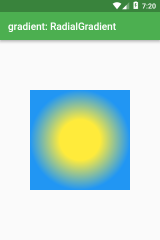
Scaffold(
  appBar: AppBar(title: Text('gradient: RadialGradient')),
  body: Center(
    child: Container(
      height: 200,
      width: 200,
      decoration: BoxDecoration(
        gradient: RadialGradient(
          colors: const [Colors.yellow, Colors.blue],
          stops: const [0.4, 1.0],
        ),
      ),
    ),
  ),
);
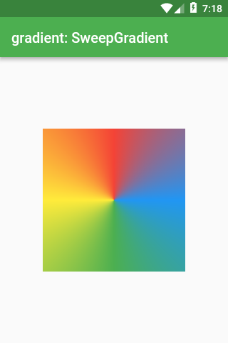
Scaffold(
  appBar: AppBar(title: Text('gradient: SweepGradient')),
  body: Center(
    child: Container(
      height: 200,
      width: 200,
      decoration: BoxDecoration(
        gradient: SweepGradient(
          colors: const [
            Colors.blue,
            Colors.green,
            Colors.yellow,
            Colors.red,
            Colors.blue,
          ],
          stops: const [0.0, 0.25, 0.5, 0.75, 1.0],
        ),
      ),
    ),
  ),
);
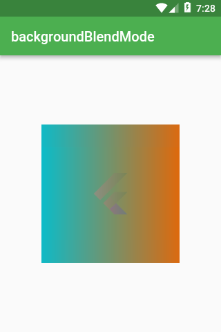
背景混合模式(backgroundBlendMode)
backgroundBlendMode 是 BoxDecoration 中最复杂的属性。
它可以混合 BoxDecoration 的颜色和渐变,并且无论 BoxDecoration 在何种元素之上。
有了 backgroundBlendMode,你可以使用 BlendMode 枚举类型中的一长串算法。
首先,配置 BoxDecoration 为 foregroundDecoration,它被渲染于 Container 子元素的上方(而 decoration 被渲染于子元素的后面)。

Scaffold(
  appBar: AppBar(title: Text('backgroundBlendMode')),
  body: Center(
    child: Container(
      height: 200,
      width: 200,
      foregroundDecoration: BoxDecoration(
        backgroundBlendMode: BlendMode.exclusion,
        gradient: LinearGradient(
          colors: const [
            Colors.red,
            Colors.blue,
          ],
        ),
      ),
      child: Image.network(
        'https://flutter.io/images/catalog-widget-placeholder.png',
      ),
    ),
  ),
);
backgroundBlendMode 不仅影响它所在的 Container。
backgroundBlendMode 能改变从 Container 的部件树中任意部件的颜色。
下面这段代码中,有一个作为父级元素的 Container,它渲染了一张图片 image 和一个使用了 backgroundBlendMode 的子元素 Container。你仍旧会得到和前一段代码相同的效果。
Scaffold(
  appBar: AppBar(title: Text('backgroundBlendMode')),
  body: Center(
    child: Container(
      decoration: BoxDecoration(
        image: DecorationImage(
          image: NetworkImage(
            'https://flutter.io/images/catalog-widget-placeholder.png',
          ),
        ),
      ),
      child: Container(
        height: 200,
        width: 200,
        foregroundDecoration: BoxDecoration(
          backgroundBlendMode: BlendMode.exclusion,
          gradient: LinearGradient(
            colors: const [
              Colors.red,
              Colors.blue,
            ],
          ),
        ),
      ),
    ),
  ),
);
SizedBox
这是最简单但是最有用的部件
用作 ConstrainedBox 的 SizedBox
SizedBox 可以实现和 ConstrainedBox 相似的效果
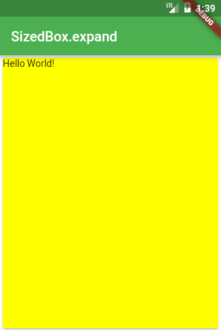
SizedBox.expand(
  child: Card(
    child: Text('Hello World!'),
    color: Colors.yellowAccent,
  ),
),
用作内边距的 SizedBox
如果你需要添加内边距或者外边距,你可以选择 Padding 或者 Container 部件。但是它们都不如添加 Sizedbox 简单易读
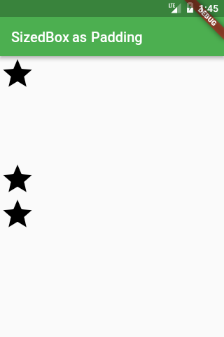
Column(
  children: <Widget>[
    Icon(Icons.star, size: 50),
    const SizedBox(height: 100),
    Icon(Icons.star, size: 50),
    Icon(Icons.star, size: 50),
  ],
),
用作不可见对象的 SizedBox
很多时候你希望通过一个布尔值(bool)来控制组件的显示和隐藏
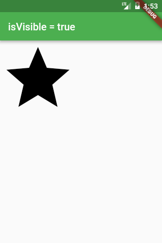
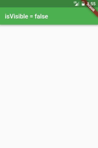
Widget build(BuildContext context) {
  bool isVisible = ...
  return Scaffold(
    appBar: AppBar(
      title: Text('isVisible = $isVisible'),
    ),
    body: isVisible
      ? Icon(Icons.star, size: 150)
      : const SizedBox(),
  );
}
由于 SizedBox 有一个 const 构造函数,使用 const SizedBox() 就变得非常简单。
更简单的解决方案是使用 Opacity 部件,然后将 opacity 的值改成 0.0。这个方案的缺点是虽然组件不可见,但是它依旧占据空间。
SafeArea
在不同的平台上,有很多特殊的位置,比如 Android 系统的状态栏,或者 iPhone X 的“齐刘海”,我们应该避免在这些位置放置元素。
解决方案就是使用 SafeArea 部件(下面的例子分别是使用和没使用 SafeArea 的效果)
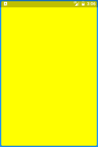
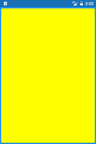
Widget build(BuildContext context) {
  return Material(
    color: Colors.blue,
    child: SafeArea(
      child: SizedBox.expand(
        child: Card(color: Colors.yellowAccent),
      ),
    ),
  );
}
更多内容敬请期待
如果发现译文存在错误或其他需要改进的地方,欢迎到 掘金翻译计划 对译文进行修改并 PR,也可获得相应奖励积分。文章开头的 本文永久链接 即为本文在 GitHub 上的 MarkDown 链接。
掘金翻译计划 是一个翻译优质互联网技术文章的社区,文章来源为 掘金 上的英文分享文章。内容覆盖 Android、iOS、前端、后端、区块链、产品、设计、人工智能等领域,想要查看更多优质译文请持续关注 掘金翻译计划、官方微博、知乎专栏。
