

上新功能时使用的css动画
先看效果:
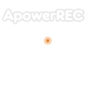
该效果一般用在新上了一个功能.引起提示效果
<!DOCTYPE html>
<html lang="en">
<head>
  <meta charset="UTF-8">
  <title>Title</title>
  <style>
    * {
      padding: 0;
      margin: 0;
    }
    html, body{
      width: 100%;
      height: 100%;
    }
    .box {
      margin: 100px auto;
      width: 50px;
      height: 50px;
      /*background: rgba(255,0,0,0.35);*/
      position: relative;
    }
    .box::before{
      content: ' ';
      display: block;
      width: 20px;
      height: 20px;
      border-radius: 50%;
      position: absolute;
      top: 0;
      left: 0;
      opacity: 0;
      background: #ed6c00;
      animation: guidePlay 3s linear infinite;
      animation-delay: 1s;
    }
    .box::after{
      content: ' ';
      display: block;
      width: 20px;
      height: 20px;
      border-radius: 50%;
      position: absolute;
      top: 0;
      left: 0;
      opacity: 0;
      background: #ed6c00;
      animation: guidePlay 3s linear infinite;
      animation-delay: 2s;
    }
    @keyframes guidePlay {
      0% {
        -webkit-transform: scale(0.1);
        transform: scale(0.1);
        opacity: 0;
      }
      10% {
        opacity: .8;
      }
      60% {
        opacity: 0.1;
      }
      to {
        -webkit-transform: scale(1.2);
        transform: scale(1.2);
        opacity: 0;
      }
    }
  </style>
</head>
<body>
  <div class="box"></div>
</body>
</html>
请求数据时使用的css动画

<!DOCTYPE html>
<html lang="en">
<head>
  <meta charset="UTF-8">
  <title>Title</title>
  <style>
    * {
      padding: 0;
      margin: 0;
    }
    html, body{
      width: 100%;
      height: 100%;
    }
    .box {
      margin: 100px auto;
      width: 100px;
      height: 50px;
    }
    .dot{
      display: inline-block;
      height: 1em;
      line-height: 1;
      text-align: left;
      vertical-align: -.25em;
      overflow: hidden;
    }
    .dot:before {
      display: block;
      content: '...\A..\A.';
      white-space: pre-wrap;
      animation: dot 3s infinite step-start both;
    }
    @keyframes dot {
      33% { transform: translateY(-2em); }
      66% { transform: translateY(-1em); }
    }
  </style>
</head>
<body>
  <div class="box">
    加载中<i class="dot"></i>
  </div>
</body>
</html>
用css画一个心
效果:

<!DOCTYPE html>
<html>
  <head>
    <meta charset="utf-8">
    <meta name="viewport" content="width=device-width,initial-scale=1.0">
    <title>ceshi</title>
    <style>
      .box{
        width: 100px;
        height: 100px;
        background: tomato;
        position: relative;
        top: 50px;
        left: 50px;
        transform: rotate(-45deg);
      }
      .box::before {
        content: ' ';
        position: absolute;
        top: -50px;
        left: 0;
        width: 100px;
        height: 100px;
        border-radius: 50%;
        background: tomato;
      }
      .box::after {
        content: ' ';
        position: absolute;
        top: 0;
        left: 50px;
        width: 100px;
        height: 100px;
        border-radius: 50%;
        background: tomato;
      }
    </style>
  </head>
  <body>
    <div class="box"></div>
  </body>
</html>
