

该文已授权公众号 「码个蛋」,转载请指明出处
上节最后留了个坑到这节来解决,因为涉及部件比较多,所以留到这边来继续讲,不然写太多了怕小伙伴看不下去
在上节最后,给小伙伴们展示了 SliveGrid 和 SliverFixedExtentList 的用法,基本上和 GridView 和 ListView 的用法差不多,所以这边就不多讲这两个部件了。
SliverAppBar
相信很多 Android 开发的小伙伴会用到 MaterialDesign 的 CollapsingToolbarLayout 来实现折叠头部,既然 Android 有的,那么 Flutter 也不会少,毕竟 Flutter 主打的也是 MaterialDesign 啊。首先看下 SliverAppBar 的源码吧,其实和 AppBar 的参数差不多,只是多了一些比较特殊的属性
const SliverAppBar({
    Key key,
    this.leading,
    this.automaticallyImplyLeading = true,
    this.title,
    this.actions,
    this.flexibleSpace, // 通过这个来设置背景
    this.bottom,
    this.elevation,
    this.forceElevated = false, // 是否显示层次感
    this.backgroundColor,
    this.brightness,
    this.iconTheme,
    this.textTheme,
    this.primary = true,
    this.centerTitle,
    this.titleSpacing = NavigationToolbar.kMiddleSpacing,
    this.expandedHeight, // 展开的高度
    // 以下三个等例子再讲
    this.floating = false,
    this.pinned = false,
    this.snap = false,
  })
别的参数应该不陌生吧,都是 AppBar 的,那么直接来看个例子吧,还是通过上节说的 CustomScrollView 来包裹 Sliver 部件
class SliverDemoPage extends StatelessWidget {
@override
Widget build(BuildContext context) {
return Scaffold(
body: CustomScrollView(slivers: <Widget>[
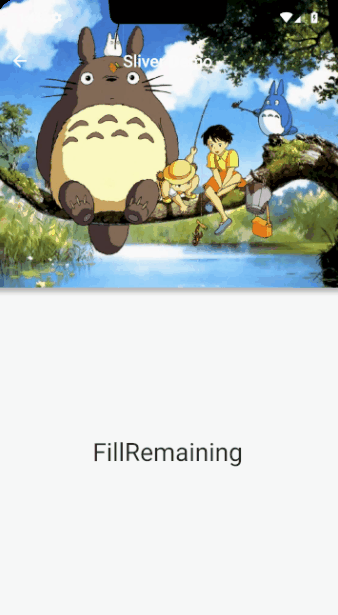
SliverAppBar(
title: Text('Sliver Demo'),
centerTitle: true,
// 展开的高度
expandedHeight: 300.0,
// 强制显示阴影
forceElevated: true,
// 设置该属性,当有下滑手势的时候,就会显示 AppBar
// floating: true,
// 该属性只有在 floating 为 true 的情况下使用,不然会报错
// 当上滑到一定的比例,会自动把 AppBar 收缩(不知道是不是 bug,当 AppBar 下面的部件没有被 AppBar 覆盖的时候,不会自动收缩)
// 当下滑到一定比例,会自动把 AppBar 展开
// snap: true,
// 设置该属性使 Appbar 折叠后不消失
// pinned: true,
// 通过这个属性设置 AppBar 的背景
flexibleSpace: FlexibleSpaceBar(
// title: Text('Expanded Title'),
// 背景折叠动画
collapseMode: CollapseMode.parallax,
background: Image.asset('images/timg.jpg', fit: BoxFit.cover),
),
),
// 这个部件一般用于最后填充用的,会占有一个屏幕的高度,
// 可以在 child 属性加入需要展示的部件
SliverFillRemaining(
child: Center(child: Text('FillRemaining', style: TextStyle(fontSize: 30.0))),
),
]));
}
}
这里分别给出不同的动图来查看三个属性的影响
如果设置了 floating 属性,当有下拉动作时,会显示 AppBar
如果设置了 snap 属性,滑动距离达到一定值后,会根据滑动方向收缩或者展开
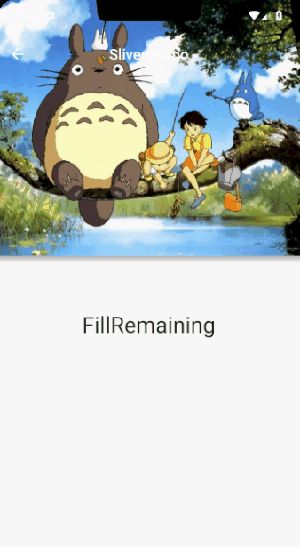
如果设置了 pinned 属性,那么 AppBar 就会在界面上不会消失
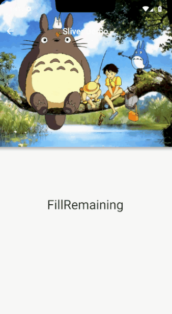
以上的效果图把 SliverFillRemaining 换成列表 SliverFixedExtentList 效果可能会更加明显,这边给小伙伴自己替换测试吧。
####SliverFillViewport
这边提到了 SliverFillRemaining 用来填充视图,那么顺带提下 SliverFillViewport 这个部件
const SliverFillViewport({
    Key key,
    @required SliverChildDelegate delegate, // 这个 delegate 同 SliverGrid
    this.viewportFraction = 1.0, // 同屏幕的比例值,1.0 为一个屏幕大小
  })
如果一个滑动列表,每个 item 需要占满一个屏幕或者更大,可以使用该部件生成列表,但是如果 item 的高度小于一个屏幕高度,那就不太推荐了,在首尾会用空白 item 来把未填满的补上,就是首尾都会留空白。我们使用 SliverFillViewport 对 SliverFillRemaning 进行替换
SliverFillViewport(
          viewportFraction: 1.0,
          delegate: SliverChildBuilderDelegate(
              (_, index) => Container(child: Text('Item $index'), alignment: Alignment.center, color: colors[index % 4]),
              childCount: 10))
效果就不展示了,可自行运行查看。
SliverToBoxAdapter
还记得上节最后的代码中,有使用 SliverToBoxAdapter 这个部件吗,这个部件只需要传入一个 child 属性。因为在 CustomScrollView 中只允许传入 Sliver 部件,那么类似 Container 等普通部件就不可以使用了,那么这样就需要更多的 Sliver 组件才能完成视图,所以为了方便,直接通过 SliverToBoxAdapter 对普通部件进行包裹,这样就成为一个 Sliver 部件了。总结下 SliverToBoxAdapter 的功能就是 把一个普通部件包裹成为 Sliver 部件,例子就不举了,上节已经有了。
SliverPadding
那么在 CustomScrollView 中部件之间如何设置间距呢,可能你会想到用 SliverToBoxAdapter 包裹一个 Padding 来处理,当然没问题。不过 Flutter 也提供了专门的部件 SliverPadding 使用方式同 Padding,但是需要传入一个 sliver 作为子类。
SliverPersistentHeader
Flutter 中,为我们提供了这么一个作为头部的部件 SliverPersistentHeader,这个部件可以根据滚动的距离缩小高度,有点类似 SliverAppBar 的背景效果。
const SliverPersistentHeader({
    Key key,
    @required this.delegate, // SliverPersistentHeaderDelegate,用来创建展示内容
    this.pinned = false, // 同 SliverAppBar 属性
    this.floating = false,
  })
SliverPersistentHeaderDelegate
这个代理比较特殊,是个抽象类,也就是需要我们自己进行继承后再实现方法。SliverPersistentHeaderDelegate 需要提供一个最大值,最小值,展示内容,以及更新部件条件
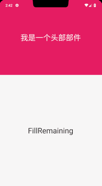
比如我们需要展示一个最大高度 300,最小高度 100,居中的文字,那么我们可以这么写这个代理类
class DemoHeader extends SliverPersistentHeaderDelegate {
  @override
  Widget build(BuildContext context, double shrinkOffset, bool overlapsContent) {
    return Container(
        color: Colors.pink,
        alignment: Alignment.center,
        child: Text('我是一个头部部件', style: TextStyle(color: Colors.white, fontSize: 30.0)));
  } // 头部展示内容

  @override
  double get maxExtent => 300.0; // 最大高度

  @override
  double get minExtent => 100.0; // 最小高度

  @override
  bool shouldRebuild(SliverPersistentHeaderDelegate oldDelegate) => false; // 因为所有的内容都是固定的,所以不需要更新
}
使用 SliverPersistentHeader 代替 SliverAppBar,看下效果
class SliverDemoPage extends StatelessWidget {
  final List<Color> colors = [Colors.red, Colors.green, Colors.blue, Colors.pink];

  @override
  Widget build(BuildContext context) {
    return Scaffold(
        body: CustomScrollView(slivers: <Widget>[
        SliverPersistentHeader(delegate: DemoHeader(), pinned: true),

      // 这个部件一般用于最后填充用的,会占有一个屏幕的高度,
      // 可以在 child 属性加入需要展示的部件
          SliverFillRemaining(
            child: Center(child: Text('FillRemaining', style: TextStyle(fontSize: 30.0))),
          ),
    ]));
  }
}
最后的效果图
当然,为了方便扩展,需要重新封装下 Delegate ,通过外部传入范围和展示内容
// 自定义 SliverPersistentHeaderDelegate
class CustomSliverPersistentHeaderDelegate extends SliverPersistentHeaderDelegate {
  final double max; // 最大高度
  final double min; // 最小高度
  final Widget child; // 需要展示的内容

  CustomSliverPersistentHeaderDelegate({@required this.max, @required this.min, @required this.child})
      // 如果 assert 内部条件不成立,会报错
      : assert(max != null),
        assert(min != null),
        assert(child != null),
        assert(min <= max),
        super();

  // 返回展示的内容,如果内容固定可以直接在这定义,如果需要可扩展,这边通过传入值来定义
  @override
  Widget build(BuildContext context, double shrinkOffset, bool overlapsContent) => child;

  @override
  double get maxExtent => max; // 返回最大高度

  @override
  double get minExtent => min; // 返回最小高度

  @override
  bool shouldRebuild(CustomSliverPersistentHeaderDelegate oldDelegate) {
    // 是否需要更新,这里我们定义当高度范围和展示内容被替换的时候进行刷新界面
    return max != oldDelegate.max || min != oldDelegate.min || child != oldDelegate.child;
  }
}
然后我们就可以愉快的使用了,不需要每个 Delegate 都重新写一遍,例如替换下刚才写死的 DemoHeader
SliverPersistentHeader(
        // 属性同 SliverAppBar
        pinned: true,
        floating: true,
        // 因为 SliverPersistentHeaderDelegate 是一个抽象类,所以需要自定义
        delegate: CustomSliverPersistentHeaderDelegate(
            max: 300.0, min: 100.0, child: Text('我是一个头部部件', style: TextStyle(color: Colors.white, fontSize: 30.0))),
      ),
例如需要替换成一张图片,直接将 Text 修改成 Image 即可。
以上部分代码查看 sliver_main.dart 文件
NestedScrollView
讲到这了,不得不提下 Scrollable 中比较重要的一员 NestedScrollView,先看下官方的解释
/// A scrolling view inside of which can be nested other scrolling views, with
/// their scroll positions being intrinsically linked.
糟透了的翻译 X 1:一个内部能够嵌套其他滚动部件,并使其滚动位置联结到一起的滚动部件
/// The most common use case for this widget is a scrollable view with a
/// flexible [SliverAppBar] containing a [TabBar] in the header (build by
/// [headerSliverBuilder], and with a [TabBarView] in the [body], such that the
/// scrollable view's contents vary based on which tab is visible.
糟透了的翻译 X 2:最常用的情况,就是在其 headerSliverBuilder 中使用携带 TabBar 的 SliverAppBar(就是使用 SliverAppBar 的 bottom 属性添加 tab 切换也),其 body 属性使用 TabBarView 来展示 Tab 页的内容,这样通过切换 Tab 页就能展示该页下的展示内容。
看下 headerSliverBuilder 的定义
/// Signature used by [NestedScrollView] for building its header.
///
/// The `innerBoxIsScrolled` argument is typically used to control the
/// [SliverAppBar.forceElevated] property to ensure that the app bar shows a
/// shadow, since it would otherwise not necessarily be aware that it had
/// content ostensibly below it.
typedef NestedScrollViewHeaderSliversBuilder = List<Widget> Function(BuildContext context, bool innerBoxIsScrolled);
糟透了的翻译 X 3:用于构建 NestScrollView 的头部部件,innerBoxIsScrolled 主要用来控制 SliverAppBar 的 forceElevated 属性,当内部内容滚动时,显示 SliverAppbar 的阴影,主要用来提醒内部的内容低于 SliverAppBar (相当于给人一种物理层次感,否则很容易被认为,头部和内容是连接在一起的)
接下来看下 NestedScrollView 内部个人觉得有点重要的一个方法 sliverOverlapAbsorberHandleFor
/// Returns the [SliverOverlapAbsorberHandle] of the nearest ancestor
/// [NestedScrollView].
///
/// This is necessary to configure the [SliverOverlapAbsorber] and
/// [SliverOverlapInjector] widgets.
///
/// For sample code showing how to use this method, see the [NestedScrollView]
/// documentation.
static SliverOverlapAbsorberHandle sliverOverlapAbsorberHandleFor(BuildContext context) {
  final _InheritedNestedScrollView target = context.inheritFromWidgetOfExactType(_InheritedNestedScrollView);
  assert(target != null, 'NestedScrollView.sliverOverlapAbsorberHandleFor must be called with a context that contains a NestedScrollView.');
  return target.state._absorberHandle;
}
请注意到中间的注释
糟透了的翻译 X 4:这个方法返回的值对于 SliverOverlapAbsorber 和 SliverOverlapInjector 部件是非常重要的参数
接着请注意代码中的那段 assert 中的文字
糟透了的翻译 X 5:sliverOverlapAbsorberHandleFor 传入的参数 context 中必须包含 NestedScrollView
#####SliverOverlapAbsorber
这边又引入了两个部件 SliverOverlapAbsorber + SliverOverlapInjector 还是看源码的解释吧
/// Creates a sliver that absorbs overlap and reports it to a
/// [SliverOverlapAbsorberHandle].
///
/// The [handle] must not be null.
///
/// The [child] must be a sliver.
const SliverOverlapAbsorber({
  Key key,
  @required this.handle,
  Widget child,
})
糟透了的翻译 X 6:一个 sliver 部件,用于把部件重叠的高度反馈给 SliverOverlapAbsorberHandle,而且指明了 handle 不能空,可以通过 NestedScrollView 的 sliverOverlapAbsorberHandleFor 方法来赋值,并且 child 必须是个 sliver 部件,也就是说我们的 SliverAppBar 需要放到 SliverOverlapAbsorber 里面。
#####SliverOverlapInjector
/// Creates a sliver that is as tall as the value of the given [handle]'s
/// layout extent.
///
/// The [handle] must not be null.
const SliverOverlapInjector({
  Key key,
  @required this.handle,
  Widget child,
})
糟透了的翻译 X 7:创建一个和指定的 handle 一样高度的 sliver 部件,这个 handle 同 SliverOverlapAbsorber 的 handle 保持一致即可。
分析完源码后,例子的目标很明确,使用 SliverAppBar + TabBar + TabBarView,先看下最后的效果图吧
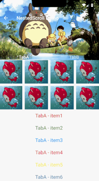
class NestedScrollDemoPage extends StatelessWidget {
  final _tabs = <String>['TabA', 'TabB'];
  final colors = <Color>[Colors.red, Colors.green, Colors.blue, Colors.pink, Colors.yellow, Colors.deepPurple];

  @override
  Widget build(BuildContext context) {
    return Scaffold(
      body: DefaultTabController(
          length: _tabs.length,
          child: NestedScrollView(
              headerSliverBuilder: (context, innerScrolled) => <Widget>[
                    SliverOverlapAbsorber(
                      // 传入 handle 值,直接通过 `sliverOverlapAbsorberHandleFor` 获取即可
                      handle: NestedScrollView.sliverOverlapAbsorberHandleFor(context),
                      child: SliverAppBar(
                        pinned: true,
                        title: Text('NestedScroll Demo'),
                        expandedHeight: 200.0,
                        flexibleSpace: FlexibleSpaceBar(background: Image.asset('images/timg.jpg', fit: BoxFit.cover)),
                        bottom: TabBar(tabs: _tabs.map((tab) => Text(tab, style: TextStyle(fontSize: 18.0))).toList()),
                        forceElevated: innerScrolled,
                      ),
                    )
                  ],
              body: TabBarView(
                  children: _tabs
                      // 这边需要通过 Builder 来创建 TabBarView 的内容,否则会报错
                      // NestedScrollView.sliverOverlapAbsorberHandleFor must be called with a context that contains a NestedScrollView.
                      .map((tab) => Builder(
                            builder: (context) => CustomScrollView(
                                  // key 保证唯一性
                                  key: PageStorageKey<String>(tab),
                                  slivers: <Widget>[
                                    // 将子部件同 `SliverAppBar` 重叠部分顶出来,否则会被遮挡
                                    SliverOverlapInjector(
                                        handle: NestedScrollView.sliverOverlapAbsorberHandleFor(context)),
                                    SliverGrid(
                                        delegate: SliverChildBuilderDelegate(
                                            (_, index) => Image.asset('images/ali.jpg'),
                                            childCount: 8),
                                        gridDelegate: SliverGridDelegateWithFixedCrossAxisCount(
                                            crossAxisCount: 4, mainAxisSpacing: 10.0, crossAxisSpacing: 10.0)),
                                    SliverFixedExtentList(
                                        delegate: SliverChildBuilderDelegate(
                                            (_, index) => Container(
                                                child: Text('$tab - item${index + 1}',
                                                    style: TextStyle(fontSize: 20.0, color: colors[index % 6])),
                                                alignment: Alignment.center),
                                            childCount: 15),
                                        itemExtent: 50.0)
                                  ],
                                ),
                          ))
                      .toList()))),
    );
  }
}
使用的部件和之前讲的没啥大区别,就是多了 SliverOverlapAbsorber 和 SliverOverlapInjector 没啥难度
以上部分代码查看 nested_scroll_main.dart 文件
sliver 部件常用的也就那么多了,望小伙伴好好吸收,跟着例子撸撸代码,撸顺下思路
最后代码的地址还是要的:
-
文章中涉及的代码:demos
-
基于郭神
cool weather接口的一个项目,实现BLoC模式,实现状态管理:flutter_weather -
一个课程(当时买了想看下代码规范的,代码更新会比较慢,虽然是跟着课上的一些写代码,但是还是做了自己的修改,很多地方看着不舒服,然后就改成自己的实现方式了):flutter_shop
如果对你有帮助的话,记得给个 Star,先谢过,你的认可就是支持我继续写下去的动力~
