

前言
前几篇文章大家已经对Flutter环境搭建、所用开发语言和一些绘图原理有了一个初步了解,本篇是一个实战篇,进行应用开发时首先要进行UI界面的开发,Flutter所展示的UI界面都是由一些Widget组合而成,Widget可以理解为我们原生开发中的UI控件和UI布局控件。例如iOS中的UILabel、UIButton、UITableView,安卓中的Button、TextView、ListView等。下面带大家一起来看一下常用的Widget使用方法。
常用Widget介绍
文本控件
文本控件是日常开发中最常用的控件,Flutter提供了两个文本控件供我们使用,下面针对常用的几个属性进行介绍。
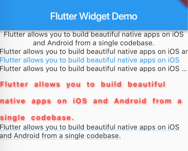
Text
Text(
  'Flutter allows you to build beautiful native apps on iOS and Android from a single codebase.',
  textAlign: TextAlign.center, // 文本对齐方式
),
Text(
  'Flutter allows you to build beautiful native apps on iOS and Android from a single codebase.',
  softWrap: false, // true时会自动换行处理;false时会判定为有无限的水平空间,不会换行
),
Text(
  'Flutter allows you to build beautiful native apps on iOS and Android from a single codebase.',
  maxLines: 1, //最大行数
  style: TextStyle(
    color: Colors.blue,
  ),
),
Text(
  'Flutter allows you to build beautiful native apps on iOS and Android from a single codebase.',
  overflow: TextOverflow.ellipsis, //溢出处理,这里ellipsis将多余的内容设置为...
),
Text(
  'Flutter allows you to build beautiful native apps on iOS and Android from a single codebase.',
  style: TextStyle( // 文本样式
    color: Colors.red, // 文本颜色
    fontSize: 14, // 字体大小
    fontWeight: FontWeight.w600, // 字体粗细程度
    fontStyle: FontStyle.normal, // 字体样式
    letterSpacing: 2, // 字母或字间距
    wordSpacing: 5, // 单词间距
    height: 2, // 行高,值为字体大小的倍数
    shadows: [Shadow(color: Colors.red, offset: Offset(1, 1), blurRadius: 5)], // 阴影
  ),
),
Text(
  'Flutter allows you to build beautiful native apps on iOS and Android from a single codebase.',
  style: TextStyle(
    decoration: TextDecoration.underline, // 文本装饰,此处设置下划线
    decorationColor: Colors.blue, // 文本装饰颜色
    decorationStyle: TextDecorationStyle.dotted, // 文本装饰样式
  ),
),
显示效果如下图:
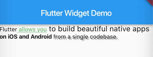
RichText
富文本控件,可以对一段连续的文本设置不用的样式,实战中比较常见。
RichText(
  text: TextSpan(
    text: 'Flutter',
    style: TextStyle(color: Colors.black),
    children: <TextSpan>[
      TextSpan(
        text: ' allows you',
        style: TextStyle(
          color: Colors.green,
          decoration: TextDecoration.underline,
          decorationStyle: TextDecorationStyle.solid,
        ),
      ),
      TextSpan(
        text: ' to build beautiful native apps',
        style: TextStyle(
          fontSize: 18,
        )
      ),
      TextSpan(
        text: ' on iOS and Android',
        style: TextStyle(
          fontWeight: FontWeight.bold,
        )
      ),
      TextSpan(
          text: ' from a single codebase.',
          style: TextStyle(
            shadows: [Shadow(color: Colors.black38, offset: Offset(3, 3))],
          )
      ),
    ],
  ),
)
显示效果如下图:
图片控件
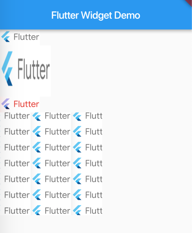
Image
Image.asset(
  'images/flutter_logo.png', //图片资源路径
),
Image.asset(
  'images/flutter_logo.png',
  width: 100, //图片宽度
  height: 100, //图片高度
  fit: BoxFit.fill, //适配显示方式,fill表示宽高填充满
),
Image.asset(
  'images/flutter_logo.png',
  color: Colors.red, //混合的颜色,和colorBlendMode一起使用
  colorBlendMode: BlendMode.overlay, //颜色和图片混合模式,功能较强大,其它模式参见官方文档或源码
),
Image.asset(
  'images/flutter_logo.png',
  width: 200,
  height: 200,
  repeat: ImageRepeat.repeat, //在宽高内重复平铺图片,直到铺满
)
显示效果如下图:
除以上使用的Image.asset()构造函数外,Image还有Image.file()、Image.network()和Image.memory()等命名构造函数。
- Image.file
可通过路径加载SD卡中存储的图片,安卓使用此方法时需要申请android.permission.READ_EXTERNAL_STORAGE权限。
-
Image.network 可通过url加载网络图片。
-
Image.memory 可通过Uint8List对象加载内存中的图片。
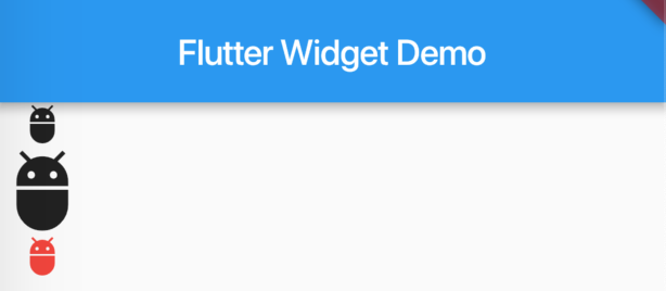
Icon
Icon(
  Icons.adb,
),
Icon(
  Icons.adb,
  size: 50, //icon大小
),
Icon(
  Icons.adb,
  color: Colors.red, //icon颜色
)
显示效果如下图:
按钮控件
按钮控件在Flutter中有两种风格的button,安卓Material Design风格和iOS Cupertino风格。
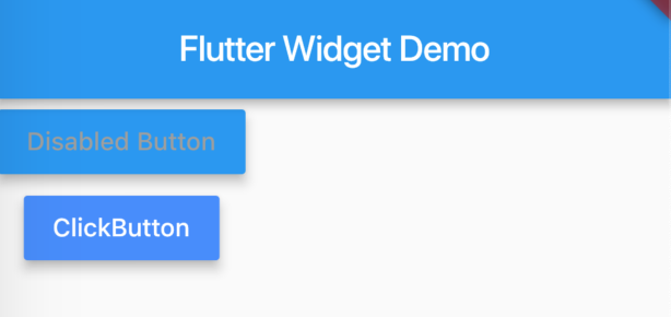
RaisedButton
RaisedButton(
  onPressed: null, // onPressed为null视为不可点击
  disabledTextColor: Colors.grey, // 不可点击的文本颜色
  disabledColor: Colors.blue, // 不可点击的按钮颜色
  disabledElevation: 5, // 不可点击时图层高度
  child: Text('Disabled Button'),
),
RaisedButton(
  onPressed: () { // onPressed不为null视为可点击
    print('You click the button');
  },
  textColor: Colors.white, // 文本颜色
  color: Colors.blueAccent, // 按钮颜色
  highlightColor: Colors.lightBlue, //点击按钮后高亮的颜色
  elevation: 5, // 按钮图层高度
  highlightElevation: 8, // 点击按钮高亮后的图层高度
  animationDuration: Duration(milliseconds: 300), // 点击按钮后过渡动画时间
  child: Text('ClickButton'),
)
显示效果如下图:
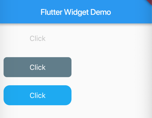
CupertinoButton
CupertinoButton(
  child: Text('Click'),
  disabledColor: Colors.blueGrey, //不可点击时按钮颜色,color属性不设置该值无效
  onPressed: null, // onPressed为null视为不可点击
),
CupertinoButton(
  child: Text('Click'),
  color: Colors.lightBlue,
  disabledColor: Colors.blueGrey, //不可点击时按钮颜色,color属性不设置该值无效
  onPressed: null, // onPressed为null视为不可点击
),
CupertinoButton(
  child: Text('Click'),
  color: Colors.lightBlue, // 按钮颜色
  borderRadius: BorderRadius.all(Radius.circular(15.0)), // 按钮圆角设置
  onPressed: () { // onPressed不为null视为可点击
    print('You click the button');
  },
)
显示效果如下图:
输入控件
输入控件同样有两种风格,分别是Material Design风格的TextField和Cupertino风格的CupertinoTextField。
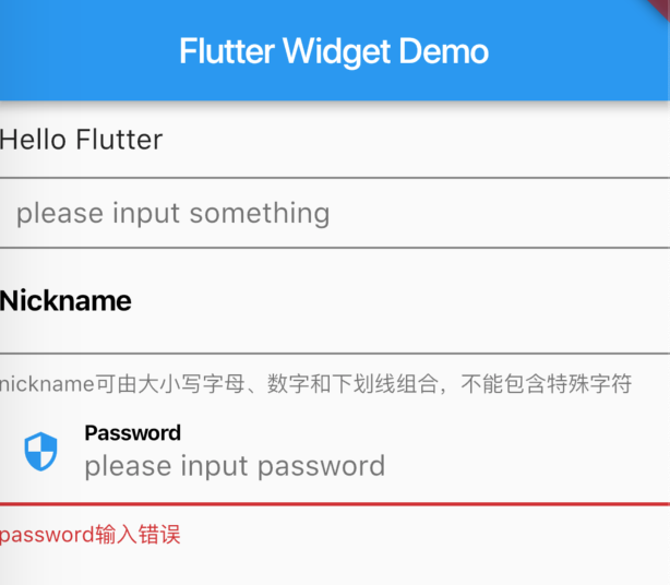
TextField
TextField(
  controller: TextEditingController(text: 'Hello Flutter'), // 默认输入内容
),
TextField(
  decoration: InputDecoration( //输入框装饰
    hintText: 'please input something', // 输入提示
    contentPadding: EdgeInsets.all(10), // 输入框内容padding值
  ),
),
TextField(
  decoration: InputDecoration(
    labelText: 'Nickname', // 输入框文本标签
    labelStyle: TextStyle(color: Colors.black, fontWeight: FontWeight.bold), // 标签文本风格
    hintText: 'please input nickname', // 输入提示
    helperText: 'nickname可由大小写字母、数字和下划线组合,不能包含特殊字符', // 帮助提示文本
  ),
),
TextField(
  decoration: InputDecoration(
    labelText: 'Password', // 输入框文本标签
    labelStyle: TextStyle(color: Colors.black, fontWeight: FontWeight.bold), // 标签文本风格
    hintText: 'please input password', // 输入提示
    errorText: 'password输入错误', // 错误提示文本
    prefixIcon: Icon(Icons.security), // 输入框前缀图标
  ),
)
显示效果如下图:
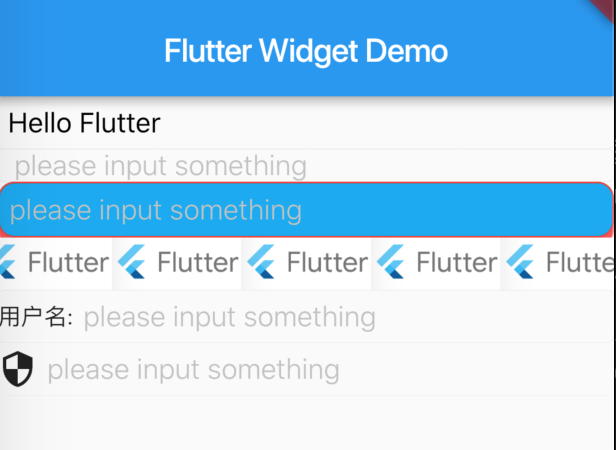
CupertinoTextField
CupertinoTextField(
  controller: TextEditingController(text: 'Hello Flutter'), // 默认输入内容
),
CupertinoTextField(
  placeholder: 'please input something', // 输入提示
  padding: EdgeInsets.only(left: 10, right: 10), // 输入框内容padding值
),
CupertinoTextField(
  placeholder: 'please input something', // 输入提示
  decoration: BoxDecoration( // 文本框装饰
    color: Colors.lightBlue, // 文本框颜色
    border: Border.all(color: Colors.red, width: 1), // 输入框边框
    borderRadius: BorderRadius.all(Radius.circular(10)), // 输入框圆角设置
    boxShadow: [BoxShadow(color: Colors.redAccent, offset: Offset(0, 5))], //装饰阴影
  ),
),
CupertinoTextField(
  decoration: BoxDecoration( // 文本框装饰
      image: DecorationImage( //文本框装饰背景图片
image: AssetImage('images/flutter_logo.png'),
repeat: ImageRepeat.repeat,
      )
  ),
),
CupertinoTextField(
  placeholder: 'please input something', // 输入提示
  prefix: Text('用户名:'), // 输入框前缀图文
),
CupertinoTextField(
  placeholder: 'please input something', // 输入提示
  prefix: Icon(Icons.security), // 输入框前缀图文
  enabled: false, // 是否可编辑
)
显示效果如下图:
从TextField和CupertinoTextField的属性设置来看,还是有很多实现不一样的地方,所以如果大家要针对iOS和安卓手机原有的风格开发UI时,要根据平台不同使用不同的Widget来实现,不同风格的Widget属性要熟练掌握。具体其它的一些属性请参考官方文档或源码。
选择控件
选择控件包括Material Design风格的Checkbox、Radio、Switch、Slider和Cupertino风格的CupertinoSwitch、CupertinoSlider、CupertinoSegmentedControl等。
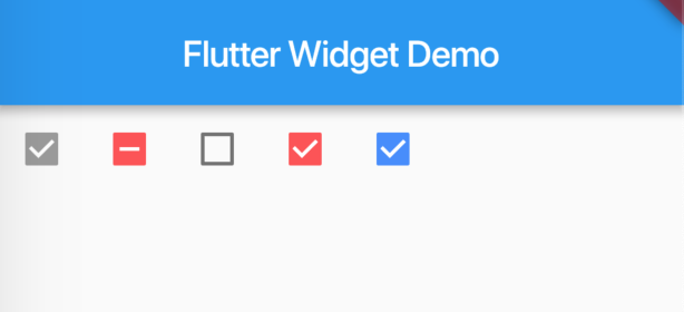
Checkbox
Checkbox(
  value: true,
  onChanged: null,
  tristate: true,
),
Checkbox(
  value: null, // 为null时tristate值必须为true,表示有三种状态
  onChanged: (checked) {},
  activeColor: Colors.redAccent, // checkbox颜色
  tristate: true, // 是否有三种状态
),
Checkbox(
  value: false, // 未选中状态
  onChanged: (checked) {},
  activeColor: Colors.redAccent, // checkbox颜色
  tristate: false, // 是否有三种状态
),
Checkbox(
  value: true, // 选中状态
  onChanged: (checked) {},
  activeColor: Colors.redAccent, // checkbox颜色
  tristate: false, // 是否有三种状态
),
Checkbox(
  value: isChecked, // 控件状态值
  onChanged: (checked) {
    print("checked = $checked");
    setState(() { // 状态改变后需要通过setState刷新Widget改变状态
      this.isChecked = checked;
    });
  },
  tristate: true, //是否有三种状态
  activeColor: Colors.blueAccent, // checkbox颜色
)
显示效果如下图:
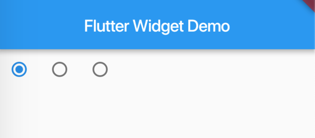
Radio
String _character = 'A';

Radio<String>(
  value: 'A', // 代表的值
  groupValue: _character, // 当前radio group选中的值,当该值与value值匹配时则被选中
  onChanged: (String newValue) {
    setState(() { // 点击当前控件时更新状态
      _character = newValue;
    });
  },
),
Radio<String>(
  value: 'B',
  groupValue: _character,
  onChanged: (String newValue) {
    setState(() {
      _character = newValue;
    });
  },
),
Radio<String>(
  value: 'C',
  groupValue: _character,
  onChanged: (String newValue) {
    setState(() {
      _character = newValue;
    });
  },
)
显示效果如下图:
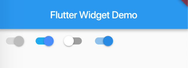
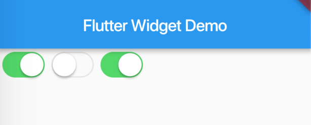
Switch
bool _switchChecked = true;

Switch(
  value: true,
  activeColor: Colors.blueAccent, // 激活状态开关颜色
  activeTrackColor: Colors.lightBlue, //激活状态开关轨道颜色
  onChanged: null, // 为null时则开关不可操作
),
Switch(
  value: true,
  activeColor: Colors.blueAccent, // 激活状态开关颜色
  activeTrackColor: Colors.lightBlue, //激活状态开关轨道颜色
  onChanged: (flag) {}, // 为null时则开关不可操作
),
Switch(
  value: false,
  inactiveThumbColor: Colors.white, // 未激活状态开关颜色
  inactiveTrackColor: Colors.grey, // 未激活状态开关轨道颜色
  onChanged: (flag) {},
),
Switch(
  value: _switchChecked,
  onChanged: (flag) {
    setState(() { // 状态改变是通过setState改变状态值
      _switchChecked = flag;
    });
  },
)
显示效果如下图:
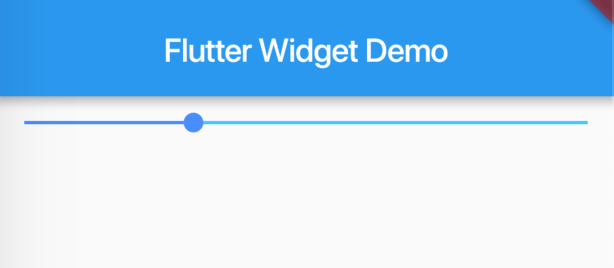
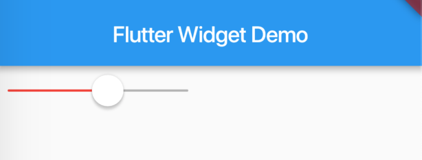
Slider
double _sliderValue = 0.3;

Slider(
  value: _sliderValue, // 当前滑块定位到的值
  onChanged: (val) { // 滑动监听
    setState(() { // 通过setState设置当前值
      _sliderValue = val;
    });
  },
  onChangeStart: (val) { // 开始滑动时的监听
    print('changeStart: val = $val');
  },
  onChangeEnd: (val) { // 滑动结束时的监听
    print('changeEnd: val = $val');
  },
  min: 0, // 最小值
  max: 1, // 最大值
  activeColor: Colors.blueAccent, //滑动过的颜色
  inactiveColor: Colors.lightBlueAccent, //未达到的颜色
)
显示效果如下图:
CupertinoSwitch
bool _switchChecked = true;

CupertinoSwitch(
  value: true, //开关值
),
CupertinoSwitch(
  value: false,
),
CupertinoSwitch(
  value: _switchChecked,
  onChanged: (flag) {
    setState(() { // 状态改变是通过setState改变状态值
      _switchChecked = flag;
    });
  },
)
显示效果如下图:
CupertinoSlider
CupertinoSlider(
  value: _sliderValue, // 当前滑块定位到的值
  onChanged: (val) { // 滑动监听
    setState(() { // 通过setState设置当前值
      _sliderValue = val;
    });
  },
  onChangeStart: (val) { // 开始滑动时的监听
    print('changeStart: val = $val');
  },
  onChangeEnd: (val) { // 滑动结束时的监听
    print('changeEnd: val = $val');
  },
  min: 0, // 最小值
  max: 1, // 最大值
  activeColor: Colors.red, //滑动过的颜色
)
显示效果如下图:
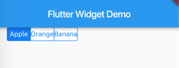
CupertinoSegmentedControl
Map<String, Text> map = {'apple': Text('Apple'), 'orange': Text('Orange'), 'banana': Text('Banana')};
String _fruit = 'apple';

CupertinoSegmentedControl(
  children: map, // 数据
  groupValue: _fruit, // 选中的数据
  onValueChanged: (fruit) {
    setState(() { // 数据改变时通过setState改变选中状态
      _fruit = fruit;
    });
  },
  unselectedColor: CupertinoColors.white, // 未选中颜色
  selectedColor: CupertinoColors.activeBlue, // 选中颜色
  borderColor: CupertinoColors.activeBlue, // 边框颜色
  pressedColor: const Color(0x33007AFF), // 点击时候的颜色
)
显示效果如下图:
总结
以上为部分常用Widget的一些常用属性详细介绍,其他常用Widget后续继续分享。
说明: 文章转载自对应的“Flutter编程指南”微信公众号,更多Flutter相关技术文章请关注微信公众号获取。
