


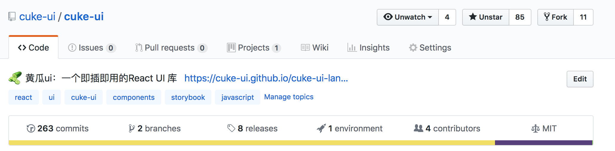
1. 前言
2018年马上结束啦, 今年是 充实忙碌的一年啊, 年中有一天脑壳一热,突然想开发一个 React 组件库, 之前偶尔写过一些 小玩具, 所以想能不能写一个 大玩具呢? 庆幸自己不是三分钟热度, 花了三个月时间, 周末,和工作日休息时间, 搞了一个 cuke-ui 在这里,记录一下心得吧
2. 组件化
2011年 我还在读初中, Twitter 的两位大佬,由于 老板给他们安排的工作太多了,很多重复性的东西, 由于他们太懒了, 一不小心就 开发了 Bootstrap, 这个东西不用多说, 虽然我不太喜欢, 但是它无疑是 最火,最早的一批 前端 Ui 库, 也是在那时候,我认识到, 能 CV 编程 尽量 不 BB 的重要性
到现在 三大框架 一统天下, 组件 成了不可或缺的一部分, 各种 UI 库 层出不穷. 最火的还是当属 antd , 于是 我觉得 借鉴 (抄袭) 一波, 开始干活了
3. 搭建项目
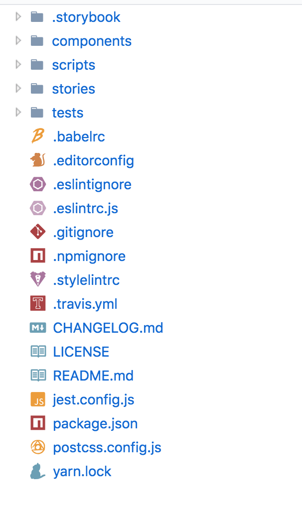
.storebookstorebook 的一些配置components参考的 antd, 放置所有组件scripts发布,打包,相关的一些脚本stories项目静态文档,负责 demo 演示tests测试相关的一些setup
其他就没啥说的, 全是一些常规文件, 不得不吐槽 现在搭个项目 需要的配置文件越来越多了
3.1 storybook 搭建网站
一个组件库 肯定需要一个 演示 demo 的静态网站 ,比如 antd 的 Button 对比了一下, 选了一个 比较简单的 storebook 来搭建网站
import React from "react"
import { configure, addDecorator } from '@storybook/react';
import { name, repository } from "../package.json"
import { withInfo } from '@storybook/addon-info';
import { withNotes } from '@storybook/addon-notes';
import { configureActions } from '@storybook/addon-actions';
import { withOptions } from '@storybook/addon-options';
import { version } from '../package.json'
import '@storybook/addon-console';
import "../components/styles/index.less"
import "../stories/styles/code.less"

function loadStories() {
  // 介绍
  require('../stories/index');
  // 普通
  require('../stories/general');
  // 视听娱乐
  require('../stories/player');
  // 导航
  require('../stories/navigation')
  // 数据录入
  require('../stories/dataEntry');
  // 数据展示
  require('../stories/dataDisplay');
  // 布局
  require('../stories/grid');
  // 操作反馈
  require('../stories/feedback');
  // 其他
  require('../stories/other');
}

configureActions({
  depth: 100
})

addDecorator(withInfo({
  header: true,
  maxPropsIntoLine: 100,
  maxPropObjectKeys: 100,
  maxPropArrayLength: 100,
  maxPropStringLength: 100,
}))
addDecorator(withNotes);
addDecorator(withOptions({
  name: `${name} v${version}`,
  url: repository,
  sidebarAnimations: true,
}))

addDecorator(story => <div style={{ padding: "0 60px 50px" }}>{story()}</div>)
configure(loadStories, module);
编写 stories
import React from 'react';
import { storiesOf } from '@storybook/react';
import { action } from '@storybook/addon-actions';
import Button from '../components/button';
import './styles/button.less';

import "../components/button/styles.less";
import { SuccessIcon } from '../components/icon';

storiesOf('普通', module).add(
  'Button 按钮',
  () => (
    <div className="button-example">
      <h2>基本使用</h2>

      <Button onClick={action('clicked')}>默认</Button>
     </div>
  )
)
再配合 webpack.config.js 就基本完事了, 配置就不贴了, 常规操作
这时候 看效果
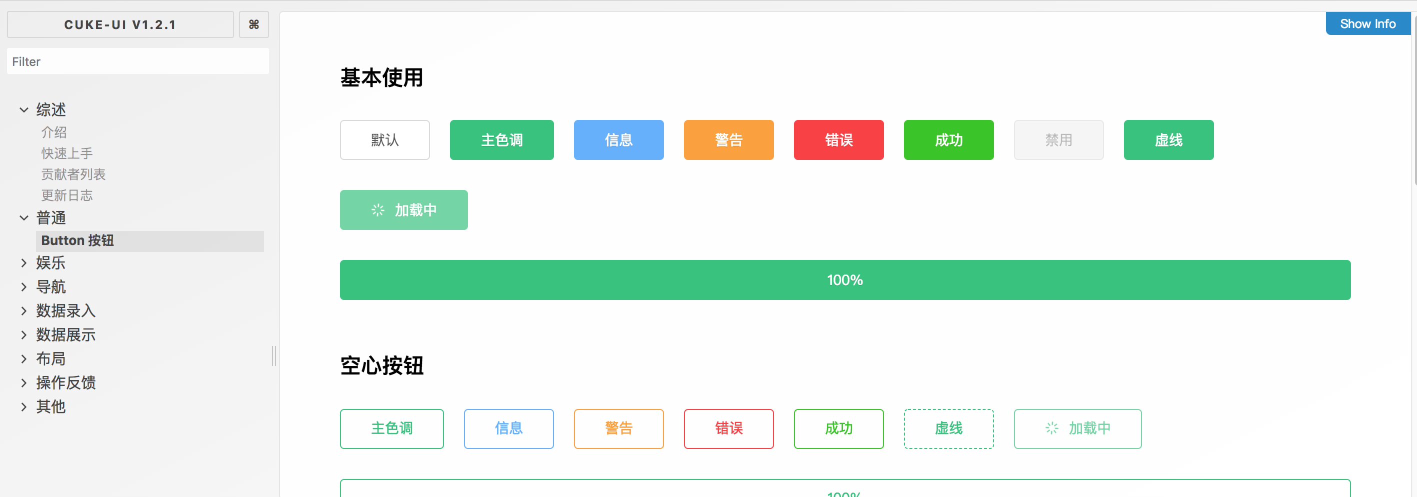
哇塞, 好像是那么回事, 美滋滋, 这里虽然几句话 就讲完了, 实际我撸的时候 , 还是遇到了很多 很繁琐的麻烦, 比如 webpack4 babel@7.x 与 storybook 版本不兼容啊 之类的, 各种搜 issue 啊, 好在最后解决了
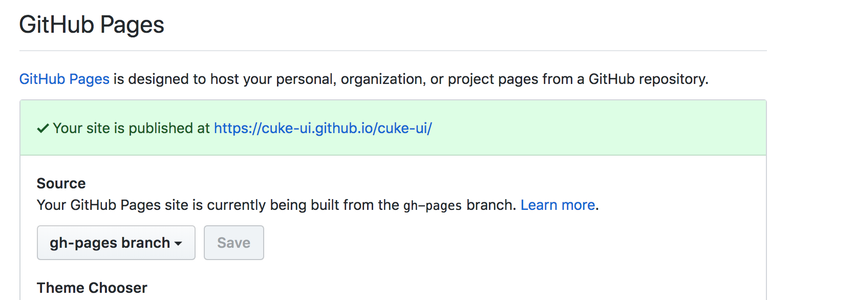
storybook 提供了 一个 静态发布 插件 , 这样解决了我最后一个问题, 发布到 github 的 gh-page , 添加两行 npm scripts
"scripts": {
    "start": "yarn dev",
    "clean": "rimraf dist && rimraf lib",
    "dev": "start-storybook -p 8080 -c .storybook",
    "build:docs": "build-storybook -c .storybook -o .out",
    "pub:docs": "yarn build:docs && storybook-to-ghpages --existing-output-dir=.out",
}
"storybook-deployer": {
    "gitUsername": "cuke-ui",
    "gitEmail": "xx@xx.com",
    "commitMessage": "docs: deploy docs"
},
然后运行
yarn pub:docs
原理很简单,先通过 webpack 打包文档, 然后 git add . 然后 push 当 远端的 gh-pages 分支,
可以通过 repo => Setting => Github Pages 看到当前 部署好的 静态网站
3.2 开始编写组件
网站搭好了, 相当于买好了 厨房用具, 可以开始 炒菜了, 菜在哪里? 好吧, 还要自己种菜, 现在我们 开始 种 Button 这个菜
cd components && mkdir button
在 components 目录 下 新建一个 button 目录
__tests__// 测试index.test.js
index.js//组件入口styles.less//组件样式
// index.js

import React, { PureComponent } from "react";
import PropTypes from "prop-types";
import cls from "classnames";

export default class Button extends PureComponent {

    // 具体代码
}
// styles.less
@import "../styles/vars.less";
@import "../styles/animate.less";
@import "../styles/mixins.less";
@prefixCls : cuke-button;
.@{prefixCls} {
  // 具体样式
}
// index.test.js

import React from "react";
import assert from "power-assert";
import { render, shallow } from "enzyme";
import toJson from "enzyme-to-json";
import Button from "../index";

describe("<Button/>", () => {
  it("should render a <Button/> components", () => {
    const wrapper = render(
    <Button>你好</Button>
    )
    expect(toJson(wrapper)).toMatchSnapshot();
  })
这样就写好了 组件了, 我们假设 这个组件库暂时只有一个 Button 组件, 最后只剩一件事 , 发布到 npm
让用户 可以向下面这样使用
import { Button } from "cuke-ui"
import "cuke-ui/dist/cuke-ui.min.css"

ReactDOM.render(
    <Button>你好</Button>,
    document.getElementById('root')
)
3.3 编写打包配置
通常组件库 会提供两种 引入的方式
- 通过 babel 打包的方式
babel components -d lib
- 通过 script 标签引入的
UMD通用模块规范
<link rel="stylesheet" href="https://unpkg.com/cuke-ui@latest/dist/cuke-ui.min.css">
<script type="text/javascript" src="https://unpkg.com/cuke-ui@latest/dist/cuke-ui.min.js"></script>
我以前写 插件的时候 只用过 第一种方式, 第二种也是放各种开源项目的代码才知道 原来可以通过 webpack 打包 umd
// scripts/build.umd.js

const config = {
  mode: "production",
  entry: {
    [name]: ["./components/index.js"]
  },

  //umd 模式打包
  output: {
    library: name,
    libraryTarget: "umd",
    umdNamedDefine: true, // 是否将模块名称作为 AMD 输出的命名空间
    path: path.join(process.cwd(), "dist"),
    filename: "[name].min.js"
  },

  ...
}

module.exports = config
这里 使用 webpack4 所以指定 mode 为 生产环境, 自动帮你优化, 重点说下 entry 和 output
找到打包入口 componnets 下面的 index.js , 然后 输入到 dist 目录, 生成一个 cuke-ui.min.js,
这时候发现 其实我们差一个 入口文件
// components/index.js

export { default as Button } from "./button";
这里 把 默认模块 导出 取了一个别名,好处就是 可以统一管理 暴露给用户的 组件名字
最后 我们 在 npm scripts 添加一条命令, 不用每次手动去打包
"clean": "rimraf dist && rimraf lib",
"build": "yarn run clean && yarn build:lib && yarn build:umd && yarn build:css",
"build:css": "cd scripts && gulp",
"build:lib": "babel components -d lib",
"build:umd": "webpack --config ./scripts/build.umd.js",
clean是为了 防止 dist 和 lib 目录有无修改的情况, 每次打包前先删除,build:lib通过 babel 打包到es模块到lib目录build:umd刚才已经解释过了
这时候 运行
yarn build
js 相关的部分倒是没问题了, 现在以及可以直接使用了
import { Button } from './lib'
<script type="module">
import {Button} from "https://unpkg.com/cuke-ui@latest/dist/cuke-ui.min.js"
</script>
这时候会发现其实 还缺少对 css 的打包, 再加把劲, 加上 gulp 的配置
这一段配置 抄袭的 dragon-ui 的 配置, 稍微改了下
const path = require('path');
const gulp = require('gulp');
const concat = require('gulp-concat');
const less = require('gulp-less');
const autoprefixer = require('gulp-autoprefixer');
const cssnano = require('gulp-cssnano');
const size = require('gulp-filesize');
const sourcemaps = require('gulp-sourcemaps');
const rename = require('gulp-rename');
const { name } = require('../package.json')
const browserList = [
  "last 2 versions", "Android >= 4.0", "Firefox ESR", "not ie < 9"
]

const DIR = {
  less: path.resolve(__dirname, '../components/**/*.less'),
  buildSrc: [
    path.resolve(__dirname, '../components/**/styles.less'),
    path.resolve(__dirname, '../components/**/index.less'),
  ],
  lib: path.resolve(__dirname, '../lib'),
  dist: path.resolve(__dirname, '../dist'),
};

gulp.task('copyLess', () => {
  return gulp.src(DIR.less)
    .pipe(gulp.dest(DIR.lib));
});

gulp.task('dist', () => {
  return gulp.src(DIR.buildSrc)
    .pipe(sourcemaps.init())
    .pipe(less({
      outputStyle: 'compressed',
    }))
    .pipe(autoprefixer({ browsers: browserList }))
    .pipe(concat(`${name}.css`))
    .pipe(size())
    .pipe(gulp.dest(DIR.dist))
    .pipe(sourcemaps.write())
    .pipe(rename(`${name}.css.map`))
    .pipe(size())
    .pipe(gulp.dest(DIR.dist))

    .pipe(cssnano())
    .pipe(concat(`${name}.min.css`))
    .pipe(size())
    .pipe(gulp.dest(DIR.dist))
    .pipe(sourcemaps.write())
    .pipe(rename(`${name}.min.css.map`))
    .pipe(size())
    .pipe(gulp.dest(DIR.dist));
});

gulp.task('default', ['copyLess', 'dist']);
这段代码 找到 components 下面 所有 的 less 文件 压缩编译后, 打包到 dist 目录 , 生成 cuke-ui.min.css 文件
4. 发布组件
相信大家都知道怎么发布 npm 包 这里就不在赘述, 大概贴下代码
// package.json
 "name": "cuke-ui",
  "version": "1.2.1",
  "main": "lib/index.js",
  "description": "A React.js UI components for Web",
  "repository": "https://github.com/cuke-ui/cuke-ui.git",
  "homepage": "https://cuke-ui.github.io/cuke-ui-landing/",
  "author": "Jinke.Li <jkli@thoughtWorks.com>",
  "license": "MIT",
  "private": false,
  "files": [
    "lib",
    "dist",
    "LICENSE"
  ],
  "scripts": {
    "prepublish": "yarn build"
    }
指定 该 库的 根目录是 lib/index.js
当用户 yarn add cuke-ui 之后 使用
import {Button} from 'cuke-ui'
可以理解为 对应的是
import {Button} from './node_modules/cuke-ui/lib/index.js'
编写相关相关的描述后就可以发布了
npm publish .
如果是测试版, 加一个 --tag 即可
npm publish . --tag=next
5. 编写其余组件
其他组件, 虽然各自逻辑 不一样, 但是套路是差不多的, 经过我的努力奋斗, 完成了以下 组件, 下面重点说一些值得说的点
- Button 按钮
- Alert 警告提示
- Breadcrumb 面包屑
- Grid 网格布局
- Input 输入框
- Message 消息提示
- Modal 对话框
- Pagination 分页器
- Tooltip 文字提示
- TurnTable 抽奖转盘
- WordPad 手写输入板
- MusicPlayer 响应式音乐播放器
- Spin 加载中
- BackTop 回到顶部
- Progress 进度条
- Tabs 选项卡
- Badge 徽标数
- Dropdown 下拉菜单
- Drawer 抽屉
- Radio 单选框
- Container 包裹容器
- Affix 固钉
- Timeline 时间轴
- Checkbox 复选框
- Switch 开关
- Tag 标签
- CityPicker 城市选择框
- Collapse 折叠面板
- Select 下拉选择器
- DatePicker 日历选择框
- Notification 通知提醒框
- NumberInput 数字输入框
- Steps 步骤条
- Upload 上传
- Calendar 日历
- Popover 气泡卡片
- PopConfirm 气泡确认框
- Card 卡片
5.1 消息提示类 组件
message, notification
理想的状态 是 直接用 api 的方式调用
import { message } from 'cuke-ui'
message.success('xxx')
利用 class static 静态属性 轻松实现这一点
static renderElement = (type, title, duration, onClose, darkTheme) => {
    const container = document.createElement("div");
    const currentNode = document.body.appendChild(container);
    const _message = ReactDOM.render(
      <Message
        type={type}
        title={title}
        darkTheme={darkTheme}
        duration={duration}
        onClose={onClose}
      />,
      container
    );
    if (_message) {
      _message._containerRef = container;
      _message._currentNodeRef = currentNode;
      return {
        destroy: _message.destroy
      };
    }
    return {
      destroy: () => {}
    };
  };
  static error(title, duration, onClose, darkTheme) {
    return this.renderElement("error", title, duration, onClose, darkTheme);
  }
  static info(title, duration, onClose, darkTheme) {
    return this.renderElement("info", title, duration, onClose, darkTheme);
  }
  static success(title, duration, onClose, darkTheme) {
    return this.renderElement("success", title, duration, onClose, darkTheme);
  }
  static warning(title, duration, onClose, darkTheme) {
    return this.renderElement("warning", title, duration, onClose, darkTheme);
  }
  static loading(title, duration, onClose, darkTheme) {
    return this.renderElement("loading", title, duration, onClose, darkTheme);
  }
把每一个 类 的 static 方法 当做一个 api, 然后调用 api 时, 在 body 创建一个 'div', 通过 ReactDOM.render 方法 渲染出来
5.2 弹窗提示类 组件
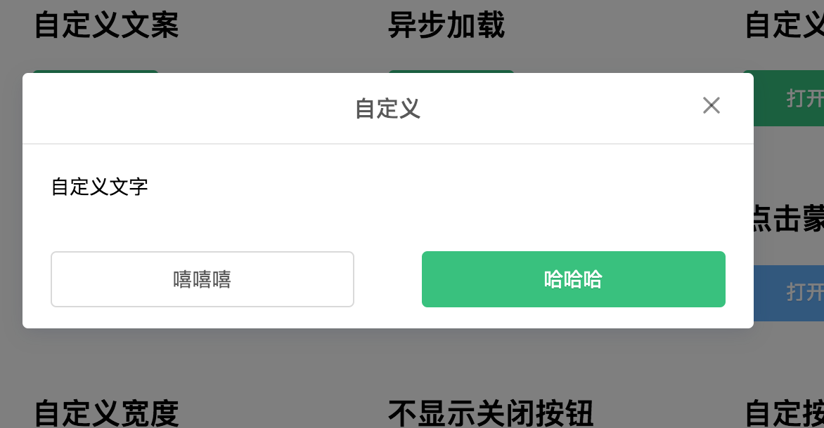
Modal
在 react-dom 提供了 createPortal api 后, 编写 弹窗类组件 变得 异常简单, 也就是通过所谓的传送门, 将 dom 挂载 在 body 下面
    return createPortal(
      <>
        <div class="mask"/>
        <div class="modal"/>
      </>,
      document.body
  )
Tooltip
Tooltip 实现有两种选择, 一种直接 绝对定位在 父元素, 这样会少一些 计算代码, 但是会带来一个问题
     <span
      ref={this.triggerWrapper}
      className={cls(`${prefixCls}-trigger-wrapper`)}
    >
      {this.props.children}
    </span>
如果 父元素 有 overflow:hidden 之类的属性 tooltip 可能会被截取一部份, 所以采用第二种方案, 挂载在 body 上 通过
    this.triggerWrapper = React.createRef();
    const {
      width,
      height,
      top,
      left
    } = this.triggerWrapper.current.getBoundingClientRect();
拿到当前 的 位置信息 , 动态赋给 当前 div, 最后 绑定一个 resize 事件, 解决 窗口改变之后 位置不对的问题
  componentWillUnmount() {
    window.removeEventListener("click", this.onClickOutsideHandler, false);
    window.removeEventListener("resize", this.onResizeHandler);
    this.closeTimer = undefined;
  }
  componentDidMount() {
    window.addEventListener("click", this.onClickOutsideHandler, false);
    window.addEventListener("resize", this.onResizeHandler);
  }
5.3 初始化动画闪烁问题
在 很多 组件 需要淡入淡出动画时 我会绑定两个 class , 对应淡入和淡出的 动画
 state = {
    visible: false
 }
 <div
    className={cls(`${prefixCls}-content`, {
      [`${prefixCls}-open`]: visible,
      [`${prefixCls}-close`]: !visible,
      ["cuke-ui-no-animate"]: visible === null
    })}
    ref={this.wrapper}
    style={{
      width,
      left,
      top
    }}
>

// xx.less
  &-open {
    animation: cuke-picker-open @default-transition forwards;
  }
  &-close {
    animation: cuke-picker-close @default-transition forwards;
    pointer-events: none;
  }

  .cuke-ui-no-animate {
    animation: none !important;
    }
这时候会出现一个问题, 在初始化的时候 因为 visible 默认是 false 所以 会执行 close 动画 , 导致 闪烁, 所以 只需要 初始化 把 state 设为 null, 当 null 时 将 css 设为 animation:none 就解决了
5.4 统一的视觉风格
为了以后维护 和 换肤, 需要维护一份统一的变量, 所有组件统一引用
//vars.less
@primary-color: #31c27c;
@warning-color: #fca130;
@error-color: #f93e3e;
@success-color: #35C613;
@info-color: #61affe;
@bg-color: #FAFAFA;
@border-color: #e8e8e8;
@label-color: #333;
@default-color: #d9d9d9;
@loading-color: #61affe;
@font-color: rgba(0, 0, 0, .65);
@disabled-color: #f5f5f5;
@disabled-font-color: fade(@font-color, 25%);
@font-size: 14px;
@border-radius: 4px;
@default-shadow: 0 4px 22px 0 rgba(15, 35, 95, 0.12);
@default-section-shadow: 0 1px 4px 0 rgba(15, 35, 95, 0.12);
@default-text-shadow: 0 1px 0 rgba(0, 0, 0, .1);
@picker-offset-top: 5px;
@mask-bg-color: rgba(0, 0, 0, .5);

// 响应式断点
@media-screen-xs-max : 576px;
@mobile: ~ "screen and (max-width: @{media-screen-xs-max})";

//动画时间
@loading-time: 1.5s;
@loading-opacity: .7;
@animate-time : .5s;
@animate-type: cubic-bezier(0.165, 0.84, 0.44, 1);
@animate-type-easy-in-out: cubic-bezier(.9, .25, .08, .83);
@default-transition: @animate-time @animate-type;
5.5 巧用 React.cloneElement
在 编写组件的时候,经常配到需要配套的 问题, 比如 Collapse
<Collapse rightArrow>
    <Collapse.Item title="1">1</Collapse.Item>
    <Collapse.Item title="2">2</Collapse.Item>
    <Collapse.Item title="3">3</Collapse.Item>
</Collapse>
<Collapse> 和 <Collapse.Item> 都是我们提供给用户的 组件 需要配套使用, 比如上面的例子 , 有一个 rightArrow 属性 告诉每个 <Collapse.Item> 箭头都在右边, 这时候就需要 通过 cloneElement 传值给 子组件
// collapse.js

   const items = React.Children.map(children, (element, index) => {
      return React.cloneElement(element, {
        key: index,
        accordion,
        rightArrow,
        activeKey: String(index),
        disabled: element.props.disabled, hideArrow: element.props.hideArrow
      });
    });
每个子组件 在拿到 父组件的 rightArrow 属性后 就可以设置对应的 class , 类似的 Row Col, Timeline 实现方式都是如此
Ï
5.6 getDerivedStateFromProps
在很多组件 都有类似的场景 state 需要依赖 props 的某一个属性
    <Tabs activeKey="1">
      <Tabs.TabPane tab="选项1" key="1">
        1
      </Tabs.TabPane>
      <Tabs.TabPane tab="选项2" key="2">
        2
      </Tabs.TabPane>
      <Tabs.TabPane tab="选项3" key="3">
        3
      </Tabs.TabPane>
    </Tabs>
比如上面这个 Tabs 组件 接受 一个 activeKey 来 渲染当前是 哪一个选项, 组件可能长这样
export default class Steps extends PureComponent {
  state = {
    activeKey: ~~(this.props.activeKey || this.props.defaultActiveKey)
  };
   onTabChange = () => {
     this.setState({ activeKey: key })
    }
  };
初始 有一个 activeKey 记录当前的索引,每次点击 改变 索引值, 这时候就会有一个问题, 如果 props 的 activeKey 更新了, 这时候 state 不会更新, 所以需要用到 getDerivedStateFromProps 这个生命周期, 在每次 props 改变之后 比较 props 和 state 的 activeKey 是否一样, 如果不一样 则更新
 static getDerivedStateFromProps({ activeKey }, state) {
    if (activeKey !== state.activeKey) {
      return {
        activeKey
      };
    }
    return null;
  }
6. 使用 antd-landing 生成一个 网站首页
经过不断的努力改造, 组件倒是开发的差不多的, 但是还差一个 像 ant.design/index-cn 这样酷炫的首页, 通过一番搜寻, 发现了 antd-landing 拖拖拽拽, 可视化的搭建好了 网站首页

最后 只需要 手写一些 webpack 配置 , 打包好发布到 github page 即可
7. 结语
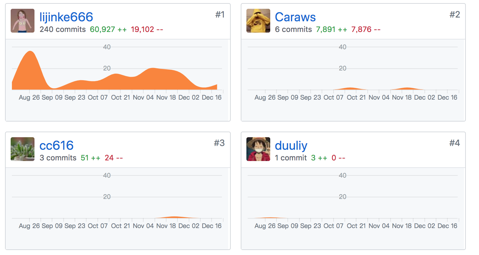
没错, 又是一个 类 antd 的库, 也许没啥意义, 通过这个 组件库, 我学到了很多 平时 接触不到的知识点, 也体会到了平时 框架,库作者的辛苦, 真心不容易, 吃力不讨好, 也得到了 偏右 等大佬 的 star, 同事也很热心的帮我提了一些 Bug fix 的 PR, 不管怎么说, 今年的学习目标完成了, 还是美滋滋的, 明年一月份 开始 搞 nest 和 flutter 了, 加油吧 骚猪
