css中calc的应用
- 假设要实现以下功能,随着视图的变化,图片始终保持如图的比列,放大或缩小
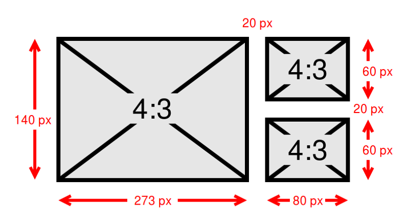
- 图片动态演示
实现
- 抽象一下如图所示
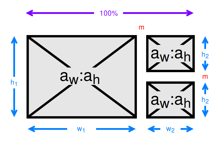
- aw:宽高比宽度
- ah:宽高比高度
- w1:大图像的宽度
- h1:大图像的高度
- w2:小图像的宽度
- h2: 小图像的高度
- m:图像之间的边距
- 结合图可以得到如下表达式
- w1 + m + w2 = 100%
- 2 × h2 + m = h1
- w1 / aw × ah = h1
- w2 / aw × ah = h2
- 现在开始求解决w1(然后是w2)。开始在公式2)中分别用公式3)和4)代替h1和h2,然后求解为w2如图所示:
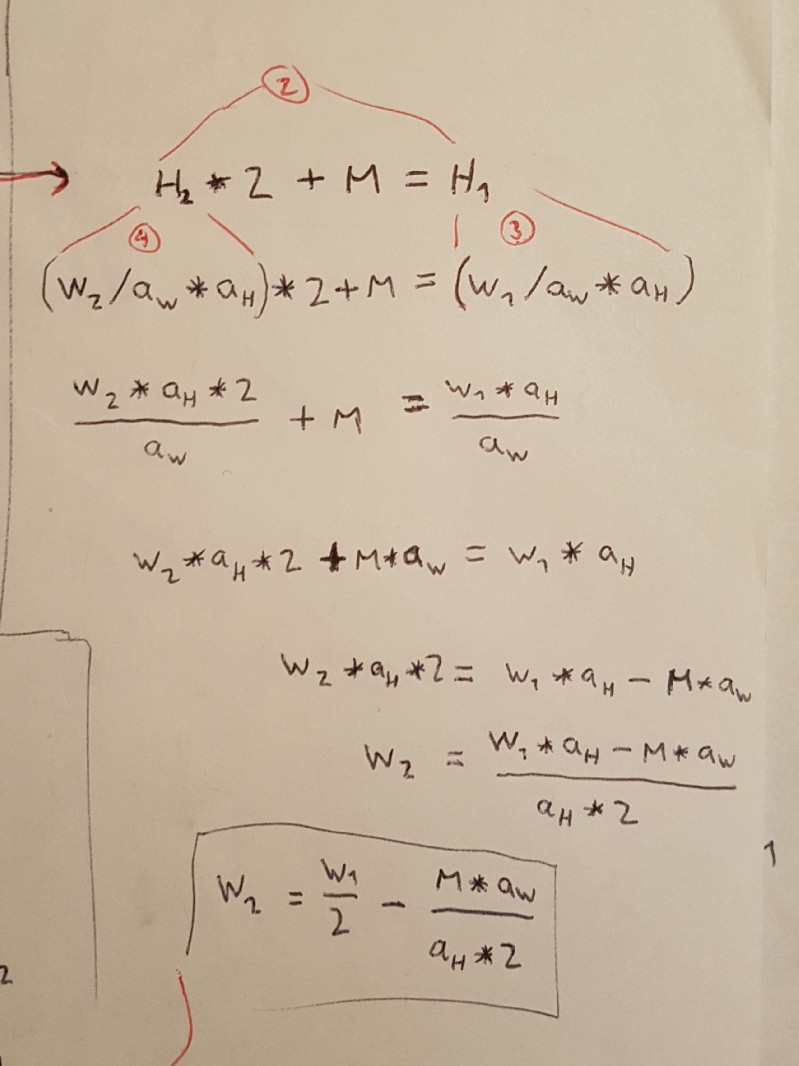
- 然后,我可以在公式1)中用w2的结果替换它,并为w1求解:
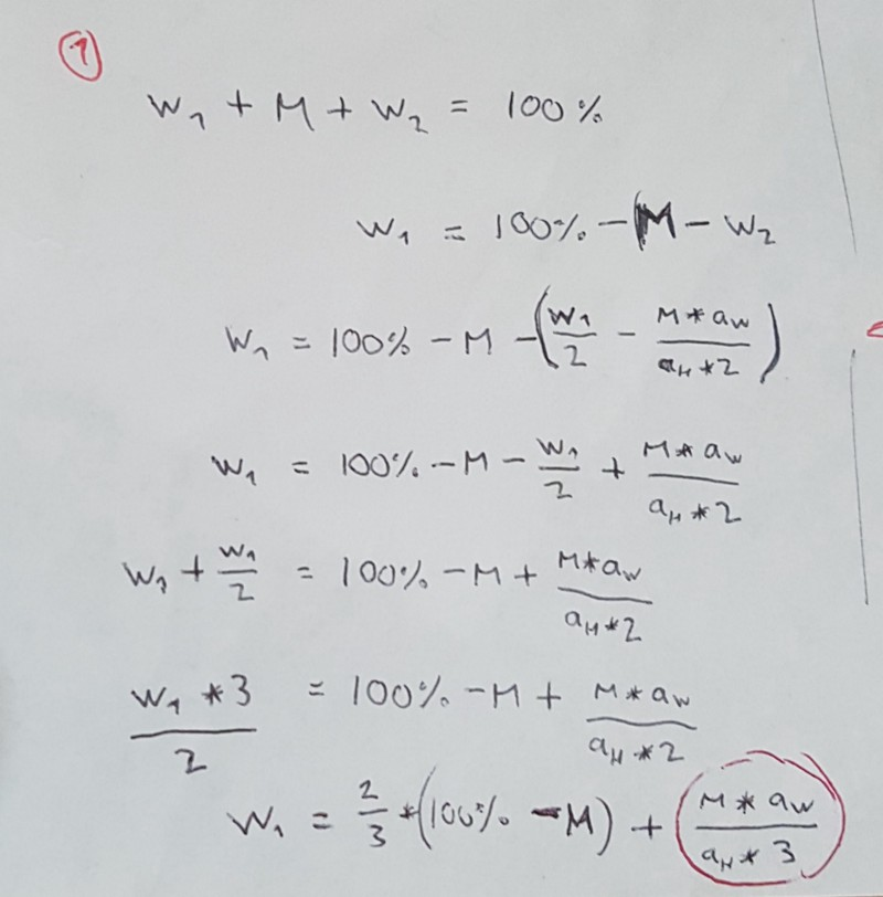
- 用红色圈出的结尾处的表达式。它只包含边距,宽高比宽度和宽高比高度 - 在运行时都不会改变。因此,它是我们可以在构建时预先计算的常数值。为方便起见,我将此命名为常量值c:
c = (m × aw) / (ah × 3)

w1 = 2/3 × (100% − m) + c
w2 = 1/3 × (100% − m) − c
代码
<!--html-->
<div class="thumbnails">
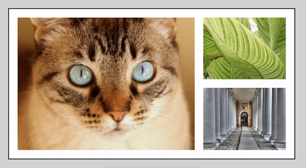
<img src="https://placeimg.com/400/300/animals" alt="A randomly selected animal photo">
<img src="https://placeimg.com/400/300/nature" alt="A randomly selected nature photo">
<img src="https://placeimg.com/400/300/arch" alt="A randomly selected archirecture photo">
</div>
<!--scss-->
// Using values from the original design
$margin: 20px;
$aspect-width: 4;
$aspect-height: 3;
// Calculate c
$constant: ($margin * $aspect-width) / ($aspect-height * 3);
.thumbnails {
width: 50%;
margin: 0 auto;
padding: $margin;
border: 2px solid black;
overflow: hidden; // crude clearfix
// First image becomes big one on left
> *:first-child {
display: block;
float: left;
margin-right: $margin;
// Magic formula!
width: calc( (2 / 3 * (100% -
}
// 2nd & 3rd images become smaller ones
// on right
> *:nth-child(n + 2) {
display: block;
float: right;
// Magic formula!
width: calc( (1 / 3 * (100% -
}
// 3rd image also has top margin
> *:nth-child(3) {
margin-top: $margin;
}
}
参考链接


