

通过上一篇实战案例,基本上能够掌握CoordinatorLayout和AppBarLayout的初步使用。至此,Android Material Design系列的学习已进行到第六篇,大家可以点击以下链接查看之前的文章:
- Android TabLayout 分分钟打造一个滑动标签页
- Android 一文告诉你到底是用Dialog,Snackbar,还是Toast
- Android FloatingActionButton 重要的操作不要太多,一个就好
- Android 初识AppBarLayout 和 CoordinatorLayout
- Android CoordinatorLayout实战案例学习《一》
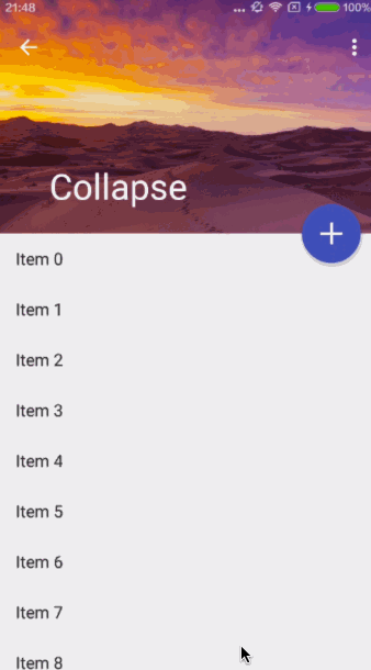
本文继续以案例的方式学习CoordinatorLayout和AppBarLayout的使用,同时引入Desgin包中的一个新控件:CollapsingToolbarLayout。效果图如下:
 Samples.gif
可以看到,Toolbar的标题放大并在下方显示,当我们向上滑动列表时,顶部Header部分的图片向上折叠隐藏,标题向上移动并缩小,同时以渐显式的方式显示蓝色主题,直至高度缩为Toolbar的高度并成为Toolbar的背景色;向下滑动列表时,Header部分逐渐显示。这个效果就是利用了CollapsingToolbarLayout控件,在讲解案例代码前,先来介绍一下CollapsingToolbarLayout。
CollapsingToolbarLayout
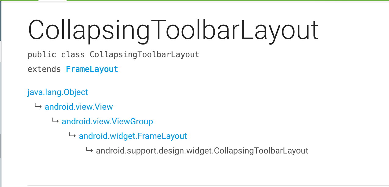
在 CollapsingToolbarLayout 的 Children 布局上,可以按照 FrameLayout 的属性来拍版,因为它本身继承于 FrameLayout :
 CollapsingToolbarLayout.png
CollapsingToolbarLayout is a wrapper for Toolbar
which implements a collapsing app bar. It is designed to be used as a direct child of a AppBarLayout
.
从官方对CollapsingToolbarLayout的介绍上可以看出,CollapsingToolbarLayout 是对 Toolbar 的一个包装,以达到折叠 AppBar 的交互视觉效果。所以,CollapsingToolbarLayout 的使用一定离不开 AppBarLayout 和 Toolbar,并且作为 AppBarLayout 的直接子视图使用。
关于CollapsingToolbarLayout的属性在官网上可以查到,这里我只介绍案例中我们常用的几个属性:
-
title
标题,布局展开时放大显示在图片底部,布局折叠时缩小显示在Toolbar左侧。注意,没有设置这个属性时,默认使用Toolbar的标题; -
statusBarScrim
顶部视图折叠状态下,状态栏的遮罩色。通常这样设置:app:statusBarScrim="?attr/colorPrimaryDark",即style样式中定义的沉浸式状态栏颜色。这个属性要和getWindow().addFlags(WindowManager.LayoutParams.FLAG_TRANSLUCENT_STATUS);(支持API19及以上版本,位于setContentView语句前面)一起使用,使顶部视图展开时图片能够延伸到状态栏位置显示,如效果图中所示; -
contentScrim
内容遮罩,上下滚动时图片上面显示和隐藏的遮罩色,Toolbar位置的的背景色;通常这样设置:app:contentScrim="?attr/colorPrimary",即显示为Toolbar颜色,应用的主题色; -
layout_collapseMode
折叠模式,设置其他控件滚动时自身的交互行为,有两种取值:parallax,折叠视差效果,比如上述效果图中的图片;pin,固定别针效果,比如上图中的Toolbar; -
layout_collapseParallaxMultiplier
不折叠视差系数,配合parallax模式使用,取值有点类似alpha(不透明度),在0.0 ~ 1.0之间,默认值为0.5。当设置为1.0,滚动列表时图片不会折叠移动;
案例分析
通过上面的介绍,相信大家对CollapsingToolbarLayout有了一个初步的认识,我们再来看看如何配合CoordinatorLayout、AppBarLayout和Toolbar来实现案例中的效果,主要在于布局文件:
<?xml version="1.0" encoding="utf-8"?>
<android.support.design.widget.CoordinatorLayout xmlns:android="http://schemas.android.com/apk/res/android"
    xmlns:app="http://schemas.android.com/apk/res-auto"
    android:layout_width="match_parent"
    android:layout_height="match_parent"
    android:fitsSystemWindows="true">

    <android.support.design.widget.AppBarLayout
        android:id="@+id/appbar"
        android:layout_width="match_parent"
        android:layout_height="wrap_content"
        android:fitsSystemWindows="true"
        android:theme="@style/ThemeOverlay.AppCompat.Dark.ActionBar">

        <android.support.design.widget.CollapsingToolbarLayout
            android:layout_width="match_parent"
            android:layout_height="wrap_content"
            app:title="Collapse"
            app:contentScrim="?attr/colorPrimary"
            app:layout_scrollFlags="scroll|exitUntilCollapsed"
            app:expandedTitleMarginStart="48dp"
            app:expandedTitleMarginEnd="64dp">

            <ImageView
                android:layout_width="match_parent"
                android:layout_height="wrap_content"
                android:fitsSystemWindows="true"
                android:src="@mipmap/header"
                android:adjustViewBounds="true"
                app:layout_collapseMode="parallax"
                app:layout_collapseParallaxMultiplier="0.7"/>

            <android.support.v7.widget.Toolbar
                android:id="@+id/tb_toolbar"
                android:layout_width="match_parent"
                android:layout_height="?attr/actionBarSize"
                app:popupTheme="@style/ThemeOverlay.AppCompat.Light"
                app:titleTextColor="@color/white"
                app:title="@string/app_name"
                app:layout_collapseMode="pin"/>

        </android.support.design.widget.CollapsingToolbarLayout>

    </android.support.design.widget.AppBarLayout>

    <android.support.v7.widget.RecyclerView
        android:id="@+id/rv_content"
        android:layout_width="match_parent"
        android:layout_height="match_parent"
        app:layout_behavior="@string/appbar_scrolling_view_behavior" />

    <android.support.design.widget.FloatingActionButton
        android:id="@+id/fab_add"
        android:layout_width="wrap_content"
        android:layout_height="wrap_content"
        android:layout_margin="@dimen/dp_16"
        android:src="@mipmap/ic_toolbar_add"
        app:layout_anchor="@id/appbar"
        app:layout_anchorGravity="bottom|right"
        app:backgroundTint="@color/fab_ripple"/>

</android.support.design.widget.CoordinatorLayout>
关于CoordinatorLayout作为根布局容器如何协调子控件之间的交互行为,可以参考上一篇文章,这里我介绍一下本例中几个新的注意点。
-
作为
AppBarLayout的直接子控件,CollapsingToolbarLayout包裹Header部分的ImageView和Toolbar,并分别设置二者的折叠模式。 -
这个例子,我们给
CollapsingToolbarLayout的layout_scrollFlags属性值设为:scroll|exitUntilCollapsed,其中exitUntilCollapsed表示控件向上折叠退出并以最小高度停留在顶部; -
前面介绍
CollapsingToolbarLayout属性时介绍到了statusBarScrim的使用,其实也可以通过android:fitsSystemWindows和values-v21中style样式的statusBarColor和windowDrawsSystemBarBackgrounds属性来完成状态栏的背景色变化,详情参考源码即可; -
通过
layout_anchor和layout_anchorGravity可以控制FloatingActionButton的behavior和位置,如上图所示,当滚动列表是,FAB按钮会随着AppBarLayout而显示和隐藏,并自带缩放动画。
补充:对于这个案例,Google官方提供了一个效果图,地址如下:
material-design.storage.googleapis.com/publish/mat…
遗留问题
"AppBarLayout + RecyclerView"的组合使用会出现一些体验上的卡顿问题,目前已知的有两个:
-
AppBarLayout视图处于显示状态的时候,ScrollingView的Fling事件容易出现卡顿,参考
stackoverflow: Flinging with RecyclerView + AppBarLayout; -
当AppBarLayout处于完全隐藏状态时,向下触发Fling事件,ScrollingView向上滚动直至顶部全部展示,而不是继续滚动使AppBarLayout的内容得以展示。
替代解决方案,开源项目:Android-ObservableScrollView
示例源码
我在GitHub上建立了一个Repository,用来存放整个Android Material Design系列控件的学习案例,会伴随着文章逐渐更新完善,欢迎大家补充交流,Star地址:
