

TypeScript 入门,写一个 react 进度条组件
写在最前面
- 如果你写过 react 的组件, 这篇文章对与你来说基本没有什么难度。纯粹的是加上了一点 ts 的知识。
- 我完全是以学习者的姿态来描述我写组件的过程,很多不严谨的地方请大家指出来哈哈。
看看实现的效果-gif 动图效果
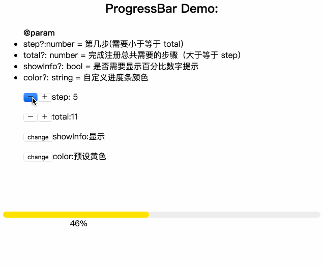
- 当然你可以点击这里亲自试一下效果,效果页面
- 也可以打开下面 codeSandbox 看一下源代码。

开始动手
-
这是一个普通的 UI 组件,难点主要在设计(css)上面。
-
需求:分步骤进行的一个精度条,我们只需要输入参数,step 和 total 来计算出百分比然后显示就 ok 了。
/*
* @param step 第几步
* @param total 总共的步骤
* @param showInfo  是否需要显示百分比提示
* @param color 可以自定义颜色
*/
说了这么多开始动手吧
- 环境配置方面就略过了,这里我们直接来写代码
- 需要配置 node,ts,less 环境
1、在你的 componments 文件下创建一个 progressBar 文件夹。tsx 是 react下特殊 ts 文件。 然后在 progressBar 下面继续添加 index.tsx 和 style.less
-- componments
    -- progressBar
        -- index.tsx
        -- style.less
2、先引进必须的组件
- index.tsx
import React, { Component } from 'react';
import * as PropTypes from 'prop-types';
import './style.less';

// 定义接口
export interface IProgressProps{

}

// 定义类
class ProgressBar extends Component<IProgressProps> {

}

export default ProgressBar;
要点: IProgressProps ,使用 pascal 命名,用I打头,Props 是代表这个接口参数支持。
3、根据我们上面需求的分析,我们来定义 interface,定义类的 propTypes 和 defalutProps
export interface IProgressProps {
    // prefixCls 为了以后样式统一设置的 classname

    prefixCls?: string;
    step?: number;
    total?: number;
    showInfo?: boolean;
    color?: string;
}

class ProgressBar extends Component<IProgressProps> {
    //设置默认值
    static defaultProps = {
            prefixCls: 'demo-progress',
            step: 2,
            total: 10,
            showInfo: false,
            color: '#FFE103'
        };
    render(){
        return(
            <div>progressBar</div>
        )
    }
}
-
划重点,这里解释下。
为什么用了 ts 和还用 prop-types?去约束代码,文章发出以后就有朋友指出这样重复了。因为刚开始写 ts 也万全没注意到,然后着重的去查阅了相关资料。发现是可以混用的这两者。 -
结论
可以只用typescript进行验证,也可以只用prop-types进行验证,也可以两者混搭进行验证,这个并没用严格限制。用typescript验证提示是ts语言带来的功能,用prop-types验证提示是react带来的功能。
要点: 其中的“ ?”表示可选,number 就是接口参数的类型。表示你输入的必须是一个 number 类型,不然 ts 会报错。这里我们可以引用一下 progressBar 模块,看看成功没有。如果现实了 progressBar 的话就表示成功了。
4、处理进度条 UI 和文字内容,render部分
/**
 * @desc  处理 progressNumber
 */
const validProgress = (progress: number | undefined) => {
  //当你的参数定义了 number 等类型,你必须对 !progress 的时候处理,不然 ts 会提示你错误。
  if (!progress || progress < 0) {
    return 0;
  } else if (progress > 100) {
    return 100;
  }

  return progress;
};

/**
 * @desc 除法处理成0-100的整数
 * @param step
 * @param total
 */
const percentDeal = (step: number | undefined, total: number | undefined) => {
  if (!step || !total) {
    return 0;
  }

  return (step / total) * 100;
};

/**
 * @param text 百分比显示
 */
const parseIntPrecent = (text: number): string => `${Math.ceil(text)}%`;

class ProgressBar extends Component<IProgressProps> {
   /* ...
    ....defaultProps
    .....propTypes
    ......
   */
    render(){
        // 把需要的值先从 this.props 中取出来
        // restProps 扩充参数用
        const {
            prefixCls,
            step,
            total,
            showInfo,
            color,
            ...restProps
        } = this.props;

        /**
         * percent 百分比
         * text tip 显示文字
         * progressInfo 提示模块
         * porgress 主模块
         */
        let percent;
        let text;
        let progressInfo;
        let progress;

        //处理百分比显示内容
        percent = percentDeal(step, total);
        text = parseIntPrecent(validProgress(percent));

        // 如果 true 的话,我们使用创建一个 showInfo 模块
        if (showInfo) {
            progressInfo = (
                <div className={`${prefixCls}-show-info`}>
                  <span className={`${prefixCls}-text`}>{text}</span>
                </div>
            );
        }

        //创建一个主模块用做进度条
        //prefixCls 这里统一了命名
        progress = (
          <div>
            <div className={`${prefixCls}-outer`}>
              <div className={`${prefixCls}-inner`}>
                <div className={`${prefixCls}-bg`}>
                  {progressInfo || null}
                </div>
              </div>
            </div>
          </div>
        );

        return (
          <div {...restProps} className={`${prefixCls}`}>
            {progress}
          </div>
        );
    }
}
要点:把处理数据的函数定义在 class 外部,不要在 render 中处理数据。 进度条的实现很多种,这里就是普通的三层,文字,背景,进度条,和外层。
5、根据上面的 gif 设计图来实现一下样式
- style.less
.tiger-progress {
    &-outer {
        width: 100%;
        display: inline-block;
        margin-top:30px;
        margin-right: 0;
        padding-right: 0;
    }
    &-inner {
        vertical-align: middle;
        display: inline-block;
        background: #eeeeee;
        border-radius: 100px;
        position: relative;
        width: 100%;
    }
//预留 &-bg 背景颜色代表进度条的长度,灰色的 inner 背景
    &-line {
        width: 100%;
        font-size: inherit;
        position: relative;
    }
    &-text {
        word-break: normal;
        width: 2em;
        text-align: left;
        font-size: 1em;
        margin-left: 8px;
        vertical-align: middle;
        display: inline-block;
        white-space: nowrap;
        line-height: 1;
    }
}
要点:// &-bg 颜色代表进度条的长度,灰色的 &-inner 背景作为总的长度。
- 补充 render 内的代码, 根据输入的 step 和 total 计算出来的数据来设置一下进度条的长度。
 const {
        prefixCls,
        step,
        total,
        showInfo,
        color,
        ...restProps
    } = this.props;

/**
 * percent 百分比
 * text tip 显示文字
 * progressInfo 提示模块
 * porgress 主模块
 */
let percent;
let text;
let progressInfo;
let progress;

percent = percentDeal(step, total);
console..log("percent",percent)
// percent: 20

text = parseIntPrecent(validProgress(percent));
console.log('text',text)
// text: 20%

if (showInfo) {
  progressInfo = (
    <div className={`${prefixCls}-show-info`}>
      <span className={`${prefixCls}-text`}>{text}</span>
    </div>
  );
}

// color defalutProps 定义默认的颜色
// 前面&-bg 设置 relative 定位
const fixBgStyle = {
  width: text,
  height: "12px",
  background: color,
  borderRadius: "100px"
};

progress = (
  <div>
    <div className={`${prefixCls}-outer`}>
      <div className={`${prefixCls}-inner`}>
        <div className={`${prefixCls}-bg`} style={fixBgStyle}>
          {progressInfo || null}
        </div>
      </div>
    </div>
  </div>
);

return (
  <div {...restProps} className="tiger-progress">
    {progress}
  </div>
);
大功告成
- 是不是很简单,然我们再来看看效果
- codesandbox.io/s/940nq3531… ,调试一下代码
回答问题:为什么使用 ts 还去使用 prop-types?
-
通常我们编写一个
react组件的时候,我们会去定义一个prop-types去校验我们的class的参数输入。而 ts 的interface的作用当然也是校验props的输入。 -
两者的区别:TypeScrip· 的类型检查是静态的,prop-types可以在运行时进行检查。你如你传了个offsetTop="abc",你的编辑器可能会提示你类型有误,但是在浏览器里仍然是可以正常运行的。而如果你使用了prop-types,在浏览器里就会给出提示。
总结: 所以两者是可以混用的,
功能上有部分重复, 所以我们使用了 typescript 以后完全可以不写prop-types来做额外的校验了。
