

问题引入
我们知道,在echarts3.0 中引入了炫酷的展示效果,但是我们发现控制这些炫酷样式的代码全部都在series或者其他标签里面,如果取消之后就变成了官方实例默认的样式。给个例子:
 option = {
	    tooltip : {
	        trigger: 'item',
	        formatter: "{a} <br/>{b} : {c} ({d}%)"
	    },
	    //注意这里的color标签,待会儿会注释掉对比效果
	    color:['#8fc31f','#f35833','#00ccff','#ffcc00'],
	    legend: {
	        orient: 'vertical',
	        x: 'right',
	        data: ['准时','迟到','请假','未到'],
	        formatter:function(name){
	        	var oa = option.series[0].data;
	        	var num = oa[0].value + oa[1].value + oa[2].value + oa[3].value;
	        	for(var i = 0; i < option.series[0].data.length; i++){
                    if(name==oa[i].name){
                    	return name + '     ' + oa[i].value + '     ' + (oa[i].value/num * 100).toFixed(2) + '%';
                    }
	        	}
	        }
	    },
	    series : [
	        {
	            name: '签到比例分析',
	            type: 'pie',
	            radius : '55%',
	            center: ['40%', '50%'],
	            data:[
	                {value:335, name:'准时'},
	                {value:310, name:'迟到'},
	                {value:234, name:'请假'},
	                {value:135, name:'未到'}
	            ],
	            itemStyle: {
	                emphasis: {
	                    shadowBlur: 10,
	                    shadowOffsetX: 0,
	                    shadowColor: 'rgba(0, 0, 0, 0.5)'
	                },
	                  normal: {
	                    label:{
                            show: true,
                            //position:'inside',
                            formatter: '{b} : {c} ({d}%)'
                        }
	                },
                    labelLine :{show:true}
	            },

	        }
	    ]
	};
加载的图形如图所示:
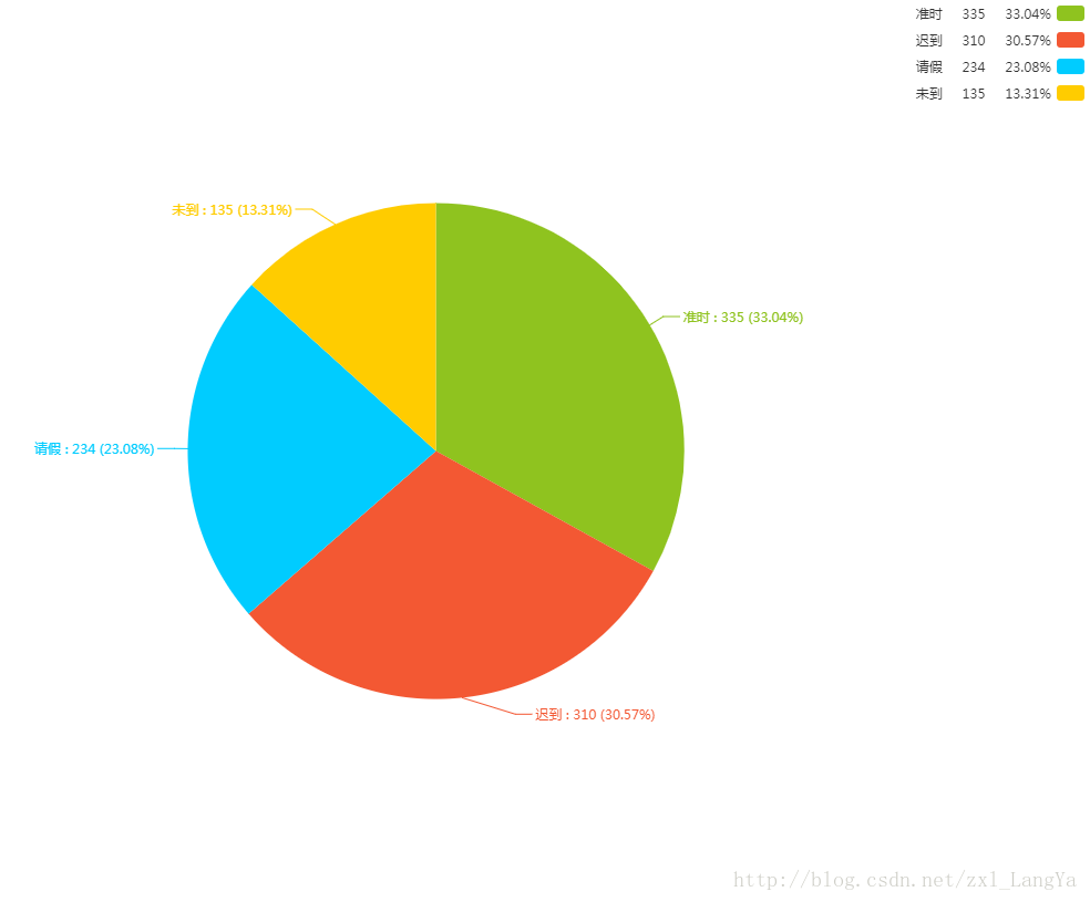
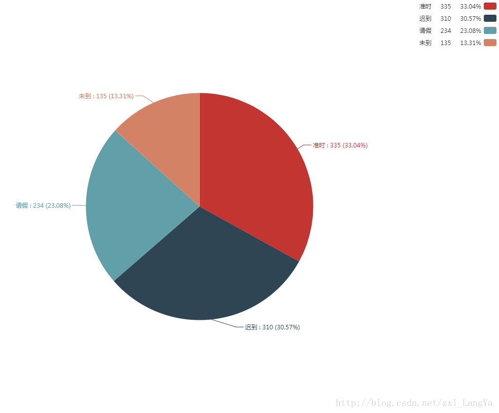
/**color:['#8fc31f','#f35833','#00ccff','#ffcc00'],*/
然后,就变成了这样:
解决方案
我们只要在js中定义一个足够大的颜色或者样式对象数组即可,然后再遍历json串的时候按需加载所需要的颜色或者样式,即有几个展示的因子就加载几种颜色(样式)。 实际来操作一下,假设我们的json串为
var json={
    "data":[
        { "value":335,  "name":"准时" },
        { "value":310,  "name":"迟到" },
        { "value":234,  "name":"请假" },
        { "value":135,  "name":"未到" }
    ],
    "text":"考勤情况统计报表",
    "subtext":"xx公司"
}
那么我们定义一个color数组,
//根据自己的需要,定义多个,保证每个数据都能取到即可。
var color=['#8fc31f','#f35833','#00ccff','#ffcc00','#9c6a79','#21b6b9'...],
然后,把这个color数组按元素因子的个数去取对应数量的颜色即可。
var color=['#8fc31f','#f35833','#00ccff','#ffcc00','#9c6a79','#21b6b9'...],
//length<=color.length;
var length=json.data.length;
//分割数组
json.color=color.slice(0,length);
再打印json数据
var json={
    "data":[
        { "value":335,  "name":"准时" },
        { "value":310,  "name":"迟到" },
        { "value":234,  "name":"请假" },
        { "value":135,  "name":"未到" }
    ],
    "text":"考勤情况统计报表",
    "subtext":"xx公司",
    "color":["#8fc31f","#f35833","#00ccff","#ffcc00"]
}
大功告成!这就达到了我们想要的数据,然后我们把json串中的数据加载到想应的echarts中option即可。
复杂案例
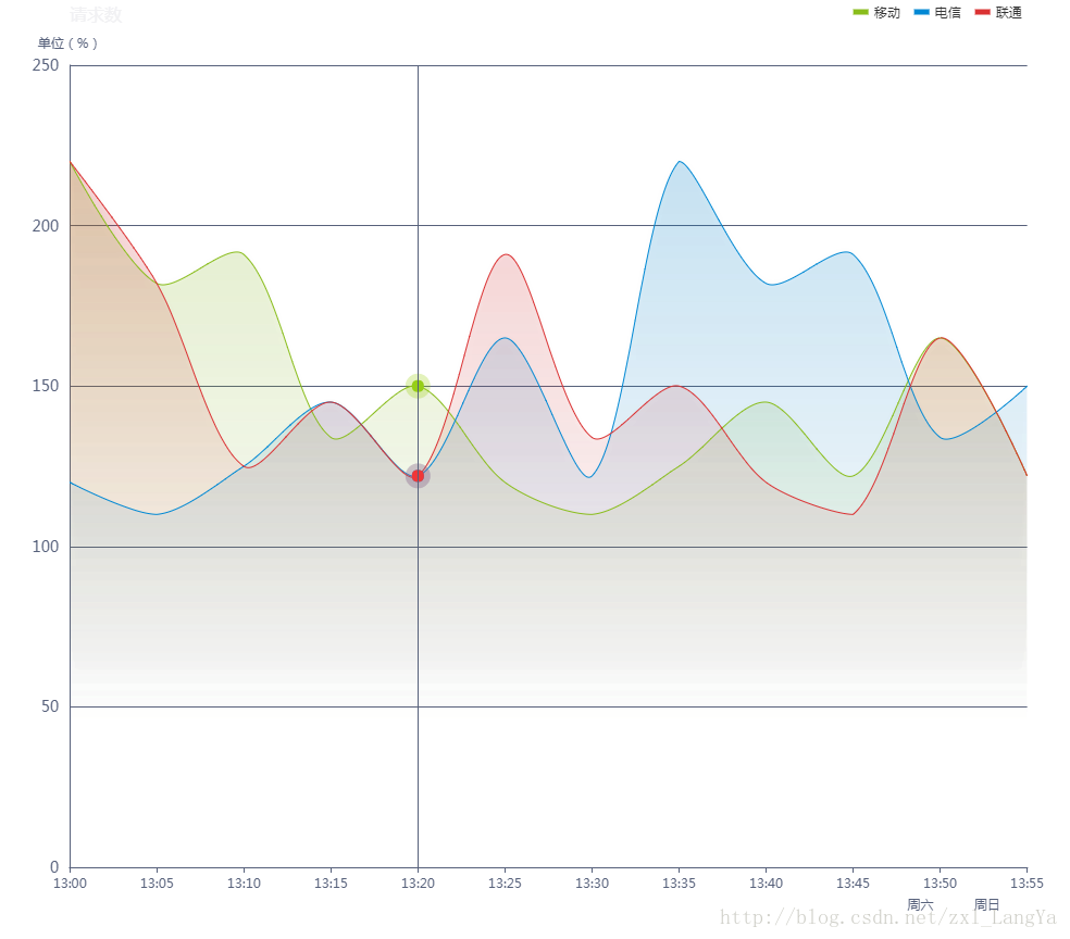
我们前面所讨论的只是颜色这一要素,是最基本的原理和思想的展示。那么我们再来看一个比较复杂的例子。涉及到series的样例,先上图。
option = {
   // backgroundColor: '#394056',
    title: {
        text: '请求数',
        textStyle: {
            fontWeight: 'normal',
            fontSize: 16,
            color: '#F1F1F3'
        },
        left: '6%'
    },
    tooltip: {
        trigger: 'axis',
        axisPointer: {
            lineStyle: {
                color: '#57617B'
            }
        }
    },
    legend: {
        icon: 'rect',
        itemWidth: 14,
        itemHeight: 5,
        itemGap: 13,
        data: ['移动', '电信', '联通'],
        right: '4%',
        textStyle: {
            fontSize: 12,
            //color: '#F1F1F3'
        }
    },
    grid: {
        left: '3%',
        right: '4%',
        bottom: '3%',
        containLabel: true
    },
    xAxis: [{
        type: 'category',
        boundaryGap: false,
        axisLine: {
            lineStyle: {
                color: '#57617B'
            }
        },
        data: ['13:00', '13:05', '13:10', '13:15', '13:20', '13:25', '13:30', '13:35', '13:40', '13:45', '13:50', '13:55']
    }, {
        axisPointer: {
            show: false
        },
        axisLine: {
            lineStyle: {
                color: '#57617B'
            }
        },
        axisTick: {
            show: false
        },

        position: 'bottom',
        offset: 20,
        data: ['', '', '', '', '', '', '', '', '', '', {
            value: '周六',
            textStyle: {
                align: 'left'
            }
        }, '周日']
    }],
    yAxis: [{
        type: 'value',
        name: '单位(%)',
        axisTick: {
            show: false
        },
        axisLine: {
            lineStyle: {
                color: '#57617B'
            }
        },
        axisLabel: {
            margin: 10,
            textStyle: {
                fontSize: 14
            }
        },
        splitLine: {
            lineStyle: {
                color: '#57617B'
            }
        }
    }],
    series: [{
        name: '移动',
        type: 'line',
        smooth: true,
        symbol: 'circle',
        symbolSize: 5,
        showSymbol: false,
        lineStyle: {
            normal: {
                width: 1
            }
        },
        //控制线条下面区域面积的颜色
        areaStyle: {
            normal: {
                color: new echarts.graphic.LinearGradient(0, 0, 0, 1, [{
                    offset: 0,
                    color: 'rgba(137, 189, 27, 0.3)'
                }, {
                    offset: 0.8,
                    color: 'rgba(137, 189, 27, 0)'
                }], false),
                shadowColor: 'rgba(0, 0, 0, 0.1)',
                shadowBlur: 10
            }
        },
        //控制线条的颜色
        itemStyle: {
            normal: {
                color: 'rgb(137,189,27)',
                borderColor: 'rgba(137,189,2,0.27)',
                borderWidth: 12

            }
        },
        data: [220, 182, 191, 134, 150, 120, 110, 125, 145, 122, 165, 122]
    }, {
        name: '电信',
        type: 'line',
        smooth: true,
        symbol: 'circle',
        symbolSize: 5,
        showSymbol: false,
        lineStyle: {
            normal: {
                width: 1
            }
        },
         //控制线条下面区域面积的颜色
        areaStyle: {
            normal: {
                color: new echarts.graphic.LinearGradient(0, 0, 0, 1, [{
                    offset: 0,
                    color: 'rgba(0, 136, 212, 0.3)'
                }, {
                    offset: 0.8,
                    color: 'rgba(0, 136, 212, 0)'
                }], false),
                shadowColor: 'rgba(0, 0, 0, 0.1)',
                shadowBlur: 10
            }
        },
        //控制线条的颜色
        itemStyle: {
            normal: {
                color: 'rgb(0,136,212)',
                borderColor: 'rgba(0,136,212,0.2)',
                borderWidth: 12

            }
        },
        data: [120, 110, 125, 145, 122, 165, 122, 220, 182, 191, 134, 150]
    }, {
        name: '联通',
        type: 'line',
        smooth: true,
        symbol: 'circle',
        symbolSize: 5,
        showSymbol: false,
        lineStyle: {
            normal: {
                width: 1
            }
        },
        //控制线条下面区域面积的颜色
        areaStyle: {
            normal: {
                color: new echarts.graphic.LinearGradient(0, 0, 0, 1, [{
                    offset: 0,
                    color: 'rgba(219, 50, 51, 0.3)'
                }, {
                    offset: 0.8,
                    color: 'rgba(219, 50, 51, 0)'
                }], false),
                shadowColor: 'rgba(0, 0, 0, 0.1)',
                shadowBlur: 10
            }
        },
        //控制线条的颜色
        itemStyle: {
            normal: {

                color: 'rgb(219,50,51)',
                borderColor: 'rgba(219,50,51,0.2)',
                borderWidth: 12
            }
        },
        data: [220, 182, 125, 145, 122, 191, 134, 150, 120, 110, 165, 122]
    }, ]
};
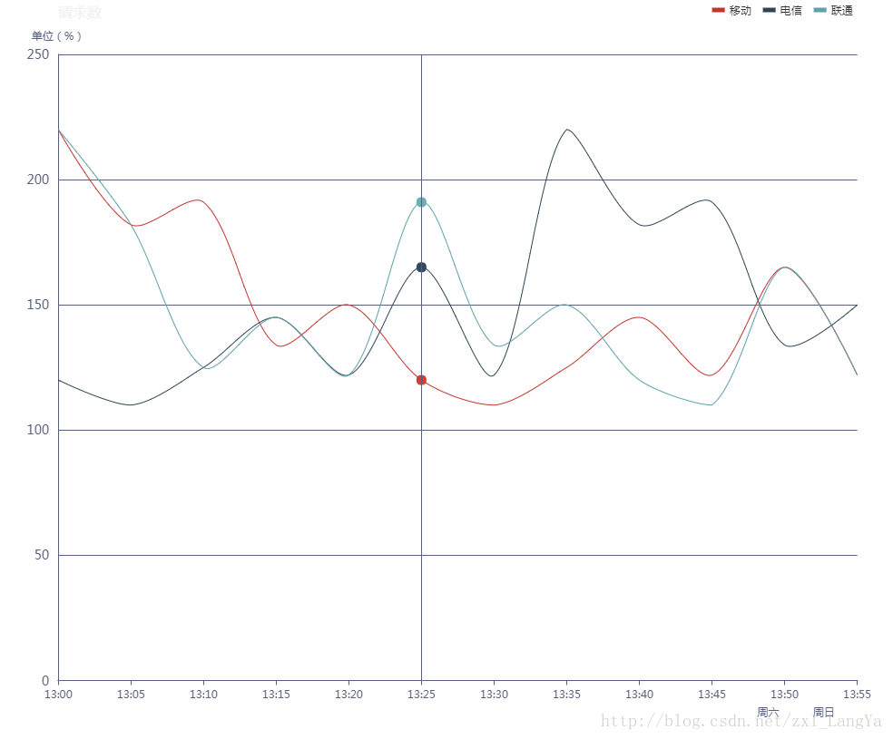
好的,我们把上面的注释部分 areaStyle,itemStyle去掉,再来看效果:
var areaStyle=[];
var item1={
            normal: {
                color: new echarts.graphic.LinearGradient(0, 0, 0, 1, [{
                    offset: 0,
                    color: 'rgba(0, 136, 212, 0.3)'
                }, {
                    offset: 0.8,
                    color: 'rgba(0, 136, 212, 0)'
                }], false),
                shadowColor: 'rgba(0, 0, 0, 0.1)',
                shadowBlur: 10
            }
          }
var item2={
        normal: {
                color: new echarts.graphic.LinearGradient(0, 0, 0, 1, [{
                    offset: 0,
                    color: 'rgba(0, 136, 212, 0.3)'
                }, {
                    offset: 0.8,
                    color: 'rgba(0, 136, 212, 0)'
                }], false),
                shadowColor: 'rgba(0, 0, 0, 0.1)',
                shadowBlur: 10
            }
          }
var item3=...,var item4=...
areaStyle.push(item1);
areaStyle.push(item2);
areaStyle.push(item3);
//itemStyle数组类似
....
然后,通过遍历将这个2个数组添加到对应的json串中即可,这里省略中间过程,最后我们得到类似这样的json串就ok了
//这里json串没有严格遵循json语法
var json={
  "data":{[220, 182, 125, 145, 122, 191, 134, 150, 120, 110, 165, 122],
            [120, 110, 125, 145, 122, 165, 122, 220, 182, 191, 134, 150].....   }
  "title":"请求数",
  "areaStyle":{
            normal: {
                color: new echarts.graphic.LinearGradient(0, 0, 0, 1, [{
                    offset: 0,
                    color: 'rgba(219, 50, 51, 0.3)'
                }, {
                    offset: 0.8,
                    color: 'rgba(219, 50, 51, 0)'
                }], false),
                shadowColor: 'rgba(0, 0, 0, 0.1)',
                shadowBlur: 10
            },
            normal:{
            ....
            },.......
        },
   "itemStyle":{
          normal: {
                color: new echarts.graphic.LinearGradient(0, 0, 0, 1, [{
                    offset: 0,
                    color: 'rgba(0, 136, 212, 0.3)'
                }, {
                    offset: 0.8,
                    color: 'rgba(0, 136, 212, 0)'
                }], false),
                shadowColor: 'rgba(0, 0, 0, 0.1)',
                shadowBlur: 10
            },
            normal:{
            .....
            },.......
          }
}
好的,这样就无所不能了,我们想要加载什么样式都不是问题了,相信大家多研究几个例子也能触类旁通啦!
