

初衷
这是一个比较着急的事情(两天时间,写一个带视频播放、图片浏览、图文混排列表、上拉刷新、滚动刷新等等的单页),一开始同事使用传统H5+JS+CSS的方式,我担心进度,就硬着头皮上vuejs,为什么说硬着头皮上,原因是这是第二次在项目中使用vuejs,第一次使用的经历并不太好,主要是vuejs在低版本android端的适配确实让人头疼。
UI组件选型
还是说回到第一次使用vuejs的事情,当时选择了元素较为丰富的element-ui,因为确实元素上和产品设计上比较吻合,就没去寻找其他组件,无奈最后因为element-ui主打pcweb,导致移动端上UI适配问题突出,趟了很多坑。这次更加理智些,选择了饿了么团队的主打移动端的mint-ui,目前来说体验很好。
mint-ui使用过程
Mint-ui维护的很不错,使用起来也足够方便,我的基本的使用流程是这样的:
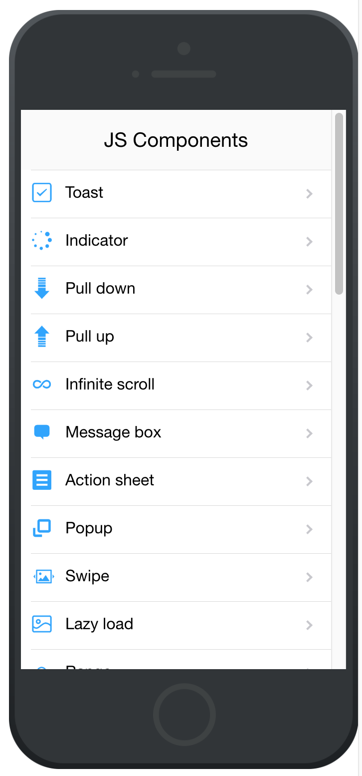
- 首先在手机上体验其demo,扫描链接:

Mint UI 挨个体验其中的提供的组件demo,评估是否满足自己需求,也对其支持的内容心里有个数。
-
使用时,参考指定demo代码。由于官方的文档稍微有点欠缺,但是结合demo代码,已经完全足够了。 mint-ui/example/pages at master · ElemeFE/mint-ui · GitHub
-
demo内特性不够支持自己需求的时候,继续参考文档,因为文档中会把各种属性值列全。 mint-ui documentation
-
实在支持不了,自定义。
记录开发过程中几个坑
移动端rem适配(含mint-ui的情况下)
这是在搭建框架的时候遇到的第一个问题,按照原先的经验,我先尝试使用了px2rem-loader来统一将px转换为rem,但是问题是,使用px2rem会将项目内所有css文件的px都转为rem,而mint-ui内的css是不能被转换的,因为其本身已经做了一些适配,但是并不基于rem的方式,所以如果强制将其内部的css文件做了转换,一般会导致所有其内部元素的尺寸变小。
所以目的应该是将自己写的样式内容做rem转换,所以使用了postcss,原因是postcss带有px2rem的插件。
贴下vue-loader.conf.js:
'use strict'
const utils = require('./utils')
const config = require('../config')
const precss = require('precss')
const pxtorem = require('postcss-px2rem')
const autoprefixer = require('autoprefixer')
const isProduction = process.env.NODE_ENV === 'production'
const sourceMapEnabled = isProduction
  ? config.build.productionSourceMap
  : config.dev.cssSourceMap

module.exports = {
  loaders: utils.cssLoaders({
    sourceMap: sourceMapEnabled,
    extract: isProduction
  }),
  postcss:[
      precss(),
      autoprefixer({
          browsers: [
              'last 10 Chrome versions',
              'last 5 Firefox versions',
              'Safari >= 6',
              'ie > 8'
          ]
      }),
      pxtorem({
          remUnit: 75 //设计尺寸的1/10
      })
  ],
  cssSourceMap: sourceMapEnabled,
  cacheBusting: config.dev.cacheBusting,
  transformToRequire: {
    video: ['src', 'poster'],
    source: 'src',
    img: 'src',
    image: 'xlink:href'
  }
}
Main.js中动态设置root节点的fontsize,配合rem适配响应式:
// px2rem
window.onresize = setHtmlFontSize
function setHtmlFontSize () {
  const htmlWidth = document.documentElement.clientWidth || document.body.clientWidth
  const htmlDom = document.getElementsByTagName('html')[0]
  htmlDom.style.fontSize = htmlWidth / 10 + 'px'
}
setHtmlFontSize()
图片列表的横向滚动需求
需求中需要的横向滚动就是类似:

这个需求的实现过程不太重要,需要的是要理解在WEB滚动的原理: * 纵向可滚动的原理是,当浏览器(webview)的可视高度小于承载的内容高度时,即可滚动,也即会出现滚动条,比如平时的无限纵向列表。 * 横向可滚动的原理类似,当某个容器的横向可视宽度小于承载内容的宽度时,即可横向滚动。
这里的实现方式是使用了一个较好的vue滚动组件,better-scroll。
模板的层级有要求: itemContainer -> imageWrapper -> imageItem,其中itemContainer需要固定宽度和隐藏滚动条。
<div class="itemImage" ref="itemContainer">
      <!--需要支持横向滚动-->
      <ul ref="imageWrapper">
        <li class="image_item" :key="image.id" v-for="(image, index) in item.images" ref="imageItem">
          <img class="image" :src="image.big"/>
        </li>
      </ul>
    </div>
.itemImage {
  overflow: hidden;
  width: 750px;
}
方法中使用到了vue的nextTick可以指定下一次DOM更新之后再执行的方法。
mounted () {
      this.$nextTick(() => {
        this.initImageScroll()
      })
  },
methods: {
   initImageScroll: function () {
      let width = 0
      for (let i = 0; i < this.item.images.length; i++) {
        width += this.$refs.imageItem[0].getBoundingClientRect().width
      }
      this.$refs.imageWrapper.style.width = width + 'px'
      this.$nextTick(() => {
        if (!this.scroll) {
          this.scroll = new BScroll(this.$refs.itemContainer, {
            startX: 0,
            click: true,
            scrollX: true,
            scrollY: false,
            eventPassthrough: 'vertical'
          })
        } else {
          this.scroll.refresh()
        }
      })
    },
}
路由跳转返回后的自动滚动复位问题
这个问题在vue-router的官方问题中有说明:滚动行为 | Vue Router 这里只贴下在vue-router实例化时加入实现的样子:
export default new Router({
  routes: [
    {
      path: '/',
      name: 'Main',
      component: Main,
      meta: {
        keepAlive: true
      }
    },
    {
      path: '/ImagePlayer',
      name: 'ImagePlayer',
      component: ImagePlayer,
      meta: {
      }
    }
  ],
  scrollBehavior (to, from, savedPosition) {
    if (savedPosition) {
      return savedPosition
    } else {
      if (from.meta.keepAlive) {
        from.meta.savedPosition = document.body.scrollTop
      }
      return { x: 0, y: to.meta.savedPosition || 0 }
    }
  }
})
子元素浮层滚动时阻止父元素随动问题
这个需求其实很常见,出现浮层后,在浮层上展示内容,当在浮层上有滚动操作是,需要防止底部元素同时滚动。我这里的解决方法是用position=fixed的方式来固定。 * 当浮层出现时,动态将底部元素的根元素设置为fixed,并记录当前的scrollY值 * 当浮层消失后,动态将底部元素的根元素设置回原始值,并滚回到scrollY位置(由于重新设置position后会位置复位)
实现方法如下:
   /**
     * 防止浮层唤起时底部滑动跟随问题
     * @param isFixed
     */
    stopBodyScroll: function (isFixed) {
      let bodyEl = document.getElementById('main')
      if (isFixed) {
        this.saveMainTop = window.scrollY
        bodyEl.style.position = 'fixed'
        bodyEl.style.top = -this.saveMainTop + 'px'
      } else {
        bodyEl.style.position = ''
        bodyEl.style.top = ''
        window.scrollTo(0, this.saveMainTop)
      }
    }
使用mt-loadmore时loading不消失问题
这个问题是文档没看清楚导致的,没有在正确的时机调用其内部子组件的onTopLoaded 方法导致,这里记录下mt-loadmore做下拉刷新的的方式:代码只保留了片段,在loadtop方法里有两个loadmore的ref原因是,在我的应用里分两个tab,同时都有下拉刷新功能,这里扔出来的原因是,大家需要注意,在同一个组件内,如果使用了多个mt-loadmore组件,那需要标识不同的ref值,比如我这里的loadmore1和loadmore2,要不然当调用onTopLoaded方法是会有各种异常出现,包括不能停止当前loading
 <!--下拉刷新列表-->
<template>
<div>
 <mt-loadmore
		:top-method="loadTop"
		:top-loading-text="null"
		:top-drop-text="null"
		:top-pull-text="null"
     ref="loadmore1"
		@top-status-change="handleTopChange">
</div>
</template>
<script>
export default {
   methods: {
    /**
     *  下拉刷新
     */
    loadTop: function () {
      if (this.selected === '1') {
        this.getYourData01(() => {
          this.$refs.loadmore1.onTopLoaded()
        })
      } else {
        this.getYourData02(() => {
          this.$refs.loadmore2.onTopLoaded()
        })
      }
    },
  }
}
</script>
结尾
Mint-ui很好用,真的强烈推荐。睡觉,哔哔哔。
