

文中完整代码下载地址:github.com/CnPeng/CnPe…
文中内容对应上述地址中的 a01_chips 目录
此外,文中DEMO是基于 AndroidStudio 3.2 Beta 5 版本构建的。gradle 中 compileSdkVersion 28 , targetSdkVersion 28
一、Chip相关组件的作用及如何导包
1、Chip相关组件的作用
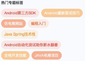
如上图,这种界面我们通常称之为 流式布局标签。
最早实现这种界面的时候,基本都是自定义一个继承自ViewGroup的控件,然后在Java代码中动态的add 一个个的TextView;
后来有了 RecyclerView , 我们实现这种界面就比较方便了;
现在谷歌为我们提供了 Chip、ChipGroup、ChipDrawable ,有了这三者, 我们实现这种界面就更加方便了!
2、引入material兼容包
使用Chip时需要先引入兼容包,可分为两种情况, 一种是新建项目;一种是在现有的项目中引入 Chip.
(1)、新建的项目
- 引入兼容包
implementation 'com.google.android.material:material:1.0.0-rc01'
- 应用 MaterialComponents 主题
为 activity 或者 APP 应用 MaterialComponents 主题(也可以是该主题的子主题)。如:
<style name="AppTheme" parent="Theme.MaterialComponents.Light.NoActionBar">
    <!-- Customize your theme here. -->
    <item name="colorPrimary">@color/colorPrimary</item>
    <item name="colorPrimaryDark">@color/colorPrimaryDark</item>
    <item name="colorAccent">@color/colorAccent</item>
    <item name="chipIconTint">@color/chipIconTint</item>
</style>
(2)、现有的项目
- 先移除 module 的 build.gradle 中的
implementation 'com.android.support:xxx', - 在module 的 build.gradle 中增加
implementation 'com.google.android.material:material:1.0.0-rc01', - 修改module的build.gradle中的
compileSdkVersion为 28 ,targetSdkVersion为 28 - 从
AndroidManifest.xml中修改 application 的 theme 为Theme.MaterialComponents或该 主题的子主题(此处没想明白,为啥单纯为chip所在activity应用该主题不行;新建的项目中,可以单纯的给activity设置主题) - 修改 project 的 build.gralde 中的 gradle版本为不低于3.2.0 的版本 ,如
buildscript {
    ......
    dependencies {
        classpath 'com.android.tools.build:gradle:3.2.0-beta05'
        ......
    }
}
- 然后在 AndroidStuido 菜单栏中依次点击:
Refactor > MigrateToAndroidX(上一步修改gradle版本就是为了这个转换,) - 最后,手动修改 上一步中转换失败的文件(这个可能会比较费时间)
补充
二、Chip的分类及其特性
1、Chip的分类
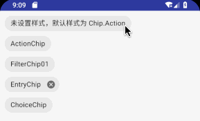
注意:以下类别中,特点描述都是基于只设置 text 和 style 不设置其他属性时总结的
根据Chip使用的 style ,可以将其分为以下四类:
(1)、Action chip
- 使用
style="@style/Widget.MaterialComponents.Chip.Action" - 不设置style时,默认使用上述style
- 默认前后图标都不展示,点击后没有选中状态
    <com.google.android.material.chip.Chip
        style="@style/Widget.MaterialComponents.Chip.Action"
        android:layout_width="wrap_content"
        android:layout_height="wrap_content"
        android:layout_marginTop="10dp"
        android:text="ActionChip" />

    <!--展示效果同上面的一致-->
    <com.google.android.material.chip.Chip
        android:layout_width="wrap_content"
        android:layout_height="wrap_content"
        android:text="这是一个单一的chip" />
(2)、Filter Chip
- 使用
style="@style/Widget.MaterialComponents.Chip.Filter" - 初始状态下, 不展示前后图标
- 点击之后会展示前面的选中图标,并且具有选中状态
- 通常应用在 ChipGroup 中
<com.google.android.material.chip.Chip
        style="@style/Widget.MaterialComponents.Chip.Filter"
        android:layout_width="wrap_content"
        android:layout_height="wrap_content"
        android:text="FilterChip01" />
(3)、Entry Chip
- 使用
style="@style/Widget.MaterialComponents.Chip.Entry" - 默认在末尾展示删除按钮;点击后前面展示选中图标,有选中状态
- 通常可以作为 chipDrawable 使用,比如在填选邮件收件人时可以使用
    <com.google.android.material.chip.Chip
        style="@style/Widget.MaterialComponents.Chip.Entry"
        android:layout_width="match_parent"
        android:layout_height="wrap_content"
        android:layout_marginTop="10dp"
        android:text="EntryChip " />
(4)、Choice Chip
- 默认不展示前后的图标,但点击后有选中状态
- 通常用在 ChipGroup 中 , 通过 ChipGroup 的
singleSelection=true/false属性可以实现单选或多选
    <com.google.android.material.chip.Chip
        style="@style/Widget.MaterialComponents.Chip.Choice"
        android:layout_width="wrap_content"
        android:layout_height="wrap_content"
        android:layout_marginTop="10dp"
        android:text="ChoiceChip" />
2、各种Chip的默认效果图
三、Chip的属性
1、Chip 的属性
| 类别 | 属性名称 | 具体作用 |
|---|---|---|
| Shape | app:chipCornerRadius | 圆角半径 |
| Size | app:chipMinHeight | 最小高度 |
| Background | app:chipBackgroundColor | 背景颜色 |
| Border | app:chipStrokeColor | 边线颜色 |
| Border | app:chipStrokeWidth | 边线宽度 |
| Ripple | app:rippleColor | 水波纹效果的颜色 |
| Label | android:text | 文本内容 |
| Label | android:textColor | 修改文本颜色 |
| Label | android:textAppearance | 字体样式 |
| Chip Icon | app:chipIconVisible | 前面的图标是否展示 |
| Chip Icon | app:chipIcon | chip中文字前面的图标 |
| Chip Icon | app:chipIconTint | 文字前面的图标着色 |
| Chip Icon | app:chipIconSize | chip中文字前面的图标 |
| Close Icon | app:closeIconVisible | chip中文字后面的关闭按钮是否可见 |
| Close Icon | app:closeIcon | chip中文字后面的关闭图标 |
| Close Icon | app:closeIconSize | 文字后面的关闭图标的大小 |
| Close Icon | app:closeIconTint | 文字后面的着色 |
| Checkable | app:checkable | 是否可以被选中 |
| Checked Icon | app:checkedIconVisible | 选中状态的图标是否可见 |
| Checked Icon | app:checkedIcon | 选中状态的图标 |
| Motion | app:showMotionSpec | 动效? |
| Motion | app:hideMotionSpec | 动效? |
| Paddings | app:chipStartPadding | chip左边距 |
| Paddings | app:chipEndPadding | chip右边距 |
| Paddings | app:iconStartPadding | chipIcon的左边距 |
| Paddings | app:iconEndPadding | chipIcon的右边距 |
| Paddings | app:textStartPadding | 文本左边距 |
| Paddings | app:textEndPadding | 文本右边距 |
| Paddings | app:closeIconStartPadding | 关闭按钮的做左边距 |
| Paddings | app:closeIconEndPadding | 关闭按钮的右边距 |
2、Chip 属性间的关系图
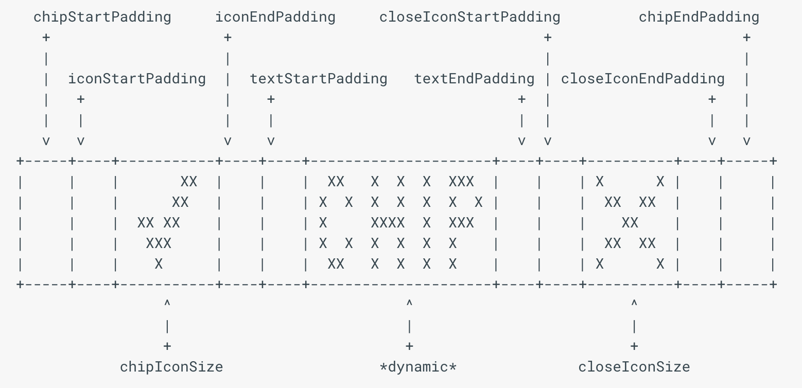
上图来自于: ChipDrawable文档 https://developer.android.com/reference/com/google/android/material/chip/ChipDrawable?hl=zh-cn
四、Chip的监听
(1)、setOnClickListener
点击事件的监听。
- Kotlin版示例代码:
//使用了 kotlinx , 所以不需要 fingViewById。
chip_normal1.setOnClickListener {
      Toast.makeText(mActivity, "Chip被点击了", Toast.LENGTH_SHORT).show()
}
- java版代码
Chip chip_normal=findViewById(R.id.chip_normal1);
chip_normal.setOnClickListener(new OnClickListener(){
      @Override
      public void onClick(View view){
              Toast.makeText(mActivity, "Chip被点击了", Toast.LENGTH_SHORT).show()
      }
});
(2)、setOnCheckedChangeListener
选中状态的监听。
注意:
- 只有 checkable 属性为true 时该监听才会生效
- 未设置 checkable 属性时,如果应用了 filter/entry/choice 的style , 该监听可生效,因为这三种style 中 checkable 的值为true。而 ation 的 style 中 checkable 是默认关闭的
- Kotlin版代码
chip_filter.setOnCheckedChangeListener { buttonView, isChecked ->
    var hintStr = ""
    if (isChecked) {
            hintStr = "被选中了"
    } else {
            hintStr = "取消选中了"
    }
    Toast.makeText(mActivity, hintStr, Toast.LENGTH_SHORT).show()
 }
- java版代码
Chip chip = (Chip) findViewById(R.id.chip_filter);

chip.setOnCheckedChangeListener(new setOnCheckedChangeListener() {
    @Override
    public void onCheckedChanged(CompoundButton view, boolean isChecked) {
        String hintStr = ""
        if (isChecked) {
                hintStr = "被选中了"
        } else {
                hintStr = "取消选中了"
        }
        Toast.makeText(mActivity, hintStr, Toast.LENGTH_SHORT).show()
    }
});
(3)、setOnCloseIconClickListener
关闭按钮被点击的监听
1)、示例代码
- Kotlin版代码
//关闭按钮的点击监听——closeIcon 没有id,所以必须需要构造匿名监听
chip_entry.setOnCloseIconClickListener {
    Toast.makeText(mActivity, "ClostIcon被点击了", Toast.LENGTH_SHORT).show()
}
- java 版代码
Chip chip = (Chip) findViewById(R.id.chip_entry);

chip.setOnCloseIconClickListener(new OnClickListener() {
    @Override
    public void onClick(View view) {
        Toast.makeText(mActivity, "ClostIcon被点击了", Toast.LENGTH_SHORT).show()
    }
});
2)、注意事项
假设我们让Chip所在的界面 实现了 onClickListener ,那么,为chip 设置点击监听时就可以直接调用 chip.setOnClickListener(this)。但是,如果此时也需要监听 CloseIcon 的点击事件,我们必须单独为 CloseIcon 构造一个匿名监听——因为:
CloseIcon 是直接通过画笔画出来的,没有id。在处理点击事件时,Chip的源码中实际是监听了触摸事件,根据触摸的位置判断 CloseIcon是否被点击了。相关源码如下:
- setCloseIcon 的源码
 public void setCloseIcon(@Nullable Drawable closeIcon) {
        Drawable oldCloseIcon = this.getCloseIcon();
        if (oldCloseIcon != closeIcon) {
            float oldCloseIconWidth = this.calculateCloseIconWidth();
            this.closeIcon = closeIcon != null ? DrawableCompat.wrap(closeIcon).mutate() : null;
            float newCloseIconWidth = this.calculateCloseIconWidth();
            this.unapplyChildDrawable(oldCloseIcon);
            if (this.showsCloseIcon()) {
                this.applyChildDrawable(this.closeIcon);
            }

            this.invalidateSelf();
            if (oldCloseIconWidth != newCloseIconWidth) {
                this.onSizeChange();
            }
        }
    }
- Chip 中 CloseIcon 点击事件的源码
    public boolean onTouchEvent(MotionEvent event) {
        boolean handled = false;
        int action = event.getActionMasked();
        boolean eventInCloseIcon = this.getCloseIconTouchBounds().contains(event.getX(), event.getY());
        switch(action) {
        case 0:
            if (eventInCloseIcon) {
                this.setCloseIconPressed(true);
                handled = true;
            }
            break;
        case 1:
            if (this.closeIconPressed) {
                this.performCloseIconClick();
                handled = true;
            }
        case 3:
            this.setCloseIconPressed(false);
            break;
        case 2:
            if (this.closeIconPressed) {
                if (!eventInCloseIcon) {
                    this.setCloseIconPressed(false);
                }

                handled = true;
            }
        }

        return handled || super.onTouchEvent(event);
    }
五、ChipGroup
与 RadioGroup 类似,ChipGroup 是用来管理多个Chip的 ,可以控制多个 chip 的布局方式以及事件。
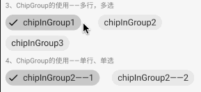
1、ChipGroup的特点
使用 ChipGroup 可以方便的实现 流式布局效果。其特点如下:
- 默认情况下, ChipGroup 中的 chip 会横向排列,当超过一行时会执行换行操作。
- 如果我们不想让 Chip 换行,那么为 ChipGroup 设置 app:singleLine=true,如果 Chip 会超过一行,则在外层包裹 HorizontalScrollView
- 只有当其中包裹的 Chip 是 checkable=true 时,才具有选中效果
2、ChipGroup的属性
| 属性名称 | 作用 | 示例 |
|---|---|---|
| app:checkedChip | 初始选中的chip | app:checkedChip="@id/chipInGroup2_1" |
| app:chipSpacing | Chip间的间距 | app:chipSpacing="25dp" |
| app:chipSpacingHorizontal | Chip间的水平间距 | app:chipSpacingHorizontal="35dp" |
| app:chipSpacingVertical | Chip间的垂直间距 | app:chipSpacingVertical="10dp" |
| app:singleLine | 是否开启单行模式 | app:singleLine="true" |
| app:singleSelection | 是否开启单选模式 | app:singleSelection="true" |
注意:
- 如果 singLine=false, app:chipSpacing 会同时控制Chips间的水平和垂直的间距
- 如果 singLine=true, app:chipSpacing 控制的是Chips之间的水平间距
- 如果设置了 chipSpacing ,也设置了 chipSpacingHorizontal / chipSpacingVertical 则 chipSpacing 的值会被覆盖
3、ChipGroup的基本使用示例
(1)、效果图
(2)、示例代码
<TextView
        android:layout_width="wrap_content"
        android:layout_height="wrap_content"
        android:layout_marginTop="10dp"
        android:text="3、ChipGroup的使用——多行,多选" />

    <!--ChipGroup 默认状态,会换行,可多选-->
    <com.google.android.material.chip.ChipGroup
        android:layout_width="match_parent"
        android:layout_height="wrap_content"
        android:layout_marginTop="10dp"
        app:chipSpacing="25dp"
        app:chipSpacingHorizontal="35dp"
        app:chipSpacingVertical="10dp">

        <com.google.android.material.chip.Chip
            android:id="@+id/chipInGroup1"
            style="@style/Widget.MaterialComponents.Chip.Filter"
            android:layout_width="wrap_content"
            android:layout_height="wrap_content"
            android:text="chipInGroup1"
            android:textAppearance="?android:textAppearanceMedium" />

        <com.google.android.material.chip.Chip
            android:id="@+id/chipInGroup2"
            style="@style/Widget.MaterialComponents.Chip.Filter"
            android:layout_width="wrap_content"
            android:layout_height="wrap_content"
            android:text="chipInGroup2"
            android:textAppearance="?android:textAppearanceMedium" />

        <com.google.android.material.chip.Chip
            android:id="@+id/chipInGroup3"
            style="@style/Widget.MaterialComponents.Chip.Filter"
            android:layout_width="wrap_content"
            android:layout_height="wrap_content"
            android:text="chipInGroup3"
            android:textAppearance="?android:textAppearanceMedium" />

    </com.google.android.material.chip.ChipGroup>

    <TextView
        android:layout_width="wrap_content"
        android:layout_height="wrap_content"
        android:layout_marginTop="10dp"
        android:text="4、ChipGroup的使用——单行、单选" />

    <!--ChipGroup 不换行,单选-->
    <HorizontalScrollView
        android:layout_width="match_parent"
        android:layout_height="wrap_content"
        android:scrollbars="none">

        <com.google.android.material.chip.ChipGroup
            android:layout_width="match_parent"
            android:layout_height="wrap_content"
            android:layout_marginTop="10dp"
            app:checkedChip="@id/chipInGroup2_1"
            app:chipSpacing="25dp"
            app:singleLine="true"
            app:singleSelection="true">

            <com.google.android.material.chip.Chip
                android:id="@+id/chipInGroup2_1"
                style="@style/Widget.MaterialComponents.Chip.Filter"
                android:layout_width="wrap_content"
                android:layout_height="wrap_content"
                android:text="chipInGroup2——1"
                android:textAppearance="?android:textAppearanceMedium" />

            <com.google.android.material.chip.Chip
                android:id="@+id/chipInGroup2_2"
                style="@style/Widget.MaterialComponents.Chip.Filter"
                android:layout_width="wrap_content"
                android:layout_height="wrap_content"
                android:text="chipInGroup2——2"
                android:textAppearance="?android:textAppearanceMedium" />

            <com.google.android.material.chip.Chip
                android:id="@+id/chipInGroup2_3"
                style="@style/Widget.MaterialComponents.Chip.Filter"
                android:layout_width="wrap_content"
                android:layout_height="wrap_content"
                android:text="chipInGroup2——3"
                android:textAppearance="?android:textAppearanceMedium" />

        </com.google.android.material.chip.ChipGroup>
    </HorizontalScrollView>
4、事件监听
(1)、setOnCheckedChangeListener
选中监听。
注意:只有 singleSelction=true 时,该监听才有效。
- Kotlin版代码
 //ChipGroup中设置选中监听-- 只有单选的chipGroup才可以使用
        chipGroup2.setOnCheckedChangeListener { chipGroup, selectedId ->
            var hintStr = ""
            when (selectedId) {
                R.id.chipInGroup2_1 -> hintStr = "被选中的是 chipInGroup2_1 "
                R.id.chipInGroup2_2 -> hintStr = "被选中的是 chipInGroup2_2 "
                R.id.chipInGroup2_3 -> hintStr = "被选中的是 chipInGroup2_3 "
                else -> hintStr = "没有选中任何chip"
            }
            Toast.makeText(mActivity, hintStr, Toast.LENGTH_SHORT).show()
        }
- java 版代码
ChipGroup chipGroup = (ChipGroup) findViewById(R.id.chipGroup2);

chipGroup.setOnCheckedChangeListener(new OnCheckedChangeListener() {
    @Override
    public void onCheckedChanged(ChipGroup group, @IdRes int checkedId) {
         String hintStr=" ";
         switch(checkedId){
                case R.id.chipInGroup2_1:
                      hintStr = "被选中的是 chipInGroup2_1 ";
                      break;
                case R.id.chipInGroup2_2 :
                      hintStr = "被选中的是 chipInGroup2_2 ";
                      break;
                case R.id.chipInGroup2_3:
                      hintStr = "被选中的是 chipInGroup2_3 ";
                      break;
                default:
                      hintStr = "没有选中任何chip";
                      break;
        }
        Toast.makeText(mActivity, hintStr, Toast.LENGTH_SHORT).show()
    }
});
(2)、getCheckedChipId( )
获取被选中的 ChipId
注意:只有 singleSelction=true 时,该方法才有效。
示例代码省略。
六、ChipDrawable
继承自 Drawable。
1、xml 中定义ChipDrawable
注意事项:
- 必须在 res 目录下新建 xml 文件夹,在 xml 文件夹下创建 .xml 文件,其他文件夹下创建会报错
- xml 中以 <chip> 开头
- chip 节点中可以使用 Chip 的全部属性。
- xml 中定义的<chip> 默认是 Entry 样式的,我们也可以根据需要更换成 filter/Action/Choice
- res/xml/standalone_chip.xml
<chip
    xmlns:app="http://schemas.android.com/apk/res-auto"
    app:chipIcon="@drawable/ic_avatar_circle_24"
    android:text="@string/hello_world"/>
- ChipActivity.kt 中应用
//直接以 Span的形式将 chipDrawable 加入到 EditText中,这样看着很好,但是,ChipDrawable 中clos额Icon的点击事件没法实现啊
bt_applyChip.setOnClickListener { view ->
    val chipDrawable = ChipDrawable.createFromResource(mActivity, R.xml.chip_drawable_1)
    val text = editText.text
    val newInputText = text.substring(mPreSelectionEnd, text.length)
    chipDrawable.setText(newInputText)
    chipDrawable.setBounds(0, 0, chipDrawable.intrinsicWidth, chipDrawable.intrinsicHeight)
    val span = ImageSpan(chipDrawable)
    text.setSpan(span, mPreSelectionEnd, text.length, Spanned.SPAN_EXCLUSIVE_EXCLUSIVE)
    editText.setOnKeyListener(this)
    mPreSelectionEnd = text.length
}
七、补充:
1、关于 textApperence
android:textAppearance 设置文字外观。如“ ?android:attr/textAppearanceLargeInverse
”这里引用的是系统自带的一个外观,?表示系统是否有这种外观,否,则使用默认的外观。可设置的值如下:
- textAppearanceButton
- textAppearanceInverse
- textAppearanceLarge
- textAppearanceLargeInverse
- textAppearanceMedium
- textAppearanceMediumInverse
- textAppearanceSmall
- textAppearanceSmallInverse
2、MotionSpec
developer.android.com/reference/c…
八、 参考:
官方:
developer.android.com/reference/c…
developer.android.com/reference/c…
含示例代码
material.io/develop/and…
其他Chip的实现
stackoverflow.com/questions/3…
引入支持库的参考:
stackoverflow.com/questions/5…
