

首先了解安全区域(safe area)的概念,它保证了内容在设备上的正确嵌入,不会被状态栏、导航栏等遮挡。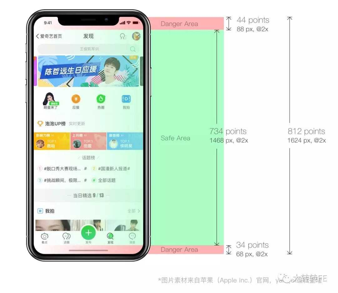
纯css实现
In order to handle any adjustment that may be required iOS 11’s version of Safari includes some constants that can be used when viewport-fit=cover is being used.
safe-area-inset-top
safe-area-inset-right
safe-area-inset-left
safe-area-inset-bottom
为了更好地适配IOS 11版本的safari提供了上面几个变量。且当 viewport-fit=cover时可以在css中使用。
首先设置meta标签
<meta name=“viewport” content=”initial-scale=1, viewport-fit=cover”>
然后我们可以使用 constant()(IOS 11.0-11.2)或 env()(>IOS 11.2)来引用上面的变量
body{

  /* 利用css fallback机制,下面的代码可以兼容两种版本 */

  padding-top: env(safe-area-inset-top);

  padding-top: constant(safe-area-inset-top);

}
js基本实现
var isIphoneX = window.devicePixelRatio && window.devicePixelRatio === 3 && window.screen.width === 375 && testUA('iPhone')

if (isIphoneX) {

  document.body.classList.add('fix-iphonex-bottom')

}

function testUA (str) {

  return navigator.userAgent.indexOf(str) > -1

}
.fix-iphonex-bottom .navi[data-v-539b7842]{

  padding-bottom: 34px;

}
js动态适配
针对有底部栏的浏览器,页面滚动过程中底部栏显示、隐藏的情况,我们可以做一个动态适配:
var isIphoneX = window.devicePixelRatio && window.devicePixelRatio === 3 && window.screen.width === 375 && testUA('iPhone')

if (isIphoneX) {

  check()

  window.onscroll = throttle(check, 200)

}

function check () {

  // 处理lib-flexible放大viewport的情况

  var scale = window.innerWidth / window.screen.width

  // 部分浏览器在滚动页面时会显示/隐藏工具栏,影响视口高度。在有底部工具栏的情况下,不做iPhoneX的fix。100为经验值

  if (window.screen.height - window.innerHeight / scale < 100) {

    document.body.classList.add('fix-iphonex-bottom')

  } else {

    document.body.classList.remove('fix-iphonex-bottom')

  }

}

function testUA (str) {

  return navigator.userAgent.indexOf(str) > -1

}
