

CSS从基础知识到技巧总结,知识点十分繁多。为了将这些知识点进行一个系统的总结。我列举了一下几部分进行记忆。我的记忆方法主要是记住所有的CSS书写顺序,然后对每个属性进行属性的相关功能进行记忆。这样就可以做到整体呈现结构式的记忆。
CSS 技巧和经验列表
目录
- 第一部分 CSS规范
- 第二部分 位置属性
- 第三部分 大小
- 第四部分 文字系列
- 第五部分 背景
- 第六部分 动画
第一部分 CSS规范
1. CSS书写顺序
1.位置属性(position, top, right, z-index, display, float等)
2.大小(width, height, padding, margin)
3.文字系列(font, line-height, letter-spacing, color- text-align等)
4.背景(background, border等)
5.其他(animation, transition等)
2. 需要写兼容的常见的CSS属性(注意:不带前缀的写法必须放在最后)
- -moz- /* 火狐等使用Mozilla浏览器引擎的浏览器 */
- -webkit- /* Safari, 谷歌浏览器等使用Webkit引擎的浏览器 */
- -o- /* Opera浏览器(早期) */
- -ms- /* Internet Explorer (不一定) */
常见的需要写兼容的CSS属性如下:
- border-radius
- box-shadow
- flex系列(flex、flex-direction、justify-content、align-items、align-self)
- transform
- transition
- animation
3. CSS条件hack
3.1 语法
注意:<keywords> 和 <version> 都为选填
<!--[if <keywords>? IE <version>?]>
HTML代码块
<![endif]-->
3.2 取值
<keywords>
if条件共包含6种选择方式:是否、大于、大于或等于、小于、小于或等于、非指定版本

是否:
指定是否IE或IE某个版本。关键字:空
大于:
选择大于指定版本的IE版本。关键字:gt(greater than)
大于或等于:
选择大于或等于指定版本的IE版本。关键字:gte(greater than or equal)
小于:
选择小于指定版本的IE版本。关键字:lt(less than)
小于或等于:
选择小于或等于指定版本的IE版本。关键字:lte(less than or equal)
非指定版本:
选择除指定版本外的所有IE版本。关键字:!
3.3 示例
大于或等于,示例代码:
<!--[if gte IE 6]>
<style>
.test{color:red;}
</style>
<![endif]-->
第二部分 位置属性
- 布局
- 最小固定宽度布局
- 百分比布局
- 栅格布局、弹性布局
- js + rem 布局方案
- 经典圣杯布局
- position:(sticky footer、sticky list、sticky Modal)/(BFC)
- z-index失效
- display:清除浮动、去掉img几像素的空白、水平垂直居中
- display:table/table-cell/table-row/flex
- display:none与visibility:hidden的区别?
1. sticky footer 代码戳这里
效果图如下:
2. sticky list 代码戳这里
效果图如下:
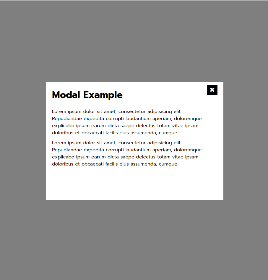
3. sticky Modal 代码戳这里
效果图如下:
4. BFC 戳这里
4.1 BFC基本概念
BFC Block Formatting Context 块级格式化上下文
4.2 BFC原理
4.3 BFC触发
- float不为none
- display值为inline-block 、table-cell、table-caption
- position值为absolute、fixed
- overflow的值不为visible
4.4 BFC应用场景
- 清除浮动
- 被float元素覆盖
- margin重叠
4. z-index 失效
- 父标签 position属性为relative;
- 问题标签无position属性(不包括static);
- 问题标签含有浮动(float)属性。
5. 清除浮动
> 方法一:
#test{clear:both;}
#test为浮动元素的下一个兄弟元素

> 方法二:
#test{display:block;zoom:1;overflow:hidden;}
#test为浮动元素的父元素。zoom:1也可以替换为固定的width或height

> 方法三:
#test{zoom:1;}
#test:after{display:block;clear:both;visibility:hidden;height:0;content:'';}
#test为浮动元素的父元素
6. 如何清除图片下方出现的几像素的空白
> 方法一:
img{display:block;}

> 方法二:
img{vertical-align:top;}
除了top值,还可以设置为text-top | middle | bottom | text-bottom,甚至特定的<length>和<percentage>值都可以

> 方法三:
#test{font-size:0;line-height:0;}
test为img的父元素
7.水平垂直居中
如何让元素水平居中
元素为 inline-* 系列(包括inline/inline-block/inline-table/inline-flex)
text-align:center;

元素为block:
margin: 0 auto;

多个块级元素:
{
    display:inline-block;
    text-aligin:center;
}
或者
{
    display:flex;
    justify-content:center;
}
如何让元素垂直居中
- inline
单行文本
{
    padding-top:30px;
    padding-bottom:30px;
}
或者
{
    height:30px;
    line-height:30px
}

多行文本
<div><p>文本文本文本文本文本</p></div>
方法一:
div{
    display: flex;
	flex-direction: column;
	justify-content: center;
}
方法二:
div{
    display: table;
}
p{
    display:table-cell;
    vertical-align:middle;
}
- block
知道高度
.parent{
	position: relative;
}
.child{
	position: absolute;
	top: 50%;
	height: 100px;
	margin-top: -50px;
}

不知道高度
.parent{
	position: relative;
}
.child{
	position: absolute;
	top: 50%;
	transform: translateY(-50%);
}
- use flex
.parent{
	display: flex;
	flex-direction: column;
	justify-content: center;
}
如何让元素水平垂直居中
固定宽带和高度:
.parent{
	position: relative;
}
.child{
	position: absolute;
	top: 50%;
	left:50%;
	width:100px;
	height:100px;
	margin:-50px 0 0 -50px;
}

不知道高度和宽度:
.parent{
	position: relative;
}
.child{
	position: absolute;
	top: 50%;
	left:50%;
	transform: translate(-50%,-50%);
}

使用flex
.parent{
	display: flex;
	justify-content: center;
	align-items: center;
}
8.如何区别display:none与visibility:hidden?
- 相同的是display:none与visibility:hidden都可以用来隐藏某个元素; 不同的是display:none在隐藏元素的时候,将其占位空间也去掉;
- 而visibility:hidden只是隐藏了内容而已,其占位空间仍然保留。
display属性值解析:display:table/table-cell/table-row/flex
第三部分 大小
1.box-sizing 戳这里
注意:
- 在响应式布局总box-sizing的border-box属性使用比较广泛
- 重置box-sizing的方法
html {
  box-sizing: border-box;
}
*, *:before, *:after {
  box-sizing: inherit;
}
2.设置图片的宽度为屏幕的宽度,(高度可设置为宽度对应的百分比)
<div class="image-header">
    <img :src="food.image">
</div>
CSS代码:
.image-header{
    position: relative;
    width: 100%;
    height: 0;
    /**100%:高度=宽度 80%:高度=0.8*宽度*/
    padding-top: 100%;
    img{
        position: absolute;
        top: 0;
        left: 0;
        width: 100%;
        height: 100%;
    }
}
3. 绘制三角形
一篇很好的关于绘制三角形原理的文章 点这里
html代码:<div id="triangle"></div>

正三角形:
#triangle{
	width: 0;
	height: 0;
	border-bottom: 100px solid red;
	border-left: 50px solid transparent;
	border-right: 50px solid transparent;
}
接下来的请点击CSS技巧总结2
