

简介
总结记录一下经常需要用到垂直居中布局,欢迎补充(空手套。。。O(∩_∩)O)
以下栗子如果未特别标注同一使用这样的html结构
<div class="container">
    <div class="content"></div>
</div>
垂直居中布局
利用绝对定位和负margin
绝对定位可以很容易做到top:50%,现在只要再让目标元素上移自身高度的一半就垂直居中了
.container {
  background: #777777;
  height: 400px;
  position: relative;
}

.container .content {
  width: 100px;
  height: 100px;
  position: absolute;
  top: 50%;
  margin-top: -50px;
  left: 50%;
  margin-left: -50px;
  background: #ee5f28;
}
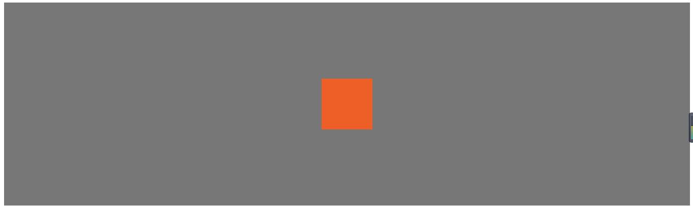
优点:兼容性好 缺点:需要知道居中元素的高度
利用绝对定位和transform
 .container {
  background: #777777;
  height: 400px;
  position: relative;
}

.container .content {
  width: 100px;
  height: 100px;
  position: absolute;
  top: 50%;
  left: 50%;
  transform: translate3d(-50%, -50%, 0);
  background: #ee5f28;
}
- 优点:不需要考虑content元素的高度
- 缺点:兼容性
利用绝对定位和calc
.container {
  background: #777777;
  height: 400px;
  position: relative;
}

.container .content {
  width: 100px;
  height: 100px;
  position: absolute;
  top: calc(50% - 50px);
  left: calc(50% - 50px);
  background: #ee5f28;
}
- 优点:相比于前面少了两条样式
- 缺点:兼容性
利用flex
.container {
  background: #777777;
  height: 400px;
  display: flex;
  justify-content: center;
  align-items: center;
}

.container .content {
  width: 100px;
  height: 100px;
  background: #ee5f28;
}
.container {
  background: #777777;
  height: 400px;
  display: flex;
}

.container .content {
  width: 100px;
  height: 100px;
  background: #ee5f28;
  margin: auto;
}
- 优点:垂直居中特别容易搞定
- 缺点:兼容性
震惊absoulute(绝对定位)还可以这样用
.container {
  background: #777777;
  height: 400px;
  position: relative;
}

.container .content {
  width: 100px;
  height: 100px;
  background: #ee5f28;
  position: absolute;
  top: 0;
  left: 0;
  right: 0;
  bottom: 0;
  margin: auto;
}
优点:
- 1.跨浏览器,兼容性好(无需hack,可兼顾IE8~IE10);
- 2.无特殊标记,样式更精简;
- 3.自适应布局,可以使用百分比和最大最小高宽等样式;
- 4.居中时不考虑元素的padding值(也不需要使用box-sizing样式);
- 5.布局块可以自由调节大小;6.img的图像也可以使用
- 6.浏览器支持:Chrome、Firefox、Safari、Mobile Safari、IE8-10。 “完全居中”经测试可以完美地应用在最新版本的Chrome、Firefox、Safari、Mobile Safari中,甚至也可以运行在IE8~IE10上
使用inline-block
.container {
  background: #777777;
  height: 400px;
  text-align: center;
  font-size: 0;
  overflow: auto;
}

.container::after {
  content: '';
  display: inline-block;
  height: 100%;
  vertical-align: middle;
}

.container .content {
  display: inline-block;
  vertical-align: middle;
  width: 100px;
  height: 100px;
  background: #ee5f28;
}
这里注意:容器‘container’里要设置font-size:0;避免inline-block之间产生间隔
优点:
- 内容高度可变
- 内容溢出则能自动撑开父元素高度
- 浏览器兼容性好,甚至可以调整支持IE7
使用table与table-cell
<!DOCTYPE html>
<html lang="en">

<head>
  <meta charset="UTF-8">
  <meta name="viewport" content="width=device-width, initial-scale=1.0">
  <meta http-equiv="X-UA-Compatible" content="ie=edge">
  <title>Document</title>
  <style>
    .container-table {
      background: #777777;
      height: 400px;
      width: 100%;
      display: table;
    }

    .container-table .container-cell {
      display: table-cell;
      vertical-align: middle;/* 这里达到了垂直居中的效果 */
    }

    .container-table .container-cell .content {
      width: 100px;
      height: 100px;
      margin: 0 auto;/* 利用margin值 水平居中*/
      background: #ee5f28;
    }
  </style>
</head>

<body>
  <div class="container-table">
    <div class="container-cell">
      <div class="content"></div>
    </div>
  </div>
</body>

</html>
- 优点:
- 内容高度可变
- 内容溢出则能自动撑开父元素高度
- 浏览器兼容性好
- 缺点:额外标签
参考资料
- https://caniuse.com/
- https://www.w3cplus.com/css3/css-secrets/vertical-centering.html
- http://blog.jobbole.com/46574/
