

1. 甜嘴棒棒糖
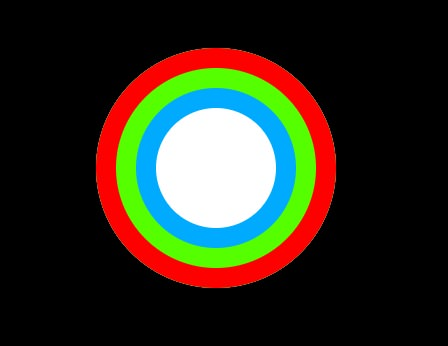
实现只需要借助box-shadow两个特性:
- box-shadow可任意个数阴影
- box-shadow的扩张半径参数。
body {
    background: #000;
}

.pin {
    margin: 60px auto;
    width: 60px;
    height: 60px;
    border-radius: 60px;
    background: white;
    box-shadow: 0 0 0 10px hsl(0, 100%, 50%),
    0 0 0 20px hsl(100, 100%, 50%),
    0 0 0 30px hsl(200, 100%, 50%);
}
如果只用来当作图片显示,那么再加上适当的外边距,显然已经大功告成了。
解决响应问题:
但其实会有一个潜在的问题。 因为用box-shadow生成的边框是出现在元素外圈的,而元素的外圈,是不会响应鼠标事件的。
可以通过把每个box-shadow属性加入inset关键词,让它在元素内部渲染,然后使用同等的内边距来解决。
代码如下:
body {
    background: #000;
}

.pin {
    margin: 60px auto;
    border-radius: 60px;
    width: 60px;
    height: 60px;
    padding: 30px;
    background: white;
    box-shadow: 0 0 0 10px hsl(0, 100%, 50%) inset,
    0 0 0 20px hsl(100, 100%, 50%) inset,
    0 0 0 30px hsl(200, 100%, 50%) inset;
}
2. 两层边框
2.1 小试牛刀
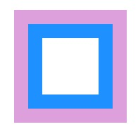
只需要两层边框的话,亦可以使用outline(描边)。
但它有个缺陷,由于outline不属于元素的内部空间,所以当使用border-radius时,是无法被渲染成充斥曲线美的弧形的。
不过好消息是,这被Css工作组认为是个bug,有望未来被修正。
示例代码如下:
.pin {
         margin: 60px auto;
         width: 60px;
         height: 60px;
         background: white;
         border: 10px solid plum;
         outline: 10px solid dodgerblue;
         outline-offset: -20px;
     }
2.2 缝边效果
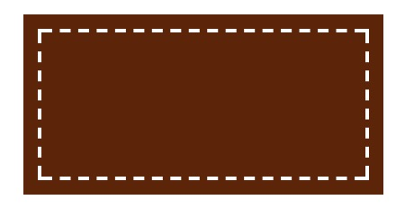
同时通过outline-offset可以来控制它的位置,还可以是负值哦。
利用这两点,一个简约而实用的缝边效果轻松诞生。
如下:
.pin {
   margin: 60px auto;
   width: 200px;
   height: 100px;
   outline: 2px #fff dashed;
   outline-offset: -10px;
   background: hsl(20, 80%, 20%);
  }
最后留个想象题,由于是虚线,所以你把outline设置更宽,或者outline-offset设置更大,那么会产生什么效果呢?
3. 边框内圆角
我们了解到box-shadow可以是圆角的,但是outline至少现在是不能的。
结合这两点特性,可以实现边框内圆角。
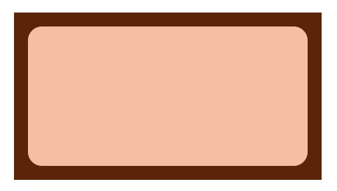
代码如下:
.pin {
    margin: 60px auto;
    width: 200px;
    height: 100px;
    background: hsl(20, 80%, 80%);
    border-radius: 10px;
    box-shadow: 0 0 0 10px hsl(20, 80%, 20%);
    outline: 10px hsl(20, 80%, 20%) solid;
    outline-offset: 0;
}
