时间序列模型决定了预测的准确性,良好的可视化展示能为模型效果增益。Seaborn因其高兼容性和交互性,在时间序列数据可视化设计中独占优势。
我们选取科赛网上公开的1965-2016全球重大地震数据集,分享Seaborn中heatmap、timeseries以及regression function的使用。
由美国国家地震中心收集,记录了全世界所有显著地震的地点和震级(自1965年报告的震级为5.5以上地震的发生日期,时间,位置,深度,大小和来源数据)。
import pandas as pd
import numpy as np
data = pd.read_csv('earthquake.csv')
data.head()
seaborn中的plot function:
- heatmap: 用颜色矩阵去显示数据在两个维度下的度量值
- tsplot: 用时间维度序列去展现数据的不确定性
- regplot: 用线性回归模型对数据做拟合
- residplot: 展示线性回归模型拟合后各点对应的残值
data['Date'] = pd.to_datetime(data['Date'])
data['Year'] = data['Date'].dt.year
data['Month'] = data['Date'].dt.month
data = data[data['Type'] == 'Earthquake']
Countplot
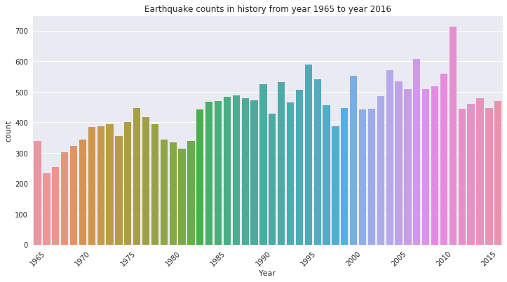
我们可以先用Countplot作图,看一看在1965-2015年间,每年各有多少次地震。
import
warnings
warnings.filterwarnings("ignore")
import
seaborn as sns
import
matplotlib.pyplot as plt
%matplotlib
inline
plt.figure(1,figsize=(12,6))
Year
= [i for i in
range(1965,2017,5)]
idx
= [i for i in
range(0,52,5)]
sns.countplot(data['Year'])
plt.setp(plt.xticks(idx,Year)[1],rotation=45)
plt.title('Earthquake counts in history from year 1965 to year
2016')
plt.show()
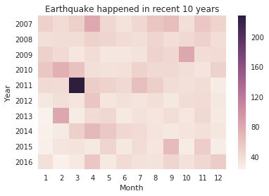
heatmap
其次,我们可以按年、月份制作热力图(heatmap),观察近十年的地震记录,
热力图的特点在于,定义两个具有意义的dimension,看数据在这两个dimension下的统计情况,完成对比分析。
test
= data.groupby([data['Year'],data['Month']],as_index=False).count()new = test[['Year','Month','ID']]
temp
= new.iloc[-120:,:]
temp
= temp.pivot('Year','Month','ID')
sns.heatmap(temp)
plt.title('Earthquake happened in recent 10 years')
plt.show()
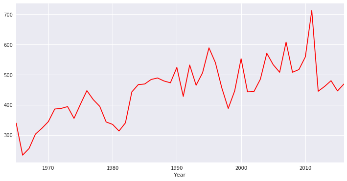
timeseries
也可以利用时间序列图(timeserise),探究以年为单位地震次数趋势。
temp
= data.groupby('Year',as_index=False).count()
temp
= temp.loc[:,['Year','ID']]
plt.figure(1,figsize=(12,6))
sns.tsplot(temp.ID,temp.Year,color="r")
plt.show()
regression
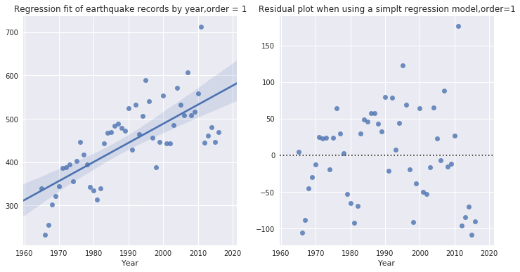
可以对以年为单位的地震记录作线性回归拟合。以下两张图分别对应一阶线性回归拟合、拟合后残值分布情况图。
plt.figure(figsize=(12,6))
plt.subplot(121) sns.regplot(x="Year", y="ID",
data=temp,order=1) # default by 1plt.ylabel(' ')
plt.title('Regression fit of earthquake records by year,order = 1')

plt.subplot(122)
sns.residplot(x="Year", y="ID",
data=temp)
plt.ylabel(' ')
plt.title('Residual plot when using a simplt regression
model,order=1')
plt.show()
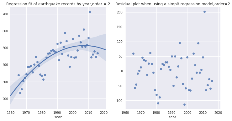
也可以尝试二阶拟合:
plt.figure(figsize=(12,6))
plt.subplot(121)
sns.regplot(x="Year", y="ID",
data=temp,order=2) # default by 1plt.ylabel(' ')
plt.title('Regression fit of earthquake records by year,order = 2')

plt.subplot(122)
sns.residplot(x="Year", y="ID",
data=temp,order=2)
plt.ylabel(' ')
plt.title('Residual plot when using a simplt regression
model,order=2')

plt.show()
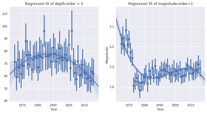
或者针对地震记录中的深度Depth、强度Magnitude做线性拟合。
plt.figure(figsize=(12,6))
plt.subplot(121)
sns.regplot(x="Year", y="Depth",
data=data,x_jitter=.05,
x_estimator=np.mean,order=3)
plt.ylabel(' ')
# x_estimator是一个参数,相当于对每年地震记录中参数取平均值,探究平均值的趋势
plt.title('Regression fit of depth,order = 3')

plt.subplot(122)
sns.regplot(x="Year", y="Magnitude",
data=data,x_jitter=.05,
x_estimator=np.mean,order=3)
# x_estimator是一个参数,相当于对每年地震记录中参数取平均值,探究平均值的趋势
plt.title('Regression fit of magnitude,order=3')
plt.show()
Seaborn可视化系列
Seaborn可视化学习之Categorial Visualization
Seaborn可视化学习之Distribution Visualization
由科赛推出的K-Lab在线数据分析协作平台,已经为你集成Python3、Python2、R三种主流编程语言环境,同步内置100+常用数据分析工具包(包括本文分享的Seaborn)。官网也聚合了丰富的数据资源,可直接登录kesci.com,任选数据集,尝试用Seaborn或其他工具包开展数据分析。