

styled-components 是一个常用的 css in js 类库。和所有同类型的类库一样,通过 js 赋能解决了原生 css 所不具备的能力,比如变量、循环、函数等。诸如 sass&less 等预处理可以解决部分 css 的局限性,但还是要学习新的语法,而且需要对其编译,其复杂的 webpack 配置也总是让开发者抵触。而 styled-componens 很好的解决了这些问题,很适合 React 技术栈的项目开发。
安装和使用
下面我们看一个简单的示例:
$ npm install styled-components
$ yarn add styled-components
我们可以用自己喜欢的方式将包安装到本地,然后就可以在项目中直接使用它:
import styled from 'styled-components';
const Wrapper = styled.section`
  margin: 0 auto;
  width: 300px;
  text-align: center;
`;
const Button = styled.button`
  width: 100px;
  color: white;
  background: skyblue;
`;
render(
  <Wrapper>
    <Button>Hello World</Button>
  </Wrapper>
);
上述的代码片段展示了 React 项目中使用 styled-components,定义了 Wrapper 和 Button 两个组件,包含了 html 结构和对应的 css 样式,从而将样式和组件之间的 class 映射关系移除。这种用法的学习成本还是很少的,在实际应用中我们完全可以将 style 和 jsx 分开维护。
组件和容器
在 styled-components 中, 将最简单只包含样式的结构称为组件(components),将包含业务逻辑或者复杂生命周期方法(无样式)的称之为容器(containers)。同时,将组件和容器分离开。
- Components = How things look
- Containers = How things work
下面的 2 个代码片段简单的说明了是否使用 styled-components 的区别:
1.没有使用 styled-components
class Sidebar extends React.Component {
  componentDidMount() {
    fetch('/url')
      .then(res => {
        this.setState({
          items: res.items,
        })
      })
  }
  render() {
    return (
      <div classNames="sidebar">
        {this.state.items.map(item => (
          <div className="sidebar__item">{item}</div>
        ))}
      </div>
    );
  }
}
- 使用 styled-component
class SidebarContainer extends React.Component {
  componentDidMount() {
    fetch('/url')
      .then(res => {
        this.setState({
          items: res.items,
        })
      })
  }
  render() {
    return (
      <Sidebar>
        {this.state.items.map(item => (
          <SidebarItem>{item}</SidebarItem>
        ))}
      </Sidebar>
    );
  }
}
基于 props 定制主题
下面来看一下使用 styled-components 来定义组件的主题。
const Button = styled.button`
  background: ${props => props.primary ? 'palevioletred' : 'white'};
  color: ${props => props.primary ? 'white' : 'palevioletred'};
  font-size: 1em;
  margin: 1em;
  padding: 0.25em 1em;
  border: 2px solid palevioletred;
  border-radius: 3px;
`;

render(
  <div>
    <Button>Normal</Button>
    <Button primary>Primary</Button>
  </div>
);
我们在组件中传入的所有 props 都可以在定义组件时获取到,这样就可以很容易实现组件主题的定制。如果没有 styled-components 的情况下,需要使用组件 style 属性或者定义多个 class 的方式来实现。
组件样式继承
通常在 css 中一般会通过给 class 传入多个 name 通过空格分隔的方式来复用 class 定义,类似 class="button tomato"。在 styled-components 中利用了 js 的继承实现了这种样式的复用:
const Button = styled.button`
  color: palevioletred;
  font-size: 1em;
  margin: 1em;
  padding: 0.25em 1em;
  border: 2px solid palevioletred;
  border-radius: 3px;
`;

const TomatoButton = Button.extend`
  color: tomato;
  border-color: tomato;
`;
我们可以看到在原生的样式和组件之间是多对多的映射关系,styled-components 通过继承彻底的移除了这种只为了样式而存在映射关系。组件内部会执行类似于对象合并的操作,子组件中的属性会覆盖父组件中同名的属性。
组件内部使用 className
在日常开发中总会出现覆盖组件内部样式的需求,你可能想在 styled-components 中使用 className,或者在使用第三方组件时。看下面的示例:
<Wrapper>
  <h4>Hello Word</h4>
  <div className="detail"></div>
</Wrapper>
对于这种 styled-components 和 className 混用,或者是一些伪类的情况同样是支持的:
import styled from 'styled-components';
const Wrapper = styled.div`
  display: block;
  h4 {
    font-size: 14px;
    &:hover {
      color: #fff;
    }
  }
  .detail {
    color: #ccc;
  }
`;
当然还可以通过 injectGlobal 的方式将通用的样式注入到全局中:
import styled, { injectGlobal } from 'styled-components';
injectGlobal`
  @font-face {
    font-family: 'Operator Mono';
    src: url('../fonts/Operator-Mono.ttf');
  }

  body {
    margin: 0;
  }
`;
组件中维护其他属性
styled-components 同时支持为组件传入 html 元素的其他属性,比如为 input 元素指定一个 type 属性,我们可以使用 attrs 方法来完成:
const Password = styled.input.attrs({
  type: 'password',
})`
  color: palevioletred;
  font-size: 1em;
  border: 2px solid palevioletred;
  border-radius: 3px;
`;
在实际开发中,这个方法还有一个有用处,用来引用第三方类库的 css 样式:
const Button = styled.button.attrs({
  className: 'small',
})`
  background: black;
  color: white;
  cursor: pointer;
  margin: 1em;
  padding: 0.25em 1em;
  border: 2px solid black;
  border-radius: 3px;
`;
编译后的 html 结构如下:
<button class="sc-gPEVay small gYllyG">
  Styled Components
</button>
可以用这种方式来使用在别处定义的 small 样式,或者单纯为了识别自己定义的 class,因为正常情况下我们得到的 class 名是不可读的编码。
CSS 动画支持
styled-components 同样对 css 动画中的 @keyframe 做了很好的支持。
import { keyframes } from 'styled-components';
const fadeIn = keyframes`
  0% {
    opacity: 0;
  }
  100% {
    opacity: 1;
  }
`;

const FadeInButton = styled.button`
  animation: 1s ${fadeIn} ease-out;
`;
keyframes 方法会生成一个唯一的 key 作为 keyframes 的名称,保证它的作用域是在单个文件内,非全局的。
总结
下面简单总结一下 styled-components 在开发中的表现:
- 提出了 container 和 components 的概念,移除了组件和样式之间的映射关系,符合关注度分离的模式;
- 可以在样式定义中直接引用到 js 变量,共享变量,非常便利;
- 支持组件之间继承,方便代码复用,提升可维护性;
- 兼容现有的 className 方式,升级无痛;
当然,style-components 还有一些优秀的特性并没有在上文中提出,比如服务端渲染和 React Native 的支持。同时,也希望在未来的版本中提供一些常用的 mixins 或者基类共开发者使用。更多关于 styled-components 的内容可以在官方站点上查询到。
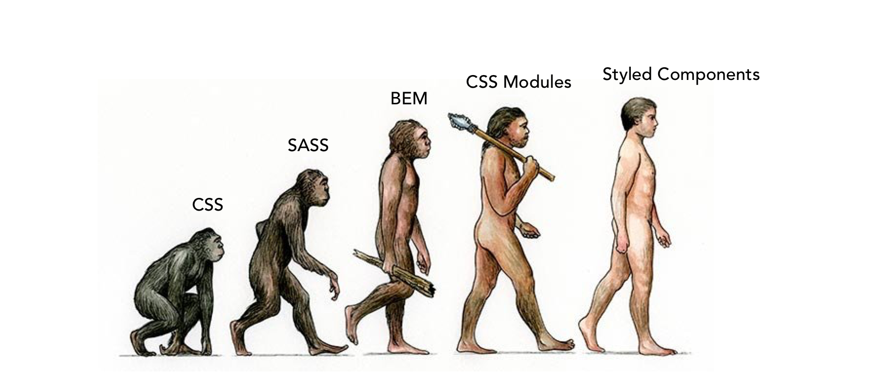
最后 po 一张 CSS Evolution: From CSS, SASS, BEM, CSS Modules to Styled Components 文中的图:

