

一、概念
弹性盒模型是css3的一种新的布局方式,是一种当前页面需要适应不同的屏幕大小及设备类型时确保拥有恰当的行为的布局方式。
二、目的
引入盒模型的目的是提供一种更加有效的方式来对一个容器中的子元素进行排列,对齐和分配空白空间。
三、内容
弹性盒子由弹性容器和弹性子元素组成
弹性容器通过设置display属性的值为flex或inline-flex将其定义为弹性容器
弹性容器内包含了一个或多个子元素
注意:
弹性容器外及弹性子元素内是正常渲染的,弹性盒子只定义了弹性子元素如何在弹性容器内布局
弹性子元素通常在弹性盒子内一行显示,默认每个容器只有一行
四、弹性父元素属性
4.1flex-direction
flex-direction顺序指定了弹性子元素在父容器中的位置
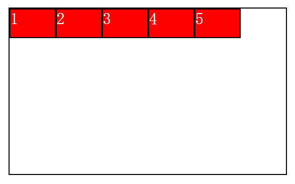
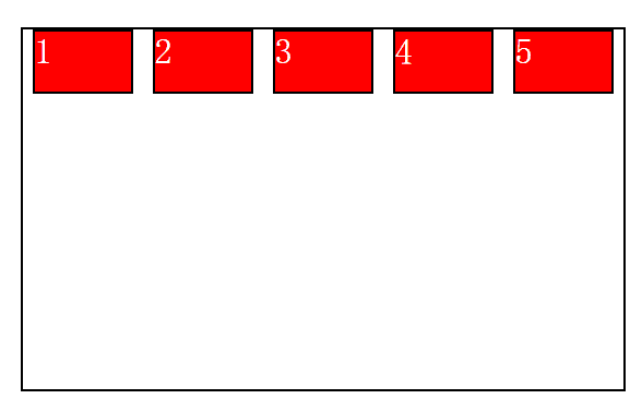
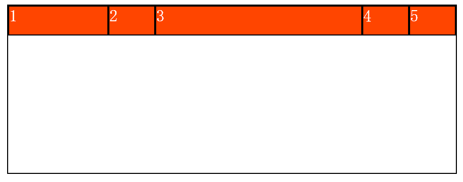
4.1.1 flex-direction: row
横向从左到右排列(左对齐),默认的排列方式。
举个栗子
<!DOCTYPE html>
<html>
    <head>
        <meta charset="UTF-8">
        <title></title>
        <style>
            *{
                padding: 0;
                margin: 0;
            }
            ul li{
                list-style: none;
            }
            ul{
                width: 500px;
                height: 300px;
                margin: 50px auto;
                border: 2px solid black;
            /*    在父容器中指定为flex布局* 将来要写浏览器兼容* /*/
                display:flex;
                flex-direction: row;
            }
            li{
                width: 80px;
                height: 50px;
                border: 2px solid black;
                background-color: red;
                font-size: 30px;
                color: white;
            }
        </style>
    </head>
    <body>
        <ul>
            <li>1</li>
            <li>2</li>
            <li>3</li>
            <li>4</li>
            <li>5</li>
        </ul>
    </body>
</html>
效果
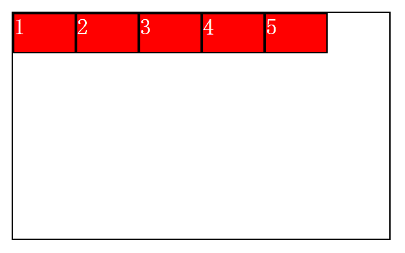
注:因为以下只是改变栗子中的 flex-direction的属性值,栗子都是都是一样的,所以偷个懒,只给最后效果图 ~。~
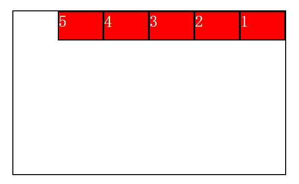
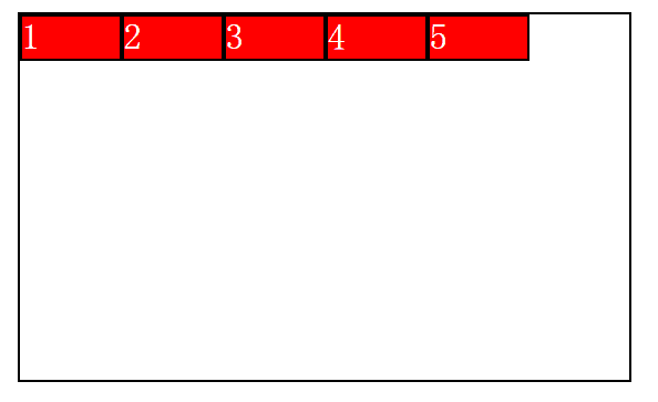
4.1.2 flex-direction: row-reverse
反向横向排列(右对齐,从后往前排,最后一排在对前面。)
效果
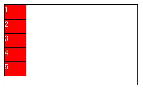
4.1.3flex-direction: column
纵向排列
效果
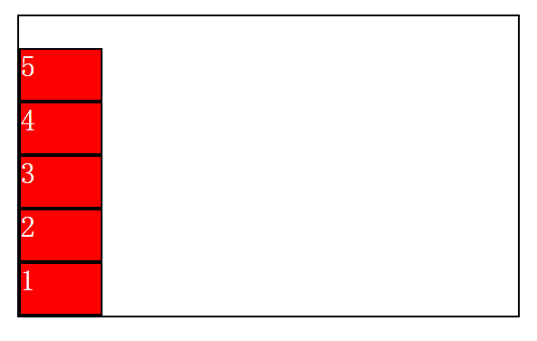
4.1.4flex-direction: column-reverse
反向纵向排列,从往前排,最后一项排在最上面
效果
4.2justify-content
内容对齐。内容随其属性应用在弹性容器上,把弹性项沿着弹性容器的主线轴对其。
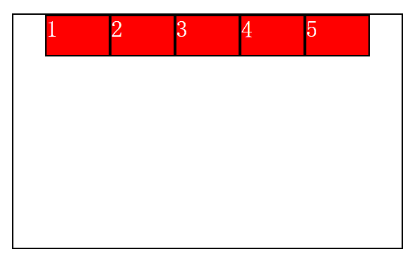
4.2.1 justify-content: flex-start
弹性项目向行头紧挨着填充。这个是默认值,第一个弹性项的main-start外边距边线被防止在该行的main-start边线,而后弹性项一次平齐排放
举个栗子
<!DOCTYPE html>
<html>
    <head>
        <meta charset="UTF-8">
        <title></title>
        <style>
            *{
                padding: 0;
                margin: 0;
            }
            ul li{
                list-style: none;
            }
            ul{
                width: 500px;
                height: 300px;
                margin: 50px auto;
                border: 2px solid black;
            /*    在父容器中指定为flex布局* 将来要写浏览器兼容* /*/
                display:flex;
                justify-content: flex-start
            }
            li{
                width: 80px;
                height: 50px;
                border: 2px solid black;
                background-color: red;
                font-size: 30px;
                color: white;
            }
        </style>
    </head>
    <body>
        <ul>
            <li>1</li>
            <li>2</li>
            <li>3</li>
            <li>4</li>
            <li>5</li>
        </ul>
    </body>
</html>
效果
注:因为以下只是改变栗子中的 justify-content: flex-start的属性值,栗子都是都是一样的,所以偷个懒,只给最后效果图 ~。~
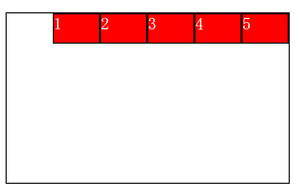
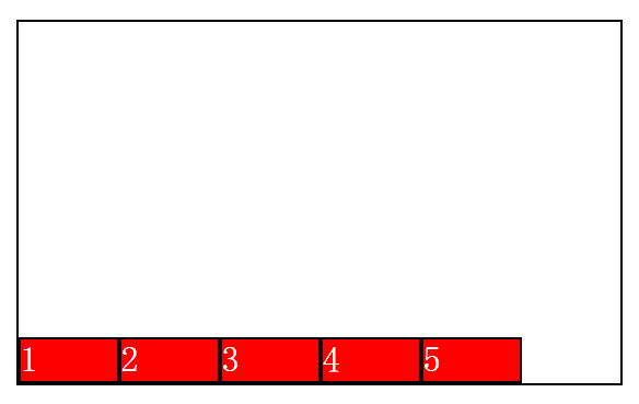
4.2.2justify-content: flex-end
弹性项目向行尾紧挨着填充。第一个弹性项的main-end外边距边线被防止在该行的main-end边线,而后续弹性项依次平齐摆放
效果
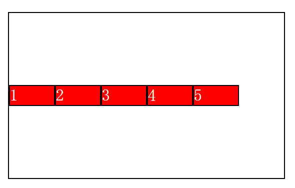
4.2.3justify-content: center
弹性项目居中紧挨着填充,如果剩余的自由空间是负的,则弹性项目将在两个方向同时溢出
效果
4.2.4justify-content: space-between
弹性项目平均分布在该行上。
如果剩余空间为负或者只有一个弹性项,则该值等同于flex-start。否则第一个弹性项的外边距和行的main-start边线对齐,而最后一个弹性项的外边距和行的main-end边线对齐,然后剩余的弹性项分布在该行上,相邻项目的间隔相等。
效果
4.2.5justify-content: space-around
如果剩余空间为负或者只有一个弹性项,则该值等同于center,否则,弹性项目沿该行分布,且必须间隔相等(比如是20px),同时收尾两边和弹性容器之间留有一半的间隔(1/2*20px = 10 px)
效果
4.3align-items
设置或检测弹性盒子元素在轴侧(纵轴)方向上的对齐方式
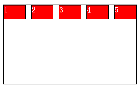
4.3.1align-items: flex-start
弹性盒子元素的轴侧(纵轴)起始位置的边界紧靠住该行的轴侧起始边界
举个栗子
<!DOCTYPE html>
<html>
    <head>
        <meta charset="UTF-8">
        <title></title>
        <style>
            *{
                padding: 0;
                margin: 0;
            }
            ul li{
                list-style: none;
            }
            ul{
                width: 500px;
                height: 300px;
                margin: 50px auto;
                border: 2px solid black;
            /*    在父容器中指定为flex布局* 将来要写浏览器兼容* /*/
                display:flex;
                align-items: flex-start;
            }
            li{
                width: 80px;
                height: 50px;
                border: 2px solid black;
                background-color: red;
                font-size: 30px;
                color: white;
            }
        </style>
    </head>
    <body>
        <ul>
            <li>1</li>
            <li>2</li>
            <li>3</li>
            <li>4</li>
            <li>5</li>
        </ul>
    </body>
</html>
效果
注:因为以下只是改变栗子中的 align-items: flex-start的属性值,栗子都是都是一样的,所以偷个懒,只给最后效果图 ~。~
4.3.2align-items: flex-end
弹性盒子元素的轴侧(纵轴)起始位置 紧靠住该行的轴侧结束边界
效果
4.3.3align-items:center
弹性盒子元素在该行的轴侧(纵轴)上居中放置。
如果该行的尺寸小于弹性子元素的尺寸,则会向两个方向溢出相同的长度
效果
4.3.4align-items:baseline
如果弹性盒子元素的行内轴与侧轴为同一条,则该值与flex-start等效,其他情况下,该值将参与基线对齐。
效果
4.3.5 align-items: stretch
如果指定侧轴大小的属性为auto,则其值会使项目的边距盒的尺寸尽可能接近所在行的尺寸,但同时会遵照'min/max-width/height'属性的限制
效果(此时没有给li设置高度)
4.4 flex-wrap
用于指定弹性盒子的子元素的元素换行方式
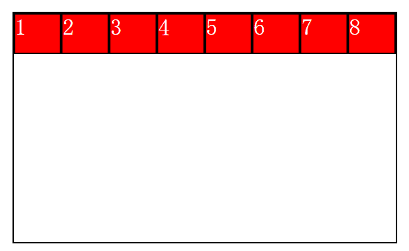
4.4.1 flex-wrap:nowrap
默认,弹性容器为单行,该情况下弹性子项可能会溢出容器或改变自身大小
举个栗子
<!DOCTYPE html>
<html>
    <head>
        <meta charset="UTF-8">
        <title></title>
        <style>
            *{
                padding: 0;
                margin: 0;
            }
            ul li{
                list-style: none;
            }
            ul{
                width: 500px;
                height: 300px;
                margin: 50px auto;
                border: 2px solid black;
            /*    在父容器中指定为flex布局* 将来要写浏览器兼容* /*/
                display:flex;
                 flex-wrap:nowrap;
            }
            li{
                width: 80px;
                height: 50px;
                border: 2px solid black;
                background-color: red;
                font-size: 30px;
                color: white;
            }
        </style>
    </head>
    <body>
        <ul>
            <li>1</li>
            <li>2</li>
            <li>3</li>
            <li>4</li>
            <li>5</li>
        </ul>
    </body>
</html>
效果
注:因为以下只是改变栗子中的 flex-wrap:nowrap的属性值,栗子都是都是一样的,所以偷个懒,只给最后效果图 ~。~
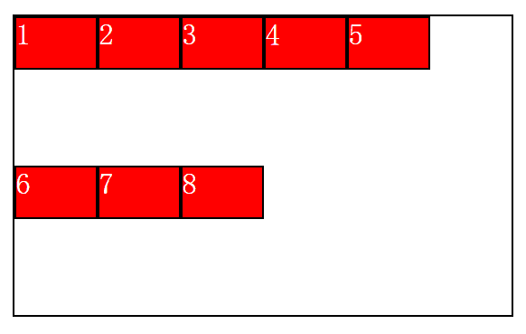
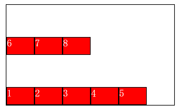
4.4.2 flex-wrap:wrap
弹性容器为多行,该情况下子项溢出的比分会被放置的新行,子项内部会发生断行
效果
4.4.3 flex-wrap:wrap-reverse
反转wrap排列
效果
五、弹性子元素属性
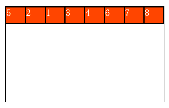
5.1 order
order属性设置弹性容器内弹性子元素的属性
order: integer(最大值)
用整数值来定义排列顺序,数值小的排在最前面。可以为负值
举个栗子
<!DOCTYPE html>
<html>
    <head>
        <meta charset="UTF-8">
        <title>01_order</title>
        <style type="text/css">
                *{
                margin: 0;
                padding: 0;
            }
            ul,li{
                list-style: noen;
            }
            ul{
                width:500px;
                height: 300px;
                border: 2px solid black;
                /*在父容器中指定为flex布局*/
                /*将来如果要写的话 需要些浏览器内核兼容*/
                display: flex;
                margin-left: auto;
                margin-right: auto;
            }
            li{
                list-style: none;
                width: 80px;
                height: 50px;
                border: 2px solid black;
                color: white;
                background: orangered;
                font-size: 30px;

            }
            ul li:nth-of-type(2){
                /*order: integer(最大值);
                 * 排序:数值越小,越排前,默认为0*/
                order:-4 ;
            }
            ul li:nth-of-type(5){
                order: -5;
            }

        </style>
    </head>
    <body>
        <ul>
            <li>1</li>
            <li>2</li>
            <li>3</li>
            <li>4</li>
            <li>5</li>
            <li>6</li>
            <li>7</li>
            <li>8</li>
        </ul>
    </body>
</html>
效果
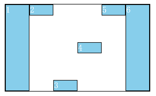
5.2 align-self单独对齐方式
align-self: auto;
如果'align-self'的值为'auto',则其计算值为元素的父元素的'align-items'值,如果其没有父元素,则计算值为'stretch'。
align-self: flex-start;
弹性盒子子元素的侧轴(纵轴)起始位置的边界紧靠住该行的轴侧起始边界
align-self:flex-end
弹性盒子元素的侧轴(纵轴)其实位置的边界紧靠着该行的轴侧结束边界
align-self: center
弹性盒子元素在该行的轴侧上居中放置。(如果该行的尺寸小于弹性盒子元素的尺寸,则会向两个方向溢出相同的长度)
align-self: baseline;
如弹性盒子元素的行内轴与侧轴为同一条,则该值与flex-start等效,其他情况下,该值将参与基线对齐
align-self: stretch
如果指定侧轴大小的属性值为auto,则其值会使项目的边距盒的尺寸尽可能接近所在行的尺寸,但同时会遵照min/max-width/height属性的限制
举个栗子
<!DOCTYPE html>
<html>
    <head>
        <meta charset="UTF-8">
        <title>05_align-self</title>
        <style type="text/css">
            *{
                margin: 0;
                padding: 0;
            }
            ul,li{
                list-style: none;
            }
            ul{
                width:500px;
                height: 300px;
                border: 2px solid black;
                /*在父容器中指定为flex布局*/
                /*将来如果要写的话 需要些浏览器内核兼容*/
                display: flex;
                margin-left: auto;
                margin-right: auto;
            }
            li{
                list-style: none;
                width: 80px;
                /*height: 50px;*/
                border: 2px solid black;
                color: white;
                background: skyblue;
                font-size: 30px;
            }

            ul li:nth-of-type(1){
                /*单独对齐方式:  自动(默认)*/
                align-self: auto;
            }

            ul li:nth-of-type(2){

                /*顶部对齐*/
                align-self: flex-start;
            }

            ul li:nth-of-type(3){
                /*底部对齐*/
                align-self: flex-end;
            }

            ul li:nth-of-type(4){
                /*居中对齐*/
                align-self: center;
            }

            ul li:nth-of-type(5){
                /*文本基线对齐*/
                align-self: baseline;
            }

            ul li:nth-of-type(6){
            /*    flex-flow: wrap;*/
                /*上下对齐并铺满*/
                align-self: stretch;
            }
        </style>
    </head>
    <body>
        <ul>
            <li>1</li>
            <li>2</li>
            <li>3</li>
            <li>4</li>
            <li>5</li>
            <li>6</li>
        </ul>
    </body>
</html>
效果
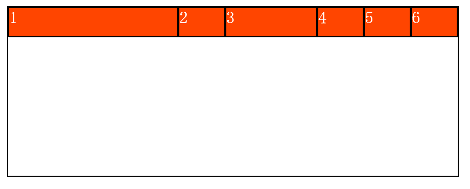
5.3 flex
flex属性用于指定弹性子元素如何分配空间
flex-basis
定义弹性盒子元素的默认基准值
举个栗子
<!DOCTYPE html>
<html>
<head>
<meta charset="UTF-8">
<title>04_flex-basis</title>
<style type="text/css">
*{
margin: 0;
padding: 0;
}
ul,li{
list-style: none;
}
ul{
width:800px;
height: 300px;
border: 2px solid black;
/*在父容器中指定为flex布局*/
/*将来如果要写的话 需要些浏览器内核兼容*/
display: flex;
margin: 50px auto;
}
li{
list-style: none;
width: 80px;
height: 50px;
border: 2px solid black;
color: white;
background: orangered;
font-size: 30px;
}
ul li:nth-of-type(1){
/*flex-basis: <length> | auto;*/ /* default auto */
/*固定大小:默认为0,可以设置px值,也可以设置百分比大小*/
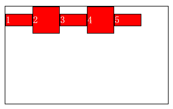
flex-basis:300px;
}
ul li:nth-of-type(3){
flex-basis: 20%;
}
ul li:nth-of-type(5){
/*默认值是auto*/
flex-basis: auto;
}
</style>
</head>
<body>
<ul>
<li>1</li>
<li>2</li>
<li>3</li>
<li>4</li>
<li>5</li>
<li>6</li>
</ul>
</body>
</html>效果
flex-grow
定义弹性盒子元素的扩展比率
举个栗子
<!DOCTYPE html>
<html>
<head>
<meta charset="UTF-8">
<title>02_flex-grow</title>
<style>
*{
margin: 0;
padding: 0;
}
ul,li{
list-style: noen;
}
ul{
width:800px;
height: 300px;
border: 2px solid black;
/*在父容器中指定为flex布局*/
/*将来如果要写的话 需要些浏览器内核兼容*/
display: flex;
margin-left: auto;
margin-right: auto;
}
li{
list-style: none;
width: 80px;
height: 50px;
border: 2px solid black;
color: white;
background: orangered;
font-size: 30px;
}
ul li:nth-of-type(1){
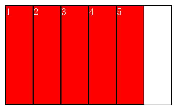
/*放大:默认0(即如果有剩余空间也不放大,值为1则放大,2是1的双倍大小,以此类推)不一定是双倍*/
flex-grow: 1;
}
ul li:nth-of-type(3){
flex-grow:3 ;
}
</style>
</head>
<body>
<ul>
<li>1</li>
<li>2</li>
<li>3</li>
<li>4</li>
<li>5</li>
</ul>
</body>
</html>效果
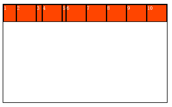
flex-shrink
定义弹性盒子元素的收缩比率
举个栗子
<!DOCTYPE html>
<html>
    <head>
        <meta charset="UTF-8">
        <title>03_flex-shrink</title>
        <style type="text/css">
            *{
                margin: 0;
                padding: 0;
            }
            ul,li{
                list-style: none;
            }
            ul{
                width:500px;
                height: 300px;
                border: 2px solid black;
                /*在父容器中指定为flex布局*/
                /*将来如果要写的话 需要些浏览器内核兼容*/
                display: flex;
                margin-left: auto;
                margin-right: auto;

            }
            li{
                list-style: none;
                width: 80px;
                height: 50px;
                border: 2px solid black;
                color: white;
                background: orangered;
                /*font-size: 30px;*/
            }

            ul li:nth-of-type(1){
             /*缩小:如果所有项目的flex-shrink属性都为1,当空间不足时,都将等比例缩小。
              * 果一个项目的flex-shrink属性为0,其他项目都为1,则空间不足时,前者不缩小。
              负值对该属性无效。)*/
                flex-shrink: 2;
            }

            ul li:nth-of-type(3){
                flex-shrink:3 ;
            }

            ul li:nth-of-type(5){
                flex-shrink: 5;
            }
        </style>
    </head>
    <body>
        <ul>
            <li>1</li>
            <li>2</li>
            <li>3</li>
            <li>4</li>
            <li>5</li>
            <li>6</li>
            <li>7</li>
            <li>8</li>
            <li>9</li>
            <li>10</li>
        </ul>
    </body>
</html>
效果
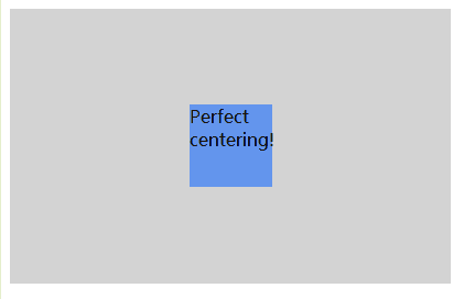
推荐的完美的居中
即父级设置display:flex,子级设置margin-auto,即可实现完美居中
举个栗子
<!DOCTYPE html>
<html>
<head>
<meta charset="utf-8">
<title></title>
<style>
.flex-container {
    display: -webkit-flex;
    display: flex;
    width: 400px;
    height: 250px;
    background-color: lightgrey;
}
.flex-item {
    background-color: cornflowerblue;
    width: 75px;
    height: 75px;
    margin: auto;
}
</style>
</head>
<body>
<div class="flex-container">
  <div class="flex-item">Perfect centering!</div>
</div>
</body>
</html>
效果
好累,伸懒腰,肩膀要废了~。~
喜欢就点赞~
