

经常在别人家的网页上看到各中好看图形,其中就有正六边形和组合的蜂窝状图形。今天我们来盘点一下,网页上有哪些姿势实现这个效果
姿势1
姿势2
姿势4

姿势1
css的border
/*css*/
.lb01 {
  position: relative;
  width: 200px;
  height: 120px;
  background-color: red;
  margin: 100px;
}
.lb01:after {
  content: "";
  position: absolute;
  display: block;
  top: -160px;
  width: 0;
  height: 0;
  border: 100px solid transparent;
  border-bottom: 60px solid red;
}
.lb01:before {
  content: "";
  position: absolute;
  display: block;
  bottom: -160px;
  width: 0;
  height: 0;
  border: 100px solid transparent;
  border-top: 60px solid red;
}
效果如图:
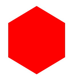 优点:代码简单,兼容性好。缺点:内部不能完美的嵌套内容,只有填充纯色才好看.
姿势2
css3的transform
.lb02 {
  width: 260px;
  height: 300px;
  margin: 50px;
  -webkit-transform: rotate(60deg);
  overflow: hidden;
}
.lb02 div,
.lb02 img {
  width: 100%;
  height: 100%;
  overflow: hidden;
}

.lb02> div {
  -webkit-transform: rotate(-120deg);
}

.lb02> div> div {
  -webkit-transform: rotate(60deg);
}

效果如图:
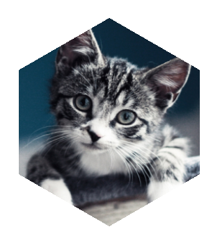 优点:内部可以嵌套图片内容。缺点:dom结构稍微多,需要对css3支持的浏览器才可以.
姿势3
svg的多边形
效果图:
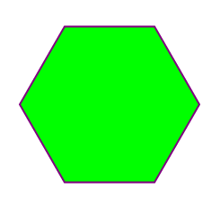 优点:矢量图形。缺点:浏览器兼容性不理想,稍微有一点偏冷门。
什么?你问我上面的坐标点怎么得到的?肯定是写一点代码算出来的呀,难道手写?具体怎么算可以参考下一种方式中的代码.
姿势4
canvas绘图
var canvas = document.getElementById("canvas");
canvas.width = 400;
canvas.height = 400;
var cc = canvas.getContext("2d");
// 填充一个背景
cc.fillStyle = "#31a6e2";
cc.rect(0 , 0 , 400 , 400);
cc.fill();
cc.beginPath();
for (var i = 0 ; i < 6 ; i++) {
var x = Math.cos((i * 60)/180 * Math.PI) * 150 + 200 ;
var y = -Math.sin((i * 60)/180 * Math.PI) * 150 + 200;
cc.lineTo(x,y);
}
cc.closePath();
cc.lineWidth = 2;
cc.fillStyle = "#fc3598";
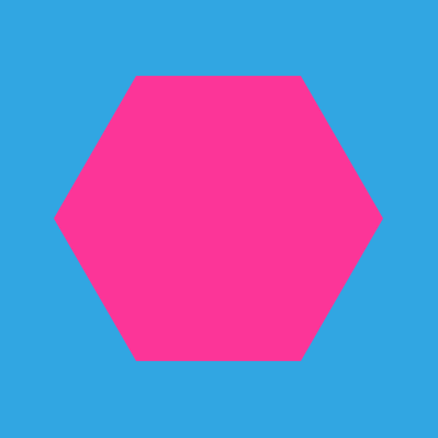
cc.fill();
效果图:
 优点:还没想好。缺点:还没想好。这个我已经不知道怎么描述了.....
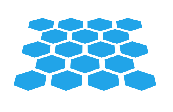
然后我们用六边形玩点有意思的:如图
代码如下:
作者:yuyuyu
链接:https://zhuanlan.zhihu.com/p/24489820
来源:知乎
著作权归作者所有。商业转载请联系作者获得授权,非商业转载请注明出处。


      #test {
        width: 850px;
        padding: 100px;
        height: 800px;
        margin: 0 auto;
        border: 1px solid red;
        -webkit-perspective: 1920px;
          -webkit-transform-origin: 50% 30% 600px;
          overflow: hidden;
      }

      ul {
        -webkit-transform-style: preserve-3d;
          -webkit-transform: rotateX(60deg);
      }

      ul:after {
        content: "";
        display: block;
        clear: both;
      }

      ul li {
        position: relative;
        float: left;
        width: 90px;
        height: 160px;
        list-style: none;
        margin: 0px 50px;
        background-color: #21a4e8;
        -webkit-transform: rotate(90deg);
      }
      ul li:after {
        content: "";
        display: block;
        position: absolute;
        top: 0;
        right: 100%;
        border-style: solid;
        border: 80px solid transparent;
        border-width: 80px 50px;
        border-right-color: #21a4e8;
      }
      ul li:before {
        content: "";
        display: block;
        position: absolute;
        top: 0;
        left: 100%;
        border-style: solid;
        border: 80px solid transparent;
        border-width: 80px 50px;
        border-left-color: #21a4e8;
      }
      .dob {
        margin-left: 145px;
      }
当然,你也发挥你的聪明才智,玩点更有意思的。如果你有新的写六边形的方式,也欢迎你补充!
本文对你有帮助?欢迎扫码加入前端学习小组微信群:
