

自定义View分类
Android 中自定义 View 个人觉得分类有两种:
- 自定义的 ViewGroup ,通过继承现有的 ViewGroup 将已有的控件组合起来方便实用。
- 自定义 View ,系统完全没有的控件需要自己绘制。这类自定义 View 的发挥余地也最大,可以随意挥动你的画笔实现各种炫酷的形状。
今天要说的组合大法即第一种方式,将现有的控件组合起来实用。先看一张图:
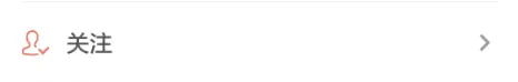
这样的一个菜单 Item 布局是不是很常见,如果每次都来写这样的布局再一个个找到上面的控件再进行赋值是不是会觉得很烦,做了很多重复的工作。这时候如果吧这个布局封装成一个控件,就能少写重复代码。
定制步骤
1、写出这个控件的布局
<?xml version="1.0" encoding="utf-8"?>
<RelativeLayout xmlns:android="http://schemas.android.com/apk/res/android"
    android:layout_width="match_parent"
    android:layout_height="40dp"
    android:background="@drawable/menuitem_background"
    android:elevation="3dp"
    android:orientation="vertical"
    android:padding="4dp">

    <ImageView
        android:id="@+id/icon_left"
        android:layout_width="wrap_content"
        android:layout_height="match_parent"
        android:padding="4dp"
        android:scaleType="fitCenter"
        android:src="@drawable/image_reward" />

    <TextView
        android:id="@+id/menu_text"
        android:layout_width="wrap_content"
        android:layout_height="match_parent"
        android:layout_marginStart="4dp"
        android:layout_toEndOf="@id/icon_left"
        android:gravity="center_vertical"
        android:text="菜单" />

    <ImageView
        android:id="@+id/icon_right"
        android:layout_width="wrap_content"
        android:layout_height="match_parent"
        android:layout_alignParentEnd="true"
        android:padding="8dp"
        android:src="@drawable/arrow_right" />
</RelativeLayout>
ps :里面的字符串资源和长度还是老老实实按需要写在 string 和 dimens 文件中。这里是个不好的习惯,实际开发注意就行
2、创建 attrs 文件,如果有的话直接在里面写自定义控件的一些属性
<?xml version="1.0" encoding="utf-8"?>
<resources>

    <declare-styleable name="MenuItemView">
        <!--布局中的文字-->
        <attr name="text" format="string" />
        <!--布局中左边的icon-->
        <attr name="leftIcon" format="reference" />
        <!--布局中右边的icon-->
        <attr name="rightIcon" format="reference" />
        <!--文字的大小-->
        <attr name="textSize" format="dimension" />
        <!--文字的颜色-->
        <attr name="textColor" format="color" />
    </declare-styleable>
</resources>
这样在需要写的布局中就可以像 android:text="xxx" 一样对这些属性进行设置
attrs 文件定义属性时需要注意,属性名称重复时需要将该属性提取为公共属性:
    //如果再定义一个自定义控件,属性还按照这样来编译会报错体会属性名已经出现过
    <declare-styleable name="RowText">
        <!--布局中的文字-->
        <attr name="text" format="string" />
        <!--文字的大小-->
        <attr name="textSize" format="dimension" />
        <!--文字的颜色-->
        <attr name="textColor" format="color" />
    </declare-styleable>

//解决办法,将共有属性提取出来

<?xml version="1.0" encoding="utf-8"?>
<resources>

    <!--布局中的文字-->
    <attr name="text" format="string" />
    <!--文字的大小-->
    <attr name="textSize" format="dimension" />
    <!--文字的颜色-->
    <attr name="textColor" format="color" />

    <declare-styleable name="MenuItemView">
        <!--布局中左边的icon-->
        <attr name="leftIcon" format="reference" />
        <!--布局中右边的icon-->
        <attr name="rightIcon" format="reference" />
        <!--布局中的文字-->
        <attr name="text" />
        <!--文字的大小-->
        <attr name="textSize" />
        <!--文字的颜色-->
        <attr name="textColor" />
    </declare-styleable>

    <declare-styleable name="RowText">
        <!--布局中的文字-->
        <attr name="text" />
        <!--文字的大小-->
        <attr name="textSize" />
        <!--文字的颜色-->
        <attr name="textColor" />
    </declare-styleable>
</resources>
3、继承ViewGroup自定义自己的ViewGroup,并在构造方法中将attrs的属性与ViewGroup中的控件关联起来
例如本例使用的 RelativeLayout ,则自定义 View 的代码如下:
    public MenuItem(Context context, AttributeSet attrs) {
        super(context, attrs);
        init(context, attrs);
    }

    public MenuItem(Context context, AttributeSet attrs, int defStyleAttr) {
        super(context, attrs, defStyleAttr);
        init(context, attrs);
    }

    private void init(Context context, AttributeSet attrs) {
        inflate(context, R.layout.menuitem_layout, this);
        ButterKnife.bind(this);
        TypedArray ta = context.obtainStyledAttributes(attrs, R.styleable.MenuItemView);
        //关联textColor
        int textColor = ta.getColor(R.styleable.MenuItemView_textColor, Color.GRAY);
        menuText.setTextColor(textColor);
        //关联TextSize
        float textSize = ta.getDimension(R.styleable.MenuItemView_textSize, getResources().getDimension(R.dimen.default_textsize));
        menuText.setTextSize(TypedValue.COMPLEX_UNIT_PX, textSize);
        //关联Icon
        int leftIconId = ta.getResourceId(R.styleable.MenuItemView_leftIcon, R.drawable.image_reward);
        iconLeft.setImageDrawable(getResources().getDrawable(leftIconId, null));
        int rightIconId = ta.getResourceId(R.styleable.MenuItemView_rightIcon, R.drawable.arrow_right);
        iconRight.setImageDrawable(getResources().getDrawable(rightIconId, null));
        //关联Text
        String text = ta.getString(R.styleable.MenuItemView_text);
        if (text != null)
            menuText.setText(text);
        ta.recycle();
    }
如果要获取控件的或者设置控件的一些属性可再写一些 public 方法提供回调:
    //设置text
    public void setMenuText(String text) {
        menuText.setText(text);
    }
    //获取text
    public CharSequence getText() {
        return menuText.getText();
    }
4、最后在布局中使用该控件:
    <com.pandaq.mvpdemo.customview.MenuItem
        android:id="@+id/https_unfriendly"
        android:layout_width="match_parent"
        android:layout_height="wrap_content"
        app:text="HTTPS unfriendly"
        app:textColor="@color/black"
        app:textSize="14sp" />
关于 attrs 中的属性说明
format 一共有如下几种类型:
- reference // 资源Id,如图片之类的
//定义 <attr name="leftIcon" format="reference" /> //控件初始化获取方式 TypedArray ta = context.obtainStyledAttributes(attrs,R.styleable.MenuItemView); //这里以图片资源为例,第一个参数为attrs中定义的,第二个为取值失败时的默认值 int reference = ta.getResourceId(R.styleable.MenuItemView_leftIcon,R.drawable.image_reward); - color // 颜色属性
//定义 <attr name="textColor" format="color" /> //控件初始获取方式 TypedArray ta = context.obtainStyledAttributes(attrs,R.styleable.MenuItemView) //第一个参数为attrs中定义的参数,第二个为取值失败时的默认值 int color = ta.getColor(R.styleable.MenuItemView_textColor,Color.RED); - boolean // 布尔值
//定义 <attr name="focusable" format="boolean"/> //代码中获取方式 TypedArray ta = context.obtainStyledAttributes(attrs,R.styleable.MenuItemView) //第一个参数为attrs中定义的参数,第二个为取值失败时的默认值 boolean focusable = ta.getBoolean(R.styleable.MenuItemView_focusable,true); - dimension //尺寸值,dp,px,sp等
//定义 <attr name="textSize" format="dimension" /> /** *getDimension() 返回值为float类型 *getDimensionPixelSize() 返回的是四舍五入后的整型值 *getDimensionPixeOffset() 返回的是舍弃小数部分的整型值 */ TypedArray ta = context.obtainStyledAttributes(attrs,R.styleable.MenuItemView) float textSize = ta.getDimension(R.styleable.MenuItemView_textSize, getResources().getDimension(R.dimen.default_textsize)); - enum // 枚举类型
//定义 <attr name="orientation"> <enum name="horizontal" value="0" /> <enum name="vertical" value="1" /> </attr> - float //浮点型
//定义 <attr name="floatNumber" format="float"/> //java代码中获取属性 TypedArray ta = context.obtainStyledAttributes(attrs,R.styleable.MenuItemView) float number = ta.getFloat(R.styleable.floatNumber,0.0); - fraction //百分数
//定义 <attr name="fraction" format="fraction"/> //java代码中获取属性 TypedArray ta = context.obtainStyledAttributes(attrs,R.styleable.MenuItemView) float fraction = ta.getFraction(R.styleable.fraction,100,30,0.3); - integer //整型
//定义 <attr name="number" format="integer"/> //java代码中获取属性 TypedArray ta = context.obtainStyledAttributes(attrs,R.styleable.MenuItemView) int number = ta.getInt(R.styleable.number,0); //或者得到一个Integer对象 Integer a = ta.getInteger(R.styleable.number, 0); - string //字符串类型
//定义
<attr name="text" format="string"/>
//java代码中获取属性
TypedArray ta = context.obtainStyledAttributes(attrs,R.styleable.MenuItemView)
String text = ta.getString(R.styleable.MenuItemView_text);
