

什么是flex.css?
css3 flex 布局相信很多人已经听说过甚至已经在开发中使用过它,但是我想我们都会有一个共同的经历,面对它的各种版本,各种坑,傻傻的分不清楚,flex.css就是对flex布局的一种封装,通过简洁的属性设置就能使得它完美的运行在移动端的各种浏览器,甚至能运行在ie10+的各种PC端浏览器中。它天然的能够很好的将页面布局和css进行分离,让css专注于元素的显示效果,我称之为声明式布局......
flex和data-flex
flex.css 有两个版本,一个是flex.css一个是data-flex.css,这两个版本其实是一样的,唯一的区别是,一个是使用flex属性设置,一个是使用data-flex属性设置。react 不支持flex属性直接布局,所以data-flex.css实际上是为了react而诞生的
安装flex.css
通过npm安装:
npm install --save flex.css本例子教程例子,则是从官方项目下载下来后,解压出来后,将dist目录下的flex.css文件引入使用
Hello world
<!DOCTYPE html>
<html lang="en">

<head>
    <meta charset="UTF-8">
    <title>Hello world</title>
    <link rel="stylesheet" href="./flex.css">
    <style type="text/css">
        .box {
            width: 150px;
            height: 150px;
            border: 1px solid #ddd;
        }
    </style>
</head>

<body>
    <div class="box" flex>Hello world</div>
</body>

</html>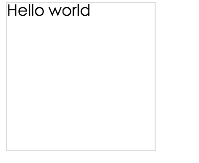
设置主轴方向
<!DOCTYPE html>
<html lang="en">

<head>
    <meta charset="UTF-8">
    <title>设置主轴方向</title>
    <link rel="stylesheet" href="./flex.css">
    <style type="text/css">
        .box {
            width: 150px;
            height: 150px;
            border: 1px solid #ddd;
        }
        .item {
            width: 30px;
            height: 30px;
            line-height: 30px;
            color: #fff;
            text-align: center;
        }
    </style>
</head>

<body>
    <h2>从上到下</h2>
    <div class="box" flex="dir:top">
        <div class="item" style="background: red;">1</div>
        <div class="item" style="background: blue;">2</div>
        <div class="item" style="background: #000;">3</div>
    </div>
    <h2>从右到左</h2>
    <div class="box" flex="dir:right">
        <div class="item" style="background: red;">1</div>
        <div class="item" style="background: blue;">2</div>
        <div class="item" style="background: #000;">3</div>
    </div>
    <h2>从下到上</h2>
    <div class="box" flex="dir:bottom">
        <div class="item" style="background: red;">1</div>
        <div class="item" style="background: blue;">2</div>
        <div class="item" style="background: #000;">3</div>
    </div>
    <h2>从左到右(默认)</h2>
    <div class="box" flex="dir:left">
        <div class="item" style="background: red;">1</div>
        <div class="item" style="background: blue;">2</div>
        <div class="item" style="background: #000;">3</div>
    </div>
</body>

</html>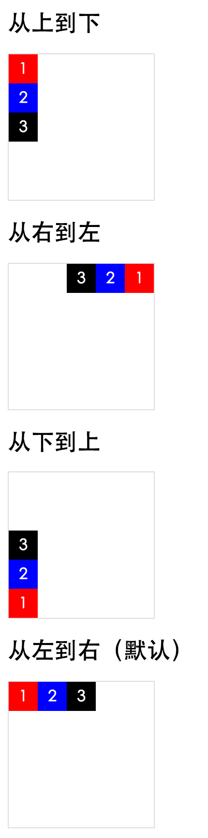
主轴对齐方式
<!DOCTYPE html>
<html lang="en">

<head>
    <meta charset="UTF-8">
    <title>主轴对齐方式</title>
    <link rel="stylesheet" href="./flex.css">
    <style type="text/css">
        .box {
            width: 150px;
            height: 150px;
            border: 1px solid #ddd;
        }
        .item {
            width: 30px;
            height: 30px;
            line-height: 30px;
            color: #fff;
            text-align: center;
        }
    </style>
</head>

<body>
    <h2>从右到左</h2>
    <div class="box" flex="main:right">
        <div class="item" style="background: red;">1</div>
        <div class="item" style="background: blue;">2</div>
        <div class="item" style="background: #000;">3</div>
    </div>
    <h2>从左到右(默认)</h2>
    <div class="box" flex="main:left">
        <div class="item" style="background: red;">1</div>
        <div class="item" style="background: blue;">2</div>
        <div class="item" style="background: #000;">3</div>
    </div>
    <h2>两端对齐</h2>
    <div class="box" flex="main:justify">
        <div class="item" style="background: red;">1</div>
        <div class="item" style="background: blue;">2</div>
        <div class="item" style="background: #000;">3</div>
    </div>
    <h2>居中对齐</h2>
    <div class="box" flex="main:center">
        <div class="item" style="background: red;">1</div>
        <div class="item" style="background: blue;">2</div>
        <div class="item" style="background: #000;">3</div>
    </div>
</body>

</html>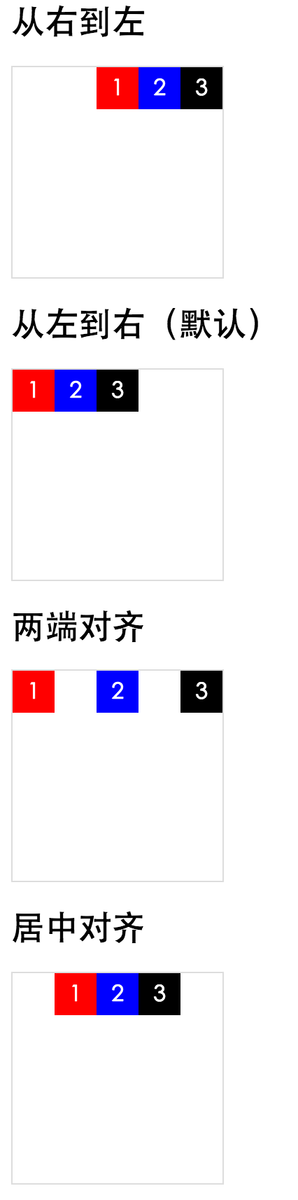
交叉轴对齐方式
<!DOCTYPE html>
<html lang="en">

<head>
    <meta charset="UTF-8">
    <title>交叉轴对齐方式</title>
    <link rel="stylesheet" href="./flex.css">
    <style type="text/css">
        .box {
            width: 150px;
            height: 150px;
            border: 1px solid #ddd;
        }
        .item {
            width: 30px;
            /*height: 30px;*/
            line-height: 30px;
            color: #fff;
            text-align: center;
        }
    </style>
</head>

<body>
    <h2>从上到下(默认)</h2>
    <div class="box" flex="cross:top">
        <div class="item" style="background: red;">1</div>
        <div class="item" style="background: blue;">2</div>
        <div class="item" style="background: #000;">3</div>
    </div>
    <h2>从下到上</h2>
    <div class="box" flex="cross:bottom">
        <div class="item" style="background: red;">1</div>
        <div class="item" style="background: blue;">2</div>
        <div class="item" style="background: #000;">3</div>
    </div>
    <h2>基线对齐</h2>
    <div class="box" flex="cross:baseline">
        <div class="item" style="font-size: 30px; background: red;">1</div>
        <div class="item" style="font-size: 12px; background: blue;">2</div>
        <div class="item" style="font-size: 40px; background: #000;">3</div>
    </div>
    <h2>居中对齐</h2>
    <div class="box" flex="cross:center">
        <div class="item" style="background: red;">1</div>
        <div class="item" style="background: blue;">2</div>
        <div class="item" style="background: #000;">3</div>
    </div>
    <h2>高度并排铺满</h2>
    <div class="box" flex="cross:stretch">
        <div class="item" style="background: red;">1</div>
        <div class="item" style="background: blue;">2</div>
        <div class="item" style="background: #000;">3</div>
    </div>
</body>

</html>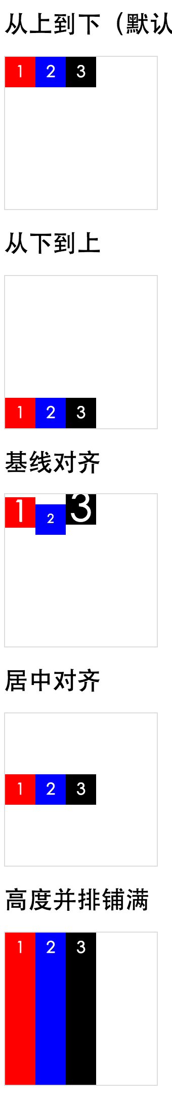
子元素设置
<!DOCTYPE html>
<html lang="en">

<head>
    <meta charset="UTF-8">
    <title>交叉轴对齐方式</title>
    <link rel="stylesheet" href="./flex.css">
    <style type="text/css">
        .box {
            width: 150px;
            height: 150px;
            border: 1px solid #ddd;
        }
        .item {
            width: 30px;
            height: 30px;
            line-height: 30px;
            color: #fff;
            text-align: center;
        }
    </style>
</head>

<body>
    <h2>子元素平分空间</h2>
    <div class="box" flex="box:mean">
        <div class="item" style="background: red;">1</div>
        <div class="item" style="background: blue;">2</div>
        <div class="item" style="background: #000;">3</div>
    </div>
    <h2>第一个子元素不要多余空间,其他子元素平分多余空间</h2>
    <div class="box" flex="box:first">
        <div class="item" style="background: red;">1</div>
        <div class="item" style="background: blue;">2</div>
        <div class="item" style="background: #000;">3</div>
    </div>
    <h2>最后一个子元素不要多余空间,其他子元素平分多余空间</h2>
    <div class="box" flex="box:last">
        <div class="item" style="background: red;">1</div>
        <div class="item" style="background: blue;">2</div>
        <div class="item" style="background: #000;">3</div>
    </div>
    <h2>两端第一个元素不要多余空间,其他子元素平分多余空间</h2>
    <div class="box" flex="box:justify">
        <div class="item" style="background: red;">1</div>
        <div class="item" style="background: blue;">2</div>
        <div class="item" style="background: #000;">3</div>
    </div>
</body>

</html>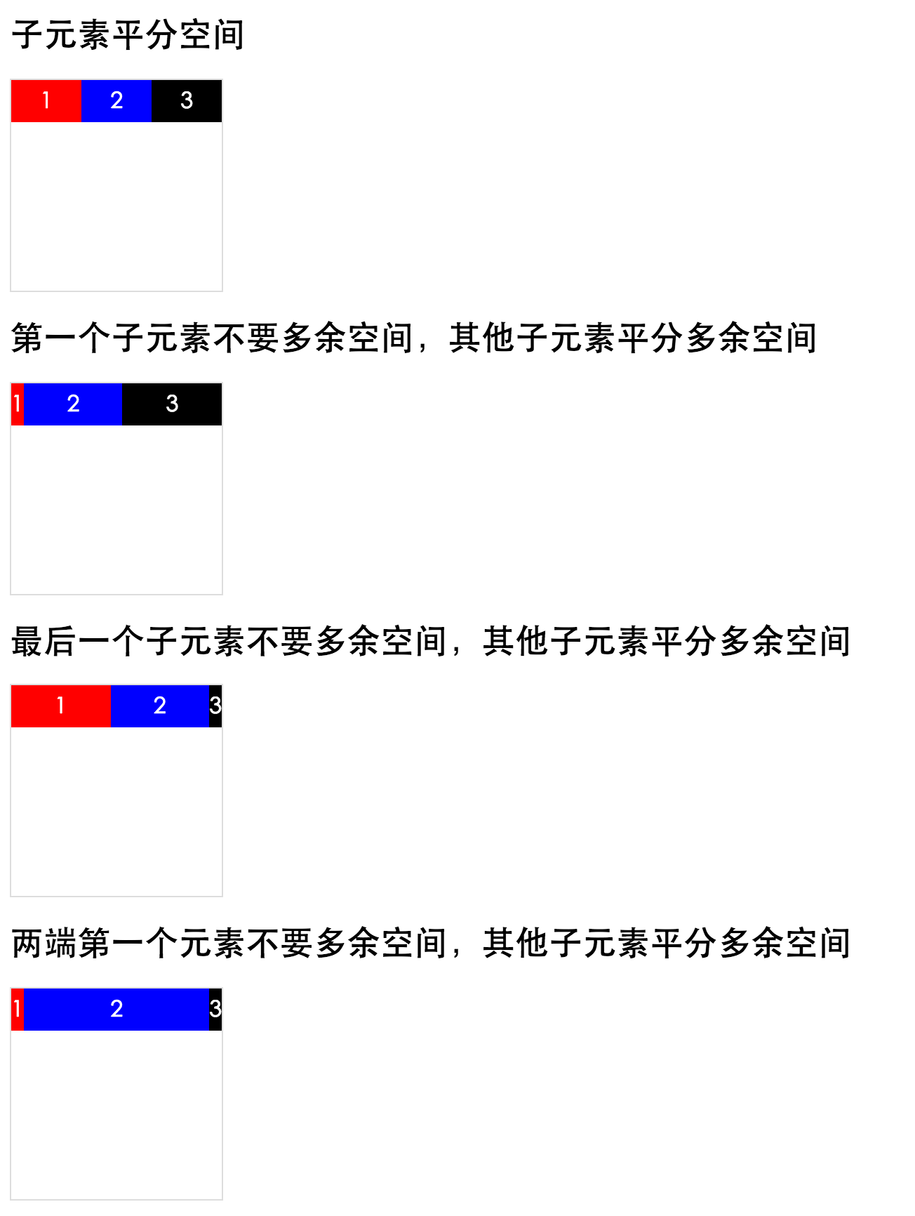
flex-box元素剩余空间比例分配
取值范围(0-10),单独设置子元素多余空间的如何分配,设置为0,则子元素不占用多余的多余空间
多余空间分配 = 当前flex-box值/子元素的flex-box值相加之和
flex-box实现两端不需要多余空间,中间占满剩余空间
<!DOCTYPE html>
<html lang="en">

<head>
    <meta charset="UTF-8">
    <title>flex-box实现两端不需要多余空间,中间占满剩余空间</title>
    <link rel="stylesheet" href="./flex.css">
    <style type="text/css">
        .box {
            width: 150px;
            height: 150px;
            border: 1px solid #ddd;
        }
        .item {
            width: 30px;
            height: 30px;
            line-height: 30px;
            color: #fff;
            text-align: center;
        }
    </style>
</head>

<body>
    <h2>flex-box实现两端不需要多余空间,中间占满剩余空间</h2>
    <div class="box" flex>
        <div class="item" flex-box="0" style="background: red;">1</div>
        <div class="item" flex-box="1" style="background: blue;">2</div>
        <div class="item" flex-box="0" style="background: #000;">3</div>
    </div>
</body>

</html>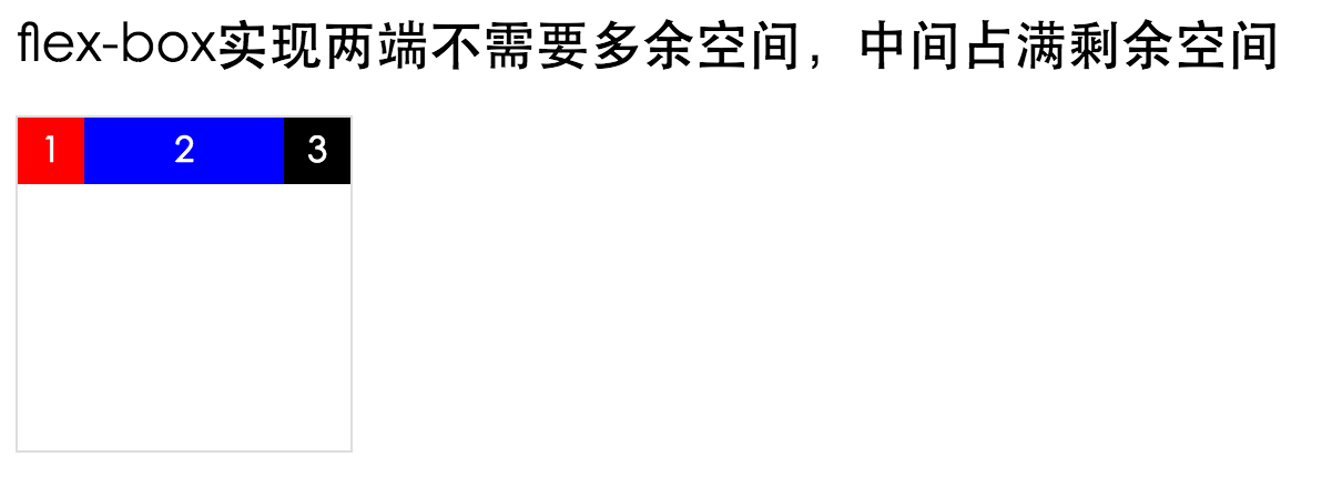
水平居中
<!DOCTYPE html>
<html lang="en">

<head>
    <meta charset="UTF-8">
    <title>水平居中</title>
    <link rel="stylesheet" href="./flex.css">
    <style type="text/css">
        .box {
            width: 150px;
            height: 150px;
            border: 1px solid #ddd;
        }
        .item {
            width: 30px;
            height: 30px;
            line-height: 30px;
            color: #fff;
            text-align: center;
        }
    </style>
</head>

<body>
    <h2>水平居中</h2>
    <div class="box" flex="main:center cross:center">
        <div class="item" style="background: red;">1</div>
        <div class="item" style="background: blue;">2</div>
        <div class="item" style="background: #000;">3</div>
    </div>
</body>

</html>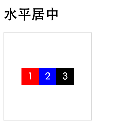
