

每次听到某大牛谈论自定义View,顿时敬佩之心,如滔滔江水连绵不绝,心想我什么时候能有如此境界,好了,心动不如行动,于是我开始了自定义View之路,虽然过程有坎坷,但是结果我还是挺满意的。我知道大牛还遥不可及,但是我已使出洪荒之力。此篇博客记录本人初入自定义View之路。
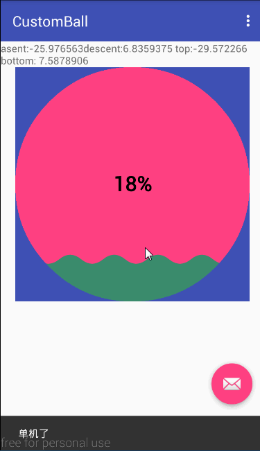
既然是初出茅庐,自然是按部就班的进行,先来一张效果图
本文章所写项目代码的GitHub链接
自定义属性
自定义属性,就是在资源文件夹下values目录中创建一个attrs.xml文件,
文件结构如下所示,atrr标签就是我们要自定义的一些属性,name就是自定义属性的名字,那么format是做什么的呢?
format是属性对应的值的类型,有十个值
- enm 枚举类型,例 android:orientation=”vertical” 此值有horizontal,和 vertical
- dimension 尺寸值
- color 颜色值,例 android:textColor = “#00FF00”
- boolean 布尔值,true or false
- flag 位或运算
- float 浮点型
- fraction 百分数,
- reference 参考某一资源ID,例 android:background = “@drawable/ic_launcher”
- string 字符串类型
- integer 整型值
知道了这些值得含义,就可以自定义我们自己的属性了,对于这个进度条,我们可以自定义圆的半径,颜色,和圆中心文本的大小,颜色,文本,最后attrs.xml文件为
布局文件配置相关内容
在布局文件要配置我们自定义的属性,首先要自定义命名空间,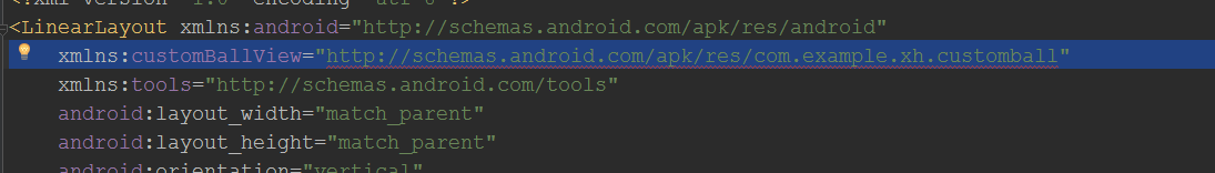
如上图,如果在as中命名空间写成schemas.android.com/apk/res/包名 此时as会报错,这是gradle造成的,在eclipse中如果自定义的属性 是不能用res-auto的 必须得替换成你自定义view所属的包名,如果你在恰好使用的自定义属性被做成了lib 那就只能使用res-auto了,而在android-studio里,无论你是自己写自定义view 还是引用的lib里的自定义的view 都只能使用res-auto这个写法。以前那个包名的写法 在android-studio里是被废弃无法使用的
所以配置后的布局文件如下
自定义控件
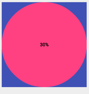
有了上边的操作,接下来就开始到了真正自定义控件的时候了,创建一个CustomBall类继承View类,先看构造方法,我们写成构造方法最终调用三个参数的构造方法,获取自定义属性的值及初始化工作就在三个参数构造方法中进行。下面我先先来绘制一个圆,文字画在圆心试试手,效果如图
当然绘制这个图形,首先获取我们自定义属性值,可通过下面获取属性值
注意通过TypedArray 获取属性值后要执行typedArray.recycle();回收内存,防止内存泄漏。
TypedArray typedArray=context.obtainStyledAttributes(attrs,R.styleable.customBallView)
        centerText=typedArray.getString(R.styleable.customBallView_centerText)
        Log.e("TAG","centerText"+centerText)
        centerTextSize=typedArray.getDimension(R.styleable.customBallView_centerTextSize,24f)
        centerTextColor=typedArray.getColor(R.styleable.customBallView_centerTextColor,0xFFFFFF)
        ballColor=typedArray.getColor(R.styleable.customBallView_ballColor,0xFF4081)
        radius=typedArray.getDimension(R.styleable.customBallView_ballRadius,260f)
        typedArray.recycle()
初始化画笔
    /**
     * 初始化画笔
     */
    private void initPaint() {
        roundPaint = new Paint();
        roundPaint.setColor(ballColor);
        roundPaint.setAntiAlias(true);
        fontPaint = new Paint();
        fontPaint.setTextSize(centerTextSize);
        fontPaint.setColor(centerTextColor);
        fontPaint.setAntiAlias(true);
        fontPaint.setFakeBoldText(true);

    }
接下来我们先画一个圆,先通过下面方法获取空间本身的宽和高,然后调用canvas.drawCircle(width/2, height/2, radius, roundPaint);画圆,在原点设置为控件中心位置,即点(width/2, height/2),半径为radius,画笔roundPaint,接下来绘制文字,将位子绘制在圆的中心。
        width = getWidth() ;
        height = getHeight();
如果我们通过canvas.drawText(centerText, width/2, height/2, fontPaint);绘制文字的话,发现文字并不是在中心位置,那么我们可以做一下调整,canvas.drawText(centerText, width/2, height/2, fontPaint);先通过float textWidth = fontPaint.measureText(centerText);获取文字的宽度,canvas.drawText(centerText, width/2-textWidth /2, height/2, fontPaint);此时文字依然不在中心,那么此时我们研究一下文字到底是怎么绘制的,为什么坐标试试中心了,绘制出来的效果依然有偏差呢。
要关注文字绘制的话,FontMetrics这个类是必须要知道的因为它的作用是测量文字,它里面呢就定义了top,ascent,descent,bottom,leading五个成员变量其他什么也没有。先看源码
public static class FontMetrics {
        /**
         * The maximum distance above the baseline for the tallest glyph in
         * the font at a given text size.
         */
        public float   top;
        /**
         * The recommended distance above the baseline for singled spaced text.
         */
        public float   ascent;
        /**
         * The recommended distance below the baseline for singled spaced text.
         */
        public float   descent;
        /**
         * The maximum distance below the baseline for the lowest glyph in
         * the font at a given text size.
         */
        public float   bottom;
        /**
         * The recommended additional space to add between lines of text.
         */
        public float   leading;
    }
这个类是Paint的静态内部类,通过注释我们就知道了每个变量的含义,为了更生动的理解这几个变量含义,我们通过下面的一张图来分别解释每个变量的含义
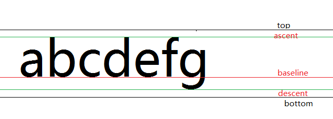
- Baseline(基线) 在Android中,文字的绘制都是从Baseline处开始的
- ascent(上坡度)Baseline往上至文字“最高处”的距离我们称之为ascent,
- descent(下坡度)Baseline往下至文字“最低处”的距离我们称之为descent(下坡度)
- leading(行间距)表示上一行文字的descent到该行文字的ascent之间的距离
- top 对于ascent上面还有一部分内边距,内边距加上ascent即为top值
bottom descent和内边距的加上descent距离
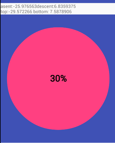
值得注意的一点,Baseline上方的值为负,下方的值为正如下图文字30%的ascent,descent,top,bottom。
通过上面的分析,我们就得出了将文本绘制中心的代码如下
//测量文字的宽度
float textWidth = fontPaint.measureText(centerText)
        float x = width / 2 - textWidth / 2
        Paint.FontMetrics fontMetrics = fontPaint.getFontMetrics()
        float dy = -(fontMetrics.descent + fontMetrics.ascent) / 2
        float y = height / 2  + dy
        canvas.drawText(centerText, x, y, fontPaint)
至此这个简单自定义的View基本实现,此时我改了布局配置文件为宽高
        android:layout_width="wrap_content"
        android:layout_height="wrap_content"
android:layout_width="match_parent"
android:layout_height="match_parent"Oh my God,为什么效果是一样的啊,此时再回到自定义的类,我们发现我们没有实现onMeasure里面测量的代码,接下来让我们实现onMeasure操作,如下
    @Override
    protected void onMeasure(int widthMeasureSpec, int heightMeasureSpec) {
        super.onMeasure(widthMeasureSpec, heightMeasureSpec);

        int widthMode = MeasureSpec.getMode(widthMeasureSpec);
        int heightMode = MeasureSpec.getMode(heightMeasureSpec);

        int widthSize = MeasureSpec.getSize(widthMeasureSpec);
        int heightSize = MeasureSpec.getSize(heightMeasureSpec);

        int width;
        int height;
        if (widthMode == MeasureSpec.EXACTLY) {
            width=widthSize;
        } else if (widthMode == MeasureSpec.AT_MOST) {
            width=(int)Math.min(widthSize,radius*2);
        } else {

            width=windowWidth;
        }
        if (heightMode == MeasureSpec.EXACTLY) {
            height=heightSize;
        } else if (heightMode == MeasureSpec.AT_MOST) {
            height=(int)Math.min(heightSize,radius*2);
        } else {
            height=windowHeight;
        }
        setMeasuredDimension(width,height);
    }
测量主要依靠MeasureSpec,MeasureSpec(测量规格)是一个32位的int数据.其中高2位代表SpecMode即某种测量模式,低32位为SpecSize代表在该模式下的规格大小,测量模式有三种
- EXACTLY 确切的,在布局文件中设置的宽高是固定的,此时测量大小就是我们设置的宽高
- AT_MOST 至多,不能超出
- UNSPECIFIED 未指定
通过上面的分析,绘制此图形的完整代码为
package com.example.xh.customball;

import android.content.Context;
import android.content.res.TypedArray;
import android.graphics.Canvas;
import android.graphics.Paint;
import android.util.AttributeSet;
import android.util.Log;
import android.view.View;

/**
 * Created by xiehui on 2016/8/10.
 */
public class CustomBall extends View {
    private int width;
    private int height;

    private int windowWidth;
    private int windowHeight;
    private Paint roundPaint;
    private Paint fontPaint;
    private String centerText = "";
    private int centerTextColor;
    private float centerTextSize;
    private int ballColor;
    private float radius;

    public CustomBall(Context context) {
        this(context, null);
    }

    public CustomBall(Context context, AttributeSet attrs) {
        this(context, attrs, 0);
    }

    public CustomBall(Context context, AttributeSet attrs, int defStyleAttr) {
        super(context, attrs, defStyleAttr);
        windowWidth = getResources().getDisplayMetrics().widthPixels;
        windowHeight = getResources().getDisplayMetrics().heightPixels;
        getCustomAttribute(context, attrs, defStyleAttr);
        initPaint();
    }


    /**
     * 获取自定义属性值
     */

    private void getCustomAttribute(Context context, AttributeSet attrs, int defStyleAttr) {

        /**
         * 获取自定义属性
         */
        TypedArray typedArray = context.obtainStyledAttributes(attrs, R.styleable.customBallView);
        centerText = typedArray.getString(R.styleable.customBallView_centerText);
        Log.e("TAG", "centerText" + centerText);
        centerTextSize = typedArray.getDimension(R.styleable.customBallView_centerTextSize, 24f);
        centerTextColor = typedArray.getColor(R.styleable.customBallView_centerTextColor, 0xFFFFFF);
        ballColor = typedArray.getColor(R.styleable.customBallView_ballColor, 0xFF4081);
        radius = typedArray.getDimension(R.styleable.customBallView_ballRadius, 260f);
        radius = Math.min(Math.min(windowWidth / 2, windowHeight / 2), radius);
        typedArray.recycle();

    }

    /**
     * 初始化画笔
     */
    private void initPaint() {
        roundPaint = new Paint();
        roundPaint.setColor(ballColor);
        roundPaint.setAntiAlias(true);
        fontPaint = new Paint();
        fontPaint.setTextSize(centerTextSize);
        fontPaint.setColor(centerTextColor);
        fontPaint.setAntiAlias(true);
        fontPaint.setFakeBoldText(true);

    }

    @Override
    protected void onMeasure(int widthMeasureSpec, int heightMeasureSpec) {
        super.onMeasure(widthMeasureSpec, heightMeasureSpec);
        int widthMode = MeasureSpec.getMode(widthMeasureSpec);
        int heightMode = MeasureSpec.getMode(heightMeasureSpec);
        int widthSize = MeasureSpec.getSize(widthMeasureSpec);
        int heightSize = MeasureSpec.getSize(heightMeasureSpec);

        int width;
        int height;
        if (widthMode == MeasureSpec.EXACTLY) {
            width=widthSize;
        } else if (widthMode == MeasureSpec.AT_MOST) {
            width=(int)Math.min(widthSize,radius*2);
        } else {

            width=windowWidth;
        }
        if (heightMode == MeasureSpec.EXACTLY) {
            height=heightSize;
        } else if (heightMode == MeasureSpec.AT_MOST) {
            height=(int)Math.min(heightSize,radius*2);
        } else {
            height=windowHeight;
        }
        setMeasuredDimension(width,height);
    }


    @Override
    protected void onDraw(Canvas canvas) {
        width = getWidth();
        height = getHeight();
        canvas.drawCircle(width / 2, height / 2, radius, roundPaint);
        float textWidth = fontPaint.measureText(centerText);
        float x = width / 2 - textWidth / 2;
        Paint.FontMetrics fontMetrics = fontPaint.getFontMetrics();
        float dy = -(fontMetrics.descent + fontMetrics.ascent) / 2;
        float y = height / 2 + dy;
        canvas.drawText(centerText, x, y, fontPaint);


    }

}
控件升级
上面我们已经实现了圆形和文本的绘制,那么接下来,我们先开始实现中心新进度的更新绘制。先看效果图
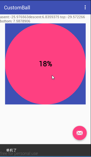
通过效果图,我们看到实现此效果就是不断的更新进度值,然后重绘,,那么我们只需开启一个线程实现更新进度值,为了更好的控制我们再加点击事件,当单机时开始增大进度,双击时暂停进度,并弹出Snackbar,其中有一个重置按钮,点击重置时将进度设置为0,重绘界面。
- 响应点击事件
因为要实现双击事件,我们可以直接用GestureDetector(手势检测),通过这个类我们可以识别很多的手势,主要是通过他的onTouchEvent(event)方法完成了不同手势的识别GestureDetector里有一个内部类 SimpleOnGestureListener。SimpleOnGestureListener类是GestureDetector提供给我们的一个更方便的响应不同手势的类,这个类实现了上述两个接口(OnGestureListener, OnDoubleTapListener,但是所有的方法体都是空的),该类是static class,也就是说它实际上是一个外部类。程序员可以在外部继承这个类,重写里面的手势处理方法
    public static class SimpleOnGestureListener implements OnGestureListener, OnDoubleTapListener,
            OnContextClickListener {

        public boolean onSingleTapUp(MotionEvent e) {
            return false;
        }

        public void onLongPress(MotionEvent e) {
        }

        public boolean onScroll(MotionEvent e1, MotionEvent e2,
                float distanceX, float distanceY) {
            return false;
        }

        public boolean onFling(MotionEvent e1, MotionEvent e2, float velocityX,
                float velocityY) {
            return false;
        }

        public void onShowPress(MotionEvent e) {
        }

        public boolean onDown(MotionEvent e) {
            return false;
        }

        public boolean onDoubleTap(MotionEvent e) {
            return false;
        }

        public boolean onDoubleTapEvent(MotionEvent e) {
            return false;
        }

        public boolean onSingleTapConfirmed(MotionEvent e) {
            return false;
        }

        public boolean onContextClick(MotionEvent e) {
            return false;
        }
    }
下面是我们自定继承SimpleOnGestureListener,由于我们只要响应单击和双击事件,那么我们只需要重写onDoubleTap双击(),onSingleTapConfirmed(单击)方法即可,
    public class MyGestureDetector extends GestureDetector.SimpleOnGestureListener {

        @Override
        public boolean onDoubleTap(MotionEvent e) {
            getHandler().removeCallbacks(singleTapThread);
            singleTapThread=null;
            Snackbar.make(CustomBall.this, "暂停进度,是否重置进度?", Snackbar.LENGTH_LONG).setAction("重置", new OnClickListener() {
                @Override
                public void onClick(View v) {
                    currentProgress=0;
                    invalidate();
                }
            }).show();
            return super.onDoubleTap(e);
        }

        @Override
        public boolean onSingleTapConfirmed(MotionEvent e) {
            Snackbar.make(CustomBall.this, "单机了", Snackbar.LENGTH_LONG).setAction("Action", null).show();
            startProgressAnimation();
            return super.onSingleTapConfirmed(e);
        }
    }
当点击时Snackbar做个提醒单击了View,然后调用startProgressAnimation()方法初始化一个线程,通过postDelayed将线程加入的消息队列,延迟100ms执行,通过singleTapThread == null判断条件,避免过多的创建对象
    private void startProgressAnimation() {
        if (singleTapThread == null) {
            singleTapThread = new SingleTapThread();
            getHandler().postDelayed(singleTapThread, 100);
        }
    }
我们将SingleTapThread 实现Runnable接口,在run方法里书写我们的处理逻辑,其实很简单,先判断当前进度值是不是大于最大进度(100),如果小于最大的值,我们就将currentProgress(当前进度值)加1的操作,然后调用invalidate()方法重绘界面,之后还需要再次将线程加入消息队列,依然延迟100ms执行。对于当如果当前进度已经加载到100%,此时我们将此线程从消息队列移除。
    private class SingleTapThread implements Runnable {
        @Override
        public void run() {
            if (currentProgress < maxProgress) {
                currentProgress++;
                invalidate();
                getHandler().postDelayed(singleTapThread, 100);

            } else {
                getHandler().removeCallbacks(singleTapThread);
            }
        }
    }
接下来还需要注册事件,我们可以在onDraw()方法中通过GestureDetector的构造方法可以将自定义的MyGestureDetector对象传递进去,然后通setOnTouchListener设置监听器,这样GestureDetector能处理不同的手势了
if (detector==null){
detector = new GestureDetector(new MyGestureDetector());
setOnTouchListener(new OnTouchListener() {
@Override
public boolean onTouch(View v, MotionEvent event) {
return detector.onTouchEvent(event);
}
});
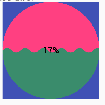
}还有最重要的一点是,View默认是不可点击的,所以我们需要 setClickable(true)设置View可点击的,OK,到这里我们就完成的中心进度值得更新,接下来就开始绘制里面的波浪形状,效果图如下
实现水波浪效果
水波纹效果是通过二阶贝塞尔曲线实现的,先简单看下什么是贝塞尔曲线
在数学的数值分析领域中,贝塞尔曲线(英语:Bézier curve)是电脑图形学中相当重要的参数曲线。更高维度的广泛化贝塞尔曲线就称作贝塞尔曲面,其中贝塞尔三角是一种特殊的实例。
贝塞尔曲线于1962年,由法国工程师皮埃尔·贝塞尔(Pierre Bézier)所广泛发表,他运用贝塞尔曲线来为汽车的主体进行设计。贝塞尔曲线最初由Paul de Casteljau于1959年运用de Casteljau算法开发,以稳定数值的方法求出贝塞尔曲线 - - - - -维基百科
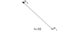
线性贝塞尔曲线
给定点P0、P1,线性贝塞尔曲线只是一条两点之间的直线。这条线由下式给出: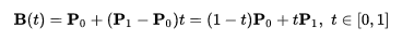
绘制效果为
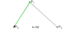
二次方贝塞尔曲线
二次方贝塞尔曲线的路径由给定点P0、P1、P2的函数B(t)追踪:
三次方贝塞尔曲线
P0、P1、P2、P3四个点在平面或在三维空间中定义了三次方贝塞尔曲线。曲线起始于P0走向P1,并从P2的方向来到P3。一般不会经过P1或P2;这两个点只是在那里提供方向资讯。P0和P1之间的间距,决定了曲线在转而趋进P2之前,走向P1方向的“长度有多长”。
曲线的参数形式为:

当然贝塞尔曲线是一个很复杂的东西,他可以延伸N阶贝塞尔曲线,如果想要真正搞明白,想自定义比较复杂或者比较酷炫的动画,那高等数学知识必须要搞明白,很多时候,我们只需要了解二次贝塞尔曲线就可以了,或者说,即使贝塞尔曲线不是那么熟悉,也不用怕,android API 封装了常用的贝塞尔曲线,我们只需要传入坐标就可以实现很多动画。
首先我们需要初始化贝塞尔曲线区域的画笔设置。其中重要的一点就是setXfermode()方法,此方法可以设置与其他绘制图形的交集,合集,补集等运算,在这个项目中,我们使用了交集(绘制贝塞尔曲线区域和圆区域的交集)
       progressPaint = new Paint()
        progressPaint.setAntiAlias(true)
        progressPaint.setColor(progressColor)
        //取两层绘制交集。显示上层
        progressPaint.setXfermode(new                 PorterDuffXfermode(PorterDuff.Mode.SRC_IN))
初始化画笔后,就开始绘制我们的图形,先初始化一个
宽和高都为radius * 2的正方形画布作为缓冲区画布,我们可以先在缓冲区画布绘制,绘制完成后一次再绘制到画布上。
        bitmap = Bitmap.createBitmap((int) radius * 2, (int) radius * 2, Bitmap.Config.ARGB_8888);

        bitmapCanvas = new Canvas(bitmap);
然后绘制圆心(width / 2, height / 2)半径为radius的圆
bitmapCanvas.drawCircle(width / 2, height / 2, radius, roundPaint)水波从圆的最下方开始(进度为0),到最上方(进度最大值maxProgress)结束,那么我们需要根据当前进度值动态计算水波的高度
float y = (1 - (float) currentProgress / maxProgress) * radius * 2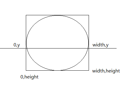
如图,我们就可以先将path.lineTo将每个点连起来,可以先从(width,y)绘制,那么需要调用path.moveTo(width, y);方法将操作点移动到该坐标上,接下下就开始依次连接其余三个点(width,height),(0,height),(0,y)。由于我们之前画笔设置的是取交集(progressPaint.setXfermode(new PorterDuffXfermode(PorterDuff.Mode.SRC_IN))),所以此时会绘制与圆相交的部分,也就是圆内的部分。
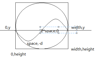
下面就是绘制贝塞尔曲线
            path.rQuadTo(space, -d, space * 2, 0);
            path.rQuadTo(space, d, space * 2, 0);
第一个是绘制向下弯曲,第二个是绘制向上弯曲。为了从左到右都绘制曲线,我们根据圆的直径计算一下,需要几次才能平铺,然后循环执行上面两句,直到平铺圆形区域,为了展示当进度增大时将波纹幅度降低的效果(直到进度为100%,幅度降为0)我们根据当前进度值动态计算了幅度值,计算方法如下
float d = (1 - (float) currentProgress / maxProgress) *space;由于我们需要以实心的方式绘制区域,那么我们调用
path.close();将所画区域封闭,也就是实心的效果。
        path.close()
        bitmapCanvas.drawPath(path, progressPaint)
Ok,到这里,自定义的水波形状的进度条就完成了,再次上效果图
由于本人目前水平有限,文字若有不足的地方,欢迎指正,谢谢。
