

本文已经翻译成中文《使用 Sketch 和 Pixate 构建 Material Design 原型 - 第二部分》,欢迎参加「掘金翻译计划」,翻译优质的技术文章。
In Part 2, we’re going to move on to creating the prototype in Pixate. For this part, you’ll need:
- Android or iOS device (preferably Android). If you can get something with a 1080 x 1920 size screen then all the better, but it’s not necessary, Pixate will scale the prototype for you.
- Pixate Studio
- Pixate app downloaded on to your Android or iOS phone.
- WiFi
Prototyping in Pixate
Open Pixate and click “Create new prototype” or create a new one from the “File” menu. Let’s name it “Material Design Prototype” and save it somewhere. On the next screen select “Nexus 5” as your “Target Device”, and then “Add Prototype”. It should be said here that if your device screen resolution is bigger than the 1080x1920 then when you load the prototype on your phone it may look a little blurry. That’s due to the scaling that Pixate is doing for your device. For smaller devices Pixate will scale it down.
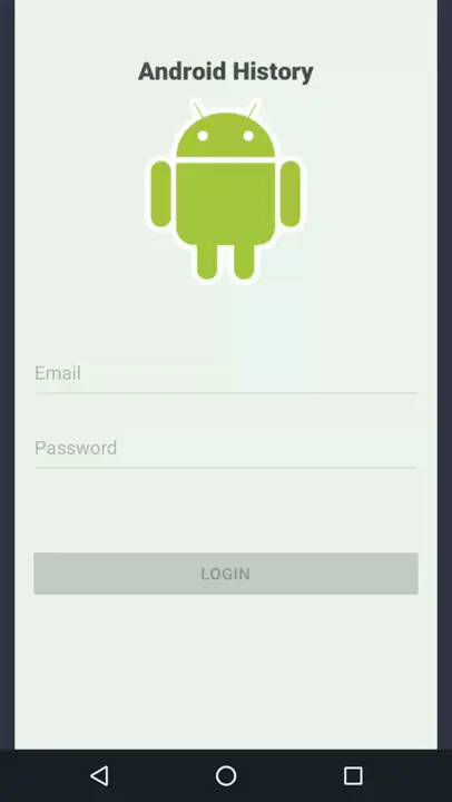
You should be presented with an empty rectangle with only some “Getting Started” text and looks eerily similar to Login Screen. They are there same size so our designs should transfer over nice and easy and in the correct proportions.
On the left hand side of Pixate Studio is a small icon menu. Select the “Assets” icon which is the second one down. Navigate to the folder where you placed all the Sketch exported assets, select all of them and then click “Open”. All the images should now be imported into Pixate:
Navigate back to the “Layers” menu (the top icon in the left hand icon menu) and let’s get started on bringing our assets in.
In the “Layers” menu, click the small plus icon to create a new layer. A small grey box should then appear in the above the white rectangle. Rename this layer to “Login Screen” so we know what it is. Then expand the box so that it fills the whole of the white background rectangle.
This grey rectangle is going to be the holder of our Login Screen. Ensure Login Screen is selected in the left hand menu, and look to the “Properties” menu on the right hand side. We’re interested in the “Appearance” field. Click the small grey plus button and select our Login Screen image that we exported from Sketch.
Can you field the pain?!
Now we need to add in our text fields. Click “Add a layer” again and we’ll get the familiar grey box. We need this to be the same dimensions as our email text field from the Sketch project, which for me is 328 x 48. Resize the box to these dimensions using the right hand “Properties” menu and the “Size” properties. We’ll also be using our positioning from Sketch as well. My email text field [x] is 16 and it’s [y] is 296. Enter these into the “Position” field in the right hand menu in Pixate. Lastly, we need to load our email text field image that we exported from Sketch, just like we did earlier for the Login Screen.
We need to move the email text field to the be part of the Login Screen. Click and drag on the email text field in the left hand “Layers” menu and place the email text field on top of the Login Screen. The email text field is now part of the Login Screen and should be showing.
查看图片
BUT WAITTTTTTTTTTT! WHAT ARE THOSE UGLY GREY BARS DOING ON THE SIDE OF THE EMAIL INPUT FIELD?!
Well, when we selected our exported email input field asset from Sketch, we didn’t remove the grey background colour from our layer. With the email input field selected, look at the “Appearance” field in the right hand “Properties” menu. There’s a little grey box next to the name of your exported email input field name. Click this and a colour palette box opens up. We want the transparent selection which is top left hand corner and has a red line through it diagonally. Ta da! The grey bars should now be removed. You’ll need to remember to do this for each image you import.
I’ll assume that your smart enough to realise that we need to this for the rest of the items for our Login Screen. Leave the login button, raised login button, email text field with input and password text field with input for now.
After you’ve finished you should have something that looks like this:
As you can see everything i’ve added belongs to the Login Screen layer.
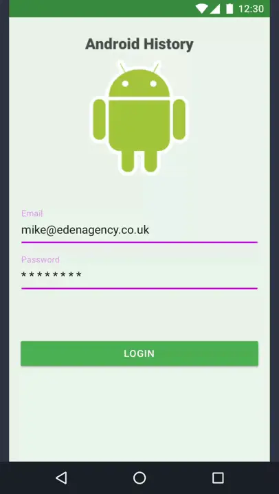
Next we need to add in our fields that have been filled. The easiest way to do this is to click the layer of the input field that we’re going be adding a filled in state for, and pressing the “Duplicate layer” button at the top of the “Layers” menu. This will create a copy above the layer the one you selected. So let’s do this for email text field with input. After it has been copied you have to click and drag it to make sure it is below the email text field. You may have to resize it also to make sure that it’s too scale, and then you may need to move it to the right position. Again, refer back to your Sketch project for correct sizing and positioning.
Once you’ve got these layers below their empty counterparts you should click the eye icon to hide them, just like we did in Sketch. The last thing you should do is set the “Opacity” in the right hand properties menu for the email text field with input and password text field with input to 0%. The reason for this is so that they are not visible when we finally load the project using the Pixate app, as it doesn’t pay attention to the visibility set for the layer in Pixate Studio.
As you can see in the screen shot above i’ve added the fields with with input but they are hidden. Now let’s get to the good stuff. Animating :D
Animating the field inputs (because I couldn't think of a funny title)
Now lets add in some animations for our login screen. We’ll start with the text fields and come to the button later.
Below the “Layers” menu on the left hand side are two boxes, “Interactions” and “Animations”. Each contain different Interactions and Animations. Interactions has things like “Tap” and “Drag”. Animations has things like “Scale” and “Move’. To use them, we need to drag them to layer upon which we want the interaction or animation to happen. Nice and simple.
Lets start with the email text field. Select it from the left hand side, and then click and drag the “Tap” from the “Interactions” box and drop it onto the email text field layer. Next we need “Fade” from the “Animations” box. Click and drag this as well to the email text field. You should see a little Tap icon on the right in the “Properties” menu under the field “Interactions” and “Fade” under the heading “Animations”.
We’re now going to get the email text field to fade out when it’s been clicked on. Under the “Fade” on the right hand menu click “Based On” and choose email text field. More options should open up below that you can explore but we’re only interested in one, the “Fade to”. Click on the box and enter “0”.
We’re nearly there where you can witness your first animation! Now we just need to get the Pixate app setup on your device….
Setting Up Pixate on your Device
Make sure you have the Pixate app downloaded on to your Android or iOS phone.
Open up the Pixate app. The app will start looking for you Pixate Studio on the network so give it a sec and make sure you're connected via WiFi. The Pixate app is sometimes a bit flippant for me and you may possibly need to exit it and re-enter. You can also connect via IP address.
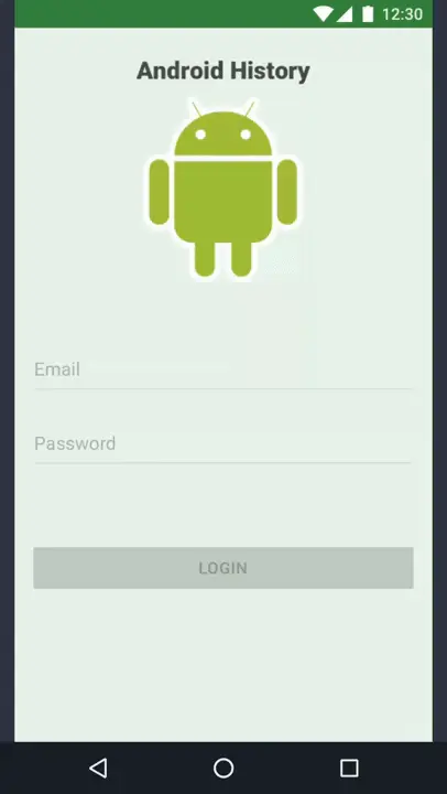
When your computer appears, click on it. In Pixate Studio in the top right hand corner click on “Devices”. You should see your phone listed here and you have to approve the connection so click the tick and your device should be connected. Check your device and listed at the top should be your computer. Click it and you should be shown your prototypes. You should see “Material Design Prototype” (depending on what you've called it), click it. You’ll now be presented with some instructions of how to interact with the device when your using your prototype. Click “Get Started” and you should now see your Login Screen! What’s even better is if you now click on the email text field it should now fade and disappear before your very eyes…
Creating more animations
Right, so now we have to finish this animation off. Empty space when we click the email text field is no good. Click on the email text field with input, and then click and drag “Fade” from the animations box and drop it on it. When you click on the first drop down box for “Based on” under “Fade” make sure you select email text field. What we’re going to do is make the email text field with input appear as the email text field fades out. Under “Fade to” enter “100”.
What we’re effectively saying is, when the email text field has been tapped, then fade it to 0 and fade the email text field with input to 100. It’s a bit, "if this, then that".
Now if you go back to your device, then the Pixate app should flash as it updates itself. Now if everything is setup correctly, when you click the email text field, it should fade out and the email text field with input should appear.
You now need to reproduce these steps to do the password text field and password text field with input.
Push the button! Animating the Login Button
So the last thing we need to animate is the login button. What we want to happen is that when you click on the button, it raises and then lowers, just like it would on a real device. This adds a nice layer of realism to the prototype. If you’re trying to do a really quick prototype, then maybe you’d leave this out and just have a button that activates the next screen. But we’re exploring Pixate so we’re going to do it.
First you need to add the login button and login button raised to the project. These should both be below the disabled login button in the left hand menu hierarchy and make sure that both opacities are set to “0”.
You may notice when you add the login button and raised login button that they may look a bit squashed. What you need to account for is the shadow. Unlike Sketch, which ignores the shadow, Pixate counts it as part of the image.
Here’s my settings for the login button:
- x = 14pt
- y = 471pt
- width = 332pt
- height = 40pt
And raised login button:
- x = 8pt
- y = 465pt
- width = 344pt
- height = 58pt
This should place the buttons all directly above each other and have room for the shadow.
We need some condition for the disabled login button to disappear on. We want it to disappear when both our email_text_field and password_text_field have both been tapped and the email_text field with input and password text field with input have both appeared. How do we do that? Well when you add an animation in Pixate you can also specify a condition upon which that animation can happen. The condition is written just like in code, so coders out there will be used to this but for the rest bear with me and we’ll get through it :)
Click and drag the “Fade” animation to the disabled login button. Now set the “Based on” to email text field. When you’ve done this the extra options should pop up. We’re interested in the “If” field. If you click the question mark icon next to it then you’ll get a through explanation of what this does as well as all the properties that you can check for on each of your layers.
What’s our condition? Well we want to check that if the password text field is no longer visible thenfade out the disabled login button. We do this as we know that if the password text field is no longer visible, then the password text field with input must be showing.
You’ll need to enter this conditional statement in the “If” box:
password_text_field.opacity == 0
We add the underscores as Pixate automatically add's them to our "Layer ID" when you name you layers with spaces.
We check for the visibility using the opacity property on the password text field layer and checking it’s set to 0.
Now if you go back to your prototype on your device and press the password text field and then the email text field, the disabled button should disappear!
We have to add another fade out animation now. This is check in case the email text field is faded out when the password text field has been pressed. This is typically how the prototype would operate normally.
You’ll need to do what we did before, but with the opposite settings. I’ll get you started, you need to click and drag ANOTHER “Fade” animation to the disabled login button. I’ll let you figure the rest out ;)
Right if all goes well, then your disabled login button should now disappear when both the email text field and password text field are no longer visible. Now we need to make the login button visible. This will be just another simple fade in animation.
We basically need to do the same as we did for the disabled login button, but we want the opacity to be 100 instead of 0 for both fade animations. I’m sure you can do this by now, but once again I’ll get you started. You need to drag a “Fade” animation to the login button. And remember to add the conditions in!
Ok, so you should now have something that looks like this:
ARISE SER BUTTON!
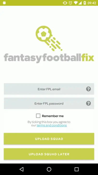
The very last thing we need to do is make our login button 'raise' when pressed; just like what happens normally with a button in Lollipop onwards. As you can see in the example of the Fantasy Football Fix login screen, the “Upload Squad” button seem’s to magnetise to your finger as you press the button, with the shadows increasing.
We're going to be making use of the raised login button obviously. Firstly, drag a “Tap” interaction to the login button as we need to know when it’s been pressed. Then we’re going to need two fades again for this so drag two over to the raised login button.
The first fade needs to be triggered when the login button is tapped, so make sure the login button is selected in your “Based on” field. We want this first fade to make our raised button appear so set the opacity to 100. We should probably name our fade as well, so we know what they are doing. Name it “Fade in on Login Button tap”.
That should make our button appear and seemingly rise, but if you click the login button now, the raised login button will appear and will stay there. We need it to disappear again to go back to our original login button, so we’re back in our resting state.
For this we need another “Fade” animation. Name this new one “Fade out after Rise”. This too needs to be based on the login button tap. This one though we want to fade to 0%. Lastly. we need to set the “Delay” to “0.2”. This is so that we wait to fade the button back out, otherwise you won’t even see the button, as we’d be fading in and fading out at the same time.
Now if you tap your login button you should get the nice raised effect!
If you want to get a bit more fancy you can fade the login button in and out too when it’s tapped but I’ll leave that to you as an extra task ;) A by product of this will be a slight flash so it looks like the button’s been tapped. Also note this will not look that great if you do not have the login button and raised login button both lined up correctly in Pixate so make sure you have that sorted.
We got there, eventually!
So that concludes this second meaty part of this series. I understand this was a lengthy process, but that’s just because of the sheer amount of instructions I had to write. Once you’ve done this once then you’ll always have it for reference. My advice would be to make loads of little sample projects, so that say if you need to remember how to do a raised button you can just open that project and see everything laid out nice and simply. As you get further into the prototype process things can start to get a bit busy in the project and you may not be able to easily locate the specific action/sequence of events.
