

Recently our design team here at Medium performed an experiment. As part of our typography refresh, we decided that our user interface should be rendered by system fonts.
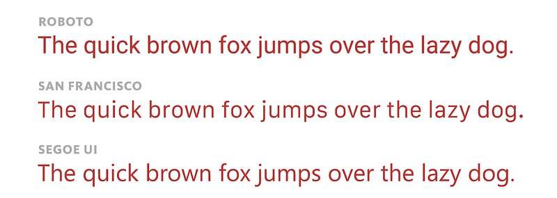
In between Roboto on Android, San Francisco on iPhones and Macs, and Segoe UI on Windows, today’s system fonts on today’s rich displays look amazing. However, relying on them to portray interfaces is much more common in native smartphone apps, but less so on the web. The reactions to our switch were — with some exceptions — positive:
I really dig that @Medium is using system fonts on mobile platforms. — Ian Patrick Hines
Using system fonts for UI in web design. I get the logic, but the visual effect is jarring, at least on OS X. — Martin Wright
I have deep love for the idea that an OS update can change a website’s fonts.(…) Makes it feel native to the device. — Joshua Benton
Joshua! I don’t know you, but your tweet was prescient. I bet, however, that you didn’t expect that an OS update would come… from the past.
The obvious way to use system fonts in CSS is to… just list all of the ones you can imagine by name:
font-family:"San Francisco", "Roboto", "Segoe UI";
(The way CSS works, if the first font is not present, the second one will be tried, and so on. Since it’s not common for an operating system to have more than one of these fonts installed, only one will be selected.)
We also need to take care of the older systems, including a fallback to use a generic sans serif font if nothing matches before:
font-family:"San Francisco", "Roboto", "Segoe UI", "Helvetica Neue", "Lucida Grande", sans-serif;
However, turns out San Francisco is a bit of a magical font. It’s not installed the usual way, instead having a “secret” name. That name is:
font-family:".SFNSText-Regular", "San Francisco", "Roboto", "Segoe UI", "Helvetica Neue", "Lucida Grande", sans-serif;/pre>Craig Hockenberry did some research and discovered that Apple very recently implemented a generic “just give me a system font” expression, so we added that, too:
font-family:-apple-system, ".SFNSText-Regular", "San Francisco", "Roboto", "Segoe UI", "Helvetica Neue", "Lucida Grande", sans-serif;And, since –apple– is a typical vendor prefix for an experimental feature, we included a more future-proof system as the first entry:
font-family:system, -apple-system, ".SFNSText-Regular", "San Francisco", "Roboto", "Segoe UI", "Helvetica Neue", "Lucida Grande", sans-serif;Eventually, in the future, if other browsers implement the feature, a simple font-family: system will take care of everything, but in the interim, this should do.
We felt pretty good about all this and on October 7, we launched Medium 2.0 which included this change.
Starting a few hours after launch, we started getting incidental reports about our fonts looking… “Pixellated.” “Blocky.” “Retro.” “Kinda awk, but mb i can get used to it.” “What.”
I looked again at all the system fonts and none seemed to match any of the descriptions. What was going on? I started asking for screenshots, and eventually a few trickled in.
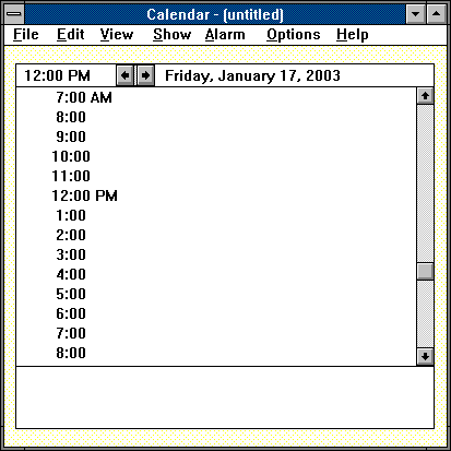
One of them looked like this:
Someone else shared something like this:
And, suddenly, I realized I know this font. It was a font I saw on my first PC.
It was 1990.
That PC was running Windows 3.0.
And the font was called… System.
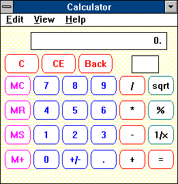
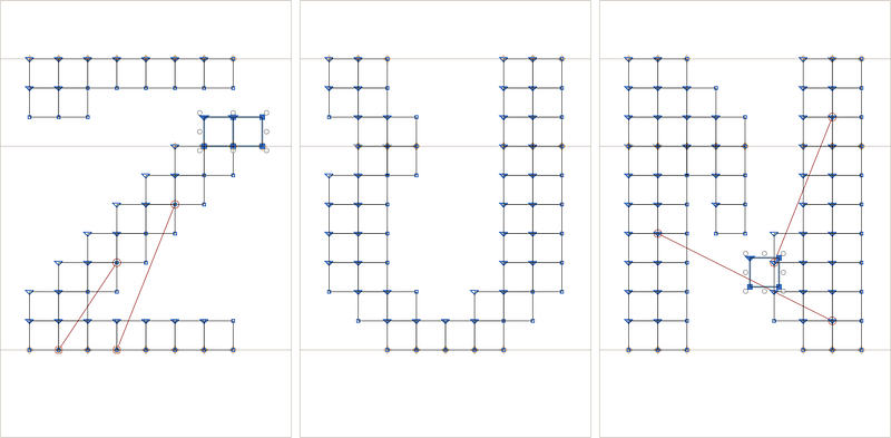
It was not even a vector font… most personal computers couldn’t use vector fonts yet. It was barely proportional — the first font of such kind on Windows.
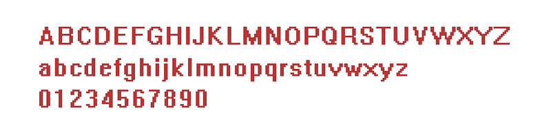
Looking at it today, System feels a bit awkward. Just look at that sprawling W, the R with a little crutch, the cut-off C, the quasimodo-like a. System’s main competition — Chicago employed by Apple’s Mac OS — had a head-start of six years, and was still much more elegant, although with tons of personality of its own:
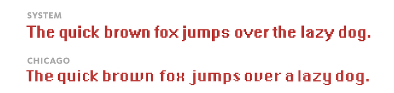
Both System and Chicago were bitmapped, and eventually superseded by nicer vector typefaces, rendered better and better by increasingly bigger displays with increasingly smaller pixels.
But, things don’t die on Windows. Windows has a strong “let’s maintain everything forever” slant. (Raymond Chen has a wonderful blog, The Old New Thing, documenting the lengths Microsoft goes to provide backwards compatibility. Here’s a story. Here’s another one. Here’s a great one about fonts, actually.)
And, somewhere within the depths of modern versions of Windows, there lay, dormant, an old-fashioned System font from 1990 — alongside some vintage software routines necessary to render it.
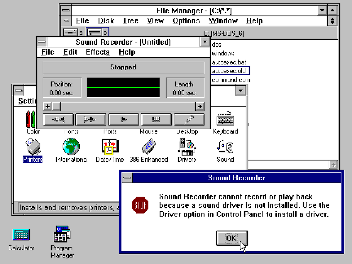
Dormant, that is, unless someone asked for it with CSS. Which we, inadvertently, did. And, to many people running modern Windows, Medium started looking like this:

And, perhaps most amazingly, this:
A humble pixel font from decades ago found a way to have its moment of 7-kilobyte glory, for perhaps the last time ever.
The fix was simple. The same day I simply removed system from the font CSS list:
font-family: -apple-system, ".SFNSText-Regular", "San Francisco", "Roboto", "Segoe UI", "Helvetica Neue", "Lucida Grande", sans-serif;
Bugs like this happen — this wasn’t very far away from our story of a disappearing Polish S — but I found this one delightful for a number of reasons:
- The accidental resurrection of System made me realize how much on-screen typography improved in the last 25 years. (Typewriters are losing, after all.)
- It certainly seems everything’s already been tried before. Look at us, pioneers of this radical idea of using UI fonts for UI! Except, this is nothing new and many smart people tried this before, down to the very same font name.
- System doesn’t just predate webfonts. It doesn’t even just predate CSS, first proposed in 1994. It is older than the web itself. Using one simple CSS clause we reached back in time much further than we were supposed to.
Given all the context today, System doesn’t feel nearly as awkward. There’s some nostalgia mixed into all this, of course, but the quirkiness of the font is welcome after the boring professionalism and similarity of Roboto/San Francisco/Segoe UI. Plus, there’s newfound appreciation for the enormous feat of squeezing so much out of such a limited canvas:

Or, maybe I simply just like flawed, vintage fonts (my other favourite is Toronto Subway). Either way, I couldn’t let the forgotten System stay there, forgotten.
So, I recreated System in a modern vector format, so you can download it and play with it:
Download System font in modern OpenType format
And also, I created a secret version of Medium so any of you can see what Medium looked like for those few last week:
To turn on the special version of Medium, go to the homepage or search page, search for C:\WINDOWS (all uppercase!), and press Enter
There’s something delightful in perusing Medium this way: the awkwardness with which the modern retina pixels need to accommodate the blocky, jagged font… and the unusual coexistence of rich contemporary vector fonts with 1,000+ glyphs, and a tiny pixellated throwback from when not just smartphones, but even mobile phones didn’t truly exist.
I hope you enjoy it as much as I did.
(And for those Mac OS aficionados snickering about Windows’s sad, awkward past, don’t forget that San Francisco once looked like this:
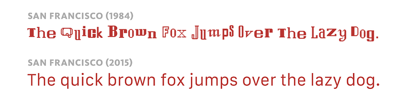
Yes, indeed. Today’s San Francisco is not the first font called by that name. And, despite all the font nostalgia and appreciation to Susan Kare, holy crap, no way I’d want to bring that font back.)
